
Why Photorealistic Artwork Became the Default Brief
A few years ago, "AI image" meant visible artefacts: melted fingers, plastic skin, impossible reflections. Today the first question in most creative kickoffs is not whether a generator can produce a realistic image, but which one gets closest to the reference photo without a human noticing the seam. That shift changes how teams work. Moodboards arrive faster, concept rounds compress, and the bottleneck moves from generation to selection and approval.
Realism is now a baseline expectation rather than a specialty skill. Advertising teams want packshots that survive a side-by-side with studio photography. Publishers want portraits that match a house style. Small studios want cinematic stills for pitch decks without renting a location. The practical goal is rarely "make any realistic image" — it is "make this specific realistic image, repeatedly, on schedule, and legally clean."
That specificity is where most workflows break down. A model that excels at portraits may struggle with hands in motion; one that nails product lighting may over-smooth fabric texture. This guide covers how realism is actually generated, how to choose a tool by job rather than by hype, and how to build a pipeline with quality control that non-artists can trust.
How Image Generators Actually Produce Realism
Most current generators are diffusion models. They begin with noise and iteratively denoise it toward an image that matches your prompt, guided by a text encoder that turns words into mathematical direction. Photorealism emerges from three ingredients: training data with enough real photography, a text encoder capable of parsing physical detail, and a scheduler that knows when to stop denoising before texture turns to mush.
Two controls matter more than most settings panels suggest. Guidance scale decides how literally the model obeys the prompt: too low and images drift dreamy and soft, too high and edges stiffen into a CGI sheen. Denoise strength during inpainting or image-to-image work decides how far the result may travel from a source image — the single most useful dial when you need realism that respects an existing composition.
Reference-driven features have become the main realism upgrade. Image prompts, style references, identity adapters, and control layers such as depth maps, pose skeletons, and edge detection let you lock composition while the model improvises surface detail. In practice, the strongest photorealistic results come from a reference image plus a short, physically precise prompt — not from a long poetic paragraph.
One more thing worth internalising: resolution is not realism. A generator can output enormous files full of unconvincing skin. Sharpness, specular highlights, and microtexture are what the eye reads as "photo." Upscalers help, but only when the underlying image already has plausible lighting and material logic.
Choosing a Generator: A Decision Framework
Rather than ranking tools, pick by the failure mode you cannot tolerate. Below are four common jobs and what actually matters for each.
People, portraits, and candid moments
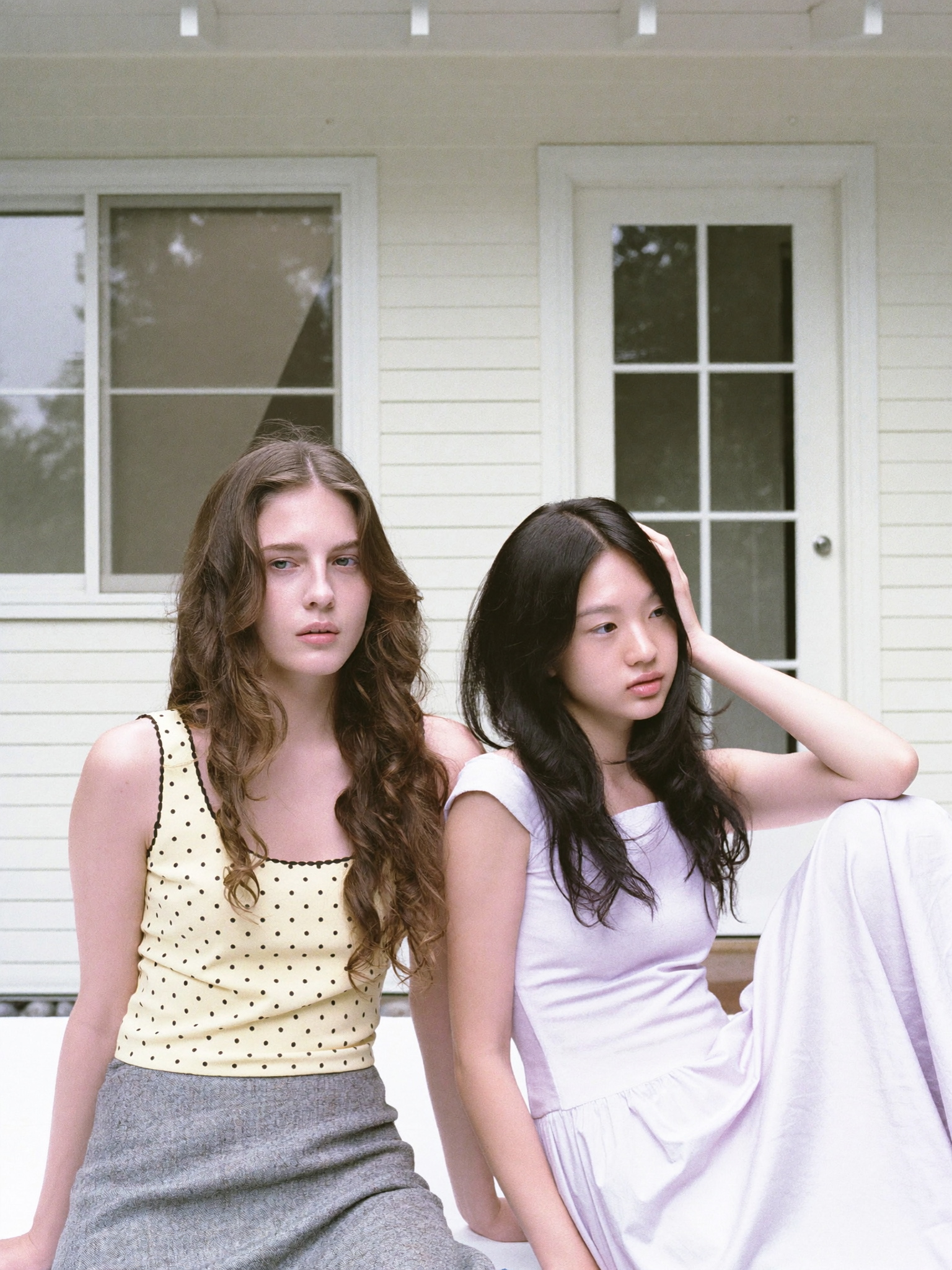
Evaluate skin microtexture, hair strand separation, eye reflections, and hand anatomy in unusual poses. Run the same prompt five times and check whether identity, age, and ethnicity stay stable. A model that nails one hero shot but drifts across a set is expensive to fix later, because you will pay for it in manual retouching or reshoots of adjacent frames.
Product and packshot work
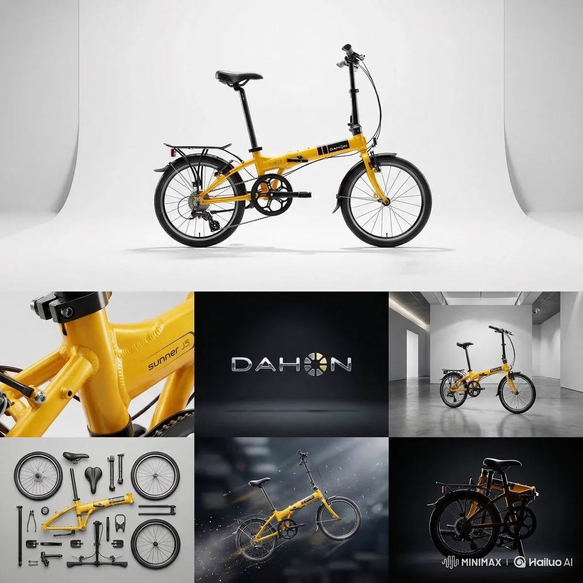
Look for edge fidelity, believable shadow contact, and reflection behaviour on glass, metal, and matte plastic. Text rendering on packaging has improved but still needs verification at full zoom. If your workflow requires exact label copy, plan a hybrid: generate the scene, then composite the label in a raster editor. Attempting to generate legible legal text rarely ends well.
Cinematic and environmental stills
Here atmosphere matters more than pixel-perfect detail: volumetric light, haze, motion blur, and depth of field. Models tuned for film-still aesthetics tend to produce better horizon lines and more convincing lens behaviour. Stress-test wide shots, because many tools collapse into mushy foliage and repeating textures at distance.
Stylized realism
If your brand sits between illustration and photography, prioritise style transfer and palette control over maximum detail. Prompt adherence to a named visual language is more valuable than hyperdetail, which can flatten a deliberate look into generic realism.
Two criteria cut across all four jobs. First, iteration speed: a slower model with better first-shot accuracy usually beats a fast model that needs eleven retries. Second, editability — inpainting, outpainting, and regional prompting decide whether you can salvage an 85 percent good image or must start over.
Prompting for Realism: Five Levers That Matter
Subject specificity with physical nouns. "Woman in her thirties, freckled, damp hair, cotton shirt" outperforms "beautiful woman." Concrete materials give the model texture cues: brushed aluminium, worn leather, raw linen, condensation on glass.
Lens and framing language. Focal length implies compression, distortion, and depth of field. A wide street frame feels documentary, a short telephoto portrait compresses features and blurs backgrounds, and a very wide angle exaggerates space and edge distortion.
Light direction and quality. Specify source, direction, and hardness: single softbox from camera left, subtle rim light from behind. Light is the strongest realism signal in any prompt — stronger than detail words.
Texture and controlled imperfection. Real photographs carry noise, dust, slight chromatic aberration, uneven skin, and imperfect focus. Adding a small amount of plausible imperfection prevents the waxy, over-clean look that reads as synthetic.
Short constraint lists. State what must not appear, but keep it tight: extra fingers, warped logos, plastic skin, oversaturated colour. Three or four high-impact constraints beat a list of twenty.
Then stop adding. The most common prompting error is stacking adjectives and two or three style anchors, which pushes the model toward a median average of everything. Short prompt, strong physical detail, one clear style reference.
Camera, Lens, and Lighting Vocabulary
A shared vocabulary speeds up team feedback. Keep this cheat sheet handy.
| Term | Effect on the image | Best used for |
|---|---|---|
| 35mm | mild perspective, documentary feel | lifestyle, street, reportage |
| 50mm | natural human perspective | portraits, general product |
| 85mm | compressed features, smooth background blur | beauty, headshots |
| 24mm | wide space, edge distortion | architecture, interiors |
| macro | extreme close detail, shallow depth | texture, jewellery, food |
| soft light | gradual shadow falloff | skin, cosmetics |
| hard light | crisp shadow edges | editorial, drama, sport |
| rim light | separates subject from background | dark scenes, silhouettes |
| bounce | fills shadows naturally | interiors, tabletop |
Keep these terms consistent across prompts and revision notes. When a stakeholder says an image "looks flat," shared vocabulary lets you translate that into "add a rim light and lift contrast on the shadow side" rather than guessing through another round.
A Repeatable Production Workflow
Brief and reference gathering
Write one paragraph describing the final image in plain language, then attach two to four references: one for lighting, one for composition, one for wardrobe or material. References resolve ambiguity faster than adjectives ever will. Note deliverable specs early — aspect ratio, crop safety, and where the image will appear.
Exploration pass
Generate a wide batch with fixed seed ranges so results stay traceable. Do not refine during this phase; you are buying coverage. Tag every output with its prompt version. Budget roughly a third of total project time here.
Refinement pass
Pick the two strongest candidates and iterate with image-to-image or inpainting at moderate denoise strength. Fix one problem at a time: composition first, then lighting, then micro-detail. Changing three variables at once makes it impossible to learn what worked.
Approval gate
Get sign-off on a single refined frame before producing the rest of the set. Approving one image is cheap; approving twelve variants built on a wrong assumption is not. Freeze the prompt, seed, and reference set at this gate and record them.
Quality control
Review at full zoom, then at thumbnail size — both matter. Check hands, teeth, jewellery, background text, reflected logos, and shadow consistency. Flip the image horizontally to catch asymmetry errors your eye has already normalised. Compare side by side against the original reference at identical crop.
Delivery and handoff
Export in the required colour space, keep a layered file if compositing occurred, and document prompts and model versions. That record is what makes the next image in the series reproducible instead of a fresh gamble.
Consistency at Scale
Series work is where realism earns its keep: six product angles, twelve social variants, one character across a campaign. Three techniques carry most of the load. Identity references or a trained adapter stabilise faces. Seed locking plus small prompt deltas keeps lighting and colour grade consistent across a set. Control layers such as depth maps, pose skeletons, and edge detection hold composition while surfaces change.
The practical rule is to change one axis per iteration. If you need a new pose and a new outfit, generate the pose first, then vary the wardrobe. Keep a version log with seed, model, and prompt for every approved frame; when someone asks for "the same but warmer," you can reproduce the exact base in a single pass instead of rebuilding from memory.
Post-Production, Upscaling, and Quality Control
Upscale deliberately
Generative upscalers can invent detail that contradicts the original — new fabric patterns, shifted letterforms, fresh wrinkles. For technical work, prefer conservative upscalers that preserve structure, then add texture manually if needed. Always compare before and after at full zoom.
Retouch, do not rebuild
Cleanup tools are for stray artefacts, not redesign. If a correction requires rebuilding a hand or a reflection, regenerate with a better reference instead. Retouching a broken region usually leaves an inconsistent light direction that the eye catches immediately.
Common realism killers
Waxy skin from over-smoothing. Symmetric catchlights that ignore the light source. Shadows falling in two directions. Missing reflections on glossy surfaces. Text that almost reads as words. Hair merging into the background with no edge separation. Most of these are fixable with a targeted inpaint pass and a shorter prompt, and nearly all of them are cheaper to prevent than to repair.
Rights, Disclosure, and Client Expectations
Realism raises the stakes. Before delivery, confirm where generation and usage rights sit for your tool and plan tier, and keep that record with the project file. Commercial-safe options exist across paid plans, but terms differ between personal and business use, and they change over time.
Be transparent about process. Many agencies now include a one-line note in the delivery email: which images are generated, which are photographed, and what editing happened. It protects everyone if a viewer later asks how an image was made, and it is far easier than retrofitting an explanation after publication.
Avoid generating identifiable real people, trademarked characters, or product designs you do not have rights to use. If a campaign requires a specific person, work from a licensed photograph or a consented likeness reference. Realism makes misuse more convincing, which is exactly why the guardrails matter more in this medium than in obviously synthetic illustration.
FAQ
How many generations does a realistic hero image need?
Typically twenty to sixty for a complex scene once references are solid. First-shot wins happen, but budgeting for exploration is what keeps deadlines believable. If you are consistently generating over a hundred frames per image, your prompt or reference set is probably too vague.
Can AI realism replace a product photographer?
For social content and concept work, often yes. For regulated packaging, legal claims, or hero e-commerce imagery, hybrid workflows still win because label accuracy and colour fidelity must be exact. Treat generation as the scene builder and photography as the source of truth for anything a regulator or a customer might scrutinise.
Why does my image look like CGI even though it is detailed?
Usually lighting and texture, not resolution. Add a single directional key light, reduce overall saturation slightly, and introduce plausible noise or surface imperfection. Over-sharpening is a common culprit too — it flattens the subtle falloff that real lenses produce.
Do negative prompts help?
Moderately. Three or four high-impact constraints work better than long lists, which can pull the model toward an average of unrelated concepts. If a negative prompt is not fixing the problem, change the positive prompt or the reference instead.
How do I keep characters consistent across images?
Use identity references or a trained adapter, lock the seed, and vary one attribute per iteration. Keep a version log so approved frames can be reproduced exactly. Consistency is a documentation problem as much as a modelling problem.
Is upscaling enough to fix soft output?
No. Upscalers sharpen and add plausible detail, but they cannot invent correct anatomy, light direction, or material behaviour. Fix structure at generation time, then upscale as the final polish step.
