

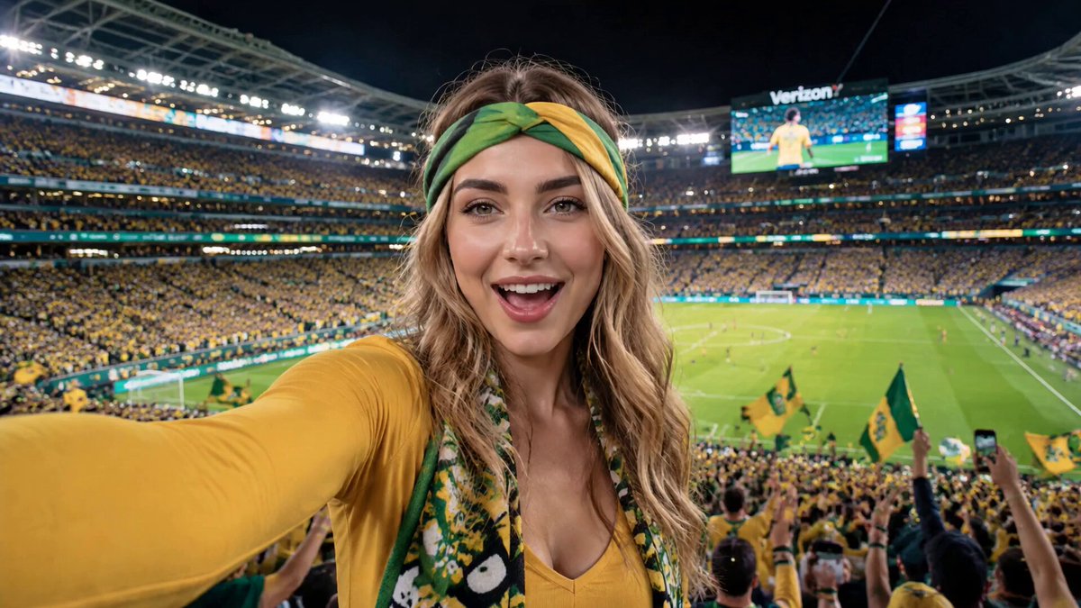
A brick-pixel look — pictures assembled from a coarse grid of flat, studded blocks — started out as a novelty filter. Inside a modern AI video pipeline it becomes something far more practical: a constraint that quietly enforces consistency across every frame, every camera angle, and every new scene you generate. That is the real value of this aesthetic. It is not decoration, it is a contract.
Why the Brick-Pixel Aesthetic Earns Its Place in an AI Video Pipeline
Generative video has an awkward trade-off baked into it. The models that produce the most believable motion are the same models that drift the hardest between shots: a jacket changes shade, a face narrows, an alley loses its lamp posts between cuts. Photoreal output leaves nowhere to hide, because every small inconsistency reads as an error. A viewer trained by cinema to notice continuity will notice it instantly.
A quantized, blocky style flips that dynamic. When the whole frame is reduced to a limited palette and a visible grid, small deviations in lighting and micro-detail stop being flaws and start reading as texture. The style absorbs noise. Better still, it creates a measurable target: you can look at two frames and tell immediately whether they share a palette, a block size, and a lighting direction. Consistency stops being a vague feeling and becomes something you can check with your eyes in two seconds.
There is a commercial argument too. Photoreal clips are everywhere, and audiences have seen so many that they blur together in a feed. A stylistic signature — a world visibly assembled from blocks — is recognizable at thumbnail size. That matters enormously for episodic series, explainers, music visuals, and social formats where the first half second decides whether anyone keeps watching. Style becomes a retention tool, not a taste preference.
Finally, block styling is forgiving of the one thing AI video still does imperfectly: hands, teeth, fabric detail, and complex background clutter. Quantization collapses those problem zones into a handful of colored squares. You are not hiding the weaknesses of the model so much as giving them a place to live.
The Visual Grammar of a Brick-Pixel Look
Before you touch a model, define the look in numbers. A style that only exists as an adjective in your head will drift the moment you generate the tenth shot.
Grid resolution and stud geometry
Decide how coarse the grid is. A 32-block-wide frame reads as chunky retro; a 96-block-wide frame reads as a detailed miniature. The number you choose becomes a hard rule: every asset in the project is resampled to that grid before it enters the edit. Mixing grid sizes is the single most common reason a stylized project looks broken, because the eye detects the scale mismatch long before it can name it.
Stud geometry — the raised knob on top of each block — is the detail that sells the illusion. Studs should stay in a fixed position relative to the block and scale with the grid. If studs jitter, disappear, or change size between shots, viewers cannot explain why the image feels wrong, but they feel it. Lock stud height in your style reference and reapply it rather than letting a model improvise.
Palette discipline and color quantization
Write down a palette of 16 to 24 colors and treat it as law. Assign roles: two or three skin tones, two sky tones, a shadow set, a highlight set, one accent reserved for the protagonist or for props that must read instantly. When you generate a new shot, the question is never "does this look nice" but "does this shot use only the palette."
Quantization is where new creators lose the most quality. Reducing colors with a generic setting produces muddy banding in gradients — skies, fog, soft skin shading. The fix is to control where the reduction happens: quantize luminance separately from hue, then dither lightly in the transition zones so banding reads as intentional texture rather than compression damage.
Lighting that survives quantization
Soft, gradual lighting dies in a blocky style. Broad gradients become two flat tones with a hard seam. The solution is to design lighting as discrete steps: a bright face, a mid tone, and a shadow tone, with clean boundaries. Hard key light, rim light, and a simple bounce fill work better than a soft box look. Practically, this means planning fewer light sources per scene and accepting chunkier falloff as part of the aesthetic.
Build a Style Reference Kit Before You Generate Anything
A reference kit is a folder of ten to twenty images that defines your world, and it does more for consistency than any prompt trick. Build it in this order:
- Two or three master frames that show the style at its best — one wide establishing shot, one close-up of a character, one interior.
- A palette sheet rendered as flat swatches with names.
- A grid-and-stud diagram showing block size relative to frame height.
- Lighting examples: day exterior, night exterior, interior practical, and a high-contrast dramatic setup.
- Prop and material references — how metal, glass, water, and foliage read once quantized. Water and glass are the two materials that most often break a blocky style, so solve them early.
Every generation task in the project references this kit. When a producer or client asks why the tenth shot looks like the first, the kit is the answer.
Choosing Tools for Each Stage of the Pipeline
Different stages reward different tools. Trying to force one tool to do everything is how projects stall.
Still-image generation and restyling
For the restyling pass — turning a real photograph or a rendered frame into a blocky version — you want a model with strong structural adherence, so edges and silhouettes survive the transformation. Diffusion models with image conditioning or ControlNet-style structure guidance work well here, especially with a palette lock applied afterward. ComfyUI-style node graphs are popular for this stage because you can chain quantization, palette mapping, and upscaling in a single reproducible pipeline instead of repeating manual steps.
Image-to-video and motion
For motion, image-to-video models are generally more controllable than pure text-to-video, because you hand the model a correctly styled first frame and ask it to move rather than to invent. Runway, Kling, Luma, Sora-class models, and open video models all behave differently here: some preserve fine grid structure, others smear it into mush within a second. Test one five-second clip per model on your own reference frame before committing an entire project.
If the model smears the grid, do not fight it. Generate motion in a cleaner, slightly less quantized version, then reapply the block treatment to every frame as a post-process. Applied consistently, this frame-by-frame pass actually improves consistency, because the same algorithm touches every single frame.
Upscaling, denoising, and finishing
Upscaling is where blocky projects are won or lost. A standard upscaler will try to invent detail and soften your grid into a blurry mess. Look for tools that preserve hard edges or, better, render at low resolution and upscale with nearest-neighbor or a pixel-art-specific model. Topaz-style upscalers have dedicated settings for this, and dedicated pixel-art upscalers exist in most editing ecosystems. Apply your final quantization after upscaling, not before, so the grid stays exact.
A Repeatable Workflow, Step by Step
Here is the sequence that keeps a multi-shot project coherent.
1. Lock the style bible
Write a one-page document: grid width, palette list, stud rules, allowed lighting setups, camera language, and forbidden elements. Forbidden elements matter as much as allowed ones — say no to lens flares, motion blur, film grain, and soft bokeh, because all four fight a quantized look.
2. Generate anchor keyframes
Produce three to five keyframes per scene at full quality in a neutral style, then restyle them. Approve these before any video generation begins. Changing the style after animating is expensive; changing it before costs nothing.
3. Propagate the style across the shot list
For each new shot, start from the nearest approved keyframe rather than from text alone. Use it as an image reference with a low-to-medium style strength, and re-apply the palette after generation. This is the closest thing to a guarantee of continuity that current tooling offers.
4. Add motion without breaking the grid
Keep camera moves simple — slow push-ins, lateral tracks, pans. Fast whip pans and handheld shake force the model to invent detail on every frame, and invention is where the grid collapses. Animate at the lowest resolution you can tolerate, then apply block treatment and upscale.
5. Assemble, grade, and finish
In the edit, build a color grade that does not fight the palette: slight contrast, minimal saturation changes, no film emulation LUTs. Add sound design generously — a stylized image with clean realistic audio reads as intentional; a stylized image with muffled audio reads as an error. Export a small test to a phone screen before the final render; blocky styles can look wonderful on a monitor and unreadable on a small display with a busy background.
Prompt Patterns That Keep a Style From Drifting
Prompts do not control style as tightly as references do, but they still matter. A few patterns help:
- Name the medium, not the mood. "Flat-shaded toy-brick render, hard-edged, limited palette, no gradients" outperforms "cute blocky vibe."
- State the negative explicitly. List what must not appear: soft shadows, bloom, depth-of-field, texture noise, film grain.
- Describe lighting in steps. "Three-tone lighting: bright key on the left, one mid tone, one shadow tone" gives a model something concrete to repeat.
- Constrain camera language. Words like "static wide shot, eye level, centered" reduce how much the model improvises.
- Keep a prompt skeleton. Reuse the same first 30 words across every shot in a scene and change only the subject, action, and framing. Models weight early tokens heavily, so a shared opening acts like a small style anchor.
Five Mistakes That Break a Brick-Pixel Project
Mixing grid sizes. The most damaging and the most common. Audit every asset at 100% zoom before assembly.
Over-detailing the source. If you feed a hyper-detailed photoreal frame into a block pass, you get visual soup. Simplify the source first — fewer props, cleaner silhouettes, stronger shapes.
Soft lighting in a hard-edged world. Gradual shadows produce ugly quantization seams. Replace them with stepped light.
Trusting the model with the final look. Every shot should pass through the same deterministic finishing chain: quantize, palette-map, stud pass, upscale. Determinism is what makes a style survive twenty shots.
Ignoring motion readability. A blocky style reduces the amount of information per frame, so motion needs to be larger and slower than in live action. If a gesture is unclear in a still, it will be worse in motion.
Pre-Render Consistency Checklist
Run this before final export:
- Grid width identical across all shots, verified at 400% zoom.
- Palette extracted from every shot and compared side by side; no off-palette outliers.
- Stud geometry present and uniform.
- Character skin tones and hair tones match across scenes.
- Lighting direction consistent within each scene block.
- No forbidden elements: grain, bloom, motion blur, film emulation.
- Audio loudness normalized across the whole timeline.
- Tested on a phone screen and a large display.
FAQ
Do I need a specialized model to do this?
No. A structured image model plus a deterministic post-processing chain will outperform a single do-everything tool. The consistency comes from the chain, not the model.
Should I animate first and stylize after, or stylize first?
Stylize a small number of keyframes first so you can approve the look cheaply, then generate motion and either preserve the style natively or reapply it per frame. Most teams end up doing both: a styled first frame to guide the model, plus a finishing pass for uniformity.
Why does my style fall apart after two seconds?
Usually because the motion is too fast or the camera is moving too aggressively. Slow the action, simplify the move, and re-apply the block treatment frame by frame.
How do I handle water, glass, and reflective surfaces?
Treat them as three-tone materials: one highlight, one mid, one dark. Avoid real reflections, which introduce high-frequency detail that quantization turns into visual noise.
Can I mix this style with live-action footage?
Yes, but only one of the two should dominate. Fully stylize the AI shots and leave the live footage untouched, or stylize both. A 50/50 blend reads as a mistake rather than a choice.
How long should a shot be in this style?
Longer than you think. Reduced detail means viewers need more time to read a frame. Two to four seconds per shot is a comfortable range for most narrative work.
Is this approach expensive?
Cost scales with generation count, not style complexity. You save by approving keyframes first, animating at low resolution, and running one deterministic finishing pass instead of endless manual retries.
Where to Take the Look Next
Once the basics are stable, the interesting work starts. Try variable block sizes to suggest depth — coarser blocks in the foreground, finer in the background. Experiment with a limited animation feel, holding frames slightly longer than realism allows. Push palette discipline further by giving each location its own accent color while keeping the core palette shared. None of these ideas require new tools; they require the style bible, the reference kit, and the discipline to run the same chain on every shot. That is what separates a project that looks like a filter from one that looks like a world.
