

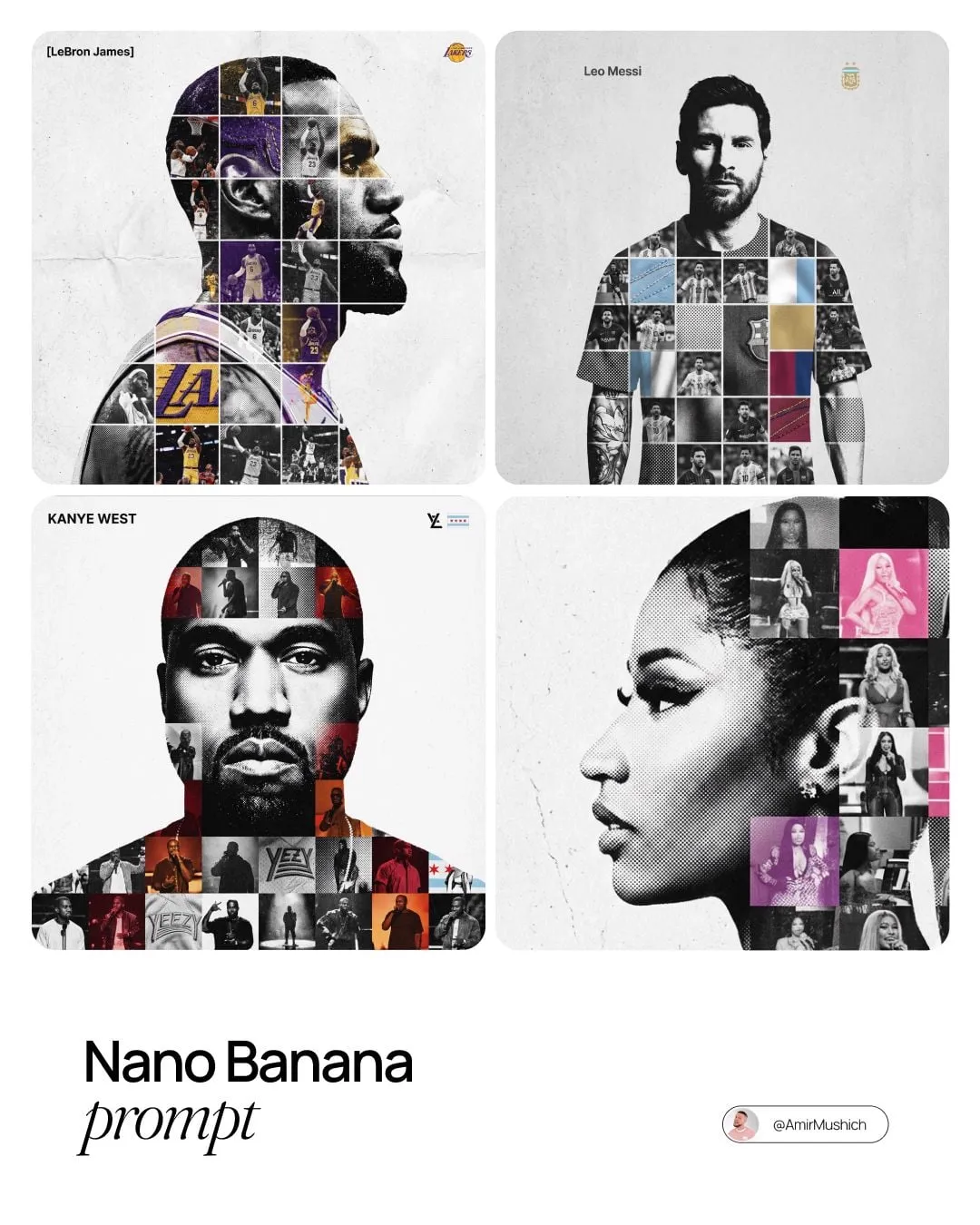

Why Brick-Style Pixel Visuals Are Having a Moment
Brick-style pixel art sits at a useful intersection. It borrows the blocky logic of construction toys, the color discipline of retro consoles, and the readability of good icon design. When you move that look into video, you get something that feels handmade and computational at the same time. A viewer can parse the scene instantly: a character is a cluster of squares, a tree is a stepped pyramid of green, a car is a rectangle with rounded corners. That clarity is why the style works in ads, music videos, explainers, game trailers, and social loops.
But the look is not just a filter. A single preset will not hold up across a moving shot. You need structure. You need a pipeline that separates what the scene is from how the scene is painted. That is where style transfer and image fusion come in. Style transfer gives you the palette, edge treatment, and texture. Image fusion keeps the anatomy, camera motion, and depth relationships intact. Together they let you push a brick-pixel aesthetic without turning every frame into mush.
The appeal is nostalgia plus control
The style triggers memory. Adults who grew up with plastic bricks and 8-bit consoles recognize the visual language immediately. Children who play block-building games recognize it too. That makes brick-pixel visuals unusually broad. A brand can use the look for a playful campaign without explaining the joke. A musician can use it to make a low-budget video feel deliberate. An educator can use it to simplify a complex process into chunky, memorable shapes.
The control matters just as much as the nostalgia. Because the style is reductive, every decision becomes visible. If the palette is muddy, the shot looks cheap. If the grid is inconsistent, the motion looks broken. If the fusion is sloppy, characters lose their faces. That is good news for creators who like systems. Once you define a grid size, a palette, and a set of fusion rules, you can reproduce the look across an entire campaign.
Where the style fails
Brick-pixel video fails when creators treat it as a one-click effect. The first frame may look great. The tenth frame may look acceptable. By the fiftieth frame, the character has lost an eye, the background has started to boil, and the camera move has turned into a shimmering mess. The problem is almost never the style reference. The problem is the missing structure pass and the missing fusion step.
What Style Transfer and Image Fusion Actually Do
Style transfer and image fusion are often mentioned together, but they solve different problems. Style transfer answers the question: how should this image look? Image fusion answers the question: what information must survive from all the available passes? If you confuse the two, you will spend hours tweaking color while the real issue is temporal consistency.
Structure versus style: the separation principle
The most reliable brick-pixel workflows separate structure from style. Structure includes silhouettes, depth, edges, pose, camera motion, and object boundaries. Style includes palette, texture, shading logic, dithering, and edge hardness. When you separate them, you can change the style without rebuilding the scene, and you can stabilize the structure without flattening the art direction.
In practice, this means running at least two passes. One pass extracts geometry: depth maps, edge maps, segmentation masks, or pose data. Another pass applies the brick-pixel look. A third pass may handle lighting or shadows. Fusion then combines those passes with controlled weights. The goal is not to average everything. The goal is to let each pass contribute where it is strongest.
Pixel grids, palettes, and brick logic
A brick-pixel aesthetic is not random mosaic. It follows rules. Bricks have a unit size. Colors come from a limited palette. Highlights and shadows are quantized into steps. Edges snap to the grid. When you design those rules, you make the style readable at small sizes and consistent across shots.
Start with a base grid. A 32-pixel wide character reads differently from a 128-pixel wide character. Smaller grids feel more abstract and retro. Larger grids allow more detail but can drift toward generic pixel art. For video, a moderate grid often works best because it preserves facial features while still looking deliberately blocky.
Fusion inputs: depth, edges, lighting, and masks
Fusion is where the magic becomes controllable. Useful inputs include depth maps, normal maps, edge maps, color passes, shadow passes, and object masks. You do not need all of them for every shot. A simple product loop may need only depth and color. A character-driven music video may need pose, face landmarks, and separate foreground and background masks.
The key is to think in layers. If the foreground character and the background city are fused together with the same settings, the character will disappear into the skyline. If the face and the jacket are fused with the same edge strength, the eyes will become black squares. Layer-specific fusion prevents that. It also gives you a place to fix problems without rerendering the entire sequence.
Building a Repeatable Brick-Pixel Workflow
A repeatable workflow is more valuable than a lucky result. The following steps can be adapted to many tools, from browser-based generators to node-based compositors.
Step 1: Prepare source footage and reference boards
Start with clean footage. Shoot or select clips with stable lighting, clear subjects, and moderate motion. Extremely fast pans and heavy motion blur will fight the pixel grid. If you must use chaotic footage, stabilize it first and consider shortening the shot.
Build a reference board with five to ten images. Include one image for palette, one for brick scale, one for edge treatment, one for shadows, and one for background complexity. Do not use a single reference for everything. Different references can control different aspects of the style, which makes the final look more intentional.
Step 2: Generate a structure pass
Extract depth, edges, and segmentation from the source. Depth helps the fusion know what is close and what is far. Edges preserve silhouettes. Segmentation separates people, products, and backgrounds. If your tool supports pose or face landmarks, add them for character shots.
Review the structure pass before you style anything. If the depth map is noisy, the final video will pulse. If the edges are too thick, the fusion will create halos. Fix the structure pass first. It is much easier to clean a depth map than to repair a boiled sequence later.
Step 3: Apply style transfer without destroying readability
Apply the brick-pixel style to the source or to a simplified color pass. Keep the palette limited. Use dithering only where it helps gradients. Avoid extreme posterization on faces and hands, because those areas communicate emotion and action.
A useful trick is to style at a slightly higher resolution than the target grid, then downsample with a controlled pixelation filter. This produces cleaner blocks than styling directly at a very low resolution. It also gives you a sharper master for later compositing.
Step 4: Fuse passes in a compositor
Bring the structure pass, style pass, and any lighting passes into a compositor. Use masks to control where each pass contributes. The background may tolerate stronger pixelation. The foreground face may need softer edges and more color variety. Products with logos may need a special mask to keep branding legible.
Blend modes are your friends, but they are not magic. Multiply can deepen shadows. Screen can add highlights. Overlay can increase contrast. Use them with masks and opacity, not as global fixes. If a blend mode is doing too much, the shot will look flat.
Step 5: Add motion, grain, and sound design
Pixel art can look stiff. Add subtle camera move, parallax, or animated brick elements to create life. A gentle drift, a flickering light, or a bouncing shadow can make the scene feel animated rather than frozen. Grain should be used carefully. Too much noise destroys the clean grid. A small amount of film grain or scanline texture can add warmth.
Sound design is often ignored, but it sells the style. Clicking bricks, soft chiptune notes, and crisp Foley effects make the visual language feel coherent. Even a simple whoosh or pop can make a transition land.
Tool Stack Options for Different Budgets and Skill Levels
You do not need a massive studio to create brick-pixel video. You need the right combination of generation, compositing, and editing tools.
Beginner-friendly web tools
Browser tools can handle simple style transfer and pixelation. They are best for still images, short loops, and concept tests. Use them to find a palette and grid size before committing to a longer workflow. Export at the highest resolution available, then finish in a video editor.
Pro workflow with node-based generation
Node-based tools such as ComfyUI give you control over depth, edges, masks, and style strength. You can build a reusable graph that takes a video, extracts structure, applies a brick-pixel style, and outputs a fused sequence. This is the most flexible route, but it requires patience. Save presets for different shot types: close-up, wide, product, and text overlay.
Video-first pipelines
Video generation and editing platforms such as Runway, Pika, and DaVinci Resolve can handle motion, color, and finishing. Use them for temporal smoothing, retiming, and final color. If your generated frames flicker, a temporal denoise or optical flow pass can help, but do not rely on it to fix broken structure.
Key Settings and Decision Criteria
Most brick-pixel problems come from a handful of settings. Understanding them will save you hours.
Resolution and pixel grid size
Decide the grid before you render. A 64-pixel wide character may be perfect for a mobile ad and too abstract for a hero film. A 256-pixel wide character may look detailed on a monitor and mushy on a phone. Test on the smallest screen your audience will use.
Palette locking and dithering
Lock the palette across shots. If one scene uses warm reds and another uses cool reds, the campaign will feel disconnected. Dithering can help gradients, but it can also create noise in motion. Use ordered dithering for a retro feel and diffusion dithering for softer transitions.
Temporal stability versus creative variation
Perfectly stable output can look dead. Slight variation in texture and shadow can add life. The trick is to constrain variation to areas that do not carry identity. Let the background shimmer a little. Keep the face, hands, and logo stable.
Render time and hardware
Higher resolution, more passes, and longer clips increase render time. If you are working on a laptop, render in chunks and preview at lower resolution. A good rule is to spend 70 percent of your time on structure and 30 percent on style. Structure problems are expensive to fix later.
Practical Projects You Can Build
Brick-pixel style transfer works across formats. Here are four project types with different priorities.
Brand campaign spot
Priorities: logo legibility, palette consistency, product shape. Keep the product mask sharp. Use the brick style for environment and transitions, but allow the product to remain recognizable. A 15-second spot can use three shots: reveal, use case, and logo lockup.
Music video treatment
Priorities: rhythm, color shifts, and character attitude. Sync cuts to the beat. Let the palette change between verse and chorus. Use stronger pixelation on wide shots and softer treatment on close-ups.
Educational explainer
Priorities: clarity and sequence. Use brick-pixel icons for concepts. Animate simple transitions between steps. Keep text large and high-contrast. If the viewer cannot read the labels, the style is working against the lesson.
Social vertical loop
Priorities: instant readability and seamless looping. Design the first and last frames to match. Use a simple action that completes in three to five seconds. Vertical framing means the subject should be centered and the background should not compete.
Common Mistakes and How to Fix Them
Over-styling
When every pixel is stylized, nothing stands out. Reduce style strength on faces, hands, and important props. Let some areas breathe with cleaner color and smoother edges. Contrast between detailed and simplified areas makes the whole frame look more intentional.
Flicker and identity drift
Flicker usually comes from unstable structure. Rebuild the depth or edge pass with more temporal smoothing. Identity drift comes from inconsistent masks. Track the subject more carefully or use a segmentation model with manual corrections on keyframes.
Seams, halos, and muddy colors
Seams appear when fusion weights change abruptly. Feather your masks. Halos appear when edge passes are too strong or misaligned. Reduce edge contribution or blur the edge map slightly before fusion. Muddy colors come from too many blend modes. Simplify the chain and adjust the base palette.
Ignoring audio and pacing
A beautiful brick-pixel shot can still fail if the pacing is wrong. Cut on action. Use sound effects to emphasize transitions. Silence can be powerful, but dead air in a short social clip is a scroll trigger.
Quality Control Checklist Before You Export
Run this checklist on every sequence.
- Check the grid size on the smallest target screen.
- Verify the palette against the brand or reference board.
- Watch the full clip at normal speed, then at half speed.
- Pause on every cut and check for identity drift.
- Inspect faces, hands, logos, and text for readability.
- Confirm that fusion masks do not create halos.
- Listen with headphones and on phone speakers.
- Export a short test at final settings before rendering the full project.
If any item fails, fix it before moving on. A small issue in a five-second clip becomes a major issue in a sixty-second film.
FAQ
Do I need a dedicated GPU to make brick-pixel video?
A dedicated GPU helps, especially if you are running diffusion models or depth estimation locally. However, you can start with browser tools and lightweight editors. If you plan to process long clips, prioritize GPU memory over raw speed, because memory limits determine the resolution and batch size you can handle.
Can I use photos instead of video?
Yes. Stills are a great way to test a style pipeline. Create a reference board, run the structure and style passes, and fuse them. Once the still looks right, apply the same settings to video. Photos also work well for title cards and end frames.
How do I keep characters recognizable?
Preserve the face mask and reduce pixelation around the eyes and mouth. Use a larger grid for close-ups than for wide shots. Add subtle color variation to skin tones so the face does not become a flat block. If a character still loses identity, simplify the background instead of sharpening the face.
What about legal and brand safety?
If your brick-pixel visuals resemble a known construction toy, avoid using protected logos, trade dress, or exact minifigure proportions. Build your own brick language with original shapes, colors, and naming. If you are using third-party assets, check the license for commercial use, modification, and distribution. When in doubt, create original art direction.
How long should a brick-style video be?
For social, five to fifteen seconds is usually enough. For brand films, thirty to sixty seconds can work if the pacing varies. For explainers, keep each concept under ten seconds. The style is dense, so viewers need frequent visual breaks. Use transitions, palette shifts, or scale changes to reset attention.
Can I combine brick-pixel with live action?
Yes. Use live action for establishing shots and brick-pixel for inserts, transitions, or animated sequences. Match the palette and lighting direction so the two worlds feel connected. You can also pixelate only part of the frame, such as a product or a character, and leave the rest live action. That contrast can be a strong creative device.
What is the biggest mistake beginners make?
The biggest mistake is skipping the structure pass. Beginners often apply a style filter and hope the motion holds together. It rarely does. Depth, edges, and masks are not optional extras. They are the scaffolding that makes the style stable enough for video.
Final Thoughts
Brick-pixel style transfer and image fusion are not about pressing one button. They are about building a small visual system: a grid, a palette, a structure pass, a style pass, and a fusion stage. Once that system exists, you can reuse it across shots, campaigns, and formats. You can swap references, change the palette, or shift from comedy to drama without rebuilding the entire pipeline.
Start small. Pick a five-second clip. Build a depth pass. Create a limited palette. Fuse the passes with masks. Watch the result on a phone. Fix the flicker before you add more detail. Then repeat the process with a second clip. The second one will be faster, and the third will feel natural. That is how a stylistic experiment becomes a reliable production workflow. The goal is not to imitate plastic bricks perfectly. The goal is to create a clean, readable, and repeatable visual language that makes your video unmistakably yours.
