
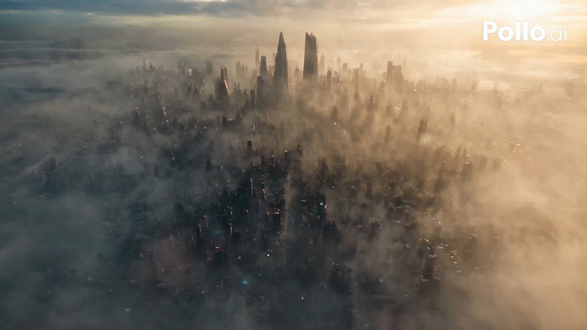


Cinematography is often described as the art of photographing a story, but that definition undersells what it does. The camera does not simply record events; it decides how an audience feels about them. A slow push-in on a face, a hard shaft of light cutting across a room, a shift from warm amber to cold cyan — these choices carry meaning long before a line of dialogue arrives. The most durable Hollywood films earned their reputations less through novelty of plot than through a visual grammar that is precise, repeatable and emotionally legible.
This guide breaks that grammar into its working parts: light, framing, camera angle, color, texture, dynamic range and editing rhythm. It then shows how to reproduce those qualities in modern production, including AI-assisted video workflows, so the look of your footage feels intentional rather than accidental.
Why Classic Hollywood Visual Grammar Still Matters
Studying classic films is not nostalgia. It is reverse engineering. When you analyze how a director and cinematographer solved a specific problem — how to make a small room feel claustrophobic, how to make a hero look isolated in a crowd — you extract a transferable recipe. That recipe survives changes in technology. The sensor may be digital, the camera may be a phone, the shot may be generated by a model, but the underlying rules of perception have not moved.
There is a practical reason this matters more now than ever. Generative video tools respond to description. If your vocabulary for camera work stops at "cinematic" and "dramatic lighting", your results will be generic. If you can specify a low-angle medium shot on a 35mm lens, hard key from camera left, deep shadow falloff and a cool background accent, you gain real control. Visual analysis is what turns a vague idea into a repeatable instruction.
A third reason is efficiency. A reference library built from studied frames — compositions, palettes, lighting diagrams — lets you communicate with a crew, an editor or a model in seconds instead of paragraphs. You stop debating taste and start testing hypotheses.
Reading Light Like a Cinematographer
Light is the primary tool of mood. Everything else — lens, angle, color — modifies what light has already established.
Hard Light, Soft Light and the Shape of a Face
Hard light produces defined edges and fast falloff. It emphasizes texture: skin pores, fabric weave, dust in the air. It reads as tension, heat, interrogation, western dust. Soft light wraps around a subject, compresses contrast and flatters. It reads as intimacy, calm, romance, safety.
The practical variable is the size of the source relative to the subject. A small source far away is hard. A large source close in is soft. Diffusion, bounce and distance are your dials. A three-point setup — key, fill, rim — is not a rule to obey but a starting point. The ratio between key and fill is what actually tells the audience where to look. An 8:1 ratio leaves one side of the face in near darkness and creates moral ambiguity. A 2:1 ratio keeps everything visible and suggests openness.
The Noir Toolkit and Practical Sources
Film noir taught filmmakers to use shadows as characters. Blind-slat patterns, doorway silhouettes, a single practical lamp that motivates the light, smoke that makes beams visible. These techniques are cheap to reproduce. A bare bulb, a flag to cut light and a hazer can create production value that rivals expensive fixtures.
The other noir lesson is color temperature discipline. Mixing a warm practical at 3200K with cool daylight at 5600K creates depth and separation inside a single frame. It gives interior scenes a lived-in quality and lets you separate foreground from background without adding fixtures. Motivated light — light that appears to come from a visible source in the scene — keeps stylization believable even when it is heavily manipulated.
Reading a Lighting Diagram
When you study a classic frame, sketch it. Mark where the key sits relative to the actor's nose line, where the shadow falls, whether the background is brighter or darker than the face, and whether any visible source justifies the direction. After twenty sketches you will start predicting lighting setups while watching films, which is exactly the skill you need when building your own.
Framing and Composition: Precision as a Language
Framing answers two questions at once: what do you want the audience to look at, and what do you want them to feel about it?
The Rule of Thirds and When to Break It
Placing a subject on a third line, with look room in the direction of their gaze, is the default for a reason — it feels balanced while remaining dynamic. Headroom matters too. Too much pushes a character down into the frame and diminishes them; too little feels cramped and amateurish. Look room is psychological space; removing it creates pressure.
Breaking the rule works when you have a reason. Centering a subject creates confrontational stillness. Dead-center compositions in a wide anamorphic frame give a character monumental weight. Pushing a subject into the extreme edge with no look room produces anxiety and trapped energy.
Symmetry, Leading Lines and Negative Space
Symmetrical one-point perspective compositions turn architecture into a statement about order or control. Corridors, stairwells and long tables become axes of power. Leading lines — a road, a railing, a row of windows — pull the eye toward a destination you chose in advance.
Negative space is the most underrated element. Empty frame area is not wasted; it is pressure. A small figure in a vast landscape communicates insignificance. A wide void beside a face communicates loneliness. Aspect ratio amplifies all of this: a 2.39:1 frame rewards horizontal staging and isolation, while 1.85:1 or 16:9 keeps faces and interiors more comfortable. Choose the frame before you choose the shots.
Camera Angles and Their Psychological Weight
Height, Distance and Focal Length
Angle is emotional shorthand. A low angle looking up at a subject grants dominance and threat. A high angle looking down shrinks a subject and signals vulnerability or judgment. Eye level is neutral and conversational. A Dutch tilt introduces unease — use it sparingly or it becomes noise.
Focal length changes the relationship between subject and space. Wide lenses (18–28mm) exaggerate depth and distort edges, pulling the viewer into the scene. Long lenses (85–200mm) compress background into the subject, isolating them in a soft field of color. A dolly zoom exploits this by moving the camera while zooming, holding the subject's size constant while the world lurches.
Distance is equally telling. Extreme close-ups are confessions. Wide shots are context and commentary. Choosing where to sit on that spectrum is a narrative decision, not a technical one. When you plan a scene, assign a shot size to each emotional beat rather than covering everything from every angle.
Color Grading as Emotional Architecture
Palette Design: Complementary, Analogous and Split
Color is the second emotional channel. Complementary palettes place warm skin tones against cool shadows, producing separation and lift. Analogous palettes stay within a narrow range of hues, creating cohesion and mood: greens and yellows for unease, blues and cyans for isolation, ambers and reds for warmth and memory.
Split-toning pushes highlights one direction and shadows another. Done well it feels like light behaving naturally. Done badly it looks like a filter applied in a hurry.
Contrast, Saturation and Skin Tone Protection
Grade on scopes, not on vibes. A waveform tells you where highlights clip. A vectorscope shows whether skin is drifting toward magenta or green. Protect skin tone above all — an audience will forgive an unusual overall palette but will notice instantly if faces look wrong.
Reduce global saturation before adding a color. Over-saturated midtones flatten an image. Pull saturation down, then push specific hues, and you get a richer result with less noise. Shape contrast rather than simply increasing it: lift shadows slightly, roll highlights gently, and keep a little detail at both ends.
Film Grain and Texture: Simulating Analog Character
Grain Structure vs Digital Noise
Film grain is random but structured — clumps that shift in an organic shimmer. Digital noise at high ISO is blotchy and colored, and it reads as a technical failure. The goal of grain emulation is not to add noise but to add texture: subtle luminance grain, a touch of halation around bright edges, and gentle gate weave if the shot calls for motion.
Grain should scale with the shot. A wide landscape holds grain lightly; a close-up reveals it. Applying one uniform grain layer across an entire edit is an instant giveaway. Varying intensity, size and softness by shot type keeps the illusion intact.
Dynamic Range, Highlight Rolloff and Shadow Detail
Dynamic range is what makes an image feel filmic. Film rolls off highlights gradually, retaining delicate detail in windows and skies. Many digital sensors clip abruptly. Shooting in a log profile and grading later preserves options. If you are working with generated footage, prefer outputs that retain highlight information, then add light halation rather than clipping to pure white.
Preserve some shadow detail as well. Crushed blacks can look dramatic, but total black in every frame removes depth. A slight lift with a subtle color cast in the shadows is a reliable cinematic signature, and it gives your grade somewhere to breathe.
Editing Rhythm and Visual Narrative Flow
Cutting on Motion, Match Cuts and J-Cuts
Editing is where shots become sentences. Cutting on motion hides the cut inside movement, so the eye never registers the break. Match cuts link two shots through shared shape or action, creating a visual rhyme that implies meaning without stating it. J-cuts bring the next scene's audio in before its image, making transitions feel inevitable rather than abrupt.
The 180-degree rule keeps spatial orientation stable. Eyeline matches preserve the logic of a conversation. Breaking either is a deliberate act — it disorients the audience, which is sometimes exactly what a scene needs.
Pacing Curves and Transitions
Scenes have a tempo curve. A long take followed by rapid cutting feels like an explosion. Rapid cutting that gradually slows feels like resolution. Think of the edit as a rhythm section: establish a beat, then deviate from it at the moment you want tension.
Silence is a cut too. Dropping music for two seconds before a reveal is often more powerful than any sound effect. Sound design and picture edit are one craft split across two departments.
Recreating Cinematic Looks in an AI Video Workflow
Prompting for Camera Language
AI video tools interpret descriptive language literally, which makes cinematography vocabulary a direct control surface. Instead of "cinematic shot of a detective", specify the grammar: "low-angle medium close-up, 40mm lens, hard key light from camera left, deep falloff, cool blue rim light, shallow depth of field, subtle grain, natural motion blur".
Build prompts in layers: subject and action, then shot size and angle, then lens and depth, then lighting, then color, then texture. Keeping layers in a consistent order makes results more predictable and much easier to iterate on.
A Repeatable Pipeline from Reference to Render
- Collect reference frames from films you admire and note shot size, angle, palette and light direction for each.
- Write a shot list that spells those attributes out in plain language.
- Test the most difficult shots first, whether you are shooting or generating.
- Assemble a rough cut on rhythm, not on completeness.
- Grade in one pass with scopes, then refine per scene.
- Add grain, halation and diffusion last, with varying intensity.
- Mix sound before the final color polish; audio changes how color reads.
Keeping the grade and texture stages separate matters. Fixing color and texture simultaneously produces muddy, unmotivated results. Also resist grading before the edit is locked — a look that works on an isolated shot often collapses once it sits next to twenty others.
Common Mistakes and How to Fix Them
- Over-grading toward a trend. Fix: build the look from the story's emotion and verify it on scopes.
- Inconsistent color temperature inside a scene. Fix: define one white point and use warm or cool accents deliberately.
- Constant camera movement. Fix: reserve movement for emotional beats. Static frames make motion matter.
- Uniform grain across an edit. Fix: vary grain size and intensity by shot type.
- Flat lighting with no ratio. Fix: choose your key-to-fill ratio before you roll.
- Ignoring skin tone. Fix: qualify and protect it, then check with a vectorscope.
- Generated shots with drifting faces or hands. Fix: shorter generations, consistent reference frames, extra takes.
- Cutting for coverage instead of rhythm. Fix: cut for tempo and information, not availability.
FAQ
Do I need an expensive cinema camera for a cinematic look?
No. Lighting, framing, lens choice and grade contribute far more than sensor size. A phone with controlled light and a thoughtful composition will outclass a cinema camera used carelessly.
How important is frame rate?
A 24fps base with a 180-degree shutter angle produces familiar film motion blur. Higher frame rates read as documentary or video. Pick per project and stay consistent within a scene.
Can AI-generated video look genuinely cinematic?
Yes, if you control lighting language, shot grammar, palette and texture consistently. The usual failure mode is generic prompting, not the technology.
How do I keep characters consistent across generated shots?
Describe them identically every time, reuse a reference image, keep individual shots short, and avoid complex motion within a single take.
What is the quickest way to improve at lighting?
Recreate one frame you admire each week. Match light direction, ratio and color temperature only. The skill compounds quickly because your eye calibrates.
Should I add grain to every project?
Only if it serves the story. Clean digital imagery suits some genres better. Treat grain as a texture decision rather than a default setting.
How do I build a reference library efficiently?
Pause on frames while watching, capture them, and note shot size, angle, palette and light direction. After a hundred entries you will recognize patterns in real time.
Bringing It Together
Cinematic technique is a vocabulary, and vocabulary is leverage. The more precisely you can describe light, framing, color and rhythm, the faster you can execute an idea — whether you are directing a crew, editing footage, or writing prompts for a generative model. Classic Hollywood films remain the best textbook available because their solutions were tested under pressure and refined for clarity. Study them, extract the grammar, then apply it with your own intent. The goal was never imitation for its own sake; it is fluency in the language of images.
