
Why Cinematography Still Decides Whether a Scene Lands
Audiences almost never walk out of a film saying "the lighting was good." They say the scene felt tense, lonely, or hopeful. That emotional translation is the job of cinematography, and it happens through choices the viewer never consciously notices: how much of the frame is dark, where the camera sits, how fast it moves, which colors survive the grade.
A script can state that a character realizes she is alone. A cinematographer has to prove it. That proof might be a wide frame with the subject pushed to the far edge and empty space swallowing the other two-thirds. It might be a slow push-in that never quite reaches her. It might be a practical lamp in the background that illuminates a room she is no longer standing in.
This guide is not a list of favorite scenes. It is a working method. We will look at what lighting, composition, camera movement, transitions, and grading actually do to a viewer, why certain approaches keep showing up in memorable scenes, and how to practice each layer on your own projects, whether you are shooting a short film, a brand documentary, or a vertical clip for social.
The reason vocabulary matters is that it makes feedback actionable. "Make it more cinematic" is not a note anyone can execute. "Drop the fill light, keep one motivated practical, crop to a wider aspect ratio, and put the subject off-center" is a set of decisions a crew can implement in twenty minutes. The sections below build that vocabulary one layer at a time.
The Three Jobs Every Shot Has to Do
Before technique, alignment. Every shot in a finished film is doing at least one of three jobs, and strong scenes usually have shots doing two or three at once.
Information. The shot tells the audience something they need: who is in the room, where the exit is, what time of day it is, that a knife is on the table. Information shots tend to be legible, wide enough to read, and lit so nothing important disappears into shadow.
Emotion. The shot makes the audience feel something, occasionally contradicting the information. A perfectly lit, symmetrical room can feel like a trap. A handheld frame that never settles can make a calm conversation feel like an argument waiting to happen.
Rhythm. The shot controls pace. A long, static hold forces the audience to sit inside a moment. A rapid series of short, moving shots creates momentum and can be used to sprint past a scene the story needs to cover but not dwell on.
When a scene feels flat, the diagnosis is usually that one job has been over-served. An entire sequence of information shots reads as exposition without tension. An entire sequence of emotion shots reads as music video: beautiful, unmotivated. Naming the job of each shot before you roll is the fastest quality upgrade available to a small crew, because it tells you what to protect when time runs short.
Lighting: The Fastest Way to Change a Scene's Meaning
If you can only control one variable, control light. Lighting changes texture, depth, and emotional register faster than any other department. Three ideas cover most of the practical ground.
Contrast ratio and the discipline of shadow
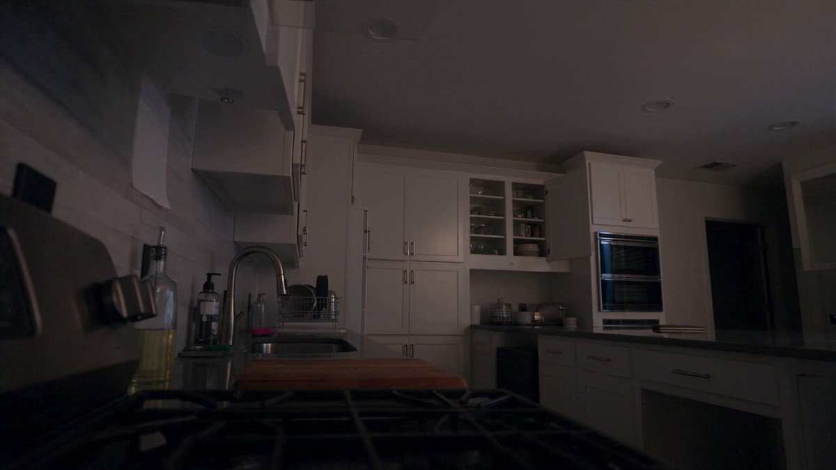
Contrast ratio describes how much brighter the key light is than the fill. A face lit with a 2:1 ratio looks approachable and open. Push to 8:1 or higher and shadow starts eating the cheekbone and eye socket. This high-contrast, shadow-dominant approach is the backbone of thrillers, neo-noir, and horror, because it withholds information from the audience. If you cannot see the character's whole face, you cannot fully read their intention, and that ambiguity is the point.
Practically, low-key lighting is easier than it looks. Start with one hard source placed off-axis, then remove light rather than adding it. Flag off any bounced light coming from pale walls. Let the background fall to near black, then decide whether one small practical in the deep background earns its place. The mistake beginners make is filling the shadow until nothing is left to reveal, which flattens the frame back into flat sitcom lighting.
Color temperature as emotional shorthand
The color of light carries associations that audiences absorb without being taught. Warm sources, roughly in the range of candlelight and tungsten, read as home, nostalgia, safety, or memory. Cool sources, in the daylight and blue-sky range, read as distance, technology, coldness, or clinical reality. When a single scene mixes both, the mix itself becomes the statement: a character standing between a warm doorway and a cool hallway is visually at a decision point.
The craft detail that separates amateur from professional results is not the choice of color, but its consistency and motivation. If the room has a window, the cool light should originate near the window. If there is a lamp, the warm light should plausibly come from it. Audiences forgive stylization but they notice unmotivated light, even if they cannot explain why the shot feels wrong.
Practical and motivated sources
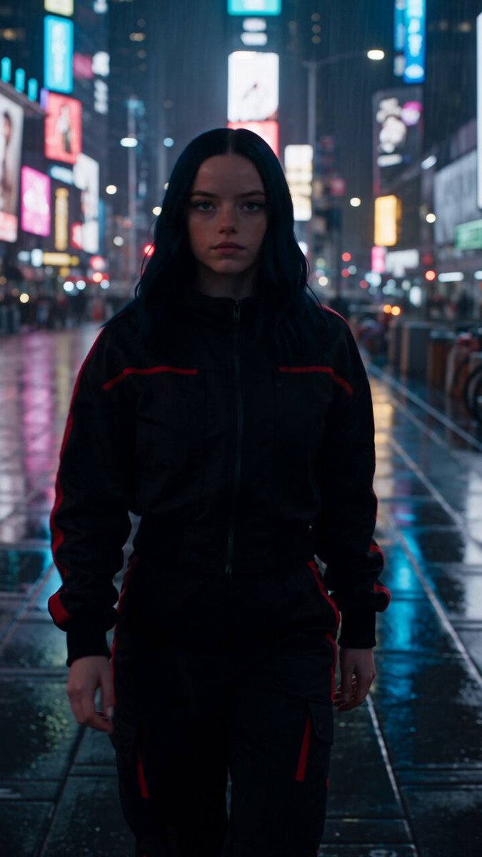
Practical lights are fixtures visible in the frame: lamps, neon signs, headlights, screens, fire. They do two useful things at once. They justify the lighting direction, and they give the frame depth by creating small bright points in an otherwise dark composition. A night exterior that would look like a black void becomes readable when a doorway, a vending machine, or a phone screen provides a source.
Motivated lighting is the broader principle: every source in your design should have a reason to exist inside the story world. That reason can be loose. A soft, directionless glow that reads as moonlight is acceptable. What is not acceptable is a face lit beautifully from the left in a scene where the only light source in frame is a campfire on the right. Small inconsistencies accumulate, and the audience quietly stops trusting the image.
Composition: Arranging the Frame for Maximum Impact
Composition is where intention becomes visible. It answers the question: what am I asking the audience to look at, and what am I placing around it?
Depth, scale, and subject dominance
A flat frame gives the audience one plane of information. A deep frame gives them layers: foreground, midground, background, each carrying something different. Placing the subject in the midground with an out-of-focus object in the foreground and a busy background behind them creates a sense of a character embedded in a world rather than pasted on top of it.
Scale is the other half. Shot size is an emotional decision, not just a logistical one. A wide shot with a small human figure tells the audience the environment matters more than the person right now. A tight shot tells them the interior world is the subject. Studios and streaming series often lock a scene into medium shots for coverage efficiency, which is exactly why sequences that commit to extremes stay memorable: the extremes are rare.
Frame within a frame
Doorways, windows, mirrors, and gaps between objects let you place a second border inside the image. The effect is psychological as much as geometric: the character appears contained, watched, or separated from the space around them. It also solves a practical problem, because natural borders let you shoot in a messy location without the background becoming a distraction.
The technique becomes powerful when the internal frame changes. A character framed inside a doorway that then gets closed, or inside a mirror that later cracks, gives you a visual event without any dialogue. If you plan one frame-within-a-frame per scene, you will usually find a place to use it.
Aspect ratio as a creative decision
Aspect ratio sets the shape of every composition you make, so choose it early. Widescreen ratios around 2.39:1 give you horizontal space: landscapes, group dynamics, characters isolated at opposite edges of the frame. A 1.85:1 or 1.78:1 frame is a flexible middle ground for dialogue and television work. Taller ratios, including the 9:16 vertical frame, invert the logic entirely, because the horizontal axis nearly disappears and the vertical axis becomes dominant.
Vertical video is not an inferior format, it is a different grammar. Groups stack instead of spreading. Doorways, staircases, and standing figures become strong compositional anchors. Empty space above a head can carry as much weight as empty space beside a subject in widescreen. If your project will be delivered vertically, storyboard vertically from the start rather than cropping later.
Camera Movement: Grammar, Not Decoration
Movement should have a reason, and the reason is almost always relational: moving toward something means increasing attention or intimacy; moving away means withdrawal, scale, or conclusion; moving alongside means joining a character on a journey; moving against them, in a circle, means instability or entrapment.
Handheld work reads as immediacy and unpredictability, which is why it works in action, documentary, and arguments. A gimbal glide reads as control and grace, which is why it works for establishing shots, dream sequences, and slow reveals. A crane or drone move reads as omniscience, because it goes where a human body cannot. A locked-off shot reads as observation, and its stillness becomes a statement when the rest of the film moves.
Two craft rules keep movement from becoming noise. First, motivated starts and stops: let the move begin because something in the scene changed, a character entered, a door opened, a realization landed. Second, repeatable speed: if a movement will be used in several shots, keep the rate consistent so the audience reads it as a pattern rather than an accident. Long unbroken takes are impressive, but what makes them effective is the choreography of what enters and leaves the frame, not the duration itself. A long take that only holds a static conversation is just a slow shot.
Transitions, Match Cuts, and Visual Rhyme
The moment between shots is where meaning gets manufactured. A cut is not a neutral act; it is an assertion that two images belong together.
The match cut connects two shots through a shared shape, motion, or sound. A hand reaching for a glass cuts to a hand reaching for a knife. The audience completes the comparison instantly. Visual rhyme is the gentler version: a recurring color, framing pattern, or object that returns at a different point in the story, so the audience feels the echo even without a cut forcing it.
Hard cuts keep energy; dissolves suggest time passing or memory; fades create chapter breaks. The mistake is using a soft transition to hide a weak shot. If two shots do not connect, the fix is usually in the framing or the movement, not the transition effect.
When planning a sequence, note the transitions before you shoot. If you know a scene should end on a match cut to the next location, you can shoot the matching framing while you are already there, rather than organizing a pickup day later. Editing decisions are cheapest when they are made during preproduction.
Building a Shot Plan You Can Actually Shoot
A shot plan is not a wish list. It is a schedule with a visual argument attached. A workable approach:
- Break the script by beat, not by page. Mark where the emotional temperature changes. Those marks are the boundaries of your scenes, regardless of slug lines.
- Assign each beat one visual idea. One idea, not four: low-key and static, or wide and drifting, or tight and handheld. Consistency within a beat makes contrast between beats readable.
- Design the first and last image of each beat. They carry the transition in and out. Everything in the middle can be covered more flexibly.
- List only the shots you must have. The master, the emotional close-up, the insert that carries information. Everything else is coverage you shoot if the day allows.
- Note the light direction for each location. This prevents you from shooting a scene in a way that forces a lighting setup you cannot afford in the schedule.
Then estimate honestly. Count setups, not shots. Every time the camera moves to a new position and the lighting changes, you have spent time. A ten-setup day is realistic for a modest crew; a thirty-setup day is a fantasy that ends with the sun going down on an unfinished scene.
Previsualization, Storyboards, and AI-Assisted Planning
Previsualization is the cheapest place to make mistakes. Storyboards, overhead diagrams, and rough animated previz let you test whether a sequence of shots reads before anyone lifts a camera. Even stick figures on index cards reveal problems: two adjacent shots with the same framing, a movement that contradicts the previous one, a cut that leaves the audience on the wrong side of the axis.
Digital tools have made this stage dramatically faster. Shot-listing apps handle the logistics. 3D scene builders let you place simple figures and camera positions to check whether a move is physically possible in a location. AI-assisted storyboard and concept tools can generate a rough frame from a text description, which is useful for communicating a look to a client or a crew before the shoot, as long as you treat the output as a reference and not a deliverable. The value is alignment, not the image itself.
One caution: previsualization can become procrastination. If you spend three days polishing a previz animation for a two-minute scene with a three-person crew, you have optimized the wrong stage. Use these tools to answer specific questions, such as "does this reveal work better from the left or the right," then move on.
Common Mistakes That Weaken Otherwise Strong Scenes
Over-lighting. Adding a fill light to make exposure comfortable removes the shadow that created mood. Learn to expose for the highlights and let the dark side fall where it wants.
Moving the camera without a reason. A slow push-in on every line of dialogue stops meaning anything by the third scene. Earn the movement by using it sparingly.
Ignoring the axis. Crossing the line between shots disorients the audience and makes a conversation look like two separate rooms. Draw the axis on your floor plan and respect it until you intentionally break it.
Decorating instead of designing. Colorful lighting that does not track a character's emotional state becomes wallpaper. Ask what the color is doing in the story, not just whether it looks striking.
Shooting for the edit you have not planned. If you do not know where the cut points will be, you will not shoot overlapping action, which makes editing painful and forces you to use takes that do not match.
Trusting the grade to fix the shoot. Color grading can shape and unify an image, but it cannot invent contrast that was never captured. Expose and light on set; grade for polish and consistency.
Practice Drills and a Closing Checklist
Craft improves faster with constraints than with gear. A few drills that pay off quickly:
- One light, ten moods. Set a single source and make ten portraits that read as ten different emotions by changing only distance, angle, and the amount of bounce you allow.
- Same scene, three ways. Shoot a one-minute dialogue scene in low-key static, in warm handheld, and in wide symmetrical framing. Compare which version tells the story most clearly without sound.
- Silent storytelling. Cut a thirty-second sequence with no dialogue that communicates a single clear change, such as a decision or a betrayal. If a viewer cannot describe the change afterward, the visual language failed.
- Vertical rematch. Take a horizontal scene and re-storyboard it for a 9:16 frame without cropping. Notice how much of your blocking has to change.
A short closing checklist before every shoot day: Is the light motivated? Does every shot have a job? Is the axis consistent? Does the movement have a reason to start and stop? Do I know what my first and last frame of each beat looks like? If you can answer those five questions, you have done more preparation than most productions, and the footage will show it.
FAQ
What separates cinematic lighting from a basic three-point setup?
Intent and control. A three-point setup is a reliable exposure strategy. Cinematic lighting adds a decision about contrast ratio, color, and motivation, and it usually removes light rather than adding it.
Do I need an expensive camera to get these results?
No. Lighting, composition, and blocking determine most of the perceived quality of a shot. A modest camera with a controlled contrast ratio and a thoughtful frame will outperform an expensive camera in flat, unmotivated light.
How do I know when to move the camera?
Move when the relationship between the camera and the subject changes in the story: closing distance to increase intimacy, pulling away to conclude, or tracking with a character on a journey. If nothing changed, hold the shot.
Is vertical video a limitation for cinematography?
It is a different grammar. Vertical framing favors stacking, height, and single-subject focus. If you plan for it during storyboarding rather than cropping afterward, it can be as expressive as widescreen.
How much should I rely on color grading?
Grade to unify and polish, not to rescue. Decide the palette before the shoot, capture the contrast you want on set, and use grading to make shots from different days and times match each other.
What is the fastest way to improve as a cinematographer?
Shoot short, complete scenes with tight constraints and watch them with sound off. If the story does not read visually, the problem is in the shot design, and that is exactly the skill worth practicing.
