

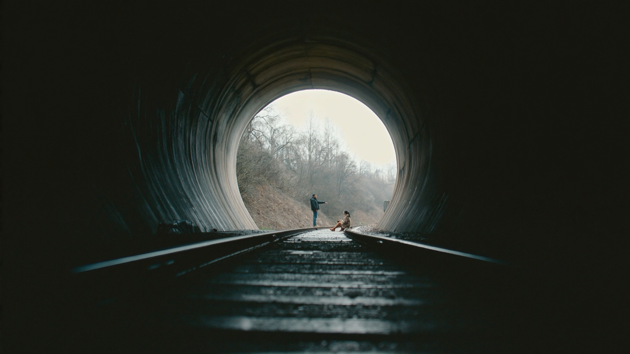
Why short-form cinematography follows different rules
Short-form video is not a trimmed-down version of filmmaking. It is a different medium with its own grammar, and the cinematography has to serve that grammar. A viewer scrolls with a thumb, watches at arm's length on a five-inch screen, often with sound off, and decides within roughly one second whether the clip deserves another two seconds of attention. Every visual decision should be tested against that reality.
The biggest shift is scale. A wide establishing shot that would feel majestic on a cinema screen reads as vague and empty on a phone. Faces, hands, textures, and objects need to fill more of the frame. You are not showing a place; you are showing a feeling about a place, and feelings live in close-ups.
A second shift is density. Long-form can afford slow scenes and patient camera moves because the audience has committed. Short-form has no such commitment. Something visually meaningful has to change every few seconds: a new angle, a light shift, a movement, a reveal, a color change. This does not mean chaotic cutting. It means the image itself carries rhythm.
A third shift is that sound-off viewing is the default. Composition and lighting have to communicate the story without dialogue or music. That pushes you toward expressive lighting, clear silhouettes, strong color contrast, and framing that makes the subject unmistakable even in a mute feed.
Good news: these constraints are learnable. A small, disciplined kit plus a repeatable process outperform expensive gear used randomly. The sections below cover framing, lighting, movement, lens language, shot planning, AI-assisted previsualization, grading, and a full workflow you can reuse from clip to clip.
Framing and composition for vertical screens
Vertical framing is tall and narrow, which means horizontal information gets cropped or ignored. Design for the tall rectangle instead of fighting it.
Build a vertical safe zone
Imagine the 9:16 frame divided into thirds horizontally. The center column is your prime real estate for the subject. The outer columns are best used for context, texture, or movement that reinforces the center. Keep the primary subject inside the middle band and let backgrounds live at the edges.
Most platforms also overlay interface elements at the bottom and sometimes the top. Reserve roughly the lowest 15 to 20 percent of the frame for captions, handles, and UI. If something important sits there, it will be covered at the worst moment.
Stack subjects vertically
Because the frame is tall, vertical stacking is unusually powerful. A foreground object at the bottom, the subject in the middle, and a graphic or sky element at the top creates depth that a horizontal frame cannot match. Layer three planes whenever possible: something close and slightly out of focus, the subject in focus, and a background with shape or color separation.
Use headroom, eyeline, and negative space deliberately
Too much headroom shrinks the subject; too little feels claustrophobic. Aim for a small gap above the head, roughly the height of a fist on screen. If the subject is looking or moving, give space in that direction. In a tall frame, negative space above a subject can carry a title, while negative space beside a subject keeps a caption readable.
Compose for the caption layer
Captions are part of the composition now. Plan shots with a quiet, low-detail region where text will land: a blurred wall, a plain sky, a smooth surface. Busy patterns behind captions destroy readability faster than any lighting mistake.
Practical test: watch a still frame on your phone at actual size with captions enabled. If the subject is unclear or the text fights the background, recompose before you shoot, not after.
Lighting for readability on a phone screen
Small screens compress contrast and crush shadow detail. Lighting that looks moody on a monitor can look muddy on a phone, and lighting that looks flat on set can look clean and readable on a feed. Expose and light for the phone first.
Three-point lighting, translated for a small setup
Classic three-point lighting still works, but you can shrink it:
- Key light: one soft source at roughly 30 to 45 degrees off the subject's eyeline, slightly above eye level. A window with a sheer curtain or a small LED panel with a diffuser is enough.
- Fill: a white foam board, a wall, or a second dimmer source. Fill controls how dramatic the face looks. Less fill equals more drama but also more risk of crushed shadows.
- Rim or hair light: a small, brighter source behind the subject. On a dark background this is the single highest-value light you can add, because it separates the subject from the frame edge.
Exploit practical and window light
Nothing beats a large window with diffused daylight for skin tones. Position the subject so the window acts as the key, then add a bounce card on the opposite side. Practical lamps in the background add color depth without extra gear. Turn off overhead ceiling lights whenever possible; they create raccoon shadows and flat, unflattering color.
Expose for the subject, not the sky
Phones and mirrorless cameras love to expose for the brightest thing in frame. That means a bright window or sky will drag your subject into darkness. Tap or meter on the face, then lock exposure. If the background blows out, that is often an acceptable trade in short-form, because viewers care about the person, not the wall.
Decision rule: if the subject is unreadable in a thumbnail, the shot is wrong, no matter how beautiful the background looks.
Camera movement: static, handheld, gimbal, and motivated motion
Movement in short-form is punctuation. Used everywhere, it becomes noise and nausea; used precisely, it adds energy and meaning.
Motivate every move
A camera move should answer a question. A slow push can reveal a reaction. A slight pull-back can show context. A whip pan can bridge two locations. If a move has no narrative job, a static shot is almost always stronger and easier to edit.
Static is underrated
Locked-off shots are stable, easy to stabilize in post, and give the edit room to breathe. If you shoot everything handheld and moving, every cut becomes a jolt. Mix locked frames with movement so the movement lands.
Handheld as a style
Handheld is not automatically amateur. Slight, intentional drift can feel immediate and personal, which suits talking-head and behind-the-scenes content. The trick is to keep the horizon level and avoid micro-jitters. Brace your elbows, breathe out, and shoot in short bursts rather than long takes.
Gimbal and glide discipline
A gimbal gives smooth tracking shots, but it also makes lazy framing look expensive. Plan the path, the start frame, and the end frame before you roll. Keep the speed consistent and low. Most beginner gimbal footage fails because it moves too fast and stops abruptly.
Movement continuity for editing
If you want invisible cuts, match movement direction and speed across shots. Panning left into one shot and continuing left out of the next cut feels seamless. Reversing direction mid-sequence reads as a mistake unless the reversal is intentional.
Lens language: focal length, compression, and depth of field
Lens choice changes meaning more than most creators realize, because it changes the relationship between subject and background.
Wide lenses in tight spaces
A wide lens lets you stand close to a subject and still include context. It exaggerates perspective: faces near the edges get stretched, and hands reaching toward the camera look dramatic. Wide lenses are excellent for interior action, crowded spaces, and immersive point-of-view shots. Keep faces away from the extreme edges unless distortion is the point.
Long lenses for compression and intimacy
A longer focal length compresses the background, making it feel closer and softer. This is the classic look for emotional close-ups and for isolating a subject in a busy environment. The trade-off is space: you need distance between camera and subject, which is not always available.
Aperture and focus discipline
Shallow depth of field looks cinematic but is risky in short-form. On a phone-sized screen, a missed focus point reads as a blurry mistake, not as art. If you shoot wide open, use face tracking and check focus after every take. A slightly smaller aperture with clean focus usually beats a dreamy background with a soft subject.
Simulating optics in generated footage
When you work with AI-generated clips, lens language becomes a prompt decision. Referencing focal length, depth of field, and angle of view gives more predictable results than generic quality words. Compare a request for a wide-angle low shot against a long-lens close-up with compressed background; the two produce visibly different moods from the same subject. Treat these terms as directorial instructions, not decoration.
Shot lists and coverage that survive the edit
A shot list is not bureaucracy. It is the only thing standing between you and a folder of unusable footage.
Start with the three-shot foundation
For almost any short-form scene, three shots cover you: a medium shot to establish the subject, a close-up for emotion or detail, and an insert or cutaway for texture. That trio can carry a fifteen-second clip or a two-minute one if you repeat it in new locations.
Plan transitions before you shoot
Think about how shots connect. Match cuts on shape, motion, or color make edits feel intentional. If you know you want a match cut, shoot both sides with the same framing, speed, and direction so the cut lands cleanly.
Shoot the hook and the loop
The first two seconds deserve dedicated coverage. Shoot three or four variations of the opening: a direct address, a striking visual, a question. Then plan the final shot so it can loop back to the opening frame. Loops increase replays, and replays are the strongest signal short-form platforms recognize.
Build in breathing room
Shoot each setup a few seconds longer than you think you need. Editors need handles on both ends of every clip. Two extra seconds is cheap; reshooting a location is not.
AI-assisted cinematography: planning, consistency, and b-roll
AI tools have moved from novelty to practical production support. Used well, they compress preproduction and fill gaps; used badly, they create inconsistent, uncanny footage that undermines the whole clip.
Previsualization and shot planning
Generate rough frames before you shoot. A storyboard built from quick generated stills forces you to answer hard questions: how tight is the framing, where is the light coming from, what is in the background. Even imprecise boards improve on-set decisions dramatically.
Style and character consistency
Consistency is the hardest problem in AI video. A character who changes face between shots breaks the illusion instantly. Practical approaches:
- Write a locked description of your subject and reuse it word for word across generations.
- Keep lighting and color direction identical between shots, since changing the light changes the perceived identity.
- Prefer fewer, longer shots over many short ones when consistency is fragile.
- Insert live-action coverage of hands, objects, and environment to bridge generated shots together.
Generating b-roll and inserts
Inserts are where AI shines: clouds, textures, city plates, abstract transitions, product swirls. These shots carry no identity burden, so inconsistency is not visible. Use them to cover cuts, add scale, and keep the visual rhythm changing.
Where AI falls short
Complex human motion, precise hand interactions, and continuous camera movement across a scene remain unreliable. Design around those limits rather than fighting them. If a shot requires a real performance, shoot it with a real camera and use AI for everything around it.
A hybrid rule that works
Use generated footage for atmosphere, transitions, and impossible shots. Use real footage for faces, dialogue, and hands. The combination looks deliberate, and it hides the seams.
Color, texture, and finishing for tiny screens
Grading for short-form is not grading for a cinema projector. It is grading for a bright, small, reflective rectangle held near a face, often in daylight.
Contrast and saturation discipline
A mild contrast boost usually helps because it separates subject from background. Saturation is a different story: oversaturated skin and neon greens look cheap quickly. Push saturation in a specific color range instead of globally, keeping skin tones natural while letting a background color pop.
Protect skin tones
Use a consistent reference, ideally a color chart or a known neutral object, at the start of every shoot. Skin that skews orange on one clip and green on the next makes a series feel unprofessional even when the framing is excellent.
Grain, sharpening, and export
Heavy sharpening creates halos that are painfully visible on high-density phone displays. Keep sharpening modest. If you add grain for texture, keep it subtle and consistent across the clip so it does not flicker between shots. Export at a high bitrate; compression artifacts in dark areas and gradients are far more damaging on small screens than most creators expect.
A practical workflow from concept to export
Here is a repeatable sequence that keeps quality high without slowing you down.
- Define the single idea. Write one sentence describing what the viewer should feel by the end.
- Outline three to five beats. Each beat gets a visual idea, not just a line of script.
- Board the key frames. Rough sketches or generated stills are enough to lock framing and lighting direction.
- Scout light first. Before you decide where the camera goes, decide where the light comes from.
- Lock exposure and white balance. Set them manually, then leave them alone within a scene.
- Shoot the foundation trio. Medium, close, insert, repeated for each beat.
- Grab variations of the hook. Two or three opening options give the edit real choices.
- Record room tone and any natural sound. It makes transitions feel grounded.
- Sync, select, and build a rough cut. Cut for rhythm first, polish second.
- Grade for the phone. Check on the actual device, not a large monitor.
- Watch with sound off. If the story is unclear, add visual information rather than captions alone.
- Export at high bitrate and verify on two devices.
Common mistakes and how to fix them
- Framing too wide. Fix by moving closer and letting the subject fill more of the tall frame.
- Overhead lighting only. Fix with a single soft key at eye level and a rim behind the subject.
- Constant camera motion. Fix by alternating locked shots with movement.
- Busy backgrounds behind captions. Fix with a shallow background or a repositioned camera.
- Inconsistent look between clips. Fix with locked exposure, white balance, and a repeatable grade.
- Neglecting the first frame. Fix by designing the hook shot as carefully as the ending.
Decision criteria when time is short
If you only have ten minutes to improve a clip, prioritize in this order: subject clarity, lighting on the face, background separation, then motion. If you have an hour, add a rim light, reshoot the hook, and regrade the skin tones. If you have a day, board the sequence and shoot the full foundation trio in two locations for variety.
FAQ
What is the single biggest cinematography upgrade for short-form video?
Light on the face. A simple soft key plus a rim light changes perceived production quality more than a new camera. Framing matters, but bad lighting makes good framing look accidental.
Should I always shoot vertical?
Shoot vertical if the primary platform is vertical-first. If you need one master file for several aspect ratios, shoot slightly wider and keep critical action in a central safe area so you can crop horizontally and vertically without losing the subject.
How do I make static shots feel less boring?
Add movement inside the frame instead of moving the camera: a subject walking into frame, a hand entering to interact with an object, changing light, drifting smoke, or a foreground element that shifts. Internal motion keeps a locked shot alive.
How much b-roll do I need for a thirty-second clip?
Plan for roughly eight to twelve usable shots, which gives the editor room to cut for rhythm. Half can be simple inserts: hands, textures, environment, and detail shots.
When should I use AI-generated footage instead of shooting?
Use it for atmosphere, transitions, abstract visuals, and anything physically impossible or too expensive to shoot. Avoid it for close human performance, dialogue, or any shot where a consistent character identity must be maintained across cuts.
What causes clips to look amateurish even with good gear?
Usually one of four things: wide framing that wastes the tall frame, flat overhead lighting, inconsistent color between shots, or excessive camera movement with no motivation. Fixing those four habits improves output more than upgrading equipment.
How do I judge my own footage objectively?
Watch it on a phone, at arm's length, muted, after a few hours away from the edit. If you cannot tell what is happening in the first second, or if your eye does not know where to look, the cinematography needs work, not the script.
The through-line across all of this is intention. Every frame, light, and move should have a reason that serves the viewer's attention. Master that habit and the gear becomes almost irrelevant.
