
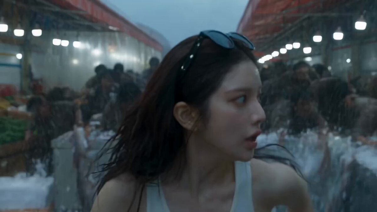
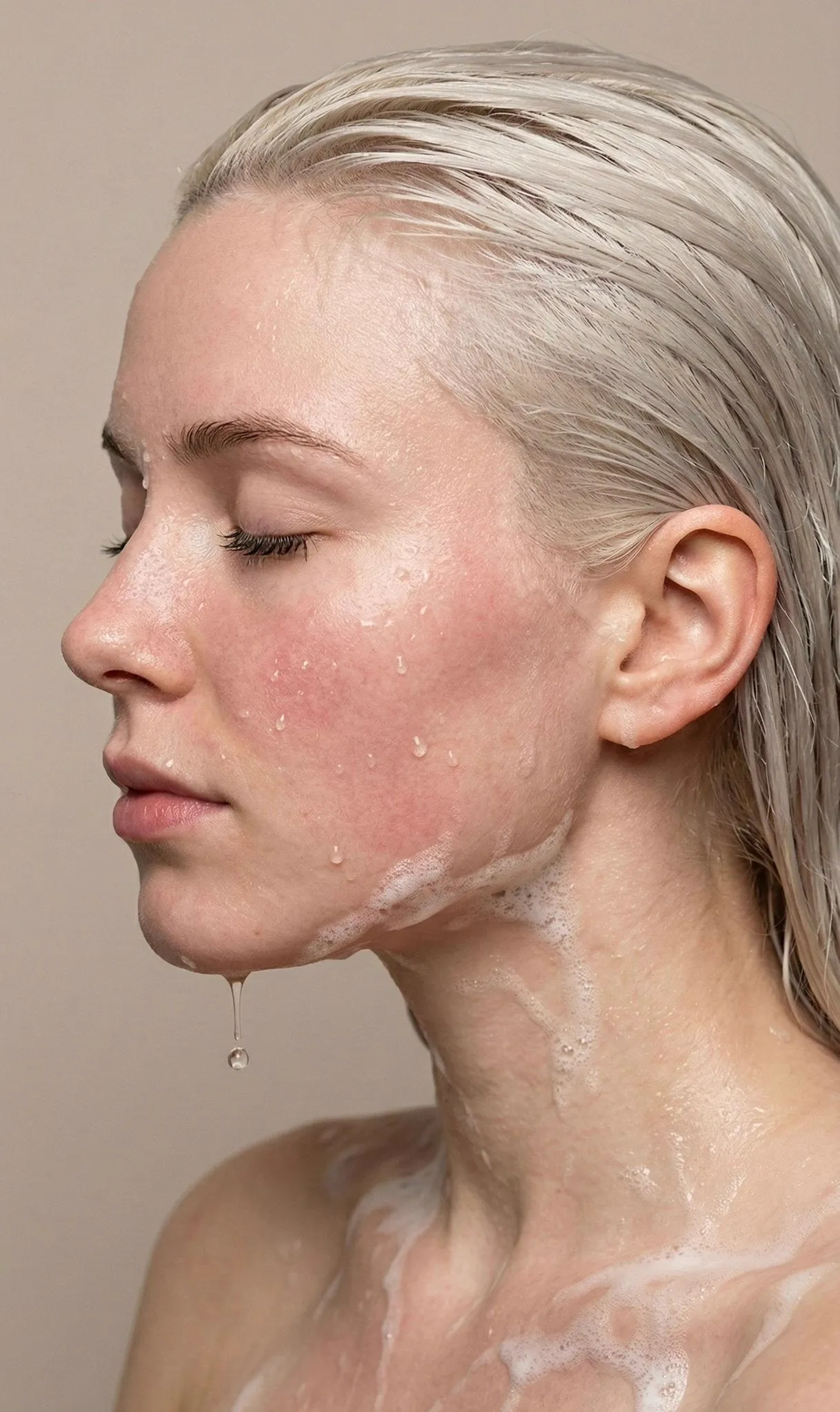
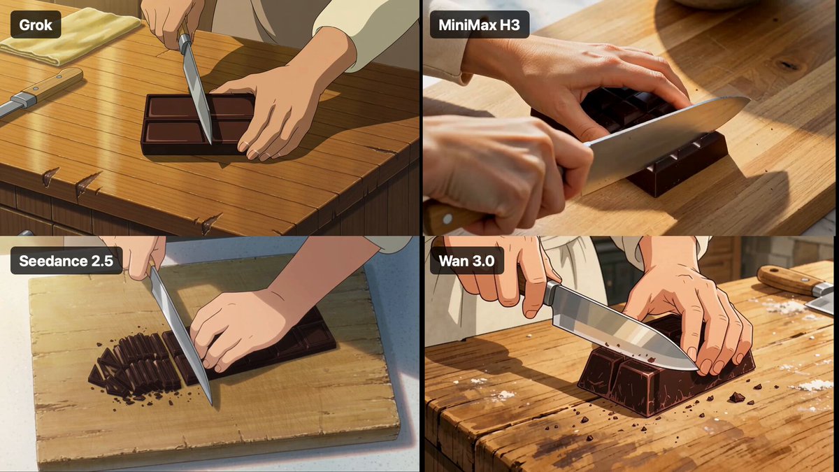
Why stock filters stopped feeling fresh
Open almost any editing app and you will find the same lineup: a faded matte look, two or three teal-and-orange blockbusters, a warm vintage preset, a black-and-white option with crushed shadows. They are convenient, they are fast, and audiences have now seen them millions of times. That familiarity is exactly the problem. When a viewer can name the preset you used, your footage stops feeling like your work and starts feeling like a template.
The deeper issue is where those filters sit in the pipeline. A traditional filter is a color transformation applied after the image already exists: it pushes shadows, shifts hues, adds grain, and calls it a day. It cannot change the light that fell on your subject, the palette of the location, the texture of the lens, or the way a scene is framed. It can only repaint what is already there.
A custom AI look works differently. Instead of repainting an existing frame, it influences the frame before it exists. You describe the light, the lens, the palette, the material texture, and the mood, and the model generates imagery that already carries those properties. Grading then becomes a finishing step rather than a rescue mission. That is the practical difference between choosing a filter and designing a look.
What an AI look is actually made of
It helps to think of a custom look as three stacked layers. Most disappointing results come from getting one layer right and neglecting the other two.
Layer one: generation
This is where palette, lighting, environment, material, and stylization are decided. Your prompt, your reference images, and the model you choose all act here. If the generation layer is generic, no amount of grading will save it.
Layer two: motion
A still image that looks beautiful can fall apart the moment it moves. Temporal consistency, motion strength, and camera behavior live in this layer. Generated footage tends to wobble, morph, or flicker when the motion instruction is vague or the clip is too long.
Layer three: finish
Grain, halation, bloom, slight chromatic aberration, contrast curves, letterboxing, and sound design sit here. This layer is where a look becomes recognizable and repeatable. It is also the cheapest layer to control, which makes it the best place to standardize.
Where consistency breaks
The usual failure points are predictable. Words like "cinematic" or "moody" mean something different to the model on every generation. Skin tones drift warm or green between shots. A soft window light in shot one becomes a hard beam in shot three because the environment description changed slightly. Treating the prompt as a throwaway sentence instead of a document is the single most common reason a look never locks in.
Step one: write a look brief before you prompt
Before generating anything, write a one-page brief. Not for a client, for yourself. It forces vague taste into decisions you can repeat.
A useful brief covers six fields:
- Palette: three dominant colors plus one accent, described concretely. "Cold slate blue, bone white, wet asphalt grey, with a single sodium-orange accent."
- Light: source, direction, quality, and time of day. "Low overcast daylight from camera left, soft, no visible sun disc."
- Lens: perceived focal length, depth of field, and distortion. "40mm feel, shallow but not extreme, mild barrel distortion at the edges."
- Texture: grain amount, halation around highlights, contrast curve. "Fine 35mm grain, gentle highlight bloom, lifted but not milky blacks."
- Mood anchors: two films, photographers, or painters whose work describes the feeling. Use them as descriptive shorthand, not as a copying instruction.
- Exclusions: what must never appear. "No neon, no lens flares, no HDR saturation, no drone-style wide shots."
A compact example for a cold coastal documentary look: slate blue and bone white palette, overcast side light, 40mm feel, fine grain, soft highlight roll-off, and a rule that all exteriors happen near dusk. That brief is short enough to paste into a prompt and specific enough to reject bad generations quickly.
Step two: turn references into prompt language
Use a consistent prompt skeleton
Free-form prompting produces free-form results. A fixed skeleton keeps the important variables in the same order, which makes debugging far easier. A reliable order is: subject, action, environment, light, lens, texture, palette, format.
A filled example: "A lone fisherman mending a net on a wet concrete pier, slow deliberate movements, overcast dusk, soft side light from camera left, 40mm lens with shallow depth of field, fine film grain and gentle highlight bloom, slate blue and bone white with a single orange lamp, 16:9."
Compare that to "cinematic fisherman at the sea" and the difference in repeatability becomes obvious.
Let reference images carry style
Words are a blunt instrument for visual style. Most modern video and image models accept reference images, style references, or image-to-video input, and a single well-chosen still communicates palette, lighting, and texture faster than three paragraphs of adjectives. The practical workflow is to generate or collect five to eight stills that share a coherent look, then use the strongest one as the anchor for every subsequent shot.
Treat negative prompts as guardrails
Negative prompts are the cheapest consistency tool available. Keep a standing list for your project and add to it whenever a generation goes wrong. Common entries include: oversaturated, HDR look, neon, lens flare, plastic skin, text artifacts, extra fingers, warped perspective, cartoon, low-detail background.
Step three: lock the look with seeds and test grids
Once the brief is written and the prompt skeleton is set, run a test grid. Use identical prompts with different seeds and compare. The goal is not to find the single best image; it is to find the seed and style-reference combination that behaves predictably across different subjects.
Then run a subject-variation test. Keep the seed and style reference fixed, and change only the subject: a person, a vehicle, a room, a landscape. If palette and light hold, the look is locked. If the palette shifts the moment the subject changes, your descriptor is too weak or too dependent on a single scene.
Write the winning combination into a short style lock document: model or tool, seed value, style reference image, the full prompt skeleton, the negative prompt list, and three notes about what to avoid. This document is what turns a lucky generation into a production asset, and it means a collaborator can reproduce your look without guessing.
Step four: move from keyframes to motion
Decide between shot-by-shot and continuous generation
Generated video is most reliable in short beats. A three to six second clip that contains one clear action will almost always look better than a twenty second clip that tries to do three things. Build sequences shot by shot, then assemble them in an editor. A single long generation is tempting, but the failure modes multiply with length: identity drift, background morphing, and lighting that slowly changes.
For image-to-video workflows, generate the keyframe first, approve it, then animate it. Animating an unapproved frame is how you end up regenerating everything.
Build a camera vocabulary
Vague camera language creates unstable motion. Keep a short list of instructions you actually use and reuse them consistently: static locked-off shot, slow push in, slow pull out, handheld drift with slight sway, lateral tracking left, gentle crane rise. Avoid stacking movement types. "Slow push in while orbiting and tilting up" is a recipe for a warped result.
Handle motion artifacts deliberately
Expect some combination of warping at frame edges, hands and fingers merging, fabric texture crawling, and background elements that subtly redesign themselves. The mitigation strategy is practical rather than technical: keep clips short, cut on movement so transitions hide imperfections, generate coverage of environments without people when a shot will not hold, and place the most complex motion in the middle of a clip where you have more frames to work with.
Step five: finish in post so the look actually reads
Generated footage rarely arrives finished. The finish layer is where a collection of clips becomes a recognizable style.
Start with a base grade that normalizes every shot: match black levels, white balance, and contrast across the sequence. Then add character. Film grain is the fastest way to unify footage from different generations, because a consistent grain layer sits on top of everything and smooths differences in texture. Halation and a light bloom soften the overly digital edges that generated images often have. A subtle vignette and a small amount of chromatic aberration add optical realism.
Aspect ratio and letterboxing do more for perceived production value than most people expect. A consistent 2.39:1 crop turns a mixed bag of clips into a deliberate sequence.
Finally, do not underestimate sound. A custom look is a visual idea, but the audience experiences it as a mood, and sound design carries at least half of that. Room tone, wind, fabric, footsteps, and a restrained score make an unfamiliar visual style feel intentional rather than accidental.
Common mistakes that break a custom look
- Prompting the finished video instead of the finished frame. Describe one shot at a time.
- Chasing photorealism when a stylized look would be stronger. Stylization hides generation flaws and gives the audience a reason to keep watching.
- Over-grading generated footage. It usually arrives contrasty already; heavy curves push it into mush.
- Ignoring skin tones. Check faces on every shot, not just the hero frame.
- No versioning. Without naming conventions and saved prompts, you cannot return to the look you liked last week.
- Judging on a still. A frame that looks perfect may flicker in motion; always review the clip at full speed before committing.
- Changing five variables at once. Change one thing per test, or you learn nothing from the result.
Choosing the right tool for the job
Tool selection should follow the shot, not the other way around. Ask four questions.
First, what kind of input do you have? If you already have footage and want a new aesthetic, you need a restyling or video-to-video workflow. If you have stills, image-to-video is often more controllable than text-to-video. If you have nothing, start with text-to-image keyframes and animate them.
Second, how much control do you need? Character consistency, camera control, and precise framing vary widely between tools. For narrative work, prioritize tools with strong reference-image support and seed control.
Third, how fast do you need to iterate? A tool that produces beautiful results in ninety seconds may lose to a faster one when you need forty variations of the same shot.
Fourth, what is your cost model? Per-generation pricing rewards careful prompting; flat subscriptions reward experimentation. Choose the one that matches how you actually work, and keep a note of which tool produced which style lock.
Scenario shortcuts: solo creators should standardize on one video model and one style reference set. Small teams should document the style lock and share the negative prompt list. Product and e-commerce work benefits from image-to-video with consistent studio lighting described explicitly. Music and experimental work can afford heavier stylization, which usually looks better than realism anyway.
Frequently asked questions
Can I get the same look every time? Close to it, but not pixel-identical. Seeds, style references, and a fixed prompt skeleton get you repeatable palette, light, and texture. Expect minor variation and treat it as part of the aesthetic.
Do I need to train a model? Usually not. Reference images and prompt control cover most needs. Training or fine-tuning becomes worthwhile when you need a very specific signature style across hundreds of shots, or when you own a large, consistent image archive.
How long does it take to establish a custom look? For a focused project, expect an afternoon of test grids plus a day of shot-by-shot production. The time is front-loaded: the first hour feels slow, and everything after that is fast.
Can I apply an AI look to footage I already shot? Yes, through restyling and video-to-video workflows. Results are strongest when the source footage is well lit and the motion is simple. Heavy camera movement and fast cuts reduce quality.
What about resolution and aspect ratio? Generate at the largest size your tool handles comfortably, then upscale and crop in post. Decide the delivery aspect ratio early, because framing instructions depend on it.
How do I keep faces consistent? Lock a character reference image, avoid changing wardrobe descriptions between shots, keep clips short, and favor angles where the face is not turned away from the light.
A custom AI look is not a single setting you switch on. It is a short document, a prompt skeleton, a seed, a reference frame, and a finishing pass that you reuse. Build that once and you stop searching for the right filter, because you already own it — and the next project starts from your look instead of the app's default.
