
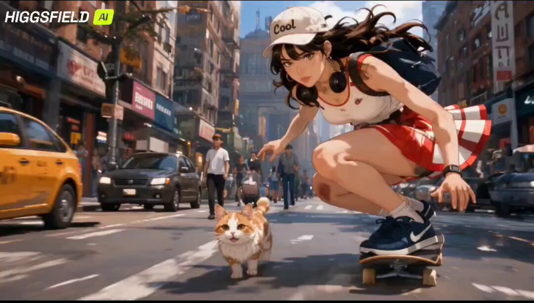
Anime-style character generation with AI has moved past the novelty stage. What used to be a party trick — type a phrase, get one charming portrait — is now a genuine production pipeline that hobbyists, indie animators, VTuber teams, and small studios use to build recurring characters across images, motion clips, and short episodes. The catch is that "cute" and "aesthetic" are the two hardest qualities to hold steady. Anyone can generate one appealing face. Very few people can generate the same appealing face forty times in a row, in different poses, under different lighting, without it drifting into a completely different person.
This guide is about the second problem. It walks through prompt architecture, character consistency techniques, tool selection by pipeline stage, a full end-to-end workflow, and the failure modes that make AI anime look cheap even when the render quality is high.
Why "cute" is the hardest aesthetic to get right
Cute anime design is not a rendering problem. It is a proportion and rhythm problem. The appeal lives in tiny ratios: eye height relative to head height, the gap between hair strands, the softness of a chin curve, the distance between the top of the pupils and the upper eyelid. Shift any of those by a few percent and the character stops reading as cute and starts reading as generic or slightly unsettling.
Generative image models are excellent at texture and lighting and much weaker at locked geometry. They reproduce the idea of a cute anime face rather than a specific measuring system. That is why the same prompt can produce a gorgeous result and a mediocre result in the same session — the underlying geometry is being resampled each time.
Aesthetic, meanwhile, is about coherent restraint. A soft pastel palette with one saturated accent, flat cel shading with a single ambient bounce, thin line art with tapering tips: these are choices. Models do not make choices. You do, through prompt structure, reference images, and post-processing discipline.
The practical consequence is that a good AI anime workflow is less about finding the magic generator and more about building a system that constrains geometry and enforces style.
What separates a usable generator from a novelty toy
Before committing hours to a tool, evaluate it against four criteria. These matter far more than raw resolution or the size of its preset library.
Identity stability under variation
Generate the same character in five poses with three expressions and two lighting setups. If the face changes shape, the tool will fight you on every shot. Look specifically at jaw width, eye spacing, and hair silhouette — the three areas that drift first.
Style coherence across a set
Generate a cast of four characters in one session. If the line weight, shading model, and color temperature vary wildly between them, you will spend your time in compositing instead of storytelling.
Directable expression and pose
Cute characters live or die on emotional readability. You need control over eye shape, mouth curve, brow angle, and head tilt without breaking the design. Tools that accept pose references or regional control are worth far more than tools that only accept text.
Exportable, editable output
You will need clean alpha channels, layered output, or at least high-resolution stills you can cut apart. A tool that only exports flattened images with a watermark is a dead end for anything beyond a mood board.
If a tool passes three of these four, it belongs in your pipeline. If it passes none, it is a sketchpad — useful for ideation, not for production.
Prompt architecture for cute, aesthetic anime characters
Most disappointing anime generations come from prompts that describe a subject but not a system. A layered prompt consistently outperforms a long descriptive sentence.
The five-layer stack
- Subject core — age archetype, gender presentation, role, and one defining silhouette feature. Example: "teen magical girl with twin low pigtails and a wide-brim hat silhouette."
- Proportion and style spec — head-to-body ratio, eye proportion, line weight, shading model. Example: "three-head chibi proportions, large oval eyes with two highlight dots, thin tapered line art, flat cel shading with one ambient bounce."
- Palette — name three to five colors with roles, not vibes. "Dusty rose main, cream secondary, teal accent in eyes only, navy outline instead of black."
- Composition and camera — framing, angle, focal length feel. "Half-body, slight low angle, 50mm-equivalent, subject offset to the right with negative space on the left."
- Output constraints — background handling, texture, and what to avoid.
Style anchors that actually change the render
Vague adjectives like "beautiful" or "high quality" add almost nothing. Anchors that reliably shift output include material words (gouache, cel vinyl, risograph, watercolor wash), era words (late-90s TV anime, early digital shoujo), and finishing words (soft bloom, film grain, slight chromatic fringe, matte finish).
The anti-slop list
Keep a reusable negative list: photorealistic skin pores, 3D render gloss, heavy bokeh, oversaturated HDR, extra fingers, warped hair strands, asymmetric eyes, watermark, signature. Add to it every time you see the same defect twice.
Worked example
A compact prompt that produces a consistent cute aesthetic:
soft pastel anime illustration, chibi teen witch, three-head proportions, oversized round eyes with dual highlights, thin tapered outlines, flat cel shading with one ambient bounce, mint hair with cream ribbon, lilac dress with gold trim, waist-up, gentle low angle, matte finish, simple gradient background, no photorealistic texture
Run it five times. The variation you see is your tool's baseline noise — plan around it rather than expecting perfection.
Keeping one character recognizable across dozens of shots
Consistency is the single largest time cost in AI anime production. Three techniques handle most of it.
The three-anchor rule
Pick three immutable design anchors that survive every prompt, pose, and scene: one hair silhouette detail, one costume detail, and one color that appears nowhere else in the cast. A scalloped sleeve, a ribbon tied on the left side, and a teal iris. When a generation drifts, these are what you check first.
Reference images and identity locking
Text alone cannot lock a face. Use image conditioning — a character sheet or a clean front-facing portrait — as a reference for every generation. Rotate a small set of references (front, three-quarter, profile) depending on camera angle. Supplying a profile reference for a profile shot reduces identity drift dramatically compared with forcing a front-facing reference to do the work.
Multi-image fusion and keyframe consistency
When you move into motion, you need at least two constraints: the same identity reference plus a pose or composition reference. Fusion of those two signals keeps the character on-model while letting the framing change. Lock the palette in a separate step during color grading so a scene-to-scene lighting shift does not read as a costume change.
Consistency check table
| Check | Frequency | Failure signal |
|---|---|---|
| Hair silhouette | Every shot | Crown widens or bangs shorten |
| Eye spacing | Every shot | Character reads older or colder |
| Signature color | Per scene | Accent appears on background objects |
| Line weight | Per session | Some shots look inked, others look painted |
| Shading model | Per scene | Flat cel vs soft gradient mixing |
Matching the tool to the stage, not the other way around
Trying to force one generator to do everything is the most common structural mistake. Different stages reward different strengths.
Ideation and thumbnailing
Speed and volume matter more than fidelity. Fast text-to-image models with loose adherence are ideal here because you want surprise. Generate fifty rough silhouettes, keep three.
Key art and turnaround sheets
You need precision and repeatability. This is where image-conditioned workflows and node-based pipelines shine, because they let you fix a seed, swap a reference, and iterate on a single variable at a time.
Motion, loops, and short scenes
For animated output, evaluate tools on temporal stability rather than resolution. The questions that matter: does the hair stay attached to the head, does the eye shape hold through a blink, does the line weight pulse between frames? Short, tightly framed clips with minimal camera movement hide weaknesses well.
Cleanup, upscale, and sound
Budget real time here. Vector cleanup in a drawing app, grain matching in a compositor, and careful audio design do more for perceived production value than another hundred generations. A crisp 1080p clip with intentional sound design beats a noisy 4K clip with nothing.
End-to-end workflow: a 45-second cute anime short
Here is a sequence that works for solo creators with a weekend of time.
- Write the character bible. One page: name, age archetype, three anchors, palette with hex values, two personality traits, one flaw. This page is the source of truth and prevents drift.
- Build the reference set. Generate twenty front-facing portraits with your locked prompt. Pick the best one, then generate three-quarter and profile views conditioned on it. Retouch by hand until the eyes and hairline are exactly what you want.
- Lock the prompt template. Save a reusable template with placeholders for scene, pose, and expression. Never rewrite the style layer once it works.
- Storyboard in text. Nine to twelve panels, each one sentence: what the viewer sees and what emotion it carries. Keep it small — 45 seconds is roughly ten to fourteen cuts.
- Generate keyframes. Two frames per cut: start pose and end pose. Use identity plus pose conditioning for both.
- Animate in short bursts. Two to three seconds per clip. Keep camera movement minimal and let expression carry the motion.
- Assemble and pace. Cut on action, not on the beat of the audio. Add a two-frame hold after any big emotional beat.
- Unify the look. Grade everything in one pass with a single lookup table so the palette stays consistent across tools.
- Add sound. Ambient bed, one or two foley details, and a music cue that resolves on the final shot.
Mistakes that make AI anime look cheap
Even technically clean generations can read as low effort. These are the usual culprits.
- Mixing shading models between shots. Flat cel and soft gradient shading in the same sequence look like two different shows.
- Over-detailed backgrounds. Cute character design depends on visual hierarchy. Busy backgrounds flatten the subject.
- Inconsistent line weight. Hair thin and crisp while clothing is soft and painterly breaks the illusion of a drawn frame.
- Chasing resolution instead of composition. A well-composed 1080p frame beats a badly framed 4K frame every time.
- Ignoring hands and feet. Cute style forgives a lot, but malformed hands destroy trust instantly. Plan shots to frame them out or fix them manually.
- No color script. Deciding the mood of each shot at generation time guarantees a patchwork result. Decide the palette arc first.
- Too many accent colors. One or two, used sparingly, keeps the aesthetic restrained and readable.
Pre-publish quality control checklist
Run this before exporting anything.
- Character anchors present in every shot.
- Eye shape and spacing identical across the sequence.
- Single shading model throughout.
- Palette limited to the bible plus one scene-specific accent.
- No frame with visible hand or finger artifacts.
- Background contrast lower than subject contrast.
- Camera movement motivated by the story beat.
- Consistent grain and finishing treatment on every frame.
- Audio levels matched across cuts with no clipping.
- Test watch on a phone screen at arm's length.
That last item catches more problems than any technical check. If the character reads as cute on a small screen with a messy background, the design is working.
Ethics, licensing, and style imitation
AI anime generation sits in a genuinely complicated space. A few practical rules keep you out of trouble.
First, check the terms of your generation tools for commercial use, since rights differ sharply between consumer and professional tiers. Second, avoid prompting directly for a living artist's name or a specific studio's proprietary character. If you want that visual direction, describe the underlying qualities instead — line weight, palette, shading model, era — and you will get something original and legally cleaner. Third, keep a record of your process: prompts, references, and edits. It helps if you ever need to demonstrate authorship. Fourth, if you publicly imitate a recognizable style, say so plainly rather than pretending it is unrelated.
None of this prevents you from building a distinctive aesthetic. It just pushes you toward describing what you actually want instead of borrowing a name.
FAQ
Why does my character look different in every generation?
Text prompts do not encode geometry. You need image conditioning from a fixed reference set, plus three immutable design anchors you can verify by eye in each output. Most drift comes from missing references rather than from the model being weak.
How many reference images do I actually need?
Three is usually enough: front, three-quarter, and profile. Add a full-body turnaround if your shots include wide framing. More references help only if they are consistent with each other.
Is a chibi style easier to keep consistent than a realistic anime style?
Yes, generally. Exaggerated proportions give the model fewer fine details to drift on, and small inconsistencies are less visible. If consistency is your priority and you are early in the process, start with a stylized proportion system.
How long should each animated clip be?
Two to three seconds. Longer clips accumulate drift, and you will spend more time fixing than generating. Build a sequence from many short, controllable clips rather than a few long ones.
Do I need to learn node-based tools?
Not to start. You can go a long way with a single image model, a single video model, and a drawing app for cleanup. Node pipelines become valuable once you are iterating on multiple variables at once and need reproducibility.
What single change improves output quality the fastest?
Writing the style layer of your prompt once, precisely, and reusing it unchanged. Most inconsistent results come from quietly rewriting the aesthetic description between sessions.
Can I sell work made this way?
Often yes, but it depends entirely on your tools' terms and your local rules. Check the license for each model you use, keep documentation of your process, and avoid prompting for protected characters or named living artists.
Start small: one character, one anchor set, one reusable template. Once that character survives ten shots without drifting, you have a system — and a system scales into a full cast, a full episode, and eventually a recognizable visual identity of your own.
