
Why Cinematography Decides Whether Video Feels Professional
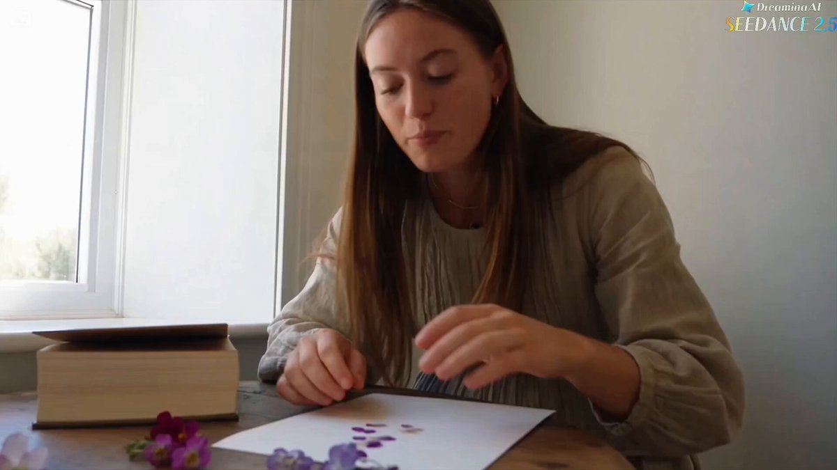
Viewers make a quality judgment about a video within the first two seconds, and almost none of that judgment is about the script. It is about light direction, camera height, color temperature, and whether the frame feels intentional. A talking-head interview lit by a single overhead ceiling fixture reads as amateur no matter how good the content is. The exact same interview, with a soft key at roughly 45 degrees, a gentle rim light separating the subject from the background, and the camera lowered to chest height, reads as authoritative. Nothing about the words changed.
That gap is what digital cinematography actually is: a set of repeatable decisions about light and perspective that communicate emotion before a single sentence lands. Modern production has made those decisions more accessible than ever. LED fixtures are cheap, cameras in the mid-range shoot log profiles with over 13 stops of dynamic range, and editing software handles color grading that used to require a dedicated suite. At the same time, audiences have been trained by streaming dramas and high-end brand films to expect a certain visual baseline. Anything below that baseline loses attention fast.
The rise of AI-generated footage has raised that baseline even further. When synthetic clips flood a feed, human-shot footage with deliberate lighting becomes a differentiator rather than a default. Well-placed shadows, consistent color, and a camera angle chosen for a reason are signals of effort that algorithms and audiences both reward.
Two levers give the highest return for the least effort: the direction of your key light and the height of your camera. Almost everything else in this guide builds on those two. The sections below cover lighting foundations, modern fixtures and color temperature, mood through contrast, the grammar of camera angles, composition, movement, AI-assisted previsualization, a repeatable shoot workflow, and the mistakes that quietly sabotage otherwise solid footage.
The Lighting Foundation: Three-Point Setup and Deliberate Variations
The three-point setup is not a rule to obey forever; it is a reliable default that solves the most common problem in video, which is a subject who looks flat and disconnected from their surroundings. Understanding why each light exists lets you break the pattern on purpose.
The key light: where authority comes from
The key is your primary source and it defines the shape of the face. For interviews, place it roughly 30 to 45 degrees to one side of the camera axis and 30 to 45 degrees above eye level. That combination creates a small triangle of light under the shadow-side eye, which reads as natural and dimensional. A large soft source close to the subject produces gentle falloff and flattering skin. A smaller, harder source produces crisp shadows and a more dramatic, confrontational look.
The fill light: controlling how much you reveal
Fill exists only to lift shadow density. It can be an LED panel, a bounce card, or a large white wall. The ratio between key and fill is your main mood dial. A 2:1 ratio, where the shadow side is only one stop darker, feels friendly and commercial. A 4:1 ratio feels dramatic and is the sweet spot for most branded interviews. Beyond 8:1 you are in noir territory. Negative fill, achieved by placing a black flag on the shadow side, is one of the most underused tools available: it adds contrast without adding a single fixture.
The backlight or rim: separating subject from background
Place a light behind and slightly above the subject, opposite the key, and you get a bright edge along the hair and shoulder line. That edge is what stops dark hair from disappearing into a dark background. A small, hard source works better here than a soft one because you want a defined line, not a wash. If you have no room behind the subject, a tube light hidden at frame edge or a bounced light on the back wall can achieve a similar separation.
When to abandon the triangle
Single-source lighting is a legitimate style. A window on one side, a subject turned into it, and a black flag on the opposite side creates a painterly Rembrandt look with zero fixtures. Practical-only lighting, where lamps and screens in the scene are the only sources, feels documentary and intimate. The point is not to abandon structure but to know which structure you are using and why.
Modern Light Sources, Color Temperature, and Daylight
LED panels, tubes, and bi-color flexibility
Bi-color LED panels covering roughly 2700K to 6500K handle most scenarios. RGBWW fixtures add colored accents for backgrounds and music-video looks. Two practical warnings matter more than specifications. First, flicker: shoot at 1/50 shutter in 50 Hz regions and 1/60 in 60 Hz regions, or use fixtures with flicker-free dimming, especially at low brightness levels. Second, dimming curve: cheap LEDs shift color noticeably as they dim, so check the look at the exact intensity you intend to use.
Color accuracy and skin tones
Look for a CRI above 95 and a TLCI above 90. Affordable panels often have a green spike that makes skin look slightly sickly. You can neutralize it with a subtle magenta gel or a targeted hue-versus-hue adjustment in post, but fixing it on set is always faster and cheaper. If you are buying your first fixtures, spend the extra on two decent panels rather than four marginal ones.
Working with daylight
Daylight is free and beautiful, and it changes every few minutes. Golden hour gives warm, low-angle light with long shadows and is worth scheduling around. Midday sun is harsh and top-down, which means deep eye-socket shadows; diffusion cloth or a scrim softens it considerably. A north-facing window provides soft, consistent light all day, which makes it the best interior location in most buildings. A simple working setup: subject positioned about 1.5 meters from the window at a 45-degree angle to the glass, a white reflector on the shadow side for fill, and a black flag to control spill from the opposite wall.
White balance discipline
Set white balance for whichever source dominates the frame, then gel smaller fixtures to match. If a warm practical lamp appears in shot against a daylight-balanced scene, that mismatch can be intentional and attractive. Random mixes of 3200K and 5600K across a subject's face are not. Decide which mismatches are deliberate, and eliminate the rest at the source rather than trying to rescue them in the grade.
Shaping Mood: Hard vs Soft Light, Shadow, and Contrast
Soft light and intimacy
Softness is a function of the size of the source relative to the subject and its distance. A 1-meter diffusion panel 60 centimeters from a face is extremely soft. The same panel 4 meters away becomes noticeably harder. Diffusion, bounce, and book lighting are all ways of enlarging the effective source. Soft light flatters skin, minimizes texture, and feels safe, romantic, or corporate depending on color and contrast.
Hard light and tension
Hard sources create defined shadow edges and reveal texture. A fresnel with a spot grid, sunlight through blinds, or a bare bulb can all produce graphic shadow patterns. Hard light suits thrillers, sports, and anything that needs energy. Gobos and cookies let you sculpt slatted or leafy shadows onto a wall, which adds production value at almost no cost.
Contrast ratios and what they communicate
The ratio between the illuminated and shadow sides of a face is the fastest mood signal you have. Around 2:1 reads open and approachable. Around 4:1 reads dramatic but still flattering. Around 8:1 or higher reads secretive, dangerous, or cinematic in the noir sense. Pick a ratio deliberately before you place a single light, and the rest of the setup becomes much easier.
Color as a mood shortcut
Warm key with a cool background is the classic complementary pairing and still works. Cyan-and-amber and teal-and-orange palettes are shorthand for blockbuster polish. Sodium-vapor orange suggests late-night streets; cool blue moonlight suggests isolation. Use color to reinforce the emotion you have already built with contrast rather than as a substitute for it.
Camera Angles: The Grammar of Perspective
Eye level: neutrality and trust
A camera at the subject's eye height feels honest and conversational. Most interviews, testimonials, and documentary pieces live here. If your tripod is at your own standing height, be aware that you may be shooting down at a seated subject by 20 centimeters, which subtly weakens them.
Low angle: power, heroism, threat
Placing the lens below eye level and tilting up makes the subject loom. It conveys confidence, authority, and sometimes menace. A slight low angle, 10 to 15 degrees, is a reliable way to make a founder or athlete look commanding without looking like a superhero parody.
High angle: vulnerability and overview
Shooting down makes the subject smaller and more exposed. It is useful for process shots, tabletop work, and any moment where you want the audience to feel informed rather than aligned. Too much downward tilt on an interview subject reads as condescension.
Overhead and top-down: graphic clarity
A true top-down frame flattens the world into geometry. It is excellent for cooking, unboxing, craft, and design content because hands and objects read clearly. It also hides facial expression, so use it for action rather than emotion.
Dutch tilt and other accents
A tilted horizon creates unease. It works once or twice in a piece and becomes distracting if overused. Save it for a moment when something is genuinely off balance in the story.
Shot sizes multiply the meaning of angles
A wide shot establishes space, a medium shot carries dialogue, a close-up carries feeling, and an extreme close-up carries detail or tension. The angle and the size work together: a low-angle wide shot says something different from a low-angle close-up. Plan coverage in pairs, and respect the 180-degree line so that eyelines and screen direction stay consistent across cuts.
Composition That Directs the Eye Without Feeling Rigid
Rule of thirds, and when to center
Placing a subject on a third line creates pleasing imbalance and gives the eye somewhere to travel. Centered framing creates formality, symmetry, and confrontation, and it is the correct choice for product showcases, graphic compositions, and deliberate deadpan comedy. Know which one you are doing.
Look room, headroom, and lead space
Give a subject space in the direction they are looking, and keep headroom modest. Around 10 to 15 percent of frame height above the head is a safe starting point. In vertical video, the face usually belongs in the upper third because interface elements cover the bottom, and subjects who are centered vertically end up hidden behind captions.
Layering, leading lines, and frame within a frame
Depth is what separates professional-looking frames from flat ones. A foreground element slightly out of focus, a doorway used as an inner frame, or a corridor of leading lines all pull the viewer into the image. Look for these structures before you move the camera, not after.
Aspect ratios and platform safe zones
A 16:9 frame, a 9:16 vertical frame, a 1:1 square, and a 2.39:1 anamorphic crop all change how much environment you can show. If you must deliver multiple ratios, frame for the narrowest one and keep the subject centered enough to survive the crop. Keep essential text and faces away from the outer edges.
Camera Movement as Emotional Language
Static shots
Locked-off frames feel observational and let performance carry the scene. They are also the easiest to match with other shots and the safest choice for interviews.
Pan and tilt
Rotating on a fixed axis reveals information and connects two subjects in a scene. A slow pan can build anticipation; a fast whip pan can transition between scenes.
Slider and dolly
Pushing in increases intimacy and tension. Pulling out creates distance and resolution. A slider gives you these moves cheaply, and even a 30-centimeter move is enough to change the emotional temperature of a shot.
Handheld
Handheld implies immediacy, urgency, or authenticity. It requires actual intention; aimless wobble reads as sloppy rather than raw. Keep the camera close to your body and stabilize with both hands and a strap.
Gimbal
Gimbals make long, fluid tracking moves possible, which is ideal for walk-and-talk sequences, real estate, and events. They can also produce a weightless, slightly sterile feel if used for everything.
Crane, jib, and drone
These are reveal tools. Start tight on a detail and rise to show the environment, or descend into a scene. Use them when the reveal carries meaning, not as decoration.
Motivate every movement
Movement should be triggered by something: a subject standing up, a door opening, a line of dialogue. Unmotivated camera drift is one of the most common signatures of an inexperienced operator.
Previsualization and AI-Assisted Shot Planning
Traditional previz still works
A script breakdown, a shot list, and rough floor plans solve most on-set confusion. Storyboards do not need to be beautiful; stick-figure sketches that capture framing, angle, and light direction are enough to align a small team.
3D previz for complex scenes
Free tools like Blender can block out a set, place a virtual camera, and test lens choices before you rent anything. This is worth the time for multi-camera scenes, stunt work, or any shoot where you cannot afford to experiment on the day.
AI image generation as a lighting reference tool
Image generators are genuinely useful for testing looks. A well-structured prompt that specifies subject, framing, light direction, light quality, color palette, lens, and aspect ratio can produce a reference frame in seconds. For example: a medium close-up of a seated interview subject, soft key from camera left at 45 degrees, subtle rim light from behind, warm 3200K practical lamp in the background, shallow depth of field, 50mm lens, 16:9. Generate six to ten variations, pick the one that matches the emotional target, and bring that image to set as a visual brief for the lighting team.
AI video generation for animatics and pitches
Short AI-generated clips are useful for building an animatic, testing pacing, and communicating tone to a client before the shoot. Treat these clips as sketches, not as deliverables. They help you decide where the camera goes and how a cut should feel.
Limits worth respecting
Generated footage still struggles with consistency across shots, physical plausibility, hands, and text. It cannot tell you how a real fixture behaves on a specific face, and it does not replace a light meter, a shot list, or a rehearsal. It is a planning aid, and it is most valuable when you already know what you want.
A hybrid planning loop
Write the shot list first. Generate six to ten reference frames for the two or three hero shots. Choose one lighting direction and one palette for the whole piece. Test that direction on set with phone stills before rolling. Lock the look, then shoot. This loop typically saves more time than it costs, because it turns vague conversations into concrete decisions.
Common Mistakes and How to Fix Them on Set
Over-lighting everything. More fixtures usually produce flatter images. Start with one key, add fill only if shadows block the eyes, and add a rim only if the subject disappears into the background.
Flat frontal light. A light directly beside the lens kills dimension. Move the key 30 to 45 degrees off axis and watch the face gain shape immediately.
Chaotic mixed color temperature. Match or deliberately contrast, never randomly mix. Carry a small gel kit and a white balance card.
Cropping at joints. Avoid framing cuts at wrists, elbows, knees, or ankles. Move the frame a few centimeters so the crop lands mid-limb or above the joint.
Crossing the 180-degree line. Once you establish a screen direction, stay on one side of the axis or insert a neutral transition shot. Otherwise subjects appear to swap places between cuts.
Movement without motivation. Ask what the move is revealing. If there is no answer, lock the camera down.
Exposing for the background. Protect the highlight on the face and let the background fall where it falls, or light the background deliberately. Nailing the window and losing the subject's skin tone is the most common exposure error in corporate video.
Ignoring skin tone consistency. Compare the face across every setup in the edit. A 400K shift between two shots in the same scene is immediately visible.
No coverage. Shoot a safe wide, a medium, and a close-up of every important beat. Editors cannot cut what does not exist.
Neglecting shutter angle. A 180-degree shutter, which means a shutter speed of twice your frame rate, gives natural motion blur. Higher shutter speeds create the staccato, strobing look of a war film, which is a choice rather than a default.
FAQ: Lighting, Angles, and AI Workflow Questions
How do I light an interview with only one light? Place a large soft source 45 degrees off axis and slightly above eye level, then use a white reflector on the shadow side for fill and a black flag to control spill. Add a small rim light if the budget allows. One well-placed light beats four badly placed ones.
What shutter speed gives the most cinematic motion? Double your frame rate. At 24 or 25 frames per second, that means 1/48 or 1/50. At 60 frames per second, use 1/120. Deviate only for a specific effect.
Is a low camera angle always flattering? No. It adds power, which can read as arrogance or threat depending on the subject and context. A 10 to 15 degree lift is usually flattering; a 40 degree lift is a statement.
How should I plan shots for vertical video? Frame with the face in the upper third, keep essential action away from the bottom quarter where captions and interface elements sit, and favor medium and close shots because wide vertical frames lose environmental context quickly.
Can AI tools replace a cinematographer? They can accelerate planning, reference creation, and animatics. They cannot make on-set decisions about a specific face, a specific room, and a specific light. The judgment is still human.
What is the fastest way to improve lighting on a small budget? Buy one large diffusion panel and one bounce card before buying a second light. Learning to shape a single source well teaches more than owning four fixtures.
How many lights do I actually need? Two fixtures, one large diffusion frame, one reflector, and one black flag cover the majority of interviews, testimonials, and product shots. Everything beyond that is specialization.
How do I keep consistency across many shots and setups? Lock a look: one key direction, one color palette, one contrast ratio. Take a reference still at the start of each setup and compare it against your master frame before moving on.
Cinematography is not a matter of expensive equipment. It is a matter of deciding what the light should do and where the camera should stand, then executing those decisions consistently across every shot. Nail the key direction and the camera height first. Add contrast and color once those are solid. Use AI tools for planning references, not as a substitute for looking at your own frame and asking whether it says what you meant it to say. Do that, and your footage will read as professional long before anyone notices what camera you used.
