

Why Interactive Ad Videos Outperform Passive Ones
Video advertising has a completion problem. Most viewers decide within a second or two whether to keep watching, and a passive thirty-second spot gives them nothing to do except wait or scroll away. Interactive ads, especially quiz-style formats, flip that dynamic. The viewer is asked to participate, which turns a one-way broadcast into a two-way exchange.
There are three practical reasons quizzes work well inside video ads:
- Attention lock. A question with visible answer options creates an open loop in the viewer's mind. Open loops are mildly uncomfortable, and people resolve them by answering.
- Self-qualification. Answers reveal intent, budget sensitivity, experience level, or a specific pain point without asking the viewer to fill out a form.
- Native personalization. The second half of the ad can change based on the first answer, so each viewer sees a more relevant pitch.
There is an important nuance here. Interactivity is not a gimmick layered on top of weak creative. A quiz cannot rescue a confusing offer or an unclear claim. What it does is amplify an already clear message by making the viewer an active participant in it. If the underlying ad does not work as a linear video, adding a question will not fix it.
This guide covers the full path: hook construction, quiz design, AI-assisted shot generation, branching logic, segmentation, measurement, and the mistakes that quietly kill these campaigns.
The Anatomy of an Effective Ad Video
Good ad videos share a recognizable skeleton. Before you generate a single frame, you should be able to describe each of these parts in one sentence.
The first two seconds
The opening must establish one of three things instantly: a problem the viewer recognizes, a visual that violates expectation, or a specific promise. Avoid logo-first openings. Brand recognition matters, but it matters after curiosity exists, not before.
A useful test: mute the first two seconds and watch. If the ad could plausibly belong to any brand in the category, the hook is not specific enough.
One core message, stated once
Ads fail most often because they try to say four things. Pick one claim and defend it for the rest of the runtime. Everything else — features, testimonials, pricing — supports that claim rather than competing with it. A viewer should be able to repeat your claim back to you after a single watch.
Visual consistency across shots
Viewers read inconsistency as amateurism even when they cannot name what is wrong. Keep these locked across every shot:
- Lighting direction and color temperature. A warm left-key shot followed by a cool right-key shot feels broken, even if both shots are beautiful in isolation.
- Lens character. Wide establishing shots mixed with tight portrait crops need a narrative reason.
- Character continuity. The same clothing, hairstyle, and apparent age across every appearance.
- Grade and contrast. One look applied to the whole spot, not one look per clip.
Sound, captions, and pacing
Assume the ad will be watched on mute at least half the time and design for that assumption. Burn in captions with high contrast, keep them clear of platform interface zones, and time cuts to the rhythm of the voiceover. Music should sit below speech, not compete with it. If a line of dialogue is hard to understand without headphones, rewrite it shorter.
Hook Patterns That Consistently Work
Rather than inventing a hook from scratch every time, reuse proven patterns and adapt the specifics. These five cover most consumer and B2B situations:
- The recognizable frustration. Open on the exact moment of friction — the spreadsheet that breaks, the checkout that fails, the morning routine that runs late.
- The counterintuitive claim. State something the audience believes is false, then spend the ad proving it.
- The before-and-after split. Show the same situation twice, seconds apart, with one variable changed.
- The question hook. Ask something the viewer is already asking themselves, then promise the answer later in the ad. This pairs naturally with a quiz format because the ad becomes a series of questions.
- The specific number. A concrete figure — time saved, steps removed, percentage improvement — outperforms vague superlatives almost every time.
Whichever pattern you pick, keep the promise honest. Hooks that overpromise create a mismatch that shows up later as low conversion, even when click-through looks healthy.
Designing a Marketing Video Quiz That People Actually Finish
The quiz is the engine of the format. Treat it as a product with its own goals, not as an afterthought bolted onto the edit.
Question types and placement
| Question type | Best use | Watch out for |
|---|---|---|
| Single choice, 2–4 options | Fast qualification | Too many options cause drop-off |
| This-or-that | Personality and taste | Feels arbitrary without context |
| Slider or scale | Intensity of a problem | Harder to answer accurately on mobile |
| Ranking | Priority discovery | Requires more cognitive effort |
| Open text | Rich verbatim insight | High abandonment; use sparingly |
Place the first question early, usually between seconds three and six. By then the hook has earned enough attention to justify asking for something small. Placing it at second fifteen means you have already lost most of the audience you wanted to qualify.
Balancing insight collection with entertainment
Every question should do double duty: it should be genuinely interesting to answer, and it should produce data you can act on later. If a question is fun but useless, it is decoration. If it is useful but dull, it kills completion.
A practical ratio for a twenty to thirty second interactive ad: one qualifying question, one preference question, one payoff frame. That is enough to split viewers into meaningful buckets without exhausting them. If you need more data, move the remaining questions to a landing experience where the viewer has already opted in.
Branching logic and personalization
Branching is where interactive video earns its keep. A single answer can redirect the viewer to a different second half: a different product tier, a different proof point, a different call to action. Keep branches to two or three paths.
Every additional path multiplies production work and increases the chance that one version is noticeably weaker than the others. It also fragments your testing data, making it harder to tell which branch actually performed. Two well-built paths beat five rushed ones.
Writing quiz copy
Question text should use the viewer's words, not internal jargon. "How do you usually handle invoices?" works better than "Select your accounts payable workflow maturity level." Keep each option to three or four words so it reads at a glance on a phone screen.
Choosing AI Video Tools for Ad Production
AI generation has removed most of the cost floor from ad production, but tool choice still determines quality, consistency, and how long the edit takes. The goal is not to use the newest model; it is to match the generation mode to the shot.
Match the generation mode to the job
- Text-to-video works for concept shots, abstract backgrounds, and any frame where an exact subject does not exist yet. It is the fastest way to explore a look.
- Image-to-video is the workhorse for product and character shots. Generate a still you are happy with, then animate it. You keep control of composition and identity.
- Video-to-video is for restyling or refining existing footage, converting a rough animatic into a polished look, or adapting a horizontal spot for vertical placements.
A common mistake is trying to solve every shot with text-to-video. When a specific face, product, or logo must remain identical across shots, always start from an image.
Criteria for picking a model
Do not choose by hype. Choose by these criteria, in this order:
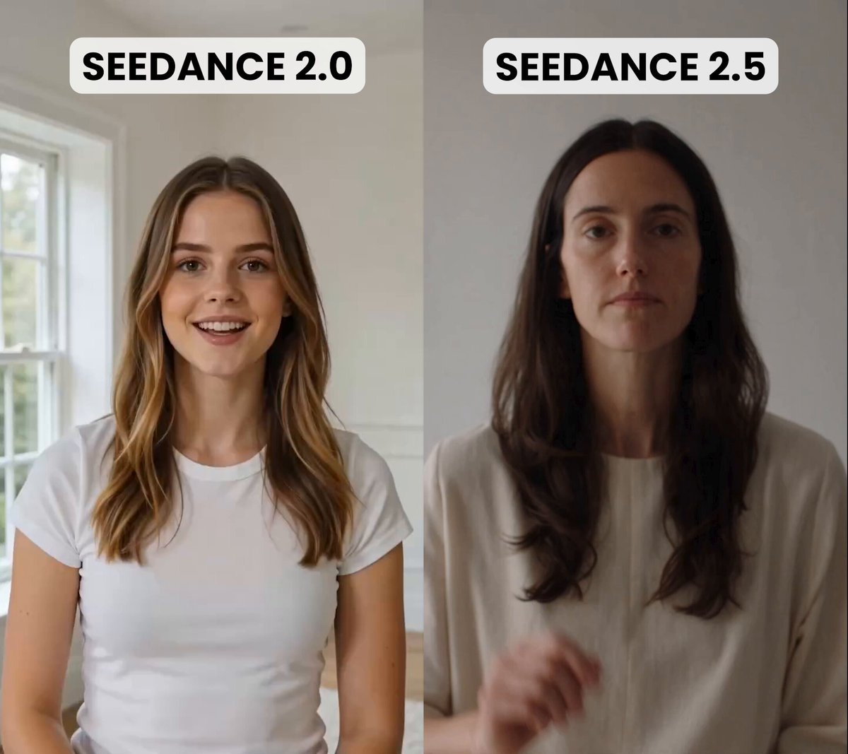
- Subject fidelity. Does it hold faces, hands, and products without morphing between frames?
- Motion plausibility. Does the physics look believable at normal speed, not just in slow motion?
- Controllability. Can you steer camera movement, duration, and aspect ratio?
- Consistency. Can you reproduce a character or a look across many generations?
- Aspect-ratio support. Vertical-first if the ad runs in social feeds.
- Iteration speed. A slightly weaker model that returns results in seconds often beats a stronger one that takes minutes, because you will run more attempts.
Consistency tactics that actually work
- Lock a written style prompt and reuse it verbatim across every shot in the spot.
- Keep a reference frame for every recurring character or product.
- Fix your seed where the tool supports it, then vary one variable at a time.
- Generate at the highest resolution available, then downscale. Small artifacts hide better at smaller scale.
- Build a look in your editor to unify color across clips that came from different generations or different days.
A Step-by-Step Production Workflow
Step 1: Write a one-page brief
Include the audience, the single claim, the desired action, the tone, and the runtime target. The brief is the contract that prevents scope creep later, and it is the document you return to when a stakeholder asks for a fifth feature to be mentioned.
Step 2: Script and shot list
Write the script in three columns: timecode, what is seen, what is heard. Keep the total shot count low — five to nine shots is plenty for a twenty-second ad. Mark which shots are text-to-video, image-to-video, or live action, and estimate how many attempts each will need.
Step 3: Generate, review, and assemble
Generate two or three candidates per shot and choose ruthlessly. Assemble a rough cut before polishing anything. Most quality problems are actually pacing problems, and pacing only becomes visible in the timeline.
Step 4: Layer the quiz
Add the question overlay as a distinct layer so it can be swapped without regenerating video. Keep the question text on screen for at least three seconds, and give the viewer a visible signal that a choice is expected — a pulsing cursor, a subtle highlight, or a short countdown.
Step 5: Test before you scale
Run the ad with a small audience and watch where people drop off. The quiz introduces two new failure points: the question itself and the moment of interaction. Instrument both separately, because a question that is skipped and a button that is not clicked are different problems.
Step 6: Version and ship
Once the structure works, produce variants by swapping one element at a time: the hook, the first question, the branch payoff, or the final frame. Changing several elements at once makes the results unreadable.
Quiz Data as a Segmentation Engine
The answers are the most valuable output of this format. Used well, they turn a single ad into a segmentation system that feeds everything downstream.
Mapping answers to segments
Build a simple mapping table before launch so data arrives with meaning already attached.
| Answer pattern | Segment | Follow-up creative |
|---|---|---|
| Beginner + price-sensitive | New entrants | Onboarding-focused, entry tier |
| Beginner + time-poor | Convenience seekers | Done-for-you, fast setup |
| Advanced + price-sensitive | Power value hunters | Volume features, efficiency claims |
| Advanced + feature-hungry | Power users | Deep capability, integrations |
From segments to creative variants
Once you know the segments, produce short follow-up videos for each one. The follow-up does not need to be a full ad. A five-second personalized continuation often outperforms a generic second spot, because the viewer has already told you what they care about and the message simply confirms it.
Feed the segments into your retargeting audiences as well. People who answered "time-poor" should not see the same creative as people who answered "feature-hungry."
Common Mistakes and How to Fix Them
The quiz interrupts the story. If the first question appears before the viewer understands the offer, they will skip it. Place the first question after a clear hook, not before it.
Too many questions. Five questions in a thirty-second ad guarantees abandonment. Cap at two or three and move the rest to a landing experience.
Inconsistent visuals. Characters change jackets, lighting flips, products morph. Use reference frames, locked style prompts, and a unifying grade.
No payoff. The viewer answers and gets nothing in return. Always deliver something: a tailored recommendation, a specific result, or a clear next step.
Quiz answers that go nowhere. The data lands in a spreadsheet nobody reads. Define the segment map and draft the follow-up creative before launch, not after.
One version only. The ad is produced once and never varied. Treat the first version as a template and produce variants for the top two segments.
Questions that feel like a form. If the quiz reads like a survey, viewers disengage. Keep the tone conversational and the options short.
Measuring Performance and Testing
Look past raw view counts. These metrics tell you whether the interactive format is actually working:
- Hook retention. Percentage still watching at three seconds.
- Question reach. Percentage who see the first question.
- Answer rate. Percentage who answer once the question appears.
- Branch completion. Percentage who finish the path they were routed into.
- Assisted conversion. Conversions from viewers who answered versus those who did not.
- Segment lift. Which segment converts best, and by how much.
Compare interactive and non-interactive versions of the same creative. The interactive version usually wins on engagement. Whether it wins on conversion depends on how well the branches match real intent, so always check the downstream numbers rather than stopping at answer rate.
A pre-ship checklist
- One core message, stated clearly and repeated once.
- Hook established within two seconds.
- Visual consistency verified shot by shot.
- Captions present and legible on mute.
- First question visible by second six.
- Two or three questions maximum.
- Two or three branches, each with a distinct payoff.
- Segment map defined before launch.
- Interactive and non-interactive versions ready to compare.
- Follow-up creative drafted for the top two segments.
Frequently Asked Questions
Do interactive quizzes work on every platform?
No. Support varies widely, and overlay capabilities change often. Test on the platforms where your audience already watches video, and use a landing page quiz as a fallback wherever interactive overlays are not supported. Never make the ad unreadable for viewers who cannot interact.
How long should the ad be?
Fifteen to thirty seconds covers most cases. If the quiz genuinely needs more room, split it: a short hook video that drives to a longer interactive experience. Do not cram a four-question flow into a fifteen-second slot.
Can AI-generated video hold up in a paid campaign?
Yes, particularly for concept shots, backgrounds, and stylized sequences. For hero product shots and human faces, generate from reference images, expect to do some cleanup, and review every frame at full size before shipping.
Do I need a designer to build the quiz overlay?
A basic overlay can be built with standard motion graphics templates. The question copy and the branch logic matter far more than the polish of the buttons, as long as the options are clearly readable on a phone.
How many variants should I produce?
Start with three: one generic version and two segment-specific versions. Expand only after you see which segment responds best and what the payoff frame looks like in practice.
What is the biggest reason these campaigns fail?
Weak hooks. Interactivity multiplies attention that already exists; it does not create it from nothing. Fix the first two seconds before touching the quiz.
Should the quiz be skippable?
Yes. Always provide a path for viewers who do not want to answer. A skippable quiz has a slightly lower answer rate but a much healthier completion rate, and the viewers who do answer tend to be more deliberate.
How do I keep creative consistent across a long campaign?
Maintain a small style bible: one prompt template, one reference frame per recurring subject, one grade, and one caption style. Review it every time you onboard a new editor or a new generation model.
The format rewards preparation more than production budget. A clear claim, a tight shot list, consistent visuals, and one well-placed question will outperform a larger budget that has none of those things.
