
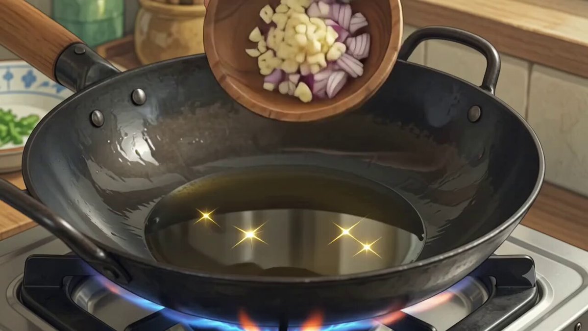
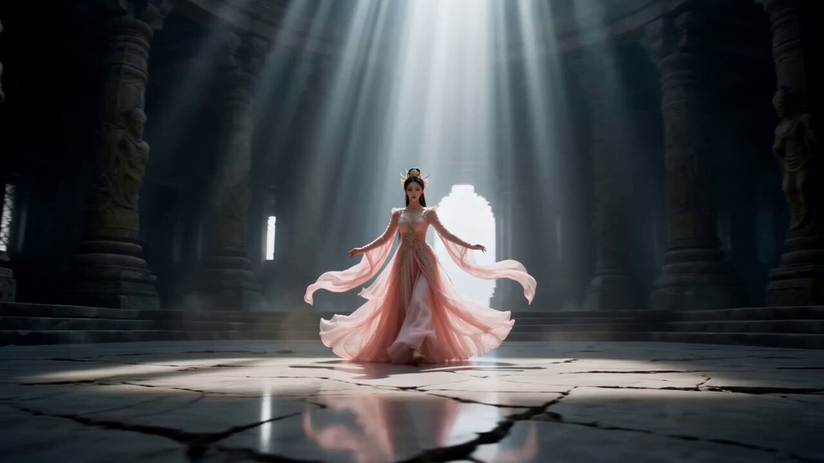
Why Anime and Artistic Video Became a Real Production Category
Anime is one of the hardest visual languages to fake. It relies on clean line work, deliberate color scripting, symbolic backgrounds, and motion that is stylized rather than physically accurate. For years, generative video tools handled photorealism far better than illustration, which meant anyone wanting anime-style motion had to compromise: either accept a painterly approximation that lost the line art, or animate it manually frame by frame.
That gap has narrowed considerably. Modern diffusion-based video models can now hold a drawn aesthetic across a clip, respond to camera instructions, and preserve a character's silhouette through movement. Two families of models in particular have become fixtures in artistic pipelines: Kling, which tends to protect illustration detail and stylistic restraint, and PixVerse, which leans into cinematic camera work and responsive motion.
This guide is written for creators who already know roughly what they want on screen and need a repeatable process to get there. It covers how the two model families behave in practice, how to build a shot pipeline around them, how to keep characters and environments stable, how to fix the motion problems that show up most often, and how to finish a piece in post-production so it feels intentional rather than generated.
How Kling and PixVerse Differ in Practice
Marketing comparisons tend to flatten these tools into a single axis of "quality." In real projects, the difference shows up in specific, predictable ways. The best approach is not to pick a winner but to assign shots to the model whose bias matches the shot's needs.
Kling: Line Fidelity and Stylistic Restraint
Kling's strength is that it does not fight illustrated input. When you feed it a cel-shaded keyframe with flat color blocks and a strong outline, the output tends to keep the outline intact rather than dissolving it into texture. That matters enormously for anime, where the line is the identity of the character.
Practically, this means Kling is the safer choice for:
- Dialogue-like shots with minimal motion, where a face must stay recognizable for several seconds.
- Close-ups where hair strands, eye highlights, and clothing folds carry the emotional read.
- Scenes with a strong graphic background — a sunset gradient, a stylized cityscape — where you do not want the model inventing realism.
Its bias toward restraint also means Kling will not rescue a vague prompt. If you ask for "anime girl running," you get a plausible but generic result. If you specify the framing, the light direction, the palette, and the type of motion, you get something much closer to a finished cut.
PixVerse: Cinematic Control and Motion Responsiveness
PixVerse behaves more like a virtual camera operator. It handles larger camera moves — pushes, orbits, crane rises, whip pans — with more confidence, and it reacts more aggressively to motion instructions in the prompt. Smoke drifts, cloth flares, and water displaces in ways that feel dramatic rather than literal.
That responsiveness is a benefit and a risk. For an action beat or an establishing shot with a sweeping camera move, PixVerse often produces the more cinematic result with less prompting effort. For a quiet, static conversation shot, the same responsiveness can introduce unwanted drift: the camera creeps, the character's shoulders sway, and by the end of the clip the composition no longer matches the neighboring shots.
A working rule: use PixVerse when the shot is defined by movement, and Kling when the shot is defined by design.
Where the Two Complement Each Other
Many short artistic films are now assembled from a mix of both. A common pattern is to generate the emotional core of a scene — the close-ups, the reaction shots — in whichever model preserves the character best, then generate the connective tissue (establishing shots, transitions, action inserts) in whichever model handles movement best. Because both output standard video files, the audience never sees the seam as long as color grading and grain are matched in post.
Building a Shot Pipeline From Script to Sequence
The single biggest cause of disappointing AI video is starting from a finished-looking image and hoping the model reads your mind. A pipeline solves that by separating decisions that should not be made at the same time.
A practical sequence looks like this:
- Write the beat sheet. Not a full script — a list of story beats, each one sentence long. Ten to twenty beats is plenty for a two-minute piece.
- Convert beats into shots. Each beat becomes one to three shots. Name them (SHOT_01, SHOT_02) so the folder structure and edit timeline stay legible.
- Design the look per project, not per shot. Decide the line weight, the shading model (cel, soft, watercolor), the palette, and the aspect ratio once. Re-decide only at deliberate stylistic breaks.
- Generate keyframes as stills first. Iterate on composition and character placement in still form, where changes are fast and cheap.
- Animate one variable at a time. First get a static shot with the right framing, then add a small motion, then a camera move.
- Assemble a rough cut immediately. Do not wait for every shot to be perfect. Watching the rough cut tells you which shots actually matter.
- Re-generate only the shots that break the cut. Polishing shots that get trimmed is wasted effort.
Two habits make this pipeline much faster. First, keep a running prompt log: the exact prompt, model, seed, and reference images for every accepted shot. Reproducing a look three weeks later is nearly impossible without it. Second, version your keyframes with descriptive suffixes rather than numbers — heroine_rain_wide_v2 is far more useful than img_0047.
Prompting for Anime Aesthetics
Anime prompting is not about adding more words; it is about adding the right categories of information. Four categories cover most of what matters.
Style, Line, and Shading
Name the technique instead of the franchise. "Anime style" is vague; "flat cel shading, thick clean outlines, limited palette, painted background with soft gradient sky" gives the model enough to work with. If you want a specific historical look, describe its properties — grain, halftone, watercolor bleeding, high-contrast shadows — rather than naming a studio.
Be consistent with your vocabulary. If your style string is "cel shaded, 2-tone shadows, warm rim light," use those exact words in every prompt for that scene. Small wording changes cause visible style drift between shots.
Composition and Camera Language
Video models respond well to conventional camera terms: wide shot, medium close-up, over-the-shoulder, low angle, dutch tilt. Pair the framing with a lens feel — "shallow depth of field," "wide-angle distortion," "telephoto compression" — to nudge the perspective.
For motion, prefer one primary instruction per shot. "Slow dolly in, character turns head slightly" works better than a list of five simultaneous movements. If you need several motions, stage them as separate shots and cut between them.
Motion Verbs That Actually Change Output
Not all motion verbs are equal. Across most models, these read clearly:
- Translation: walks, runs, drifts, slides, falls
- Rotation: turns, spins, tilts, rotates
- Camera: push in, pull back, orbit, pan, crane up, handheld sway
- Atmosphere: smoke rises, petals scatter, rain streaks, dust kicks up
Ambiguous verbs — "moves," "acts," "reacts" — give the model nothing to anchor to and usually produce either stillness or chaotic drift.
Negative Prompting and Restraint
If the model supports negatives, use them for structural errors rather than aesthetic preferences: extra fingers, merged limbs, warped face, text artifacts, watermark, flicker. Piling up dozens of aesthetic negatives tends to flatten the result instead of improving it.
Maintaining Character and Environment Consistency
Consistency is the difference between a portfolio piece and a demo. It comes from three layers of control.
Reference Images and Multi-Image Conditioning
Most modern models accept one or more reference images alongside the prompt. A single strong character sheet — front view, three-quarter view, and a neutral expression — is worth more than a paragraph of description. Where multi-image input is available, supply the character reference plus an environment reference plus a composition reference, and let the prompt describe only the action.
Keep the reference set small and consistent. Mixing a highly detailed illustration with a rough sketch produces a blend that matches neither.
Scene Bibles and Continuity Checklists
Write a short document per project that fixes the non-negotiables: palette hex values, key light direction, costume details, hair length, prop positions. Before rendering a scene, check every shot against it. Continuity errors in AI video are rarely about the model; they are about the creator forgetting which side the light came from.
Reducing Drift Across Long Takes
Long clips drift. Identity, color, and background detail all degrade gradually. Three mitigations work well:
- Generate shorter clips (three to five seconds) and join them in the edit rather than asking for one long take.
- Re-anchor each new clip with the last accepted frame as the starting image.
- Keep camera movement modest in shots where the face must remain stable.
Beyond Anime: Painterly, Clay, and Ink Styles
The same workflow applies to other artistic registers, with different emphasis.
Painterly and impressionist video benefits from describing brush behavior and edge quality — "visible impasto strokes, soft edges, warm ochre and umber palette." Expect texture to flicker between frames; a light temporal smoothing pass in post cleans it up.
Clay and stop-motion looks depend on describing a physical material and a frame rate illusion: "matte clay surface, visible fingerprints, subtle 12fps judder." A slight grain overlay and a warmer grade sell the effect more than extra prompt words.
Ink and sumi-e styles require restraint. High-contrast, low-detail frames confuse models that expect texture to track. Use slow, minimal motion and let the background remain near-empty. Fast movement causes the ink to smear into gray mush.
In all three cases, the rule from anime applies: design the still first, then animate it.
Troubleshooting Motion, Faces, and Flicker
Most failures fall into a handful of recognizable buckets. Here is how to diagnose each.
The Clip Melts or Warps
Usually caused by too much requested motion relative to the shot's information density. A wide shot with many characters and a fast camera move is a difficult combination. Fix it by simplifying: reduce the camera move, reduce the number of visible characters, or shorten the clip. If a face warps specifically, switch to a model with stronger illustration preservation and increase the proportion of clean line art in the reference.
The Camera Creeps When It Should Be Static
This is common with highly responsive models. Add explicit stillness language: "static camera, locked-off tripod shot." Increase the strength of the input image if the tool allows it, and shorten the clip. If creep persists, generate the shot as a still and animate only a small internal element, such as hair or steam.
Flicker and Texture Boiling
Frame-to-frame instability appears when the model is uncertain about surface detail. Reduce fine texture in the source image, avoid prompts that mention complex patterns, and apply temporal denoising or frame interpolation in post. Interpolation set to a moderate rate often smooths flicker while preserving the drawn look.
Hands, Props, and Crowds
These are the classic weak points. Frame them out, obscure them, or replace them with stylized alternatives — silhouettes, gloves, foreground blur. In anime specifically, cutting away from a difficult action is itself a legitimate stylistic convention.
Color Shift Between Shots
When two shots generated from the same prompt look like different scenes, the cause is usually inconsistent wording or a different seed. Reuse the style string verbatim, reuse the seed where possible, and finish with a shared color grade so the sequence reads as one world.
Post-Production That Makes AI Video Feel Deliberate
Generation is roughly half the work. The remaining half is what separates a clip from a film.
Editing and pacing. Cut on motion. If a character raises an arm, cut at the peak. AI clips often have a soft beginning and end, so trimming the first and last few frames makes transitions cleaner.
Upscaling. Generate at the highest resolution your hardware and time budget allow, then upscale. Upscaling a clean, low-noise frame works far better than upscaling a noisy one, so prefer a slightly soft render over a grainy one.
Frame interpolation. If the model outputs at a low frame rate, interpolation can smooth motion, but it can also introduce warping around line art. Use it selectively, and compare before and after at full resolution rather than in a small preview window.
Color grading and grain. A global grade unifies shots generated by different models. A subtle grain layer, matched to the intended medium, hides small inconsistencies in texture and sharpness.
Sound design. Ambient beds, footsteps, cloth rustle, and music do more for perceived quality than another round of generation. Silence makes even good animation feel unfinished.
Choosing a Model Per Shot: Decision Criteria
Rather than committing to one tool, decide shot by shot using a short set of questions.
| Question | Lean toward Kling | Lean toward PixVerse |
|---|---|---|
| Is the shot defined by design or by movement? | Design | Movement |
| How much camera movement is needed? | Little or none | Moderate to large |
| How many characters are in frame? | One or two | One, ideally |
| How long is the clip? | 3–5 seconds | 3–5 seconds |
| What matters most? | Identity and line fidelity | Impact and dynamics |
| What is the fallback if it fails? | Shorten, simplify, add references | Lock the camera, add stillness language |
Two practical notes. First, budget time for at least three attempts per accepted shot; the first generation is rarely the best. Second, keep a small library of "hero" prompts — the ones that reliably produce a usable result — and build variations from them rather than starting from scratch.
Frequently Asked Questions
Can I mix two models in one film without it looking inconsistent?
Yes, provided you unify the output in post. Keep the same aspect ratio, resolution, and frame rate across all clips, apply a single color grade, and add a consistent grain layer. Viewers notice continuity errors in lighting and color far more than they notice subtle differences in how motion is rendered.
How long should each generated clip be?
Three to five seconds is the sweet spot for artistic work. Shorter clips preserve detail and reduce drift, and the edit gives you pacing control that a single long take cannot.
Do I need a character sheet, or is a text description enough?
A reference image is dramatically more reliable for faces and costumes. Text descriptions are excellent for mood, lighting, and motion, but they are a poor tool for specifying exactly what a character looks like.
How do I stop a character's face from changing between shots?
Use the same reference, the same style wording, and the same seed when possible. Keep the face large in frame, avoid extreme angles, and cut away rather than showing a difficult profile or a full-body action shot at distance.
Is it better to generate stills and animate them, or to prompt full scenes directly?
For narrative work, stills first. It costs less time to fix a composition as an image than as a video, and the resulting shot list is far easier to keep coherent.
What resolution should I target?
Render at the highest resolution your time budget tolerates, then upscale. If you must choose, favor a clean image at moderate resolution over a noisy one at high resolution, because upscalers amplify noise and compress line art.
How should I organize project files?
One folder per scene, one subfolder per shot, with keyframes, accepted clips, rejected attempts, and a prompt log inside each. Rejected takes are useful — they tell you which directions consistently fail.
When should I stop iterating?
When the shot survives being watched three times in a row at full speed without a distracting flaw. Perfection at the frame level is invisible in motion; a coherent sequence beats a flawless clip every time.
Bringing It Together
The shift toward illustrated and artistic AI video is not about a single model winning. It is about creators gaining enough control that the tool stops dictating the aesthetic. Kling rewards careful design and preserves the drawn line. PixVerse rewards clear motion direction and delivers cinematic movement. Used together, with a disciplined shot pipeline, a fixed style vocabulary, reference-driven consistency, and a genuine post-production pass, they can carry a short film from idea to finished piece.
Start small: three shots, one character, one location. Lock the style string, log every prompt, and cut the results together before generating anything else. Once that loop feels predictable, scale the same process to a full sequence — and let the models handle the frames while you handle the storytelling.
