
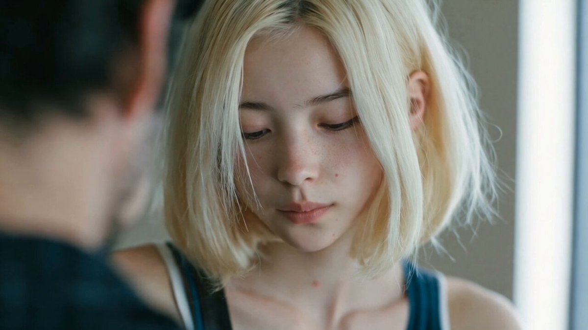
Why Korean Cinema Is Such a Useful Reference for AI Video
Korean filmmaking has become one of the most studied visual languages in modern cinema, and for AI video creators it is an unusually practical reference. The films that define the style rarely depend on spectacle. They depend on faces, weather, ordinary interiors, and the way light falls through a window at a specific hour. That is good news for generative video, because current systems still struggle with large-scale action and dense crowds, but they handle skin, fabric, rain, and soft daylight remarkably well.
The style is also unforgiving. Korean cinematography tends to pair emotional restraint with visual intensity: a long, quiet shot that suddenly carries enormous weight. A frame that is slightly too bright, slightly too wide, or slightly too long stops reading as film and starts reading as stock footage. The distance between 'cinematic' and 'generic' is measured in small decisions — the direction of a key light, the height of the camera, the amount of time a shot holds after the dialogue ends.
This guide is organized as a production workflow rather than a theory piece. You will work through what to identify in a reference frame, which class of tool suits which shot, how to write prompts that survive dozens of generations, and how to finish the sequence in the edit so it feels intentional.
The Visual Grammar You Are Actually Reproducing
Before opening any tool, name what you are copying. 'Korean cinematography' is not a preset you can apply. It is a collection of recurring habits that you can translate into a written brief.
Light as emotion
Overcast daylight. Single practical sources. Deep shadows used to hide as much as to reveal. The camera usually exposes for the face and lets the background fall into darkness or soft gray. If you take one thing from this style, take the willingness to let parts of the frame be unreadable.
Framing that respects silence
Compositions often give characters more negative space than Western commercial work does. Figures sit off-center, sometimes with their back to camera, often looking out of frame rather than into the lens. Rooms are framed to feel lived in, with doorframes and corridors used as natural crop lines.
Color as memory
Muted greens, teals, and sickly ambers dominate. Mid-tones are desaturated, then one element is allowed to be saturated: a red jacket, a neon sign, blood, a child's toy. The palette tends to shift across a film rather than sitting in one look.
Camera movement with intent
Long static holds interrupted by a slow push or a lateral dolly. Handheld appears when a character's composure breaks, not as a default texture. Movement is usually motivated by a change in the scene's emotional temperature.
Write these four items down. Every prompt, grade, and cut should be traceable to at least one of them. If a shot cannot be justified by the brief, it is decoration.
Matching AI Tools to Shot Types
Generating an entire sequence with one method produces a flat result. Split the work into four buckets and use the right approach for each.
Text-to-video for establishing shots
Wide streets, apartment blocks, rain on asphalt, empty stairwells. These shots tolerate lower fidelity in faces and can be generated from text alone. Produce three to five variations and select by mood rather than by sharpness. A slightly soft establishing shot that sets the right tone beats a crisp one that feels generic.
Image-to-video for performance shots
Close-ups and medium shots need a locked face. Generate or select a still first, then animate it with a short, specific motion prompt such as 'she turns her head a few degrees toward the window, eyes lowering.' Keep generated clips to two to four seconds and stitch them. Longer clips drift, and drift is most visible in the face.
Video-to-video for texture and grade passes
Once the cut works, run selected shots through a style-transfer or video-to-video pass at low strength to unify grain, contrast, and color. Keep the strength low enough that faces stay stable; in most tools that means a setting near the bottom of the range. The goal is cohesion, not transformation.
Upscaling and frame interpolation
Do this last, after the edit is locked. Upscale once, at the end, using a model that preserves grain rather than one that scrubs it away. Frame interpolation is useful for smoothing stitched clips, but avoid it on shots with fast hand movement or fine fabric detail, where it tends to smear.
Building a Prompt System Instead of One-Off Prompts
A single clever prompt will not carry a sequence. What carries a sequence is a repeatable template with variables.
The five-slot prompt template
Use the same five slots in the same order for every shot:
- Subject and wardrobe — age, attitude, clothing, condition (damp, wrinkled, slept-in).
- Action in one beat — one physical action, not a sequence of actions.
- Light source and direction — where the light comes from and what fills the shadow side.
- Camera — lens feel, height, movement, and speed.
- Atmosphere and era — humidity, season, decade, palette, texture.
A filled example: 'Woman in her mid-thirties in a damp beige trench coat stands at a half-open apartment window; she exhales and glances down at the street below; overcast daylight from camera left, no fill; medium close-up, 50mm feel, eye level, very slow push in; humid summer air, muted green and gray palette, faint grain.'
That prompt is not poetic, and that is the point. It is a shot list entry.
Negative prompts and restraint
Most amateur AI footage fails by addition: too much light, too much saturation, too much camera movement. Negatives correct this directly. Useful entries include 'no smile, no direct eye contact with camera, no lens flare, no HDR look, no slow motion, no drone movement, no wide-angle distortion, no background blur excess.'
Consistent characters across shots
Lock identity with a reference still that you attach to every generation involving that character. Keep wardrobe and hair identical between shots unless the script changes them. If your tool supports reusable character elements, save one and reuse it. If it does not, keep a folder of three approved stills and always attach the same one — not the one that looks best in isolation, but the one that generates most consistently.
Lighting Recipes You Can Reuse
Lighting is where AI video most often breaks its own illusion. Four recipes cover most of what this style requires.
Overcast window light
One large soft source at roughly 45 degrees, no fill, background two stops darker than the face. In prompts: 'overcast daylight through a window, soft shadow edges, no fill light, background falling into gray.' This is the default look for dialogue and quiet observation.
Single-source night interior
One warm practical — a table lamp, a refrigerator light, a hallway bulb — placed close to the subject. Prompt as 'single warm practical lamp, deep falloff, room mostly dark, warm highlights on skin.' The trick is letting most of the frame stay dark. If your generated clip looks evenly lit, the mood is gone.
Hard noir contrast
For crime and thriller beats: one hard key, heavy shadow, faces half-lost to black. Prompt as 'hard key light from one side, deep black shadows, high contrast, minimal fill, cold highlights.' Use this sparingly; a full sequence of hard noir becomes exhausting.
Practicals and reflections
Neon signs, headlights on wet asphalt, mirrors, and glass partitions do a lot of atmospheric work in this style. Prompt as 'wet street reflecting neon, shallow focus, reflections dominant, sodium and magenta light.' Reflections also give the AI something structured to render, which often improves realism.
Camera Language: Lens Choice, Height, and the Long Take
Focal length as psychology
Wide lenses around 24–35mm isolate a person inside a space and emphasize environment. Normal lenses around 40–50mm feel observational and honest. Long lenses at 85mm and beyond compress space and create intimacy in close-ups. Naming a focal feel in the prompt is usually enough for the model to shift perspective, even if it does not simulate optics precisely.
Eye level and its variations
Most of this style sits at eye level or slightly below, letting ceilings and doorways loom. Low angles imply power or threat. High angles are used sparingly and rarely for comedy. Pick one height per scene and hold it, because constant height changes read as inconsistency rather than style.
Simulating a long take
Generate a four-second clip, then start the next clip from the final frame of the previous one, keeping exposure, movement direction, and wardrobe identical. Cut only where the camera would naturally pause — behind a wall, on a turn, when a figure crosses frame. Three or four of these stitched together read as a single sustained take, which is one of the most recognizable signatures of the style.
Texture, Grain, and the Analog Finish
Grain that matches the era
Add grain once, at the very end, after resizing and grading. Fine grain in highlights and heavier grain in shadows reads as film; uniform digital noise reads as a compression artifact. If your grade already has soft shadows, grain will sit more naturally.
Halation, bloom, and gate weave
Halation around bright practicals, slight bloom on windows, and a very subtle gate weave all push footage toward an analog feel. Use each sparingly. These effects should be felt rather than noticed; if a viewer can point at the halation, it is too strong.
Color grading order
Work in this order: balance exposure, neutralize color, build the look, add texture, then verify on a phone screen. Most viewers watch on phones in inconsistent lighting. A grade that only works on a calibrated monitor is not finished, it is merely finished on your desk.
A Shot-by-Shot Production Workflow
Step 1: Preproduction board
Write the sequence as a list of shots with a required emotional beat, a light recipe, a lens feel, and an estimated duration. Keep it under twenty shots for a first project. This board becomes your generation checklist and your prompt source.
Step 2: Generation passes
Generate all stills first for any shot with a face. Approve identity before animating anything. Then generate motion in short clips. Then, and only then, apply the style pass to the assembled shots. Doing these in the wrong order means redoing the whole scene when a face drifts.
Step 3: Assembly and pacing
Cut to a scratch soundtrack. Hold shots longer than feels comfortable in quiet moments; the style earns its weight from patience. Remove any shot that exists only because it looked impressive in isolation.
Step 4: Sound
Room tone, rain, distant traffic, and restrained music. Sound design does more for perceived production value than resolution. A 1080p clip with good ambience reads as more cinematic than a 4K clip with silence.
Common Mistakes and How to Fix Them
- Everything is evenly lit. Add a negative prompt for fill light and force a direction.
- Faces change between shots. Lock one reference still and reuse it, even if it is not the most flattering.
- The camera never stops moving. Remove movement from at least half of your prompts.
- The grade is too clean. Add grain and reduce saturation before adding contrast.
- Long generated clips drift. Cut to short clips and stitch at natural pauses.
- Every shot is a close-up. Add establishing and transition shots to give close-ups weight.
- Music carries the emotion. Strip the music and check whether the scene still works.
FAQ
Do I need a specific AI video tool to get this look?
No. The look comes from lighting direction, framing, pacing, restraint, and finishing. Different tools will produce different textural qualities, but the workflow transfers.
How long should a finished sequence be?
Two to four minutes is a realistic target for a first project. Anything longer multiplies consistency problems faster than it multiplies impact.
Can I use real film stills as references?
Use them for study rather than direct replication. Analyze light direction, palette, and framing, then describe those qualities in your own words rather than uploading someone else's frame.
What resolution should I generate at?
Generate at whatever your tool handles stably, then upscale once at the end. Stability matters more than native resolution during generation.
How do I stop generated faces from looking plastic?
Reduce smoothing, add grain, lower the saturation, and avoid over-lit setups. Skin reads as real when part of the face is allowed to fall into shadow.
Is grain or film emulation necessary?
Not strictly, but it hides small inconsistencies and unifies shots generated at different times. Apply it at the end and keep it subtle.
