

What the Lego Pixel Effect Really Is
The Lego pixel effect is a block-based image processing technique that rebuilds a picture from a grid of discrete structural tiles instead of treating it as a continuous field of colour. A conventional filter samples every pixel and preserves smooth gradients. A block renderer does the opposite: it divides the frame into cells, decides what each cell represents, and replaces the whole cell with a single optimized block that carries colour, luminance, edge direction, and a hint of three-dimensional shading.
That one decision — replace, never blend — is what creates the effect. Because every tile is a hard object with visible boundaries, the eye reads the output as something you could pick up. The image stops looking like a photograph and starts looking like a construction.
It helps to separate the technique from three things it is often confused with:
- Pixel art uses a fine grid, usually from 16x16 up to 128x128 cells, and every cell is placed deliberately. Block rendering typically works at a much coarser resolution — 24 to 96 cells across — and is generated automatically from a source image.
- Mosaic filters keep blocks flat and produce a stained-glass flatness with no lighting logic. The Lego treatment adds bevels, top-light highlights and shadow gaps so blocks read as objects with thickness.
- Low-poly or voxel art changes the geometry of the subject itself. Block-based processing preserves the original silhouette and composition; only the surface is rebricked.
The property that matters most for video work is that the treatment acts as a style anchor. Once block size, palette, light direction and bevel settings are fixed, wildly different subjects — a skyline, a portrait, a bowl of fruit — all come out looking as though they belong to the same toy set. That consistency is difficult to achieve with prompt-only stylization, and it is the main reason the technique has become a staple in AI-assisted production pipelines.
Why Block-Based Processing Earns a Place in the Workflow
Stylization tools come and go, so it is worth being specific about what this approach actually buys you.
It compresses detail into legibility. A 48-block-wide image throws away fine texture and keeps only the large shapes: the arch of an eyebrow, the tilt of a wing mirror, the curve of a wave. On a phone screen at thumbnail size, that image is instantly readable. Photorealistic renders often dissolve into noise at the same scale.
It is deterministic enough to be repeated. Because the transformation is defined by measurable parameters — grid width, palette size, bevel depth, light angle — you can write those values down and reproduce the look next month on a different subject. Prompt-only style descriptions drift; parameter sheets do not.
It tolerates imperfect source material. Generative images often carry small artefacts: a stray finger, a smeared reflection, a melted lens edge. Coarse block quantization absorbs most of this because the cell averages the region rather than magnifying it. Blocks are, in effect, a graceful error-hiding layer.
It travels between deliverables. The same render logic scales from a 1080x1080 social post to a 300 DPI poster and to an animated sequence, without the look falling apart. Flat illustrations break down when you need depth; photographic renders break down when you need to print large. Block renders hold.
It reads as intentional. Audiences forgive abstraction when it is clearly deliberate. A blocky image signals craft, which gives you permission to be playful with content that would otherwise feel generic.
Core Mechanics: Segmentation, Quantization, and Reassembly
Every block renderer, whether it is a filter, a shader, or a node graph, performs the same three operations in sequence: split the image into cells, decide what each cell should become, and write the result onto a fresh canvas. The quality difference between a cheap filter and a good renderer lives almost entirely in the second step.
Choosing Block Size and Grid Alignment
Block size is the single most powerful knob, and it changes meaning at different values.
| Grid width (cells across) | Reads as | Best for |
|---|---|---|
| 96–160 | Fine mosaic, texture-level detail | Portraits, product shots, UI mockups |
| 48–80 | Classic toy build | Characters, vehicles, city scenes |
| 24–40 | Bold icon | Logos, thumbnails, posters |
| 10–20 | Abstract symbol | Backgrounds, transitions, textures |
The grid must align to the composition, not just the pixel dimensions. If you centre a 64-cell grid on a face, the eyes usually land near a cell boundary and lose their shape. Nudging the grid by half a cell often rescues a portrait. Most tools let you offset the grid origin; use it before you change the size.
Non-square grids are legitimate and often better. A 72x40 grid suits a widescreen shot, and vertical social formats benefit from 40x72. Keeps the blocks roughly square on screen; rectangular blocks read as accidental stretching.
Palette Quantization and Colour Discipline
A block render with 4,000 unique colours looks like a corrupted JPEG. The effect depends on a constrained palette, usually 12 to 32 colours sampled directly from the source image, plus two or three fixed accent tones you add by hand.
A practical method:
- Extract a palette of 24 dominant colours from the source.
- Merge near-duplicates until you have 16.
- Assign the darkest tone to shadows and the brightest to specular detail rather than letting the algorithm pick per block.
- Reserve one saturated accent colour for the single most important element in the frame.
That last rule is what makes hero subjects pop. If the palette is uniformly muted, the eye has nowhere to go.
Preserving Silhouette, Edges and Depth
A naive sampler averages each cell, which rounds off corners and makes everything look soft. A better pipeline assigns each cell a role before it assigns it a colour:
- Edge cells straddle a contour. Give them the dominant side of the boundary and a slightly lower luminance so the outline stays crisp.
- Corner cells sit where two contours meet. Bias them toward the foreground object.
- Interior cells get a straight colour average.
- Background cells get desaturated by 10–20 percent and pushed darker so the subject separates.
Depth follows the same logic. Objects closer to camera get larger effective blocks (or higher contrast between adjacent blocks); objects further away get tighter, lower-contrast blocks. This mimics atmospheric perspective and gives a flat render an illusion of space.
Adding Tactile Shading: Bevels, Studs and Gaps
The final pass is what sells the physical-material read. Three small additions do most of the work:
- Bevel: a one or two pixel inner highlight on the top and left edges of each block, with a matching shadow on the bottom and right. This costs almost nothing and instantly creates thickness.
- Gap lines: a thin dark line between blocks, ideally slightly blurred. Gaps of 1.5 to 2.5 percent of block width look right; thicker gaps turn the image into brickwork rather than a toy build.
- Stud detail: optional circular highlights are only worth adding on blocks larger than roughly 40 pixels on screen. Below that they turn into visual noise.
Keep the light direction identical across every block. Inconsistent bevels are the fastest way to make a render look broken.
Style Control: Locking One Look Across a Project
Consistency is a documentation problem more than a technical one. Write down the settings once and treat them as a style bible:
- Grid dimensions and grid offset
- Palette swatches with hex values
- Peak-to-valley luminance range for bevels
- Gap width as a percentage of block size
- Light azimuth and elevation (for example, top-left at 45 degrees)
- Background desaturation percentage
- Accent colour and its allowed use cases
Then test those values on three deliberately different frames: a close-up with skin tones, a wide landscape, and a high-contrast object like a glass bottle. If the same numbers work on all three, the style is robust. If the close-up turns waxy or the landscape turns into undifferentiated blocks, adjust palette size rather than block size — palette is usually the culprit, not resolution.
For animated projects, also pin a reference frame. Export one approved still and paste it next to the timeline while you work. Human memory for colour is poor; two renders thirty minutes apart will drift without an anchor.
A Practical Workflow: From Photo to Block Still in Eight Steps
Here is a repeatable sequence you can run in a raster editor, a node-based compositor, or a generative tool that supports image references.
1. Prepare the source. Work from an image at least 2,048 pixels on the long edge. Crop tighter than feels natural — block rendering rewards bold compositions and punishes cluttered framing.
2. Simplify first. Remove small high-frequency detail before you sample: skin blemishes, wire fences, distant foliage, text on signage. Anything under roughly one block wide will be destroyed anyway, and removing it early prevents it from creating colour noise inside cells.
3. Balance contrast. Raise local contrast slightly before quantization. Block rendering flattens; a source image with a full tonal range survives the flattening much better.
4. Choose grid size. Start at 64 cells across for a person or object, 40 for a wide scene, 24 if the image must work as a thumbnail. Generate three variants and compare them side by side rather than guessing.
5. Quantize the palette. Drop to 16 colours, then hand-correct. Check specifically that skin tones and sky gradients do not band into stripes.
6. Assign edge and corner cells. Fix the silhouettes manually on the five or six most important contours — jawline, hands, wheel arches, product edges. Automated edge priority is good; hand correction on hero contours is better.
7. Apply the material pass. Add bevels, gaps and stud highlights. Render at two or three times the final size so these details are drawn cleanly, then downscale with a hard resampling method (nearest neighbour for the block grid, a mild sharpening pass afterwards if edges look soft).
8. Deliver in the right container. For stills, export PNG at final size plus one 2x version. For print, keep the palette version and export a 300 DPI TIFF. For screens, avoid aggressive JPEG compression — block edges are exactly the kind of high-frequency content that compression mangles into halos.
A full run takes fifteen to twenty minutes for a simple subject once the style bible exists, and most of that time is step 6.
Turning Stills into Motion: What Changes When Frames Move
Block rendering one frame is easy. Rendering 240 consecutive frames that do not shimmer is the actual engineering problem.
Flicker is the enemy. When a cell sits on a contour and the subject shifts by a fraction of a pixel, the cell's average flips between two colours from frame to frame. On screen that reads as static noise crawling across the image. Three fixes work well in combination: raise the temporal smoothing on the sampling step, hold cell assignments for three to five frames before allowing a change, and reduce the palette slightly so neighbouring colours merge.
Let blocks lag deliberately. Perfect per-frame block accuracy looks mechanical. Giving blocks a one or two frame delay when the subject moves quickly creates a stop-motion cadence that suits the toy aesthetic. This is a stylistic decision, not a bug, and it should be applied uniformly.
Animate inside the material, not on top of it. Stud highlights, bevel shading and gap shadows can shift subtly with a moving virtual light source, which adds life without disturbing the block grid. Rotating the light a couple of degrees across a shot is usually enough.
Render high, deliver low. Produce frames at 2x or 3x target resolution, then downscale. This keeps gap lines and bevels from aliasing at standard delivery sizes and it gives you headroom if a client later asks for a square crop.
Match the frame rate to the cadence. Block animation reads well at 24 or 25 frames per second because the slight stutter feels handmade. At 60 frames per second it can look strangely smooth and lose the charm.
Plan camera moves around the grid. Slow pushes, lateral trucks and gentle orbits all work. Fast whip pans do not, because the block grid cannot resolve the motion and the frame turns to mush. If a script demands a fast move, cut to a flat-colour transition instead.
Pairing Block Renders with AI Video Generation
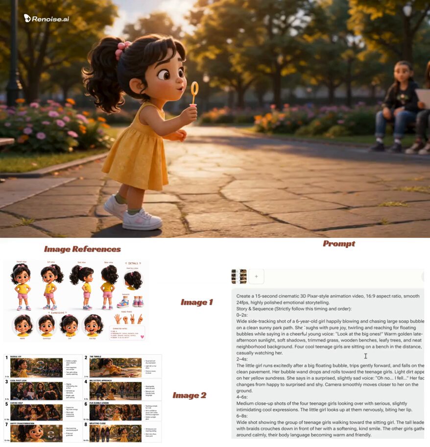
Generative video tools are excellent at motion and mediocre at holding a precise graphic style. The reliable pattern is to let each system do what it is good at: build your block render as a static plate first, then use it as the visual anchor for the motion pass.
A workable procedure:
- Generate or edit a strong hero still in the block style. This is your style reference.
- Create two or three additional block renders of the same subject from different angles so the model understands the style in three dimensions rather than from one view.
- Use the block render as the first frame for an image-to-video pass, and include the reference images alongside it.
- Write a prompt that explicitly forbids re-smoothing.
An example prompt skeleton:
Hard-edged block mosaic style, flat-shaded square tiles with visible gaps, limited palette of 16 colours, consistent top-left bevel lighting, no gradients, no photographic texture, no blur, no soft shading. Subject: [description]. Camera: slow lateral truck, locked horizon. Motion: subtle, restrained, blocks maintain their grid alignment throughout.
The phrases doing the heavy lifting are flat-shaded, no gradients and blocks maintain their grid alignment. Video models default toward smoothness, and without explicit instruction they will happily paint over your carefully built tiles with a soft, photographic surface.
Two hybrid workflows also deserve a mention. The first is plate-and-comp: render a block still, project it onto simple geometry in a 3D scene, and animate a real camera move across it. You get perfect style control and genuine parallax. The second is footage-to-blocks-to-footage: shoot or source real video, apply the block treatment to every frame, then run a light generative cleanup pass to repair edges. This is slower, but it produces the most convincing results when a subject involves complex motion like water or fabric.
Whichever route you take, keep stylization strength moderate. Pushing it to maximum usually discards your block structure in favour of the model's own interpretation.
Common Mistakes and How to Fix Them
Blocks too small to read. A 200-cell grid looks like a compression artefact, not a style. Push the grid coarser until the effect is unmistakable, then step back one increment.
Palette too large. If you cannot count the colours on two hands, the image will look dirty. Cap the palette at 16 to 32 and add accents deliberately.
Inconsistent bevel lighting. Highlights on all four sides, or shadows alternating direction, destroy the physical read. Pick one light direction and enforce it everywhere.
Grid misalignment on faces. Eyes crossing a cell boundary lose their shape. Offset the whole grid until the eyes sit inside single cells.
Over-clean source photography. Perfectly lit, finely textured stock images often quantize badly because every cell averages to the same mid-tone. Add contrast or pick a source with stronger shapes.
Gap lines that are too heavy. Thick black gaps turn a toy build into a brick wall. Keep gaps under three percent of block width.
Combining with photographic effects. Depth-of-field blur, film grain and chromatic aberration all fight the block aesthetic. Use at most one, and keep it subtle.
Skipping the temporal pass. A beautiful still sequence that flickers will be unwatchable. Always review motion at full speed, never frame by frame, before signing off.
FAQ
Is the Lego pixel effect the same as pixel art?
No. Pixel art is a hand-drawn discipline at fine grid resolutions where an artist places every cell. Block-based processing works at coarse grids and derives each tile from a source image, usually with automated segmentation plus manual clean-up on key contours.
How many colours should a block render use?
Sixteen is the sweet spot for most work. Go down to eight or ten for bold poster-style images and up to thirty-two when the subject has important skin tones or subtle sky gradients.
Can I apply it to existing video footage?
Yes, and this is one of the strongest uses. Process each frame through the same grid, palette and material settings, then add a light temporal smoothing pass to suppress flicker. Keep the palette on the lower end, because subtle colour variation between frames is the main source of shimmer.
Does it work for vertical social formats?
It works especially well there. Vertical frames are usually viewed on small screens, and the coarse grid stays legible where photographic detail turns to noise. Use a grid around 40 cells across and keep the palette tight.
Why does my render look like a bad JPEG instead of a toy build?
Almost always one of three causes: the grid is too fine, the palette is too large, or the bevel and gap pass is missing. The material pass is what makes blocks feel like objects; without it you are only looking at an averaged image.
Can block renders be printed at large sizes?
Yes, and they print better than most illustration styles because the blocks are hard geometric shapes. Export at 300 DPI, avoid upscaling the original source, and consider adding a slight paper texture to the final print file if the flat colour fields feel too clinical.
How do I keep animation from flickering?
Hold cell assignments for several frames, smooth the temporal sampling, limit the palette, and render at higher resolution than you deliver. Reviewing the sequence at full playback speed rather than scrubbing frame by frame will also help you judge what the audience actually perceives.
Do I need special software?
Any environment that lets you downsample, quantize colours and then composite highlights per cell will do the job: a raster editor with a mosaic or crystallize filter, a node-based compositor with a custom shader, or a generative image tool driven by a reference render. The technique is defined by its parameters, not by a specific application.
