

Why the Blocky Look Works in Short-Form Video
Most editing decisions today are made under brutal constraints: a phone held vertically, sound off for the first second, a thumb hovering over the scroll. In that environment, visual clarity beats visual fidelity nearly every time. A chunky, grid-based, brick-and-pixel aesthetic wins attention for reasons that have nothing to do with nostalgia and everything to do with how human eyes parse a small image quickly.
Three practical advantages stand out.
Readability at small sizes. A character built from stacked blocks has a silhouette you can identify in a 120-pixel-wide thumbnail. A photoreal character at the same size becomes a smudge. If your hook depends on the viewer recognizing an object, a creature, or a product in under a second, block geometry is doing you a favor.
Forgiveness. Generated video still struggles with hands, faces at odd angles, fine hair, and complex cloth. A blocky style converts those weaknesses into non-issues. When everything on screen is made of rectangles, a slightly odd finger reads as another rectangle. The style hides artifacts that would be fatal in a realistic render.
Distinctiveness without licensing risk. You do not need to reproduce any specific toy brand to get the effect. Voxel geometry, low-resolution sprites, isometric brick sets, and modular plastic-looking materials are all generic visual languages. Build with rounded studs if you like the reference, but for commercial work it is safer to invent your own brick proportions and call it a "modular block" or "toy-brick" look.
The rest of this guide is a working method: how to define the style, pick tools, build shots, keep characters consistent, animate plausibly, add sound, edit the sequence, and avoid the mistakes that make the whole thing look cheap.
Understanding the Lego Pixel Aesthetic
Structural simplicity meets limited resolution
The style is a fusion of two separate disciplines. Brick-based construction gives you modular geometry: everything is assembled from a small set of repeated units, which produces clean right angles, flat planes, and satisfying repetition. Pixel art gives you a constrained palette and a visible grid: hard edges, deliberate aliasing, and no soft gradients.
Merged, the result is a world that looks built rather than rendered. Volumes are simple blocks. Surfaces show stepped edges instead of smooth curves. Lighting is flat and readable. Shadows are either absent or drawn as a hard shape rather than a soft falloff. Every element feels deliberately placed.
The defining rules are consistent across every good example you will find:
- A visible or implied grid, usually 16, 32, or 64 units wide for a character or prop
- A restricted palette, often 12 to 24 colors for an entire scene
- Hard edges with no anti-aliasing at the source resolution
- Strong silhouettes that stay legible when scaled down
- Shallow depth cues: layered parallax rather than realistic depth of field
The spectrum from sprite to studded render
You do not have to pick an extreme. There is a whole gradient of looks, and consistency matters far more than which point you choose:
- Pure 2D sprite. Flat pixel characters in a flat pixel world. Cheapest, most nostalgic, hardest to move the camera in.
- Isometric sprite. Classic game perspective, great for environments, awkward for dynamic action.
- Low-poly and voxel. 3D geometry with deliberately low detail. Easy to light, easy to animate, easy to generate consistently.
- Block-built 3D. Rounded studs, plastic materials, real depth. Closest to toy photography.
- Hybrid. Block-built characters composited into a photographed or realistically rendered environment, or the reverse.
For AI-assisted production, options three and four are the sweet spot. They give you real depth, real camera movement, and a style that generative models can hold onto across many shots.
Where the style shines and where it fights you
The style is spectacular for environments, vehicles, weapons, packaging, abstract transitions, text cards, mascots, and anything that is essentially a prop. It fights you on close-up human faces, delicate hand gestures, flowing fabric, water, smoke, hair, and rapid camera movement. If your script needs a tearful close-up, either redesign the beat or accept that you are making a different kind of film.
Choosing Tools for a Block-Pixel Pipeline
Image-first beats text-first
Text-to-video is seductive and unreliable for stylized content. You can describe a block-built world perfectly and still get something sludgy and semi-realistic. Image-to-video flips the order: you control the style completely in a still image, then ask the model to move it. That single change removes most consistency problems before they start.
A practical pipeline looks like this: build or draw a keyframe, generate a short motion clip from it, review for style drift, extend or re-generate on failure, then finish in a conventional editor. The AI handles motion; you handle art direction.
What to compare across video models
Model capabilities change constantly, so evaluate on behavior rather than brand. Test each candidate on the same five clips and score:
- Style retention. Does the blocky geometry survive the motion, or does the model smooth it into realism?
- Motion coherence. Do blocks stay rigid, or do they melt and smear between frames?
- Prompt adherence. If you ask for a locked camera, do you get a locked camera?
- Frame and seed control. Can you lock a starting frame? Can you reproduce a result?
- Clip length and extension. Can you extend a shot without a visible seam?
- Resolution and aspect ratio. Native vertical output saves you a crop later.
- Audio. Some tools generate ambience or dialogue; others need a separate pass.
Widely used options include Runway, Pika, Luma's Dream Machine family, Kling, Veo, Sora, and open workflows built on Stable Video Diffusion through ComfyUI or AnimateDiff. For the blocky look specifically, image-to-video models with strong first-frame adherence tend to outperform pure text models.
A lean starter stack
You do not need much to begin. A reasonable studio of one looks like:
- Art and keyframes: Aseprite or Pixelorama for sprites; MagicaVoxel or Blender for voxel and brick geometry.
- Animation: Image-to-video generation plus a layered compositor.
- Upscaling: A dedicated upscaler for clean nearest-neighbor or AI-assisted enlargement.
- Editing: DaVinci Resolve (free tier) or any mainstream NLE; CapCut for fast social cuts.
- Sound: A chiptune-friendly DAW pass plus an AI voice tool when you need narration.
- Optional: A node-based workflow tool if you want to batch-generate hundreds of variants.
Building Your First Shot: A Step-by-Step Workflow
Step 1 — write a shot that survives low detail
Low-detail styles cannot carry subtle acting. They carry action, contrast, and composition. So write shots accordingly. One action per shot. A clear start state and a clear end state. No dialogue delivered through micro-expressions; put the emotion in posture and in what the character does.
A useful test: cover the face of your protagonist in your mind. Does the beat still read? If not, rewrite the beat.
Step 2 — design a clean keyframe
Compose the still as if it were a poster. Place the subject on a third. Keep a strong value contrast between subject and background. Use three to five shades per material at most, plus one accent color that appears nowhere else. Light with a single dominant key light plus a broad fill so shadows stay hard and readable.
If you are working in voxels or a brick builder, rotate the camera to a three-quarter angle. Straight-on views look flat; extreme angles break the grid illusion. Render at a modest resolution — 720p or even 540p — then scale up with nearest-neighbor to keep edges crisp. That preserves the essential crunch that AI models love to smooth away.
Step 3 — animate with constrained motion
Short clips work better than long ones. Two to four seconds is the practical window for a single generated action. Then keep the motion simple:
- Ask for a locked or slowly tracking camera, explicitly stating "no camera shake" and "no zoom."
- Move one object, not four.
- Prefer lateral or vertical translation over rotation; rotation is where geometry drifts.
- Request a loop if the shot will repeat in your edit.
- Animate at a stepped frame rate — 8, 12, or 15 frames per second — and hold each pose for two or three frames. This reads as intentional stylization rather than as low frame rate.
Step 4 — upscale, stabilize, and grade
Once the motion is right, upscale in two stages if needed: first a clean nearest-neighbor or integer-scale pass to lock edges, then a light AI pass only if banding or chroma noise is visible. After that, grade with your palette clamped: crush the blacks slightly, protect the accent color, and avoid heavy vignettes that read as modern camera artifacts rather than as pixel art.
Finish with grain or dithering matched to your grid size. Dithering patterns — the classic checkerboard blends between two palette colors — sell the look better than any filter.
Keeping Characters Consistent Across Shots
Reference sheets and image fusion
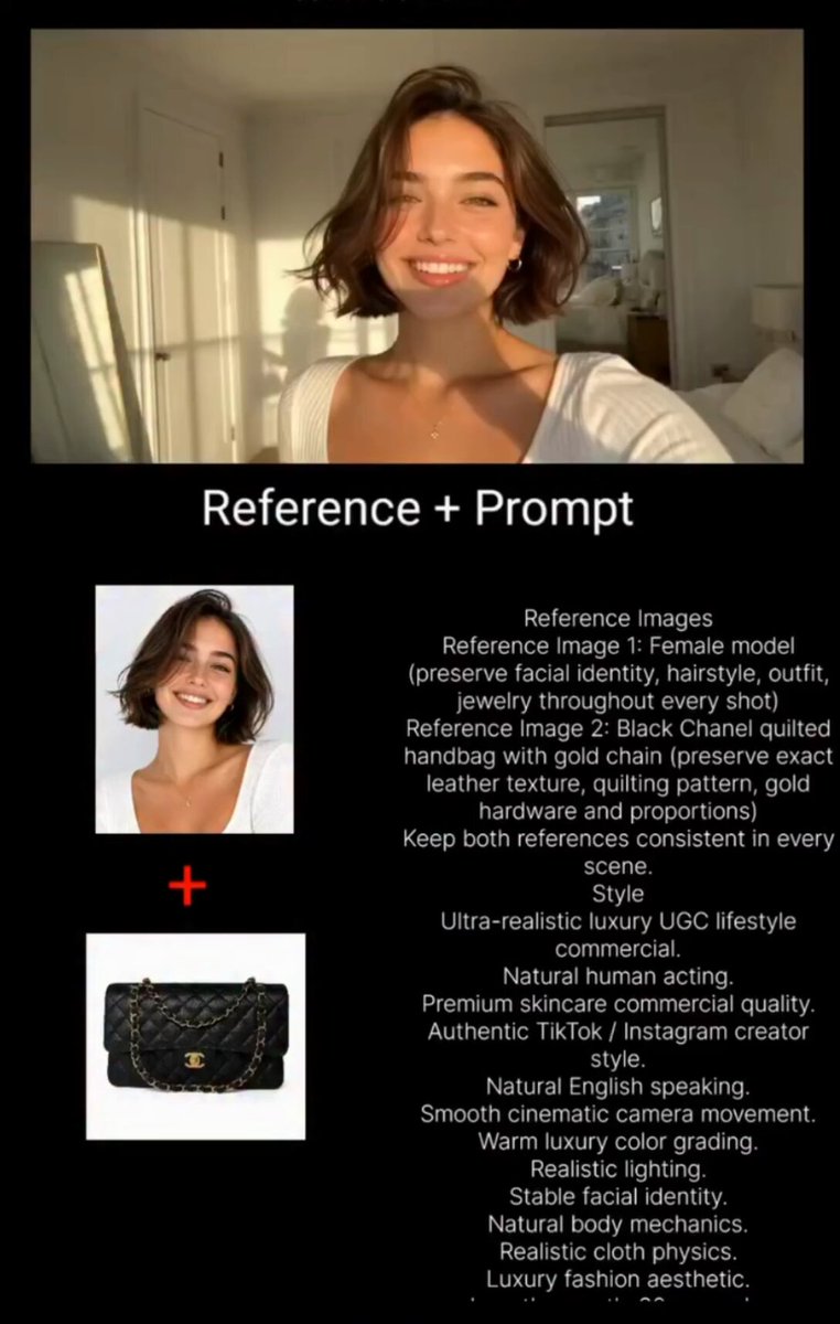
Consistency is the hardest problem in AI video, and the solution is administrative as much as technical. Build a character sheet before you shoot: front view, side view, three-quarter view, and two or three expressive poses, all in the final style. Then feed those frames as references into every generation, or composite a reference beside the scene and crop it out.
Multi-image or multi-reference features inside modern video tools are built for exactly this. Use them. Lock a seed when the tool allows it, and keep a written record of which seed produced which approved shot.
Silhouette codes and naming
Give every character an unmistakable silhouette code: a specific hat shape, a shoulder block, a tool, a color that appears nowhere else. Two blocky humanoids in similar colors will be visually interchangeable after the first cut. Also name every asset consistently — character, shot number, version — so you can find the approved take without scrubbing through a folder of files called final and final-final.
Before committing to a long project, generate a contact sheet: one frame from every planned shot, all in a grid. Style drift, palette drift, and scale drift become obvious at a glance when you are looking at twelve frames side by side rather than one at a time.
Motion, Camera, and Physics in a Block World
Real-world physics looks wrong in a stylized world. Slow, weighty, realistic motion reads as muddy when the characters are built from blocks. Instead, study classic animation principles and exaggerate them:
- Anticipation. A brief wind-up before every action, two or three frames long.
- Snappy timing. Fast out, slow in. Big poses held for an extra frame.
- Squash and stretch, but angular. Instead of deforming a body, displace individual blocks and the joints between them.
- Hinged joints. Arms and legs rotate around a single pivot; no soft deformation, no bending.
Camera language should respect the grid too. A lateral dolly across a modular set shows off the geometry. A slow push-in on a locked subject builds tension cheaply. Whip pans, handheld shake, and aggressive rack focus fight the aesthetic — they advertise a camera instead of a world.
For depth, skip realistic depth of field. Use layered parallax: foreground blocks, midground subjects, background shapes, each scrolling at a different rate. This costs nothing and looks correct.
Sound Design and Voice for Pixel Animation
Visuals get all the attention, but the audio is what makes blocky footage feel delicious instead of flat. The good news is that this genre has a natural sound palette.
Music. Chiptune and its modern descendants sit perfectly under pixel visuals: square and triangle wave leads, arpeggios, simple drums. If you are generating music with an AI tool, prompt for "8-bit chiptune, upbeat, no vocals, clean square lead." Keep the tempo aligned with your cut rhythm.
Foley. Real objects make better block sound effects than synthetic libraries. Record plastic bricks clicking together, a small box being set down, a zip, a snap. Layer three elements per impact: a click, a body, and a tail.
Voice. If characters speak, process the voice lightly — a touch of bit reduction, a small amount of ring modulation, and a narrow frequency band keep it in-genre while staying intelligible. Do not over-process narration; comprehension always wins. AI voice synthesis is fine for placeholder or even final work if you keep the performance natural and the processing subtle.
Mix. Dialogue around -12 to -8 dB relative to your music bed, music dipping under lines, effects peaking briefly but never masking speech. Loudness-normalize the final mix for social platforms rather than mixing to cinema standards.
Editing and Post-Production: Assembling the Sequence
Cut rhythm and transitions
Blocky footage rewards fast, hard cuts. A 1.5 to 3 second average shot length keeps energy high, and hard cuts feel native to the style rather than jarring. Where you need a transition, use one that belongs to the vocabulary: a grid wipe, a dissolve stepped through dithering, a block-based slide, a match cut on geometry.
Watch your cut points. Cutting on a pose change, an impact, or the brightest frame of an action makes the sequence feel deliberate. Cutting mid-drift looks accidental.
Export and delivery settings
Deliver the final at the platform's native aspect ratio — vertical for short-form, square or 16:9 for other placements. Export at a healthy bitrate, because pixel art with hard edges is exactly the kind of content that compression destroys. H.264 at a high bitrate is usually enough; if your platform accepts a better codec, use it. Keep your palette stable across the whole timeline so a color shift does not appear at a cut.
Add captions in a bitmap-style font, sized generously, placed inside safe zones. Hard-code them if you want total control over rendering — platform auto-captions will smooth your typography into a generic sans-serif and break the illusion.
Mistakes That Kill the Effect and How to Fix Them
Most disappointing blocky videos fail for one of a handful of predictable reasons.
Mixing pixel scales. A 16-unit character next to a 64-unit prop looks like a mistake, not a style. Fix: define a base unit and enforce it across every asset.
Adding realistic motion blur. Blur belongs to cameras, not to grids. Fix: disable motion blur in generation and in your editor.
Over-detailed faces. The moment a face becomes realistic, the whole scene reads as uncanny. Fix: keep faces abstract — dot eyes, a line mouth, no nose detail.
Palette sprawl. Twenty colors per object destroys cohesion. Fix: lock a scene palette before generating anything and check every frame against it.
Camera shake. Handheld movement fights the geometry. Fix: lock the camera or use a slow, deliberate move.
The wrong frame rate. Smooth 60 fps motion reads as modern and generic. Fix: animate on twos or threes at 12 to 15 fps, or apply a stepped-frame effect if you generated smooth footage.
Too much grain or glow. Both eat the crisp edges that make the style work. Fix: use dithering instead of grain, and keep bloom to a minimum.
Letterboxing pixel art. Bars around a grid-based image just look like a broken export. Fix: design the composition for the final aspect ratio from the start.
Unreadable captions. Thin pixel fonts disappear on a phone. Fix: minimum font size, high contrast, and a solid backing plate if the background is busy.
Style drift across shots. The most expensive mistake, because it usually appears late. Fix: contact-sheet reviews after every batch, and re-generate anything that strays before you edit.
FAQ
How long does a 30-second blocky AI video take to produce? For a first attempt with no existing assets, expect a few days of learning and one to two days of actual production. Once you have a character sheet, a palette, and a prompt template, a comparable piece can be assembled in a single working day. The generation itself is fast; reviewing, discarding, and re-running is what consumes time.
Do I need 3D software to get this look? No, but it helps enormously. You can build strong keyframes in a pixel editor alone, or even describe flat compositions in an image generator. Voxel or brick-building tools simply make perspective, lighting, and camera angles much easier to control, which raises the consistency of every downstream shot.
What resolution should I generate at? Start lower than you think. Generating at 540p to 720p and upscaling with nearest-neighbor preserves the crunchy edges that models like to smooth. Generating at 4K and trying to add pixel character afterwards almost never looks right.
Can I mix this style with live-action footage? Yes, and it can be very effective: blocky characters composited into a real room, or a real object inside a block world. The trick is to commit fully — match the lighting direction, keep the block elements' shadows consistent with the real ones, and avoid half-real materials on the stylized elements.
Is AI voice good enough for dialogue in this style? For short lines and stylized characters, yes, especially when the voice is processed to fit the genre. For longer narrative pieces, human performance still delivers nuance that synthesis struggles to match. A hybrid works well: AI for placeholders and secondary characters, a real voice for the lead.
How do I avoid trademark problems with toy-brick aesthetics? Use generic modular geometry, invent your own proportions and stud shapes, and describe the style as blocky, voxel, or modular rather than referencing any specific toy system. The visual language of stacked blocks is broad; specific branded proportions and logos are not.
What is the single biggest improvement I can make? Invest in your character sheet and your palette before generating a single second of motion. Nearly every consistency problem in blocky AI video traces back to skipping that preparation step. When your references are locked, everything downstream becomes faster, cheaper, and far more coherent — and you can spend your remaining time on the parts that actually make the piece memorable: timing, sound, and a punchy final cut.
