
What Lego Pixel Style Transfer Actually Does
Lego pixel style transfer rebuilds a frame as a grid of small interlocking tiles, each filled with a flat or lightly shaded color drawn from a deliberately small palette. Silhouettes stay readable, edges turn hard and chunky, and highlights become blocked rectangles instead of smooth gradients. The output reads like a sprite sheet or a brick mosaic rather than a photograph with a texture filter laid over it.
The practical difference appears in motion. A photographic filter drifts: skin texture shifts between frames, fabric weave mutates, film grain crawls. A quantized tile grid absorbs those small generative errors, because a slightly wrong pixel usually collapses into the same tile color. You are giving the model fewer places to be wrong, and the viewer fewer places to notice.
That shift also changes how you write prompts. Instead of chasing realism, you describe a construction system: tile size, palette, edge treatment, detail budget, and which regions are allowed to stay smooth. Once that system is written down, it becomes a consistency contract you can reuse for every shot in a sequence.
Why the Constraint Is the Feature
Generative video models are good at inventing plausible detail and bad at repeating it. A blocky style inverts the problem. Because the look is defined by a small number of discrete choices, identity is carried by pose, palette, and silhouette instead of micro-texture. A character can walk through a doorway, turn, and walk back, and the audience still recognizes them from the shape of the head tiles and the two-color jacket.
Why Modular, Blocky Looks Hold Up in AI Video
Temporal consistency is mostly a low-frequency problem. Big shapes such as head, shoulders, arms, and background masses need to stay put; tiny textures can flicker without most viewers noticing. Tile-based styling moves nearly all visual information into the low-frequency band, where models are already stable, and pushes high-frequency noise into intentional, hard-edged steps that look deliberate rather than broken.
There is also a practical benefit for compositing. Blocks are easy to track, easy to mask, and easy to recolor. If a jacket drifts from crimson to orange in one shot, you can correct the tile palette in a single pass instead of rotoscoping every frame. Animators who work in this style often treat color correction as a palette swap rather than a per-pixel fix, which keeps iteration fast even on long sequences.
Palette Locking as a Consistency Contract
Decide on a fixed palette before generating anything: perhaps six to twelve colors, with two or three reserved for the main character. Reference the palette explicitly in every prompt and keep a swatch image in the same folder as your reference plates. When a shot drifts, the fix is almost always to remove a competing color from the prompt rather than to reroll the entire clip.
The Core Mechanics: Tile Grids, Depth, and Reference Fusion
Three ideas do most of the work in a lego pixel pipeline: quantization into a tile grid, separation of depth planes so foreground and background tiles do not merge, and fusion of multiple reference images so a single frame inherits identity from several angles. None of these are exotic concepts. They are ordinary compositing ideas applied to generation, and they explain most of the difference between a style that holds for twenty seconds and one that falls apart after three.
Tile Quantization and Palette Locking
Tile size is a stylistic dial, not a technical one. Large tiles, roughly one fortieth of frame height, give a chunky, toy-like look that forgives detail errors and reads well on small screens. Small tiles, around one hundred twentieth of frame height, look closer to classic pixel art but demand steadier motion, because every tile edge becomes a place where shimmer can appear. Pick one grid size for the whole project and never mix sizes inside a scene.
Depth-Aware Tiling
Ask the model, or a separate depth estimator, for a depth map of each keyframe, then style the near, middle, and far planes with slightly different tile scales. Large tiles in front and smaller tiles behind create genuine parallax, which sells camera movement even when the underlying motion is simple. Without this separation, a dolly shot tends to flatten into a single wall of identical tiles moving together.
Multi-Image Fusion and Reference Plates
Most modern image-to-video tools accept several reference images at once. Use them deliberately: one for character design, one for environment, one for the palette, and one for lighting mood. When references conflict, for example a warm environment paired with a cold character key light, the model averages them into mud. Keep reference plates tonally consistent with each other and review them side by side before you generate anything.
A Practical Workflow: From Reference Plate to Final Render
The workflow below assumes you already have a still image model and an image-to-video model available, hosted or local. The order matters more than the tools: style decisions made after generation are always more expensive than style decisions made before it.
Build a Clean Reference Plate
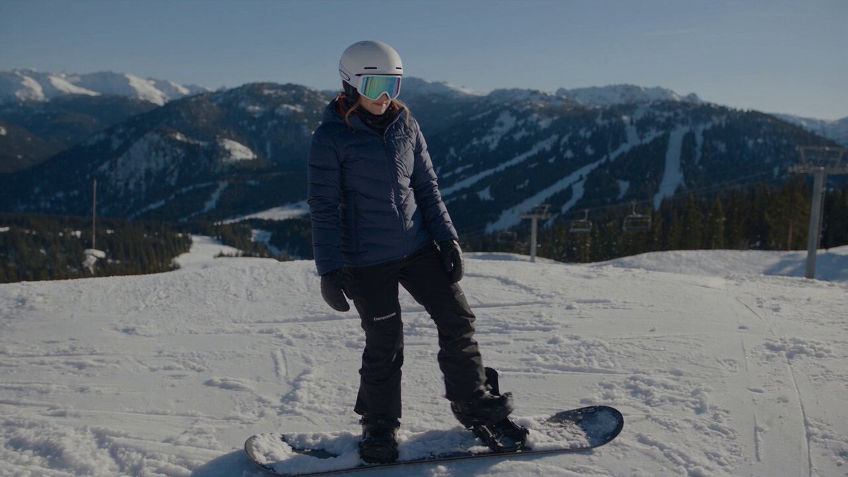
Start from a single, well-lit frame: full body, neutral pose, plain background, no motion blur. If you only have footage, pull a clean frame and remove clutter before styling. This plate defines proportion and costume. Style it once, save the result as your style anchor, and treat it as ground truth for every later shot. Keep the unprocessed frame next to the styled one so you can compare silhouettes at a glance.
Define Tile Size and Palette Before Generating Anything
Write down the grid size, the palette in hex values, and the edge rule: hard edges, no anti-aliasing, flat fills with at most one shade step. Generate three test frames of the same plate at slightly different tile densities, view them at final output size, and choose. Changing tile size halfway through a sequence is the single most common cause of a style break that cannot be repaired in post.
Run a Single-Frame Style Test
Before animating, convert five to ten stills from different scenes into the target style and lay them side by side. If the character looks like a different person in shot four, the prompt or the palette is ambiguous. Fix it now. A mismatch that takes a minute to spot in stills will take hours to notice in motion, and by then you will have many more frames to correct.
Lock Identity With Keyframes
Generate animation in short segments, each beginning from a locked keyframe. Reuse the same seed and the same reference plate for every segment, and re-inject the character reference at each segment boundary. For dialogue or close-ups, generate a dedicated face keyframe and hold it slightly longer than the body motion. Faces are where quantization hurts readability most, since eyes and mouths are already tiny at typical tile densities.
Extend Motion in Short Segments
Four to six seconds per generation is a comfortable working length. Overlap each new segment by roughly half a second with the previous one so you can cut on a shared frame or cross-dissolve across matching tiles. Keep camera moves simple: slow push-ins, lateral tracks, and locked-off shots survive tiling best, while fast whips and handheld shake produce tile crawl that looks like compression damage.
Composite, Scale, and Finish
Assemble segments in an editor, then apply one shared finishing chain: a slight sharpen to crisp the tile edges, a mild bloom on highlights, and a grain layer applied after scaling so the tiles stay clean. If you plan to upscale, do it after compositing so the upscaler sees the full frame and does not invent its own tile structure on top of yours.
Prompt Patterns for Consistent Lego Pixel Shots
A reliable prompt has four parts: the construction rule, the palette, the subject, and the camera. Keep the first two identical in every prompt of a sequence, and vary only the last two. This sounds restrictive, but it is exactly what allows a ten-shot sequence to feel like one film.
Construction: blocky tile mosaic, hard edges, flat fills, no anti-aliasing,
visible grid of interlocking squares, limited palette of eight colors
Subject: courier in a two-tone jacket, chunky pixel silhouette,
readable from a distance
Camera: slow lateral track, locked horizon, shallow parallax
between foreground and background
Negative prompts do the other half of the job: photographic realism, smooth gradients, soft focus, motion blur, film grain, detailed fabric texture, text, watermarks. Add texture-specific negatives when a shot drifts, and remove them once the model over-corrects into flatness. Negative prompts are a tuning knob, not a permanent setting, so keep a short log of which phrasing fixed which problem.
Consistency Toolbox: Masks, Control Maps, and Anchors
The tools below are generic and available in most modern generation stacks. You rarely need all of them at once; you need the two or three that address the specific instability in front of you.
- Depth maps: keep foreground and background tiles on separate planes so parallax stays readable.
- Edge or line control maps: preserve costume seams and architectural lines that quantization would otherwise smooth away.
- Pose skeletons: hold body language steady across segment boundaries, especially during turns.
- Region masks: exclude faces, hands, and signage from heavy stylization so they remain legible.
- Seed reuse: the cheapest consistency tool available; reuse it whenever the composition is close.
- Palette swatch references: a single image that forces color drift back toward the intended range.
- Motion brushes or trajectory controls: useful for directing a single element without re-generating the whole frame.
When two tools disagree, trust the one that affects the silhouette. A viewer forgives a slightly wrong highlight far more easily than a character whose shoulders change shape between shots.
Common Failure Modes and How to Fix Them
| Symptom | Likely cause | Practical fix |
|---|---|---|
| Tiles shimmer or crawl | Tile size too small relative to motion speed | Increase tile size or slow the camera move |
| Palette drifts toward brown | Too many competing color words in the prompt | Trim to the locked palette and remove mood lighting terms |
| Face becomes unreadable | Quantization applied to small features | Mask the face and style it at a larger tile scale |
| Background fuses with subject | No depth separation | Add depth conditioning and reduce background contrast |
| Style breaks at a cut | New segment started without the anchor frame | Re-inject the styled keyframe at every boundary |
| Edges look jagged and noisy | Upscaling before compositing | Composite first, then sharpen and scale once |
Two patterns sit behind most of these rows. The first is inconsistency in the instruction, meaning the construction rule changed quietly between prompts. The second is inconsistency in the source, meaning two reference plates disagreed about costume, lighting, or proportion. Both are cheaper to fix at the still stage than in a finished timeline, so build a habit of checking the anchors before every long generation run.
Finishing: Sound, Compositing, and Motion Polish
A blocky visual style pairs well with crisp, high-contrast audio. Foley that is slightly exaggerated, short reverbs, and simple musical textures match the graphic look better than dense orchestral scoring. If you are generating sound alongside picture, keep the same discipline you applied to visuals: fix a small palette of sounds, such as three to five recurring effects, and reuse them across the project so the audio identity is as stable as the tile grid.
In the edit, resist the urge to add effects that soften the tiles. Motion blur, heavy glow, and texture overlays undo the crispness that makes the style readable, and they reintroduce exactly the high-frequency detail that caused flicker in the first place. A short list is enough: one sharpen pass, one subtle bloom, one grain layer at low opacity, and a consistent output encode for every segment.
Choosing Tools and Planning Render Budgets
When you evaluate tools, score them against the style rather than against general realism benchmarks. A model that produces beautiful photographic motion may still be the wrong choice if it cannot hold a limited palette across five seconds.
- Reference support: can it accept several images at once, including a palette swatch?
- Control inputs: does it accept depth, edges, or pose without demanding a heavy setup?
- Segment length: how long can a single generation stay stable before drift appears?
- Determinism: can you reuse a seed and get a near-identical starting point?
- Resolution paths: does it offer a clean way to iterate at low resolution and finish high?
- Batch behavior: can you queue many short tests cheaply instead of one long expensive run?
Plan the work as small iterations rather than long renders. Twenty short tests at low resolution will teach you more about a style than a single polished four-second clip, and the lessons transfer directly to the final pass. Budget time for the compositing stage as well, since assembly, palette correction, and finishing often take as long as generation itself on a tightly styled sequence.
FAQ
Is lego pixel style transfer the same as a pixel art filter?
No. A filter processes an existing frame after the fact, while style transfer shapes how the frame is generated in the first place. Generation-time styling gives you control over silhouette, palette, and depth separation, which is why it holds together far better across a moving shot than a post-process effect.
How long should each generated segment be?
Four to six seconds is a practical default. Shorter segments are easier to keep stable and to cut together, while longer segments save assembly time but accumulate drift. If a shot needs to run longer, overlap segments and cut on a matching frame rather than pushing a single generation past its stable range.
Why does my palette keep shifting between shots?
Usually because the prompt describes lighting moods rather than a color list. Replace phrases such as warm sunset glow with explicit palette references and a swatch image. Contrast-heavy lighting terms pull the model toward gradient blends, which conflict with the flat fills the style depends on.
Should I animate first and stylize later?
It can work for very short clips, but it is fragile. Stylizing after generation means the model has already committed to detail the style will discard, and any frame-to-frame texture difference remains visible. Generating in style from the start keeps those decisions consistent across the whole sequence.
How do I keep a character recognizable across many shots?
Combine three anchors: a styled full-body plate, a styled face keyframe, and a fixed palette. Re-inject all three at every segment boundary, and keep costume details simple enough that they survive quantization. Distinctive shapes, such as a wide hat or an asymmetric jacket, survive far better than subtle facial features.
What resolution should I work at?
Iterate low and finish high. Test prompts and tile densities at a small size where the tiles are still visible at roughly final viewing scale, then render the approved version at the delivery resolution and composite from there. This keeps experimentation cheap without sacrificing the crispness that makes the style work.
