
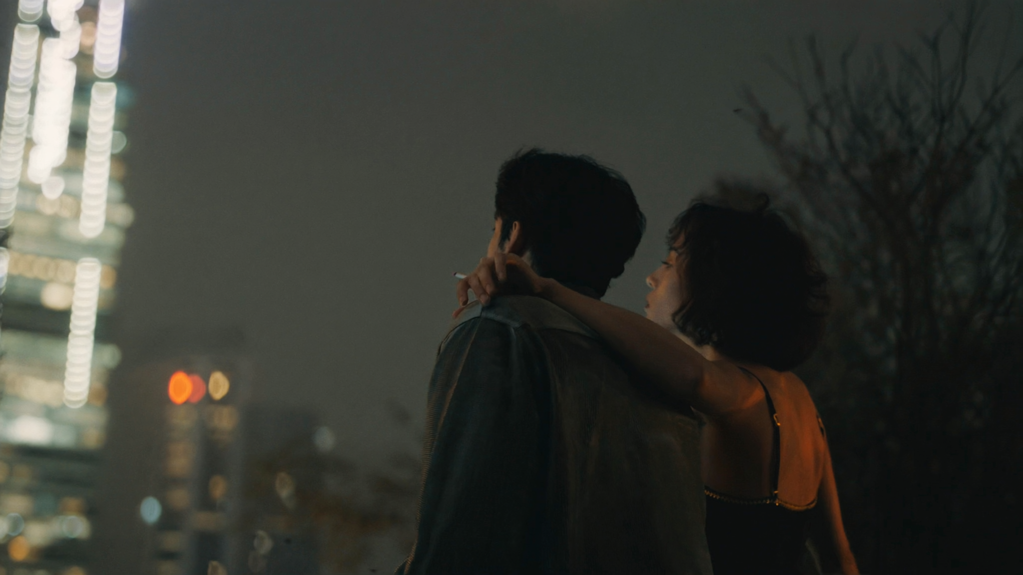
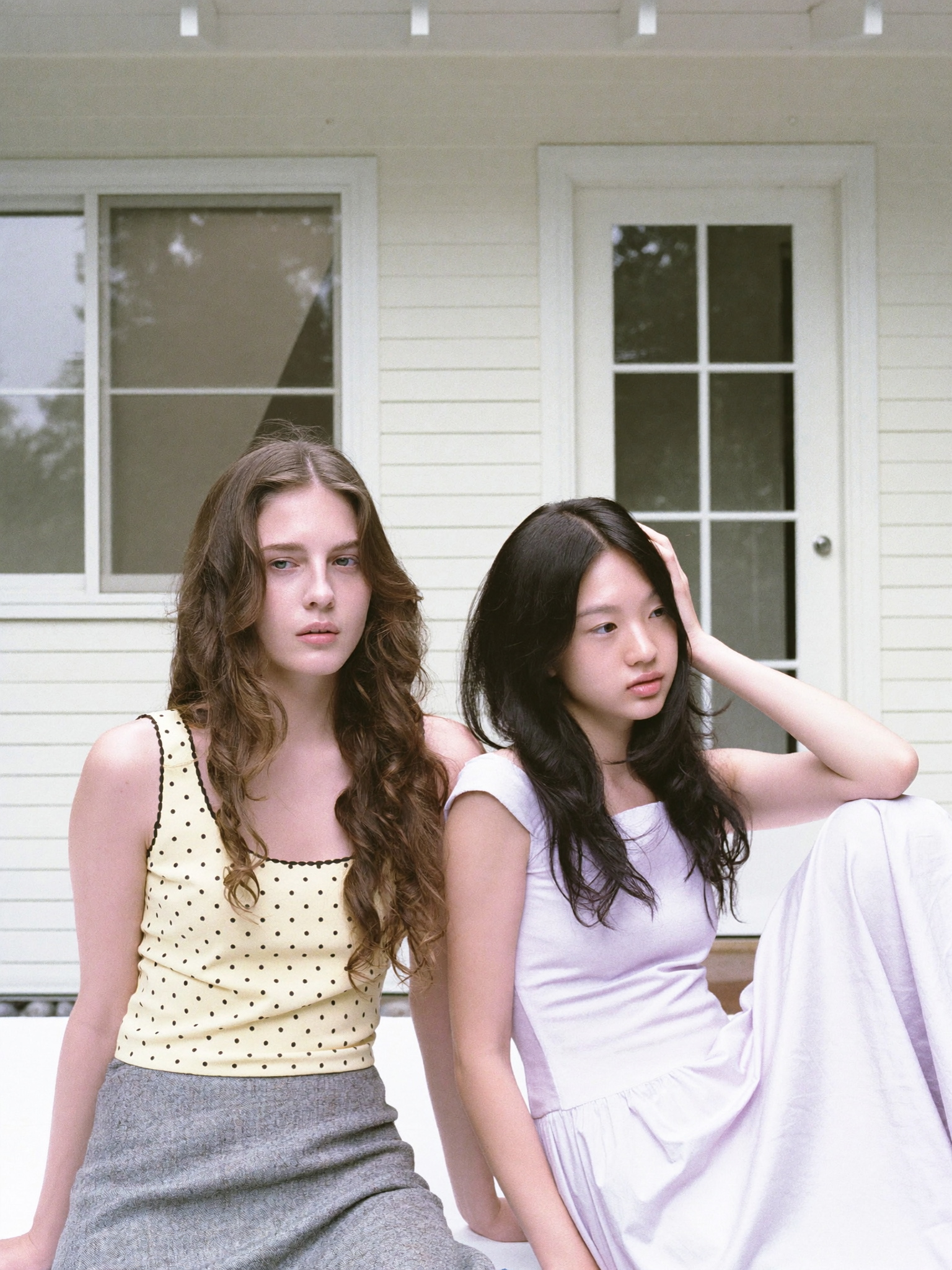
Photorealism is more than high resolution
Ask someone what a photorealistic AI image is and they will usually say "an image that looks like a photo." That is true, but it is also incomplete. Photorealism is not a resolution target. It is a set of physical cues that convince the human eye that a picture could have been captured by a camera. Light interacting with surfaces, materials reflecting their environment, depth of field matching the lens, subtle noise and grain where a real sensor would produce it.
This distinction matters because it changes how you work. If you treat photorealism as a resolution problem, you will keep upscaling and keep being disappointed. If you treat it as a physics problem, you will fix the actual causes: prompts that describe light and materials, references that anchor the scene, and workflows that preserve detail instead of adding artifacts.
This guide explains what separates photorealistic AI images from merely realistic ones, why AI images fail the test, and how to improve your output step by step.
Photorealism vs realism: a useful distinction
In everyday language the two words overlap. In practice, they point at different standards.
A realistic image gets the basics right: the object has the correct shape, the colors are plausible, the composition is coherent. It reads as "a picture of something."
A photorealistic image goes further. It reproduces the sub-pixel details that a camera sensor captures without thinking: the specular highlight on a wet surface, the micro-contrast at the edge of a shadow, the way a fabric reflects the color of the light source, the slight blur where the lens loses focus. These cues are small individually, but together they decide whether an image feels like a photograph or like a painting pretending to be one.
The practical test is simple: if you zoom in and the details hold up, if the light behaves consistently across the frame, if the texture responds to the surface, the image passes. If you notice the "AI look" — waxy skin, warped geometry, inconsistent shadows — it fails, regardless of resolution.
Why AI images fail the photorealism test
Most AI-generated images fail on the same small set of issues. Knowing them helps you catch problems before you spend time fixing the wrong thing.
Inconsistent lighting. The light in the background does not match the light on the subject. Shadows point in different directions. The model paints plausible patches but does not always unify them into one physical scene.
Anatomy and geometry. Hands, ears, fingers, and anything repetitive are weak points. Chairs with extra legs, reflections that do not align, text that warps. These errors break the illusion immediately.
Materials that do not behave. Skin looks plastic, metal lacks reflections, water looks like gel. A photorealistic image must respect how each material reflects, absorbs, and scatters light.
Over-smoothing. AI tends to produce clean, averaged surfaces. Real photos contain noise, grain, and micro-detail. Removing that texture is what gives images the smooth "generated" look.
How to improve your image quality
Improvement comes from controlling the generation, not from hoping for better luck.
Write prompts about physics, not adjectives. Instead of "beautiful portrait", describe the light, the lens, and the environment: "portrait lit by soft window light from the left, shallow depth of field, shot on a 50mm lens, natural skin texture, subtle film grain." The model has far more to work with when you specify observable properties instead of subjective judgments.
Use reference images. A single strong reference of the lighting style, the material, or the composition anchors the output. For series or products, build a small reference set and reuse it.
Use negative prompts for known failure modes. If your outputs consistently show plastic skin or warped hands, exclude those explicitly. Negative prompting is not magic, but it reduces the frequency of common artifacts.
Control the lens and camera language. Mention focal length, aperture, and camera position. "Shot on 35mm, f/1.8, eye-level" produces a different image than "wide angle from above" even with the same subject.
Upscale and refine in passes. Generate at a solid base quality, inspect the details, then upscale with a good upscaler rather than asking the model for maximum resolution in one step. A detail pass can add the micro-texture that makes the difference.
Keep consistency with multi-image fusion. When the same character or product must appear across several images, fuse multiple references into the generation. This preserves identity across the set instead of regenerating a slightly different version every time.
A practical workflow for photorealistic images
- Define the scene physically: time of day, light source, weather, materials, camera position.
- Gather or generate references: 1-3 images that establish the look.
- Write the prompt: subject, lighting, lens language, materials, grain and noise.
- Generate and inspect at 100%: check hands, edges, reflections, and text.
- Iterate on the weakest element: change one thing at a time, not the whole prompt.
- Upscale and finish: preserve detail with a dedicated upscaler, then apply final color adjustments.
Where photorealistic AI images are used
- Marketing and advertising: product shots without a photo studio, campaign visuals in consistent style.
- E-commerce: catalog images that match a product's real look, lifestyle scenes for listings.
- Film and VFX: concept art, pre-visualization, and background plates that match a live-action scene.
- Architecture and real estate: realistic renders of spaces before they are built.
- Individual creators: album art, thumbnails, and personal projects that need a professional finish.
The physics checklist for every image
Before generating, run the scene through this mental checklist. Each item is something the human eye checks automatically:
- Light source: Where is it? What quality? If the subject is lit from the left, the background should respond from the left too.
- Material behavior: Metal reflects, skin scatters, water refracts. Does the surface in the image respond like the material it claims to be?
- Depth of field: What is in focus and why? A portrait with a sharp background feels off unless the lens choice explains it.
- Contact and grounding: Does the object sit on the surface, or does it float? Shadows should anchor objects to the ground.
- Micro-texture: Zoom in. Is there grain, noise, or surface detail, or is everything airbrushed smooth?
- Color temperature: Is the white balance consistent across the frame? Mixed lighting is possible, but it should look intentional.
Use this checklist every time. It turns "I do not know why this looks fake" into a specific, fixable diagnosis.
Prompt patterns that work
Here are patterns that reliably push output toward photorealism. Adapt them to your subject.
Portrait:
"Close-up portrait of a woman in her 40s, natural skin texture with visible pores, soft window light from the left, shallow depth of field, shot on 85mm lens at f/1.8, subtle film grain, realistic catchlights in the eyes"
Product:
"Studio product shot of a leather wallet on a concrete surface, single softbox from above, sharp focus on the texture, slight reflection on the surface, muted color palette, shot on 100mm macro lens"
Architecture/interior:
"Sunlit modern living room, floor-to-ceiling windows, morning light casting long shadows, realistic wood grain, fabric texture visible on the sofa, shot with a wide 24mm lens, natural color temperature"
The common thread: every phrase names an observable physical property. Light quality, lens, material, texture, and grain are the vocabulary of photorealism.
The iteration loop that fixes weak images
When an image is close but not photorealistic, do not rewrite the whole prompt. Change one variable at a time:
- Identify the weakest element with the checklist (usually lighting or material).
- Fix that one element in the prompt or in the reference.
- Regenerate and compare against the previous version.
- Repeat until the image passes the zoom test.
A disciplined loop beats a lucky prompt every time. Log what changed between versions so you can reproduce the winning combination.
Building a tool stack for image quality
You do not need one giant tool. You need a small stack with clear jobs:
- Image generation model: your main engine. Choose based on how well it handles materials and lighting, not just resolution.
- Reference management: keep your character sheets and style frames organized so every generation starts from the same identity.
- Upscaler: a dedicated upscaler preserves detail better than asking the generator for maximum resolution.
- Color pass: final grading in any photo editor corrects the small color imbalances that break the illusion.
Learn one tool per job and master it. The stack is more reliable than a single all-in-one.
A quick glossary for photorealistic prompting
These terms appear constantly in model documentation and prompt guides. Knowing them saves time and confusion:
- Specular highlight: the bright spot where a light source reflects off a shiny surface. It sells the material.
- Depth of field: the range of distance that appears sharp. Controlled by aperture in real cameras.
- Bokeh: the aesthetic quality of the blur outside the focus area.
- Grain: the fine texture of film or sensor noise. Its absence is a common cause of the "AI look".
- Color temperature: measured in Kelvin; warm light is orange, cool light is blue.
- Catchlight: the reflection of a light source in the eyes, which makes portraits feel alive.
Add these words to your vocabulary and your prompts will read like a photographer's notes rather than a wish list.
What to expect from different model families
Different models have different strengths when it comes to photorealism:
- Photorealistic-first models (often the newer flagship releases) handle materials and lighting well and are the safest default for product and portrait work.
- Generalist models produce good results but need more prompt discipline; expect to iterate more on lighting and texture.
- Stylized models are great for illustration and animation but should be avoided when the goal is photographic trust.
- Fast and budget models are fine for test shots and drafts, but do not judge your final quality from them.
Match the model to the trust level the image needs. A thumbnail can survive a stylized look; a product page cannot.
The honest bottom line
Photorealism is a process, not a setting. The same model can produce generic or photorealistic images depending on how you write the prompt, choose the references, and inspect the output. Build the checklist, keep the iteration loop tight, and the quality will follow. Master the physics vocabulary — light, materials, lens, grain — and you will stop chasing lucky outputs and start producing them deliberately.
FAQ
Q. What is the fastest way to notice a big improvement?
A. Describe the light. Most AI images fail because the lighting is generic or inconsistent. Specify a source, a direction, and a quality for the light in every prompt.
Q. Do I need a special tool for photorealism?
A. No. The model matters less than the prompt, the references, and the inspection loop. The same model can produce generic or photorealistic results depending on how you use it.
Q. Why do hands still look wrong in many images?
A. Hands are small, complex, and repetitive, which is exactly what generative models struggle with. Generate more variants, use negative prompts, and inspect closely before using an image.
Q. Is photorealism always the goal?
A. No. Many projects need stylized or illustrative looks. Photorealism is the right target when the image must be trusted as a representation of something real: products, spaces, people, or historical scenes.
Q. Is there a shortcut to photorealism?
A. The closest thing to a shortcut is a good reference image. A photo that already has the lighting and mood you want is worth a hundred prompt tweaks.
Q. Does photorealism require a high-end GPU?
A. No. Generation happens in the cloud. What matters is your workflow: prompt discipline, references, and a solid inspection loop.
Q. Why do my images look "too clean"?
A. Over-smoothing is a common AI default. Add grain and micro-detail explicitly in the prompt or in post, and resist heavy upscaling that erases texture.
