
Photorealism Is a Pipeline Problem, Not a Prompt Problem
Most people searching for how to make photorealistic AI images are really asking the wrong question. They assume there is a magic phrase, a secret model, or a hidden toggle that converts a synthetic render into something indistinguishable from a photograph. In practice, photorealism is the output of a chain of decisions: which model you choose for this specific shot, how precisely you describe light, how you lock identity across multiple frames, what you do after the first generation, and how ruthlessly you reject output that is merely close.
That chain is what this guide covers. It is written for people producing real work — advertising stills, product shots, editorial portraits, game key art, storyboard frames, social campaigns — where the image has to survive inspection on a large screen or a phone at arm's length. The advice applies whether you are generating a single hero image or a sequence of twenty shots that need to look like they came from the same camera on the same afternoon.
The core reframe is this: a photorealistic image is not a picture of a thing. It is a picture of light bouncing off a thing, captured by a specific lens, recorded by a specific sensor, and later graded by a specific colorist. Once you start generating the physics instead of the object, quality jumps immediately.
Choosing the Right Generation Tier for the Shot
Different shots need different engines. Using a heavyweight model for a rough composition pass is slow and expensive in attention; using a lightweight model for the final hero frame guarantees you will be fighting mush in the fine detail. The skill is matching the tier to the job.
Diffusion-first versus video-derived frames
Text-to-image diffusion models are still the most direct route to a single sharp still. They were trained to produce one frame, so they spend all their capacity on that frame. Use them for portraits, product photography, textures, and anything where the camera is static.
Video models become useful when the image needs to imply motion, when you need a physically plausible sequence of poses, or when you want a frame that looks like a genuine screen capture from a moving camera. Pulling a still from a short generated clip often gives you motion blur, sensor behavior, and micro-imperfection that pure still models smooth away. The trade-off is resolution and control: you get realism cues, but you inherit whatever framing the clip decided on.
A practical hybrid: block the shot in a still model, confirm composition and lighting, then reproduce the approved look as a short clip and extract the best frame. You keep the control of the still and borrow the physicality of the video.
Fast tiers versus quality tiers
The single biggest time saver in any generation workflow is a two-stage pass. Stage one runs on a fast, low-fidelity tier purely for composition, silhouette, and color blocking. You will throw away nine out of ten of these. Stage two runs the approved composition on a high-fidelity tier with a locked description and reference inputs.
Treat the fast tier as a sketchbook and the quality tier as the final render. People who skip the sketch stage end up doing ten expensive renders to find a composition they could have found in thirty seconds.
A simple selection matrix
- Product and packshot work: prioritize models that handle hard specular highlights, glass, metal, and clean typography spaces.
- Human portraits: prioritize models with strong skin texture, pore-level detail, and reliable hand and eye anatomy.
- Environments and architecture: prioritize models with coherent perspective, straight verticals, and believable depth haze.
- Stylized-real hybrids: prioritize models that hold a consistent grade rather than drifting into either cartoon or uncanny realism.
- Motion-implying action frames: prioritize a video-derived frame over a still model.
Building a Prompt Stack: Light, Lens, Material, Moment
Prompt length is not the goal. Structural clarity is. A good photorealistic prompt reads like a shot description written by a cinematographer, not a paragraph of adjectives.
Light is the single highest-leverage variable
If you change one thing about your prompting, change how you describe light. Almost every "AI-looking" image fails because the lighting is generic — an even, sourceless illumination that exists nowhere in the real world.
Name the source, its size, and its direction. A large soft source slightly behind the subject's left shoulder produces a very different image from a small hard source at eye level. Add the consequence: where does the light fall, what does it graze, what does it fail to reach? A face lit by a window on a rainy afternoon has soft directional fill and cool color; the same face lit by a bare bulb has a hot falloff and a hard nose shadow.
Useful vocabulary to have in rotation: softbox, beauty dish, bounced daylight, practical lamp, overcast ambient, rim light, bounce card, negative fill, golden-hour backlight, bare strobe.
Lens and sensor language
Camera language does more work than most people expect. Specify focal length, aperture, and distance because these three numbers determine perspective compression, depth-of-field, and how much of the background reads as context.
An 85mm at f/1.8 from two meters gives you a flattering portrait with a creamy background. A 24mm at f/8 from half a meter gives you a distorted, environmental, everything-in-focus look. Both are "a person," and they are completely different images.
Add sensor behavior when it matters: full-frame versus medium format, ISO noise in low light, subtle lens vignetting, and the specific rendering of skin under high ISO. These details are what make viewers unconsciously accept an image as a photograph.
Materials, micro-detail, and the value of imperfection
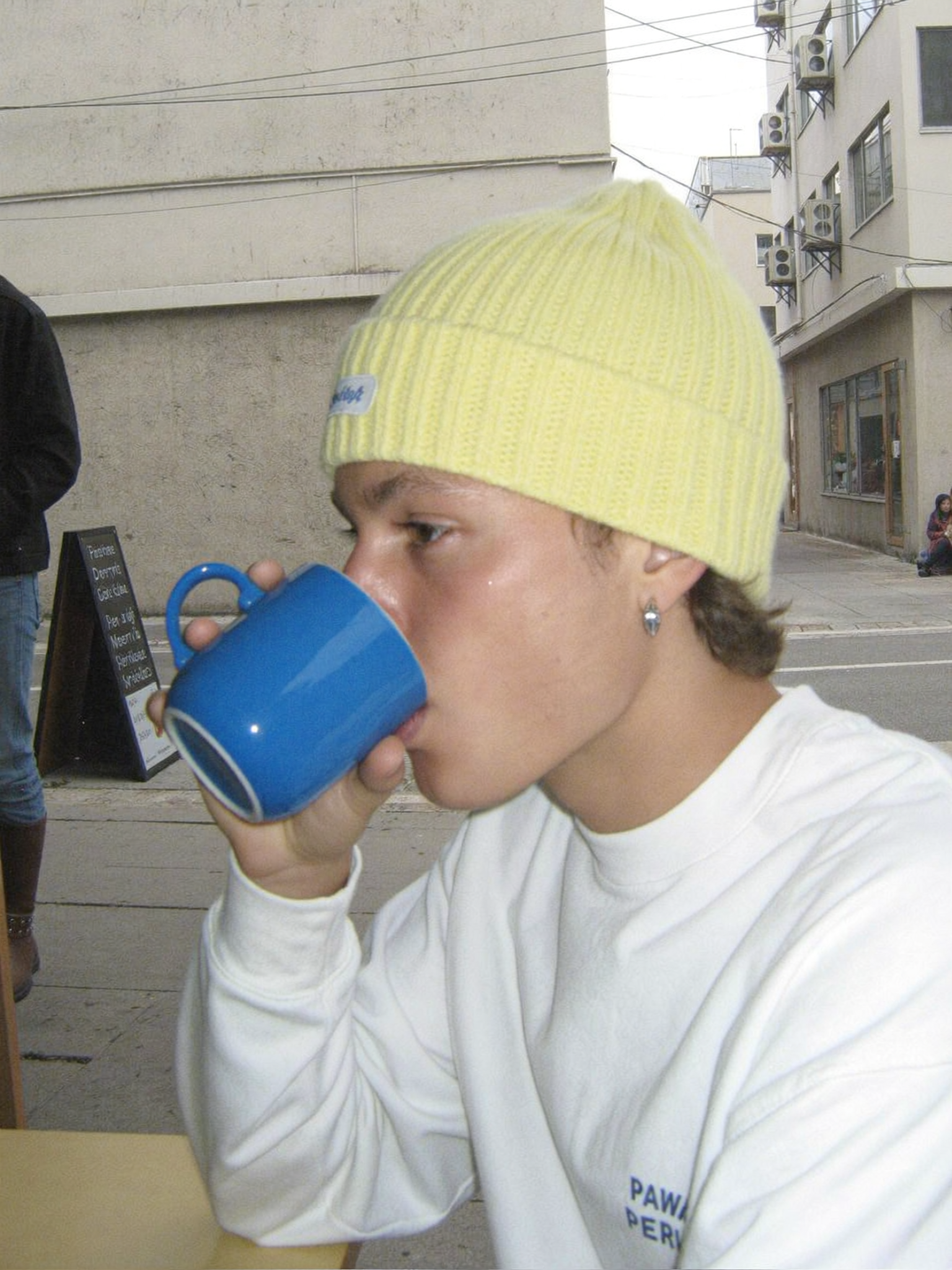
Human eyes are trained to spot the absence of entropy. Perfectly smooth skin, spotless surfaces, and unblemished fabric read as synthetic. Real photographs are full of tiny failures: a stray hair crossing the cheek, dust on a lens element, a fingerprint on glass, slightly asymmetric eyebrows, creases where fabric folds against a chair.
Describe one or two imperfections per image, not ten. A single well-placed flaw — a wisp of hair out of place, condensation on a cold glass, scuffed leather on a shoe — does more for believability than a list of twelve.
Describe the moment, not just the subject
Finally, anchor the image in a specific instant. "Mid-blink," "caught mid-turn," "hands still in motion," "the second before she laughs" all push the model toward a candid frame rather than a posed render. Candid framing is one of the strongest realism signals available, because studio-perfect posing is exactly what most synthetic images default to.
Reference Images and Character Consistency Across a Set
A single convincing image is a demo. A set of convincing images of the same person, product, or location is a deliverable. Consistency is where most workflows break.
Identity locks that survive multiple shots
Start by generating a reference sheet rather than a finished image. Create five to eight angles of the same subject under neutral lighting: front, three-quarter, profile, back, close-up of the face, and a full-body frame. Choose the two or three that best capture identity, and treat those as canonical references for every subsequent generation.
When you generate a new shot, feed the canonical reference alongside the new scene description. The model then solves a constrained problem: keep this face, change the environment. Without a reference, every generation re-invents the face, and no two images will match.
Multi-image fusion without the uncanny smear
Combining several reference images is powerful but easy to overdo. Feeding six references usually produces a blended, slightly generic face — the statistical average of everyone in the set. Two or three strong, mutually consistent references outperform six mediocre ones.
Keep hair, wardrobe, and lighting descriptions identical between shots unless the scene genuinely changes them. If the story moves from day to night, change the light and keep everything else fixed. Consistency comes from changing one variable at a time, exactly as it does on a real shoot.
Wardrobe, props, and continuity notes
Write continuity notes the way a script supervisor would. Note the jacket color, the collar state, which wrist has the watch, the exact shade of the wall behind the subject. Store these notes next to the reference images and paste them into every prompt. This single habit eliminates most of the drift people blame on the model.
Camera Control and Motion: Stealing Frames From Video Models
Some realism cues are almost impossible to prompt into a still model but come free with a video generation.
Keyframes, first and last frame control
First-frame and last-frame control is one of the most useful features in modern generation tools. You supply a starting image and an ending image, and the model produces plausible motion between them. For stills, this is a way to manufacture a naturally blurred, mid-action frame: set the first frame to a neutral pose and the last frame to the extreme of the action, then extract a frame from the middle.
This technique is especially strong for sports, dance, and combat imagery, where the audience expects motion blur, weight, and slight anatomical asymmetry that still models rarely produce.
Lens and movement presets
Panning, dolly-in, crane, and handheld presets add camera personality. A subtly handheld frame reads as documentary; a locked-off tripod frame reads as commercial. Choose the camera behavior that matches the genre of the final image, then extract the frame that best expresses it.
When not to use video
If your final deliverable needs 6K plus sharpness with no motion artifacts, a video extraction will usually cost you more time in cleanup than it saves. Use video for realism cues, stills for resolution and product accuracy. Most professional pipelines lean on both, each in its proper place.
Post-Processing: The Last Twenty Percent That Sells the Image
Raw generations are usually 80 percent of the way there. The final 20 percent is what separates a convincing image from an obviously synthetic one, and it happens after generation.
Upscaling and detail recovery
Upscale in stages rather than one large jump. A 1.5x to 2x upscale with a detail-preserving model keeps skin and fabric texture intact; a 4x jump in one pass tends to invent plastic-looking micro-texture that screams artificial. After upscaling, apply a light detail pass only to areas that need it — eyes, hair strands, fabric weave — and leave smooth regions alone.
Grain, halation, and chromatic aberration
Real photographs have optical and sensor artifacts. Adding film grain, a touch of halation around bright highlights, faint chromatic aberration at the frame edges, and a whisper of sensor noise will do more for believability than any prompt tweak. Keep each effect subtle. If you can clearly see the grain as a texture, you have used too much.
Color grading and delivery specs
Grade the image as a whole. Photographs have a unified color temperature and a consistent contrast curve; synthetic images often have mismatched highlights and shadows. Pull the grade toward a specific environment — cool window light with warm practical lamps, or flat overcast with slightly lifted blacks. Then deliver in the right container: sRGB for web, Display P3 or Adobe RGB for print, and 16-bit intermediates if you still intend to work on the image later.
A Repeatable End-to-End Workflow
This is the sequence that produces consistent results without wasting generation time.
- Write the shot brief. One paragraph: who or what, where, when, what lens, what light, what moment. No prompt language yet, just the photographic intent.
- Sketch on a fast tier. Generate six to ten low-fidelity compositions. Ignore texture quality entirely. Pick the best silhouette and framing.
- Lock identity. Generate or select your reference images. Store them with continuity notes.
- Build the prompt stack. Structure it as: subject, wardrobe, pose and moment, environment, light source and quality, lens and aperture, imperfection, camera behavior.
- Run the quality tier with the approved composition, references, and locked description. Generate three to five variations rather than one.
- Select against the checklist in the next section, not against personal taste alone.
- Repair targeted problems. If the hands fail, regenerate with cleaner hand framing rather than trying to paint them in. If the background is wrong, use an inpainting pass with the exact environment description.
- Upscale in stages and recover detail selectively.
- Add optical artifacts — grain, halation, vignette — and apply a unified grade.
- Archive the prompt, references, and settings next to the final file. Reproducibility matters when a client asks for a matching shot next month.
Quality Control: How to Judge Photorealism Objectively
Taste is unreliable when you have been staring at the same image for an hour. Use a checklist instead.
- Light logic: can you identify every light source and predict the direction of the shadows? If a source is unaccounted for, the image will feel wrong even if viewers cannot say why.
- Shadow consistency: shadows on the face, walls, and floor must agree about where the light is coming from.
- Depth of field: the falloff should be continuous and physical, matching the stated aperture and distance.
- Skin and surface texture: pores, fine hair, fabric weave, and slight unevenness should be present but not exaggerated.
- Anatomy under occlusion: hands, ears, and hair edges are where models fail. Check any partially hidden body part.
- Optical artifacts: are grain, vignetting, and edge softness consistent across the frame?
- Grade unity: do highlights and shadows share one color temperature logic?
- The squint test: shrink the image to thumbnail size. If it reads as a photograph at thumbnail scale, the global light and grade are working. If it only reads well at full size, the composition is carrying it and the light is not.
The squint test is the fastest filter you have. Most bad generations fail it immediately.
Common Mistakes and How to Fix Them
Overlong, adjective-stuffed prompts. Fix by rewriting as a shot brief with nouns and technical terms instead of emotional descriptors. Three precise sentences beat forty vague ones.
No reference images across a sequence. Fix by building a canonical reference sheet before generating anything that needs to match.
Chasing a perfect first generation. Fix by generating in batches of three to five and discarding freely. Iteration is cheaper than repair.
Fixing errors with more prompt text. If a specific area is wrong, use inpainting on that region with a clean, focused description. Global prompt changes often break what was already correct.
Over-smoothing in post. Fix by keeping grain subtle and avoiding aggressive denoise or beauty filters. The airbrushed look is the fastest way to lose the photographic read.
Ignoring the environment's light. Fix by describing interior and exterior light sources explicitly, including where the camera is standing relative to them.
Inconsistent grade between shots in a set. Fix by developing one grade and applying it identically, or by extracting the grade from the approved hero image and matching it.
Treating resolution as realism. A 4K image with baked-in plastic texture is less convincing than a sharp 1080p frame with correct light and grain. Prioritize physics over pixels.
FAQ: Photorealistic AI Images in Practice
How many generations does a professional-quality still usually take? For a simple portrait, expect ten to twenty total attempts across sketch and final tiers. For a complex scene with hands, reflective surfaces, and multiple characters, thirty or more is normal. The sketch stage absorbs most of that count.
Do I need a different model for every shot type? No. Most producers settle on two or three reliable models: one for people, one for products and hard surfaces, and one video model for action frames. Rotating through dozens of engines creates inconsistency, not quality.
Why do my images look AI-generated even though the prompt is detailed? Almost always because the lighting is generic and the image lacks optical imperfection. Fix the light description and add subtle grain and halation before rewriting the subject description.
How do I keep the same character across many images? Canonical reference images plus frozen continuity notes. Change one variable per shot, never more. If the face drifts, your reference set is too large or internally inconsistent.
Is video-derived frame extraction worth the extra step? Yes for action, sports, and documentary-style moments. No for packshots, flat-lay product work, or anything requiring maximum resolution with zero motion artifacts.
How much post-processing is too much? If a viewer can identify the effect — visible grain, obvious vignette, plastic skin — you have crossed the line. Every adjustment should be invisible in isolation and noticeable only in its absence.
What is the fastest way to improve an existing AI image? Regrade it and add optical artifacts. Correct light logic, a unified color grade, and subtle grain will improve an average generation more than another twenty attempts at the same prompt.
Can I use AI images commercially? That depends on the model's license terms and your jurisdiction, and it varies by engine and by the type of content. Check the specific terms of the tool you use and keep records of your generations, references, and edits.
The through-line across all of it is simple: think like a photographer with a viewfinder, not like a person typing into a search box. Decide the light, choose the lens, lock the identity, then clean up what physics could not provide. Do that consistently and photorealism stops being a lucky accident and becomes a repeatable craft.
