
Photorealism Became the Baseline, Not the Bonus
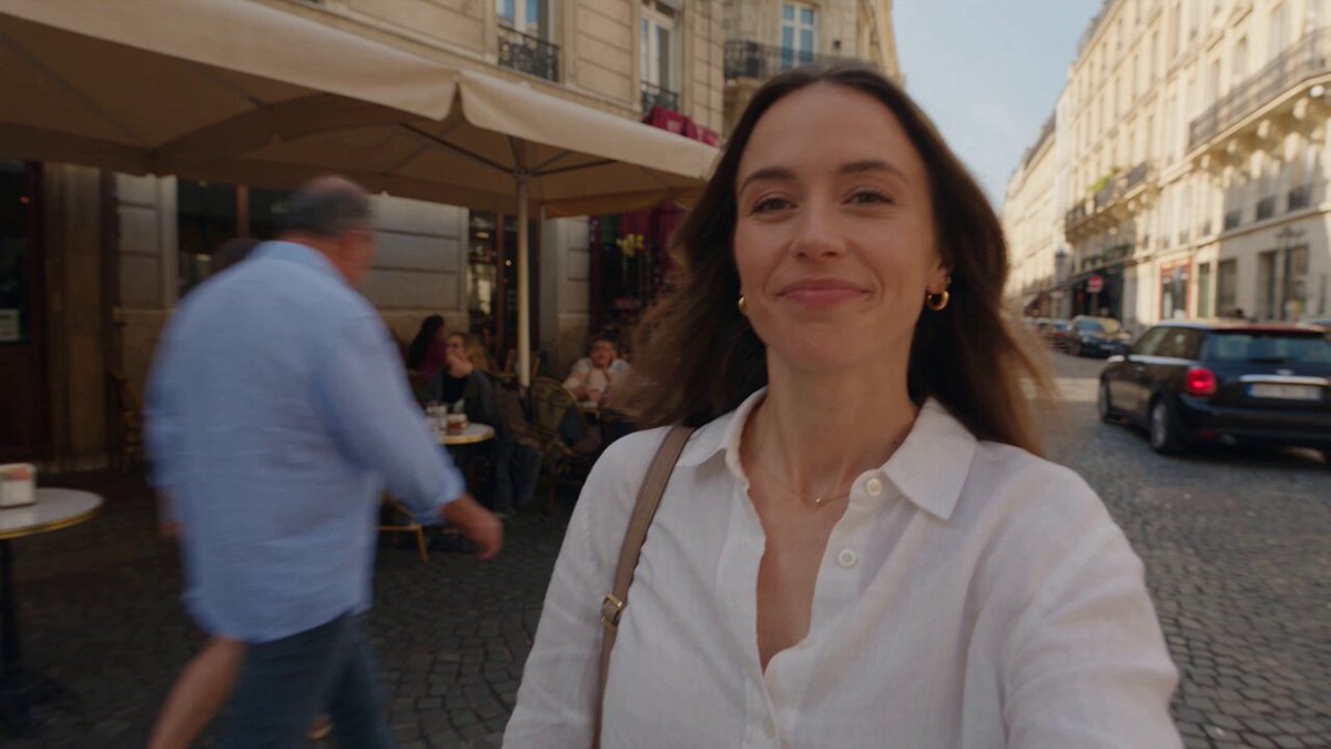
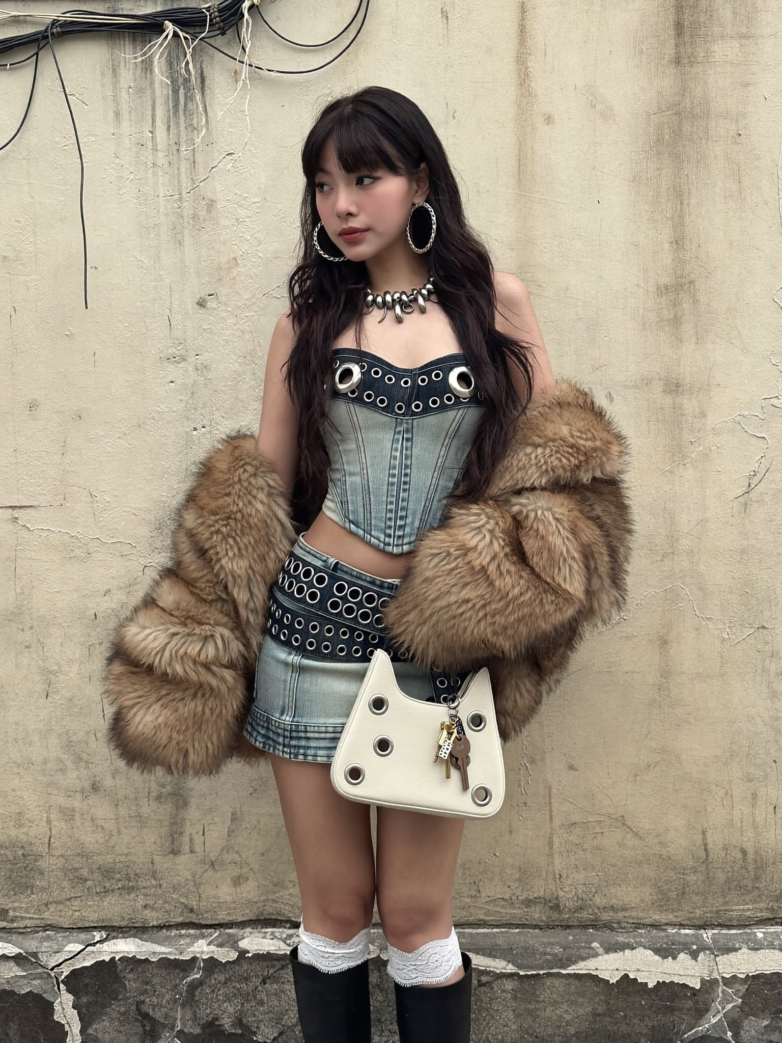
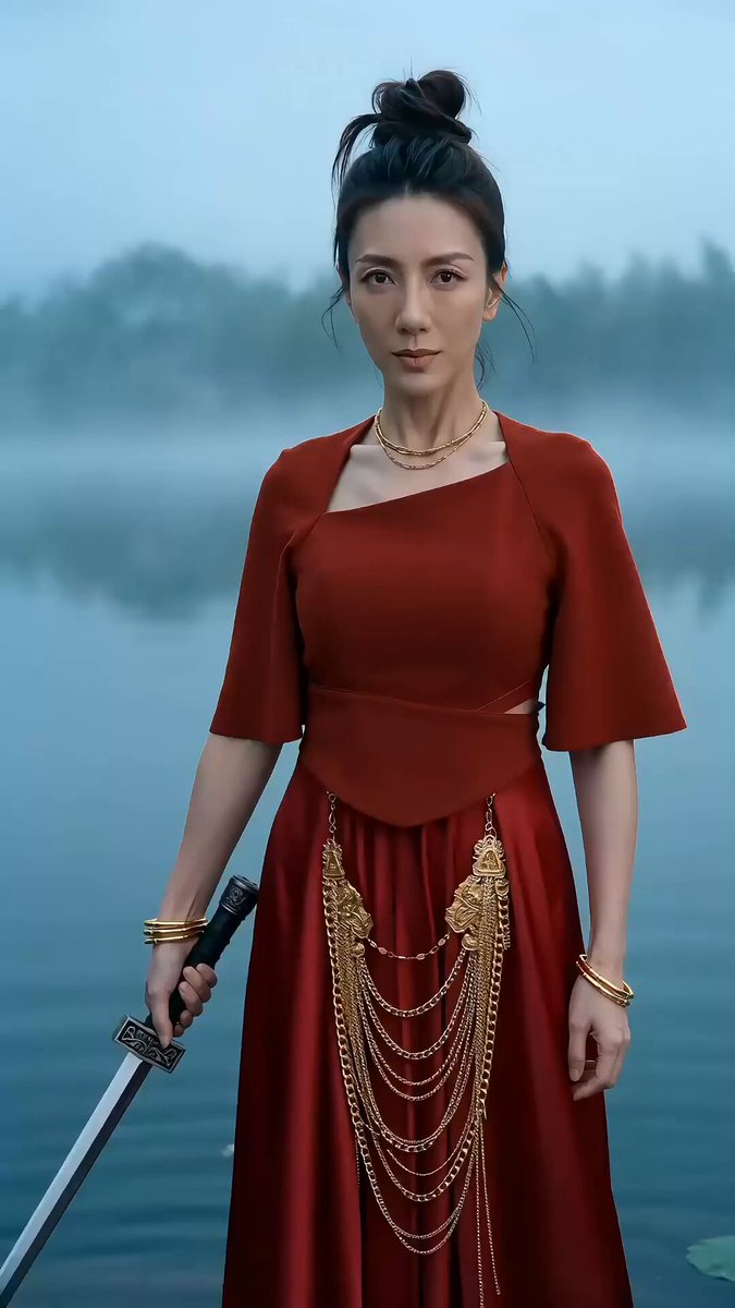
For years, AI-generated imagery carried a signature. Viewers learned to spot it in a second: waxy skin, melting fingers, backgrounds that dissolved into fog, and that unmistakable hyper-smooth sheen that read as "computer-made" no matter how dramatic the composition was. That era is effectively over. Modern diffusion and transformer-based image models, paired with better sampling, sharper upscaling, and far stronger prompt adherence, produce stills that survive close inspection — pores, fabric weave, lens flare, skin oil, dust suspended in a light beam.
The practical consequence is that photorealism is no longer a novelty you show off. It is the entry requirement for commercial work. If a generated image will sit next to a photograph on a landing page, inside a product carousel, or in a fifteen-second vertical ad, it has to pass the squint test: does it look like something a camera could have captured?
This guide is a working method, not a demo reel. It covers how to choose models, how to write prompts that behave predictably, how to hold a character or product consistent across dozens of images, how to hand stills off to motion, and how to catch the failure modes that still slip past casual review. Everything here applies whether you are producing one hero image or a two-hundred-asset campaign.
What Actually Makes an AI Image Look Real
Realism is not one property. It is a stack of cues your eye checks in a specific order, and when any single cue fails, the whole image reads as synthetic even if everything else is flawless.
Skin, hair, and micro-imperfection
Real skin is uneven. It has visible pores, fine facial hair, slight redness across cheeks and knuckles, asymmetric features, and specular highlights that break up as they move across the T-zone. Most models default to smoothing because smoothed faces score better on aesthetic benchmarks. You have to push back with explicit vocabulary: "visible pore texture," "fine facial hair at the jawline," "natural skin shine with slight unevenness," "documentary-style, no beauty retouching." Words like "flawless," "perfect skin," and "smooth" are actively harmful — they tell the model to do the exact thing that breaks realism.
Light that behaves like light
A render stops looking real when light stops obeying physics. Be precise about four things: the source (window, softbox, overcast sky, practical lamp), the direction (45 degrees camera-left, backlit, top-down), the quality (hard, soft, diffused), and the falloff (how quickly shadows go dark). Vague lighting words like "cinematic" produce a look, not a physically plausible scene. Specify the source and let the model derive the mood.
Lens language and depth of field
Depth of field is one of the strongest realism signals available to you. A 35mm lens at f/2 renders a scene very differently from an 85mm at f/1.4. Say which one you want. Include the format — full-frame, medium format, or phone sensor — because sensor size changes how much background blur you get at the same aperture. If you want the slightly imperfect focus of a real shoot, add "slight focus miss on the left eye" or "focus on the shoulder, subject slightly soft."
Sensor artifacts and color science
Real cameras add character: fine luminance grain, mild chromatic aberration at high-contrast edges, halation around bright highlights, and a highlight rolloff that clips gracefully instead of flatlining. Asking for "subtle film grain," "mild lens flare," or "highlight bloom around practical lights" gives the image the texture of a captured moment rather than a rendered one.
Choosing the Right Model for the Shot
No single model wins every category. The fastest way to improve output quality is to stop using one model for everything.
General-purpose photoreal models
These handle the widest range: people, environments, objects, mixed scenes. They are the right default for exploration because they follow prompts broadly and produce usable results without heavy tuning. Their weakness is consistency — ask for the same character twice and you may get two different people.
Cinematic and style-tuned models
Style-tuned checkpoints bake in a look: anamorphic framing, teal-and-orange grading, shallow depth of field, period film stock. They are excellent for hero images and mood boards because the aesthetic is already solved. Use them when the look matters more than the literal prompt adherence, and accept that they will fight you on unusual compositions.
Specialized models for faces, products, and interiors
Face-specialist models deliver much higher fidelity on close-ups and portraits. Product models understand hard-surface geometry, reflections, and label typography. Interior and architecture models handle straight lines, perspective grids, and window light correctly — a category where general models frequently produce warped walls and impossible corners.
When to composite instead of generate
If a shot requires readable text on packaging, an exact logo placement, or perfect symmetry, generate the scene and composite the precise element in an editor afterward. Fighting a model for typography wastes hours that a ten-minute edit solves.
Prompting for Predictability
A good prompt is not a poem. It is a spec sheet written in the order a camera crew would discuss the shot.
The five-slot structure
Use this order every time: subject, action or pose, environment, lighting, capture. For example: a 40-year-old ceramicist, hands wet with clay, mid-turn at the wheel; a small studio with north-facing windows; soft overcast daylight from camera-left; 50mm lens, f/2.8, full-frame, fine grain. Each slot answers a question the model would otherwise invent an answer to.
Constraints that actually change output
Not every adjective matters. Test your vocabulary and keep only what visibly changes results. In practice, the high-leverage phrases are about texture, light direction, focal length, and imperfection. Low-leverage phrases are emotional abstractions: "beautiful," "stunning," "masterpiece." They mostly burn prompt weight.
Version your prompts
Save prompts as text files with a version number beside each generated batch. When a client picks image #37 of 200, you need to know exactly which prompt, model, and seed produced it. Teams that skip this step end up unable to reproduce their own best work three weeks later.
A Repeatable Eight-Step Image Workflow
1. Define the deliverable before generating anything
Write down the aspect ratio, resolution, crop-safe areas, and where the image will live. A vertical ad and a website hero have almost nothing in common. Getting this wrong is the most expensive mistake in the entire process.
2. Assemble references
Collect 5–15 reference images: lighting references, wardrobe references, pose references, texture references. Group them by what they communicate. References reduce ambiguity far more efficiently than additional prompt words.
3. Draft the base prompt
Write the five-slot prompt once, cleanly. Resist the urge to stack modifiers — long prompts frequently collapse into mush.
4. Run a cheap exploration batch
Generate a wide set at low resolution with different seeds. You are looking for composition and lighting, not detail. Delete aggressively. Most strong projects are built on a brutal first cull.
5. Lock the strongest candidate
Pick one image and treat it as the anchor. Note its seed, model, and prompt version. Everything downstream will reference it.
6. Refine with image-to-image
Use the anchor as an input at moderate strength, then correct specifics: hand position, background clutter, expression. This is where most of the quality gain happens.
7. Upscale and grade
Upscale in two stages rather than jumping straight to maximum resolution, which tends to invent detail. Then apply a light grade — contrast curve, subtle color balance, and a touch of grain that matches the scene's lighting.
8. Package with metadata
Store the prompt, model, seed, and edit history alongside the final file. Future you will need it for a variant request.
Holding Characters and Products Consistent
Consistency is the hardest problem in AI image production and the one clients notice immediately.
Identity anchoring with reference sets
Build a small reference pack: one neutral front portrait, one three-quarter view, one profile, one full body, one in motion. Feed the pack when generating new scenes and describe immutable traits explicitly — hairline, eye color, face shape, distinguishing marks. Avoid restating variable traits like clothing or expression, which invites drift.
Keyframe trees for sequences
For narrative work, generate a keyframe rather than a final image. A keyframe establishes pose, framing, and lighting in a form you can reuse as input for the next shot. Chain keyframes left to right across a scene and the sequence holds together far better than generating shots independently.
Product consistency: geometry first
For products, start from a clean reference of the item and describe materials precisely: brushed aluminum with a matte anodized finish, not just "metal." Reflections should match the environment you have described, not a generic studio. If a label is involved, plan the composite from the start.
Handing Stills Off to Motion
When a photorealistic image becomes the first frame of a video shot, realism gets a second examination — usually a harsher one.
Plan first and last frames
Decide where the shot begins and where it ends before generating motion. If you can produce or select both endpoints, the model has far less room to improvise, and the result is steadier.
Motion prompts that stay believable
Describe camera movement and subject movement separately and modestly. "Slow dolly in, subject turns head slightly, curtain moves in the breeze" outperforms dramatic instructions that force the model to invent large-scale motion. When in doubt, request less movement — subtle motion reads as real, and overstated motion reads as generated.
Check for temporal artifacts
Watch at quarter speed and look for four things: identity drift across frames, hands changing shape, background textures that crawl, and lighting that shifts without motivation. Fix at the frame level rather than re-rolling the whole clip.
Common Failure Modes and Their Fixes
Plastic skin. Caused by beauty-retouching bias plus smoothing words. Fix: add texture vocabulary, remove "perfect" and "flawless," lower the denoising strength on refinement passes.
Melted hands and fingers. Still the most common artifact. Fix: frame hands out of shot, put them in pockets or behind objects, or generate at higher resolution and refine hands in a targeted inpainting pass.
Warped architecture. General models struggle with straight lines. Fix: use an architecture-specialized model or add explicit lens and perspective language, then correct in an editor.
Unmotivated lighting. The subject looks lit by one source, the background by another. Fix: name a single dominant source plus at most one fill, and describe the shadow direction.
Over-sharpened output. An aggressive upscale pass creates crunchy edges. Fix: upscale in stages, then re-introduce grain to soften the digital edge.
Color drift across a series. Different batches come back with different white balance. Fix: apply one shared grade to the entire set instead of grading image by image.
A Pre-Publish Quality Checklist
Before an image leaves your hands, check: skin has visible texture at full zoom; highlights roll off rather than clip; shadows contain detail; hands and hair edges are clean; the perspective lines converge; the light direction is consistent across every element; there is no accidental text; the eyes have a catchlight from a plausible source; and the figure sits correctly in the scene's focus plane. Then shrink the image to thumbnail size and check it again. If it still reads as a photograph at 200 pixels wide, it will survive almost anywhere.
Iteration Speed and Resource Discipline
Photorealistic work is an iteration game, and iteration discipline separates professionals from hobbyists. Three habits matter most.
First, explore cheap and finish expensive. Use low-resolution batches for composition decisions and spend high-resolution passes only on images you have already chosen. Second, keep a personal library of prompts, references, and grades that worked. A reusable lighting recipe saves more time than any single model upgrade. Third, batch your review. Generating fifty images and reviewing them in one sitting produces more consistent selections than reviewing five images at a time across a week.
Track your hit rate honestly. If one in twenty generations is usable, your prompt structure needs work. A well-tuned workflow should land closer to one in four for exploration and near one in one for refinement passes with a locked anchor.
FAQ
Do I need a different model for every project? No. Most teams settle on two or three: a general photoreal model, a cinematic model for hero shots, and one specialist depending on their niche. Depth comes from prompt structure and reference packs, not from constantly switching tools.
How do I stop faces from looking AI-generated? Remove smoothing language, add texture language, use portrait-capable models for close-ups, and check the image at 100% zoom. If the skin has no visible pores at full resolution, it will read as synthetic on a large screen.
Why does the same prompt give different results later? Model versions change, and sampling is stochastic. Save seeds and version numbers, and keep a local copy of anything you might need to reproduce.
Is it better to generate at high resolution directly or upscale? Generate at moderate resolution first, then upscale in stages with light grain applied afterward. Direct high-resolution generation is slower and often invents detail that does not hold together.
How many reference images should I use for a character? Five to eight well-chosen references covering different angles work better than thirty near-identical ones. Variety across angles matters far more than volume.
What is the biggest realism mistake beginners make? Over-describing mood while under-describing light, lens, and texture. Cinematic is a feeling; "soft window light from camera-left, 85mm at f/1.8" is an instruction the model can actually execute.
Can generated stills be used as video first frames reliably? Yes, with discipline: keep motion modest, plan both endpoints where possible, and inspect at reduced playback speed for identity drift and texture crawl.
Where to Focus Next
Photorealism is a craft built from small correct decisions rather than one big trick. Choose models for the shot rather than out of habit. Write prompts in the order a camera crew would plan a scene. Build reference packs so characters and products survive across dozens of images. Refine with image-to-image instead of re-rolling from scratch. Grade the whole set together so nothing drifts. And before anything ships, zoom in, then zoom out, and ask whether a viewer would ever suspect it was not captured.
Do those things consistently and the question stops being whether AI images look real. It becomes what you want to shoot next.
