


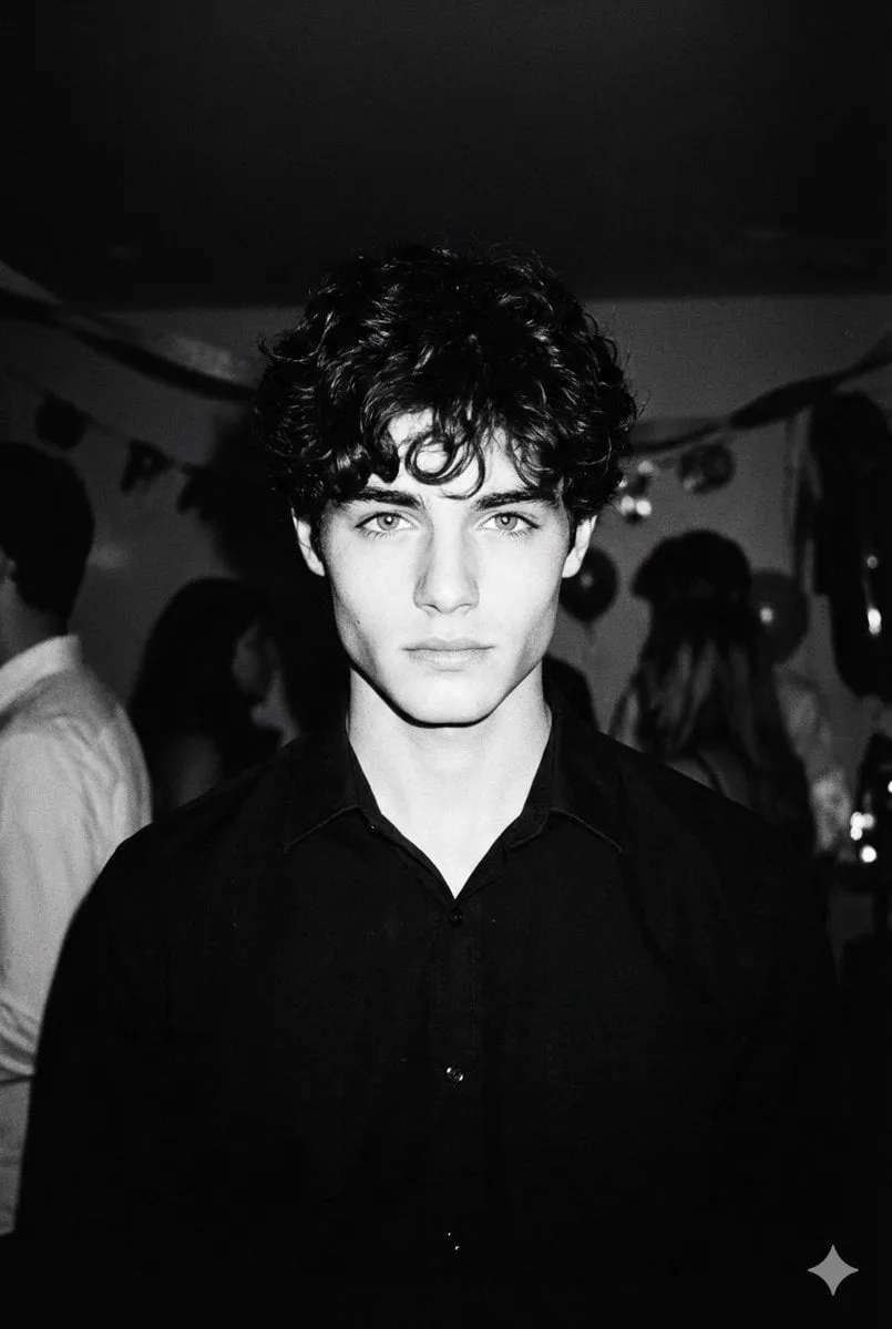
Photorealistic images used to be a rendering problem: enough samples, enough polygons, enough patience. Today the models are good enough that the bottleneck has moved. The challenge is no longer producing one convincing frame — it is producing twenty frames that belong to the same world, at the resolution and aspect ratio the job actually requires, with no visible seam between a shot made this morning and one made three days later.
That shift changes what skill looks like. A strong operator is not someone who knows a secret phrase that unlocks realism. They are someone who can diagnose why a frame reads as fake, decide whether the fix belongs in the prompt, the reference set, the motion controls, or the finishing pass, and repeat that decision across an entire sequence without losing the look.
This guide lays out that process from start to finish: how realism actually works, how to choose and test tools, how to prompt and stay consistent, how to move from stills into controlled motion, and how to finish and deliver work that holds up at full size.
Why photorealism has become a workflow problem
A couple of years ago the interesting question was which system rendered skin most convincingly. That question is largely settled. Several tool families now produce skin, glass, metal, and foliage at a level where a casual viewer cannot separate the result from a photograph at first glance. What is not settled — and probably never will be fully automated — is consistency.
Take a typical commercial job: eight product images, three lifestyle shots with a model, and a six-second loop for a landing page. If every image is generated as a standalone hero piece, the set falls apart. The light comes from a different direction in shot three. The model's jawline changes. The marble surface shifts from honed to polished between two frames that will sit side by side on a page. Each image may be excellent on its own; the set is still unusable.
That gap between a good image and a good set is where most wasted time hides. Realism in isolation is a demo. Realism across a set is a deliverable, and it depends on decisions that have little to do with the model: a written brief, a reference library, a continuity document, a locked camera-and-lens language, and a quality-control pass done at full zoom rather than at thumbnail size.
The economics are straightforward. Generation is cheap and getting cheaper, so the scarce resources are selection and inspection. A team that generates two hundred frames and reviews them carelessly loses to a team that generates forty, inspects each one at full size, and knows exactly which five decisions to change when something looks wrong.
Failure points that survive good models
- Identity drift. Faces, hands, and hair edges change subtly between frames of the same person.
- Lighting mismatch. Two shots in the same sequence disagree about where the sun is.
- Physics breakdown. Reflections, contact shadows, and overlapping objects stop making sense.
- Delivery damage. A correct image is destroyed by aggressive sharpening, heavy compression, or the wrong aspect ratio.
What a production-ready workflow contains
A brief that fixes tone and audience, a reference library of ten to thirty borrowed images, a one-page continuity document, a reusable prompt template, a review checklist, and a written delivery spec with resolution, aspect ratio, and file format. None of these are glamorous. All of them are cheaper than a reshoot.
The four pillars of believable realism
Realism is not the same thing as detail. A hyper-detailed render with waxy skin and impossible shadows reads as fake within half a second. Believable output comes from four properties working together, and when something looks wrong, it is almost always one of these four failing rather than a shortage of resolution.
Light that behaves like light
Light has a source, a direction, a quality, and a colour. It falls off with distance, bounces off nearby surfaces, and leaves highlights only where a surface actually faces the source. Frames that fail here usually have flat, sourceless illumination: everything evenly lit, no shadow anchor, no reason for contrast to exist. Naming one or two light sources per scene forces the system to commit to a direction and fixes more problems than any other single change.
Optical logic
Real photographs are made through glass. They have a focal length, an aperture, a plane of focus, some vignetting, and a little barrel or pincushion distortion. When a frame has infinite depth of field, perfectly straight lines, and no falloff at the corners, the eye reads it as computer-generated even if every material is perfect. Specify a plausible lens and aperture, and accept the small imperfections that come with them.
Material honesty
Skin has pores, fine hairs, and uneven tone. Fabric has weight, weave, and a behaviour when it folds. Metal reflects its surroundings; ceramic scatters light slightly below the surface. Prompts that ask for flawless, uniform surfaces produce plastic. Prompts that name a real material — brushed aluminium, unglazed stoneware, oiled walnut — produce something the eye can recognise as physical.
Contextual imperfection
Real cameras capture dust motes, slight motion blur, sensor grain, condensation, fingerprints, and imperfect framing. These imperfections are not noise to be removed; they are evidence that a physical process happened. A small amount of grain and a believable depth of field do more for realism than another round of upscaling.
Diagnosing which pillar failed
Before touching a prompt, ask which of the four is broken. Flat light means pillar one. A background that is sharp when it should be soft means pillar two. A plastic face means pillar three. A frame that is technically clean but feels synthetic usually means pillar four. Fixing the right pillar takes one attempt; guessing across all four takes twenty.
Choosing and benchmarking a generation tool
Tool choice matters, but less than most people assume. The differences that count are not on the marketing pages; they are in how each system handles your specific subject. Build a small benchmark before you commit a project to anything.
Build a five-prompt benchmark
Write five prompts that represent your real work, not the easiest case. A portrait with tricky hair. A product on a reflective surface. A wide interior with mixed daylight and artificial light. A close-up with hands. A frame containing a short line of text. Run all five through three or four candidate systems with identical settings.
Score with a fixed rubric
Score each result from one to five on six criteria: skin and hair, hard materials, foliage and fabric, hands, legibility of text, and how easily the composition can be steered. Keep the scores in a simple spreadsheet. Ten minutes of structured comparison saves hours of fighting a system that simply does not handle your category well.
Cloud, local, or hybrid
Browser-based tools win on iteration speed and require no hardware. Local generation wins when you need volume, batch experiments, or strict control over where your inputs live. A hybrid setup is often the most practical: explore and select in the browser, then run large batches or sensitive material on your own machine. Choose based on throughput and data policy, not on ambition.
Specialists beat generalists for narrow jobs
Most production pipelines end up using three or four different systems rather than one. A general image model for concepts, a portrait-focused system for faces, an inpainting tool for repairs, and a separate upscaler for the final pass. Deciding which stage each tool owns prevents the common mistake of trying to fix an inpainting problem with better prompting.
Prompt architecture that survives close inspection
The five-part skeleton
Write every prompt in the same order: subject and action, environment, lighting, optics, finish. For example: a middle-aged ceramicist shaping a bowl, in a dusty workshop at dusk, single warm window light with cool shadow fill, 50mm at f/2, visible clay dust and slight grain. Fixed order stops you forgetting the elements that separate a photograph from a render, and it makes prompts comparable across a project.
Lighting vocabulary that changes pixels
Vague lighting words produce generic images. Replace them with physics. Instead of vague praise such as beautiful lighting, write a single softbox from camera left, a three-quarter backlight from a doorway, overcast window light with no fill, or low sun raking across the floor. Naming direction and quality gives the system something specific to solve.
Negative prompts: short lists and hard rules
Keep negative lists short — five terms or fewer. Add a term only after you have seen the same defect twice, and delete terms that no longer apply. Long negative lists flatten images, remove texture, and push results toward a bland middle. If a defect appears once, regenerate; do not rewrite the list.
Reference images and how hard to push them
Reference images are the strongest lever you have. Most systems let you control how strictly they are followed; low strength copies the mood, high strength copies the composition. For a character, use a clean reference with even light and no dramatic shadows, because the system will reproduce those shadows along with the face. For a product, use a reference on a neutral background so the shape transfers without the old surroundings.
Consistency across people, products, and places
Reference sheets
Keep one sheet per recurring subject: front, three-quarter, profile, full body, plus a detail crop of hands and a crop of any logo or label. Between twenty and forty clean images is usually enough to describe a person or product well. Every prompt about that subject should use identical wording, because changing a single adjective shifts the whole appearance.
Seeds and locked compositions
Reusing a seed keeps the overall composition stable while you change small details. Use it to build variations of the same setup — a different camera height, a slightly different pose — without the background rearranging itself. When a scene needs a completely new angle, change the seed deliberately and note the change in your continuity document.
The continuity document
Write it before you generate anything. Wardrobe, hair, props, time of day, weather, lens, colour temperature, and any on-pack text. Scenes are rarely produced in order, so this one page becomes the single source of truth that stops a jacket changing colour between shots. It also makes handover to an editor or a second operator possible.
Text, logos, and packaging
Lettering is still the weakest area of image generation. The reliable approach is to generate the frame with clean empty space where the text belongs, then add real type in a layout tool. The result is legible, editable, and correctly kerned. If a label must be part of the render, generate it as a separate element on a plain background and composite it in.
Turning stills into controlled motion
First and last frame control
The most controllable way to build a shot is to define its first and last frame as stills and let the system interpolate between them. You keep editorial control of framing while the model handles the movement in between. Reshoots become cheap because only one frame has to change, and the start and end compositions match your storyboard exactly.
Camera language that reads on screen
Use real terms: slow dolly in, handheld follow, static locked off, crane up, rack focus from foreground to subject. Combine one primary movement with one subtle secondary movement per shot. Two large moves in a short clip always look artificial, because no camera operator would attempt them in four seconds.
Shot length and pacing
Plan a shot list with duration, framing, and purpose, exactly as you would for live action. Keep individual clips short, between two and five seconds, and cut on action. Sequences feel coherent when the camera language stays consistent, not when every clip is a showreel moment. A wide establishing shot followed by two tighter angles reads better than five equally dramatic frames.
Motion artifacts and their fixes
Watch for warping at the edges of the frame, ghosting around moving limbs, faces that morph mid-clip, and hands that change shape. Shorten the clip, reduce the amount of movement requested, or split one ambitious shot into two simpler ones. Long clips with complex motion are the single most common source of unusable output.
Lighting, lenses, and colour continuity
Focal length and aperture
Specify focal length and aperture in the prompt; they change compression and background separation more than most people expect. Portraits sit around 50 to 85mm at wide apertures, wide establishing shots at 24 to 35mm stopped down. Keep lens choices consistent within a scene, or the geography stops making sense and the viewer feels disoriented without knowing why.
Motivated light
Every light in a frame should have a visible reason to exist: a window, a lamp, a phone screen, a shop sign. Motivated light makes a scene believable and gives contrast a source. Decide the direction of the key light before generating, and keep it on the same side of the frame across the whole sequence unless a character physically moves.
Grading order
Decide the grade early. Warm highlights with cool shadows reads cinematic; neutral and slightly desaturated reads documentary; high contrast with crushed blacks reads dramatic but loses shadow detail. Grade all shots with the same base look before matching individual frames, so you are adjusting within a family rather than fighting each image separately.
The finishing pipeline
Upscale in stages
Upscale in two mild passes with light sharpening between them rather than one aggressive pass. Aggressive upscaling invents detail, and invented detail is exactly what makes skin look plastic. If only part of an image needs more resolution — an eye, a label, a piece of jewellery — crop and upscale that region rather than the whole frame.
Local repair
Inpainting fixes most small defects: a stray hand, a mangled reflection, a duplicated button. Mask tightly, describe only the missing content, and change one thing at a time. When a repair fails twice, step back and regenerate the frame; chasing a bad generation with repeated inpainting produces visible seams.
Compression and delivery
Deliver at the aspect ratio and resolution the platform requires, test playback on a real phone, and export a high-quality master alongside platform versions. The wrong bitrate damages fine texture more than any generation problem, and a beautiful render can look mushy after a single careless export.
The full-size checklist
At full zoom, check eyes and teeth, hands, hair edges against the background, jewellery and small text, reflections, and contact shadows where objects meet the ground. Floating objects are detected instantly by viewers. Run the same list every time so nothing slips through at the end of a long session.
Worked example, common mistakes, and a practice plan
Worked example: a 30-second product film
A skincare bottle, built almost entirely from stills. Generate a hero frame with visible window light on a marble surface and lock the seed. Create three more framings of the same setup by changing only camera position. Use the hero as the first frame of a slow push-in clip. Add a macro clip of the bottle cap using a first-and-last-frame pair. Interpolate a four-second shot of a hand placing the bottle down, using the continuity document to keep nails and sleeves consistent. Upscale everything, grade to one warm look, then cut six shots of two to five seconds each. One lighting decision and one continuity document govern the entire piece.
Mistakes that quietly destroy realism
- Chasing detail instead of light; more resolution never fixes bad illumination.
- Changing descriptive adjectives between shots of the same character.
- Overloading negative prompts until everything looks flat.
- Mixing focal lengths inside a single scene.
- Two large camera moves inside one short clip.
- Upscaling aggressively in a single pass.
- Delivering without checking compression on a phone.
- Skipping the continuity document and trying to fix wardrobe later.
A four-week practice plan
Week one: run the five-prompt benchmark and write down what each tool does badly. Week two: build a reference sheet for one fictional character and one product, then generate the same scene five times with identical prompts. Week three: turn three of those stills into two-to-five-second clips and study where motion breaks. Week four: take one full sequence from brief to delivery, including the full-size check. By the end you will have a personal prompt library and a realistic sense of where your pipeline needs another tool.
FAQ
How many variations should I generate per shot?
Four to six while you are still finding the direction, then two or three once the composition is locked. Inspection costs more time than generation, so extra volume rarely helps. The exception is faces, where generating six variations of the same framing often reveals which reference wording is most stable.
Why do my results look plastic?
Usually over-sharpening, aggressive upscaling, or prompts that ask for flawless, uniform skin. Add texture language, reduce sharpening, upscale in two gentle passes, and let grain survive the pipeline. A small amount of noise is more convincing than a perfectly clean render.
How do I keep a face consistent across dozens of shots?
Use a reference sheet, a locked seed, identical subject wording, and — when the face has to survive hundreds of frames — a lightweight personalisation adapter trained on twenty to forty clean images. Prompt-only consistency works for a handful of shots; anything larger benefits from a trained adapter.
Do I need expensive hardware?
Not necessarily. Many workflows run entirely in a browser, and local generation becomes attractive mainly for volume, batch experiments, or strict data control. Match the setup to your actual throughput rather than to the most demanding thing you might one day attempt.
Should I generate at final resolution?
No. Generate at the size where the model is most coherent, then upscale afterwards. Forcing maximum resolution in one step costs structure, and the repair work afterwards takes longer than the upscale would have.
Can I use generated work commercially?
Check the licence terms of the specific system you use, keep records of your inputs and references, and treat licensing as a project step rather than an afterthought. Policies differ between tools and change over time, so verify before delivery rather than after.
How do I handle hands and text?
Hide hands behind props, crop them, or generate them as a separate element and composite. Add text in a layout tool on a clean plate rather than asking the model to render lettering. Both problems shrink dramatically when you stop treating them as prompt problems.
What single change improves realism fastest?
Tighten your lighting vocabulary and your continuity process. Those two improvements outperform switching models, adding resolution, or hunting for better negative prompts — and they are the two things you can control completely.
