
Why Photorealism Is Mostly a Prompt Problem
When an AI image looks fake, the instinct is to blame the model. In practice, most failures are prompt failures. The model can render skin, fabric, wet asphalt, and lens flare perfectly well. What it cannot do is guess the physical circumstances that would have produced a real photograph of your scene.
A photograph is not a description of a subject. It is a record of a specific moment: a particular camera, a particular lens, a particular light source, a particular distance, and a particular set of atmospheric conditions. When a prompt only describes subject matter — "a woman in a cafe" — the generator fills the gaps with statistical averages. Averages are exactly what photorealism is not. Real photographs are full of specific, slightly awkward, unfiltered detail: a slightly uneven shadow under the jaw, a highlight on a coffee cup that does not match the one on the table, a faint color cast from a window across the street.
So the working definition of prompt engineering for photorealism is this: describe the conditions, not just the content. Before you type a single word, answer three questions.
- Who took this photograph, with what equipment, and from what distance?
- What is the dominant light source, where is it, and how hard or soft is it?
- What is the single most detailed object in the frame, and what would that detail look like at 100% zoom?
If your prompt cannot answer those three questions, no amount of model switching will save it. Conversely, a prompt that answers all three will often produce convincing results even on a modest model.
One more principle worth internalizing early: token budget is attention budget. Every word you spend on vague mood language is a word not spent describing the light. Cut "stunning," "beautiful," "masterpiece," and "8k" from your vocabulary. Replace each of them with a concrete physical fact.
The Five Layers of a Photorealistic Prompt
The most reliable way to structure a prompt is to build it in layers. Each layer answers a different physical question, and the order roughly mirrors how a photographer thinks about a shot.
Layer 1: Subject and Moment
Describe a person, object, or scene in a specific state of action. Replace static descriptions with moments.
- Weak: "a man in a suit"
- Strong: "a man in his late forties in a charcoal wool suit, mid-sentence, left hand raised, leaning slightly forward over a desk"
Include age, build, posture, wardrobe material, and one asymmetric detail such as a loosened collar or a scuffed shoe. Asymmetry is a strong realism signal because real bodies are never perfectly symmetrical.
Layer 2: Light Source and Direction
Name the source, its direction, its quality (hard or soft), its color temperature, and the contrast ratio between lit and shadowed areas.
- "single 5600K window light from camera left, soft, shadow side two stops down"
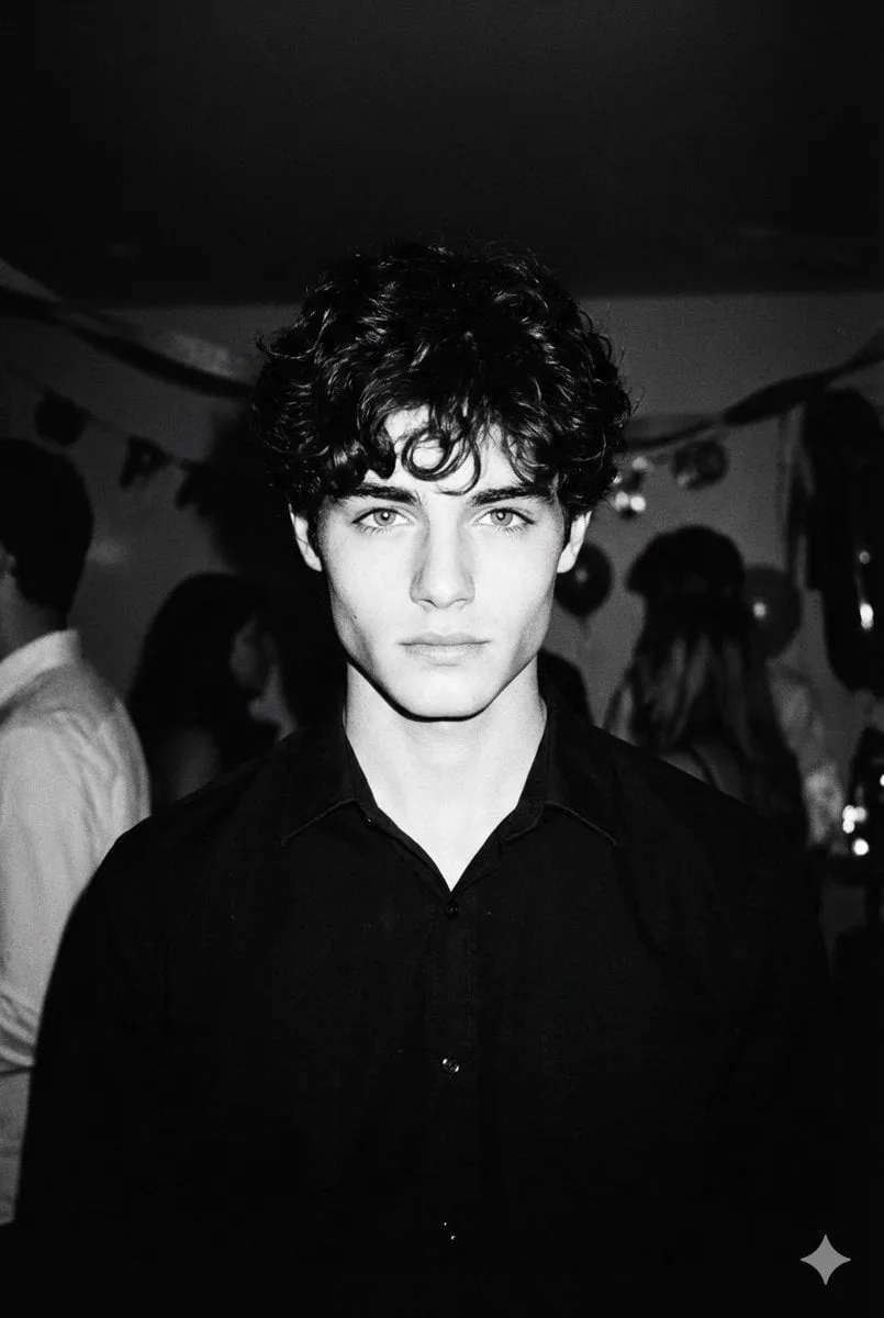
- "direct on-camera flash, hard shadow edge, slight falloff on the background wall"
Lighting is the highest-leverage layer. If you only have time to improve one part of your prompt, improve this one.
Layer 3: Camera, Lens, and Framing
Specify focal length, aperture, camera distance, and angle. These parameters do two things at once: they control composition, and they signal to the model which optical distortions to apply.
- "85mm lens at f/2, chest-up framing, eye level, subject 2 meters away"
- "24mm lens at f/8, wide environmental shot, low angle, strong perspective convergence"
Layer 4: Material and Surface Behavior
Describe how light behaves when it hits the surfaces in your scene. This is the layer most people skip, and it is the layer that separates "AI-looking" from "photographic."
- "subsurface scattering on the ears and nose, visible pores, vellus hair catching the rim light"
- "brushed aluminum with anisotropic highlights and two faint fingerprints"
- "wet cotton jersey, dark where it clings, specular highlights along the shoulder seam"
Layer 5: Atmosphere and Color Grade
Finally, set the air itself and the treatment. Haze, dust, humidity, and smoke all affect contrast and highlight rolloff.
- "light airborne dust in the sunbeam, mild atmospheric haze in the background, gentle highlight rolloff, warm-neutral grade"
This layer goes last because it is a global modifier. Placing grade language early tends to wash out the specific details that follow.
Negative Prompts, Weights, and Control Without Overcooking
Negative prompts are useful, but they are widely overused. A long negative list consumes the same attention budget as your positive prompt and can push the model toward generic output, because you have effectively told it to avoid fifty things and pursue nothing in particular.
Keep negatives short and targeted at the actual failure modes you are seeing:
plastic skin, airbrushed, waxy, CGI, 3d renderoversaturated, HDR, over-sharpened, Instagram filterwatermark, text, logo, extra fingers, deformed hands
Rule of thumb: start with zero negatives, generate a batch, and then add only the two or three terms that describe what actually went wrong.
Weights work similarly. A moderate emphasis on the most important phrase (roughly 1.1 to 1.3 depending on syntax) is usually enough. Pushing a term to 1.8 or 2.0 often produces artifacts, color bleeding, or a distorted composition, because the model tries to satisfy the weighted token at the expense of everything else. If you find yourself needing extreme weights, the prompt is usually vague rather than under-weighted.
Guidance or CFG scale deserves the same restraint. Lower values give a softer, more photographic look but drift from your instructions; higher values increase adherence while adding contrast and a slightly synthetic crispness. Sweep the middle of the range in small steps and judge at 100% zoom, not in a thumbnail.
Finally, watch for contradictions. Asking for shallow depth of field while listing everything sharp or blurry background in the negatives creates a tug-of-war. The model resolves it unpredictably. Delete the conflict instead of weighting your way out of it.
Reference Images and Blending Multiple Inputs
Text alone is not always the fastest route to realism. Reference-driven workflows — image-to-image, inpainting, structural conditioning, and multi-image blending — let you supply the specific detail the model cannot invent.
Three practical uses:
- Structure transfer: supply a reference that defines the composition, pose, or architecture, and let the prompt handle light and materials. This is the most reliable way to hit an exact framing.
- Style and grade transfer: use a reference for the look, but keep the prompt's subject description strong, otherwise the new image will simply copy the reference's content.
- Detail inpainting: generate a solid overall image, then repaint hands, eyes, signage, or fabric folds at high resolution with a tight prompt that describes only the region.
Denoise or strength settings matter more than most people expect:
- 0.2–0.35: subtle cleanup; preserves the source almost entirely.
- 0.4–0.6: reinterpretation; keeps composition and rough color, rewrites detail.
- 0.7–0.85: heavy transformation; only broad shapes survive.
- Above 0.9: essentially a new image with a color suggestion.
For character consistency across a series, keep one fixed block of descriptive text (face shape, hairline, distinguishing features) and vary only the scene, lighting, and camera layers. Reusing the same seed alongside the same character block improves consistency further.
Lighting Recipes That Read as Real
These are prompt fragments, not full prompts. Drop them into layer 2 of your structure and adjust.
Golden Hour, Done Right
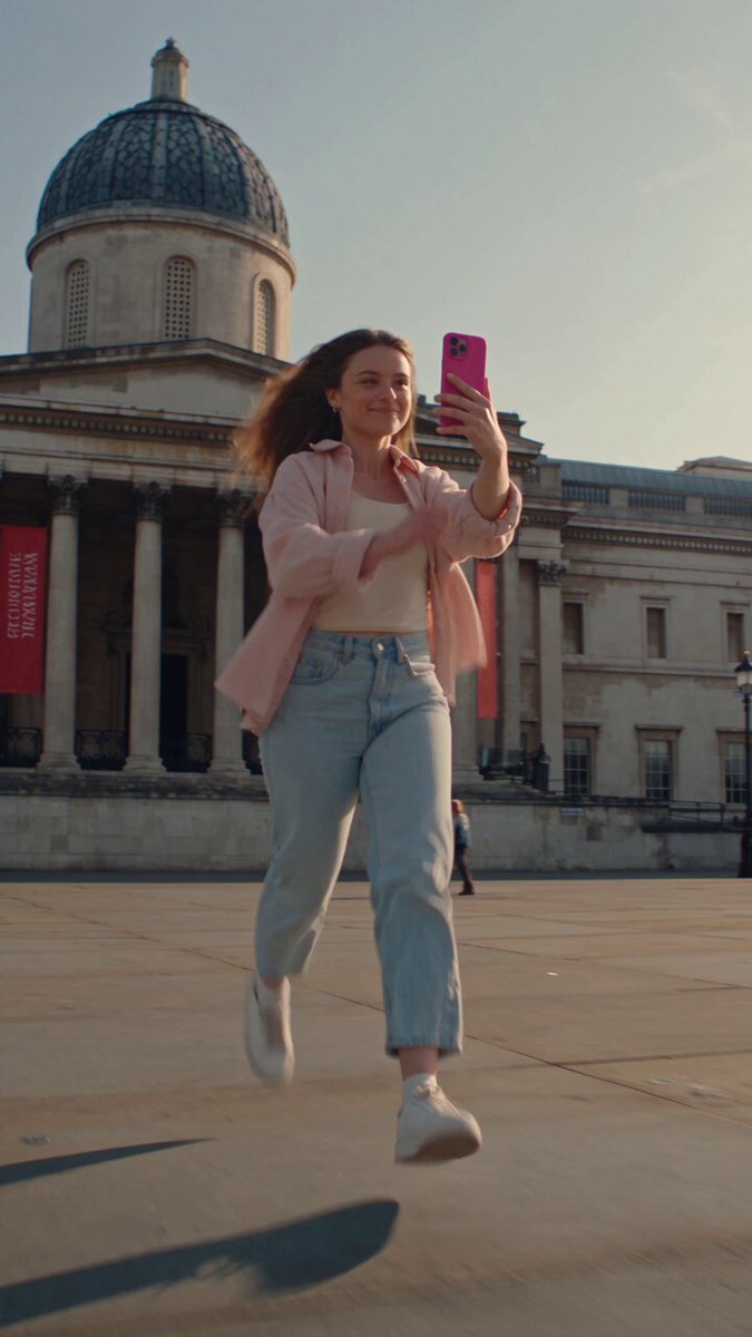
Most golden-hour prompts fail because they describe orange light with no direction. Real low-sun light comes from a low angle, rakes across surfaces, and produces long, soft-edged shadows.
"low sun 12 degrees above the horizon from camera right, warm 3200K rake light, long soft-edged shadows across the ground, warm bounce from a nearby wall filling the shadow side"
Overcast: The Free Softbox
Overcast light is the most flattering and easiest to render convincingly. The giveaway is the shadow: soft, barely-there, and slightly cool.
"overcast daylight, large soft source overhead and slightly behind, minimal shadow contrast, cool-neutral 6500K, gentle skin highlights with no hard specular"
Hard Flash and Direct Sun
The opposite extreme. Hard light is unforgiving but extremely realistic when the falloff is described.
"direct on-camera flash, hard-edged shadow behind the subject on the wall, rapid falloff to darkness, slight red-eye-safe catchlight, skin sheen from flash"
Window Light and Practicals
Indoor realism usually depends on one dominant window plus smaller practical sources.
"single large window camera left, north-facing soft light, 1:4 ratio, cool window light against a warm 2700K desk lamp on the right, visible lamp glow on the desk edge"
Night, Neon, and Mixed Color Temperature
Night scenes look artificial when everything is one color. Mix at least two temperatures.
"night street, cyan neon sign camera right, warm sodium streetlamp behind, wet pavement reflections, mixed white balance around 3800K, deep shadows with retained detail"
Lens, Sensor, and Film Emulation
Specifying optics is one of the fastest ways to change the feel of an image. Learn a small vocabulary and reuse it.
- 24mm: environmental, mild distortion at the edges, strong depth cues. Good for streets, interiors, and journalism.
- 35mm: documentary neutral; feels close to human vision without being flat.
- 50mm: clean and unobtrusive; useful when you want the subject to dominate without compression.
- 85mm: portrait compression, flattering facial proportions, background separation at wide apertures.
- 135mm: strong compression, isolated subject, background reduced to soft shapes.
- Macro: extreme close focus, razor-thin depth of field, visible surface detail.
Sensor and process language adds another layer:
- "full-frame sensor, 14-bit color depth, smooth highlight rolloff"
- "medium format, high micro-contrast, gentle tonal transitions"
- "modern smartphone, computational HDR, slightly over-sharpened edges, small-sensor depth of field" — genuinely useful when you want a casual, social-media-real look
Film emulation is a shorthand for a whole grade: Portra-style warm skin tones and moderate grain, a tungsten-balanced cinema stock for cyan shadows and red halation around highlights, or a pushed high-ISO look with coarse grain and lifted blacks. Use one film reference at most. Stacking three stock names produces mud.
Texture and Material Passes
This is where photorealistic images are won. Texture is the reason a render reads as a photograph at 100% zoom.
Skin. Ask for pores, fine lines, and uneven tone rather than smoothness. Include subsurface scattering on thin areas like ears and nostrils, and mention that the skin is not retouched. Add one blemish or freckle pattern.
Fabric. Name the weave and its behavior: linen with visible slubs and creases, denim with diagonal twill and wear at the edges, wool with a fuzzy silhouette, silk with a long specular streak. Say where the fabric creases — elbows, hips, knees — because creases follow anatomy.
Metal. Distinguish polished, brushed, and painted metal, then describe reflections: brushed steel with anisotropic highlights, chrome reflecting the environment, painted metal with tiny chips at the edges.
Water and glass. Ask for refraction, caustics, and contact shadows. Small details like a meniscus at the edge of a glass, or condensation beads on a cold bottle, sell a shot instantly.
Wood, stone, and concrete. Directional grain, scratches, and dust. Concrete should have pitting and a slightly uneven gray, not a flat fill.
A compact pattern you can reuse: [material] with [surface feature], [reflection behavior], [signs of wear or use].
Step-by-Step Workflow: Draft to Final Frame
1. Write a One-Sentence Shot Brief
Before prompting, describe the photograph in plain language: who, where, what light, what lens. This brief becomes the backbone of the prompt and prevents scope creep.
2. Assemble the Five Layers
Write the subject line, lighting line, optics line, material line, and atmosphere line. Aim for roughly 40 to 70 words total. Longer prompts are not better; more specific prompts are better.
3. Batch Low-Cost Explorations
Generate four to eight variations at a modest resolution. Judge composition first, realism second. Most of your time should go into picking, not prompting.
4. Iterate One Variable at a Time
Take the closest frame and change exactly one thing: the light direction, or the focal length, or the wardrobe material. Changing three things at once makes it impossible to know what helped.
5. Lock Composition, Then Upscale
Once the composition is right, stop regenerating and move to upscaling or a detail pass. Upscalers occasionally smooth skin, so add a light grain or texture pass afterward if the result looks too clean.
6. Repair Hands, Eyes, and Text Locally
Inpaint these regions with a tight prompt describing only the area. Region prompts should be short: the model already knows the context from the surrounding image.
7. Finish in Post
Real photographs have imperfect color. A slight curve adjustment, a small vignette, and a touch of grain in an external editor will do more for realism than another hundred generations.
8. Keep a Prompt Log
Save prompts that worked alongside their settings and seed. A personal library of twenty proven prompts beats any generic prompt list, because it is tuned to your subject matter and your model.
A Reusable Prompt Skeleton
[subject + specific moment], [wardrobe/material], [light source, direction, quality, temperature], [focal length, aperture, framing, angle], [surface and texture behavior], [atmosphere, grade, grain].
Batching and Version Control
Name your files with the date, subject, and version number. Keep the exact prompt text in a text file or spreadsheet. When you return to a project weeks later, the difference between a recoverable look and a lost one is whether you wrote it down.
Failure Modes and Fixes
Plastic, Waxy Skin
Cause: no texture language, or heavy negative lists that push toward smoothness. Fix: add pores, subsurface scattering, and "unretouched" to the prompt; remove generic quality boosters.
Over-Sharpened HDR Look
Cause: stacking terms like high detail, hyperrealistic, and 8k. Fix: delete all of them, add "natural contrast, gentle highlight rolloff."
Contradictory Depth
Cause: asking for both a wide environmental view and extreme background blur. Fix: choose one. Wide shots at f/8 have deep focus; portraits at f/1.8 do not.
Hands and Eyes
Cause: hands occupy few pixels relative to their complexity. Fix: frame them larger, or generate a clean pass and inpaint the region at higher resolution.
Everything Is in Focus
Cause: no aperture specified. Fix: name an aperture and a subject distance. Optical falloff is a realism cue, not a limitation.
Unnatural Night Color
Cause: single-source night lighting. Fix: mix at least two color temperatures and mention wet or reflective surfaces.
FAQ
How long should a photorealistic prompt be?
Between 40 and 80 words for most models. Beyond that, later tokens compete with earlier ones and the image often becomes less coherent, not more.
Do camera brand names help?
They help as loose style shorthand, but lens focal length and aperture communicate more useful optical information. Prefer measurable parameters over brand names.
Why does my image look like stock photography?
Because it is too clean and too symmetrical. Add imperfection: uneven lighting, a slightly off-center subject, visible wear, one distracting element in the background.
Can I reuse one prompt across different models?
The structure transfers, but the vocabulary does not. Different models respond differently to film references, weight syntax, and negative prompts. Expect to re-tune rather than copy.
How many generations produce one keeper?
For a well-structured prompt, expect roughly one usable frame in five to ten at lower resolution, then a few more passes for the final polish. Poor prompts can burn dozens of attempts with no result, which is the clearest sign that the prompt, not the model, needs work.
Do negative prompts still matter?
Yes, but selectively. Use two to five targeted terms for the failure you are actually seeing rather than a permanent blocklist.
How do I keep a character consistent across a set?
Freeze a descriptive block and a seed, and vary only the scene, lighting, and camera layers. Consistency comes from repetition of specific physical traits, not from a single adjective like "same face."
A Final Checklist
Before you hit generate, run through this in thirty seconds:
- Does the prompt name a specific moment rather than a static subject?
- Is there one clearly defined light source with a direction and a quality?
- Are focal length, aperture, and framing distance specified?
- Does at least one surface in the scene have described texture behavior?
- Is the color grade a single coherent choice rather than a stack of references?
- Are negatives short and aimed at a real problem?
- Have you changed only one variable since the last attempt?
Photorealism is not a setting you switch on. It is the accumulated result of describing physical circumstances precisely enough that the model has no room left to invent averages. Build the five layers, iterate one change at a time, keep notes on what worked, and the difference between a synthetic-looking render and a photograph will come down to details you chose deliberately.
