
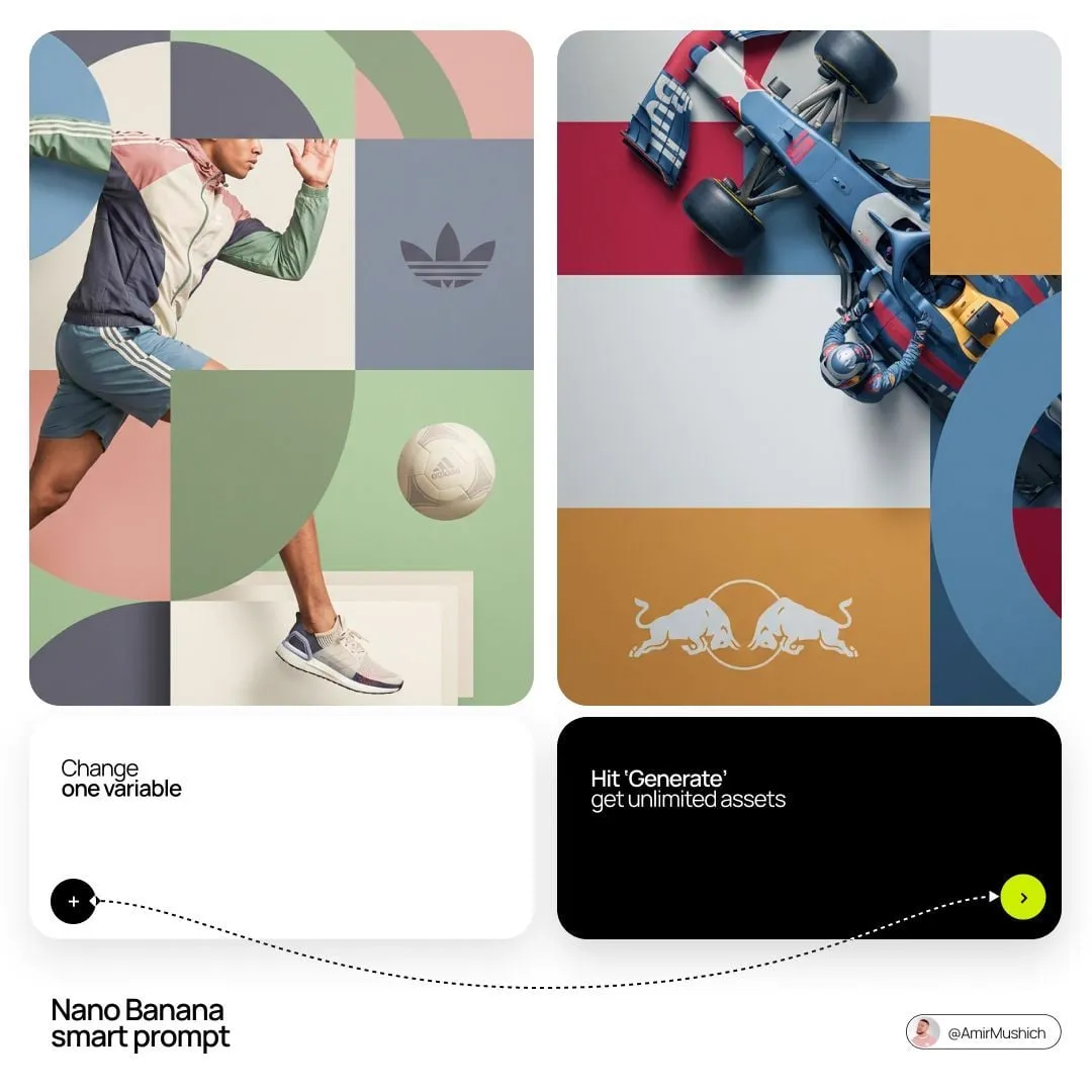

Why Grid-Based Looks Break the Moment They Move
A single still image rendered out of small uniform tiles almost always looks good. The grid flattens detail into something the eye can read instantly, the palette feels deliberate, and the subject stays recognizable even after being reduced to squares. That is the easy part.
The difficult part starts when you need one hundred of those frames in a row. Now the tiles have to stay the same size when the subject walks toward the camera. Shadows have to crawl across the grid in a way that respects tile boundaries instead of smearing across them. The palette has to survive a scene change from morning light to interior tungsten without drifting into a completely different color identity.
The good news is that frame-to-frame instability in grid-based rendering is rarely a mysterious model failure. It is almost always a production problem with a small number of identifiable causes: an unlocked tile scale, a palette that was never fixed, references that contradict each other, motion that fights the grid, and no repair pass when drift appears. Fix those five things and even modest tools produce sequences that hold together.
This guide walks through the production side of pixel-block styling: how the effect behaves, which controls matter, how to structure a workflow that scales from a five-second social clip to a three-minute narrative short, and where projects usually fall apart. The principles apply whether you are building a music video, an explainer animation, a product teaser, or a stylized title sequence.
How Pixel-Block Style Transfer Works in Practice
The grid is a contract, not a slider
A grid pass makes a single promise to the viewer: everything visible resolves into tiles of one size, one shape, and one material treatment. That constraint does more for perceived quality than any adjective you can put in a prompt. When the grid holds, viewers accept heavy abstraction. When it slips — one region rendered at half density, an edge that keeps anti-aliased softness, a corner where tiles become diamonds — the illusion collapses immediately.
So treat tile size as a locked parameter. Decide it once, write it into your project notes, and verify it every time you change model, resolution, aspect ratio, or editing tool. Most complaints that "the style changed halfway through" trace back to a quiet grid mismatch rather than to prompting.
Style and identity are two different jobs
Style transfer in video is really two processes running at once. The first transfers a look: color relationships, contrast curve, edge treatment, material feel. The second preserves identity: the same face, the same building, the same product silhouette across dozens of shots.
Modern pipelines handle both by fusing multiple references. You supply a style reference (a tile render with the material feel you want) plus content references (character sheets, location plates, product angles). The model then negotiates between them. When the result wobbles, the fix is nearly always to strengthen one side and weaken the other — never to pile on more adjectives, which simply gives the model more conflicting signals to average out.
Masks protect the details that sell the shot
Every serious project involves edits: swapping a logo, changing a garment color, removing a prop, adding a caption panel. The practical rule is to make edits in the cleanest domain available, then re-render the grid pass on top.
Preservation masks do the heavy lifting. Mask the face, the logo, or the product label before styling, and composite the styled output back only outside the mask. You lose a little stylistic uniformity on the protected region, but you keep the specific detail that makes the shot work. A slightly inconsistent badge beats an unreadable one.
Layering beats one magic pass
The most reliable results come from stacking stages, not from a single model that supposedly does everything. A common stack looks like this: generate or animate clean base footage in a realistic or illustrative style; apply a grid-stylization pass; then finish with a grade and any compositing.
Generating directly in a brick aesthetic can work, but it frequently produces melted geometry and inconsistent tile sizes once anything moves. Layering keeps every stage answerable to one question, which makes troubleshooting dramatically faster. If the motion is wrong, you know it came from the base pass. If the tiles wobble, it came from the styling pass.
Designing the Visual Grammar Before You Generate Anything
Pick a tile scale relative to frame height
Tile scale is a storytelling decision, not a technical afterthought. Large tiles simplify aggressively. They are excellent for logos, icons, bold motion graphics, and text-driven sequences, and they are terrible for faces. Medium tiles are the workhorse and read well on phones. Small tiles approach a mosaic or cross-stitch look and preserve far more detail, but they demand higher output resolution to avoid shimmering during camera movement.
Define tile size as a fraction of the frame's shorter dimension rather than as an absolute pixel count. A twenty-four-tile-wide grid on a vertical clip behaves completely differently from a twenty-four-tile-wide grid on a wide cinematic frame. Working in relative units is what keeps a vertical cutdown and a horizontal master feeling like the same piece.
Lock a palette of six to ten colors
Pixel aesthetics read as designed precisely because the palette is small enough for the eye to learn. Pick six to ten colors, assign roles (base, shadow, highlight, accent), and stay inside them.
When a new saturated hue appears in shot five that never existed in shots one through four, the sequence feels broken even if each individual frame is attractive. A useful technique is to build a palette strip image and pass it as a style reference alongside your main reference. It does not need to be described in text; it just needs to be present.
Set a detail budget
Before generating anything, ask what the viewer must identify in the worst-case frame: a face? a badge? a button label? a product name? Then design the grid so those elements survive at their smallest on-screen size. If a detail cannot survive the grid, do not depend on it. Replace it with shape, color, or motion — the three channels grid rendering handles best.
Building a Reference Board That Actually Controls Output
Collect three kinds of references. Material references show the tile look you want: brick studs, flat squares, hexagons, mosaic, woven thread. Color references are two or three stills carrying the mood you are after. Content references are your actual assets: character, location, product.
Keep the board to roughly eight images. More references do not mean more control; they mean more negotiation between conflicting signals, which shows up as bland averaging. If two references disagree, decide which one wins before you generate, not after.
Order matters too. Place the reference that defines the hard constraint — usually the character or the product silhouette — closest to the front of the conditioning set, and let the material reference shape the rendering.
The Production Workflow, Step by Step
Step 1: Approve a single hero frame
Generate one frame: the most important shot in the piece. Iterate there until the grid, palette, and detail level all feel right. Do not begin a sequence until this frame is genuinely finished, because everything downstream inherits its properties, including its mistakes.
When you approve it, record the parameters: tile density, palette list, reference order, seed, resolution, and any masking. This record becomes your preset for the rest of the project.
Step 2: Extend to four to six seconds of motion
Take the approved hero frame and extend it into a short moving clip. Watch for three failure modes: grids that change size mid-shot, palettes that drift warmer or cooler, and geometry that melts during fast movement. Fix these now, in a short clip, where iteration is cheap and you have not yet built five minutes of material on a shaky foundation.
Step 3: Segment long shots and repair drift
When a long shot wobbles, do not regenerate the entire thing. Identify the frames where the grid or palette breaks, regenerate only those segments using the same references and seed logic, and stitch. Segments of two to four seconds keep the model's attention tight and reduce cumulative error.
This is the single highest-leverage habit in grid-based video work. Treating repair as a surgical operation rather than a full redo is what makes long sequences affordable in time and attention.
Step 4: Composite protected regions
Bring your masked elements back at this stage: faces, logos, labels, screens, signs. Match the color grade of the protected region to the surrounding styled area so the seam does not read as a mistake. A soft edge transition of a few pixels hides the boundary better than a hard cut.
Step 5: Assemble, grade, deliver
Edit the styled segments together, then apply a light grade to unify contrast across shots. Small exposure differences that were invisible in isolation become obvious in sequence, so this pass matters more than in conventional editing.
Finish with a resolution check on the smallest screen your audience realistically uses. Grid aesthetics fail on small screens more often than any other style, because tiles shrink below the point where the eye can resolve them and the image turns into mush.
Prompt and Parameter Recipes That Hold Up
Prompts for grid-based styling should describe rendering rules rather than scenes. Useful fragments look like "uniform tile size," "flat shading per tile," "no gradients," "limited palette," "crisp tile edges," and "hard-edged shadows." Vague atmosphere words such as "beautiful" or "cinematic" contribute almost nothing and often push the model back toward photorealism, which is the opposite of what you want.
Keep motion prompts separate from style prompts. If one prompt asks for both a camera move and a rendering treatment, the model tends to compromise on both. Decide camera and subject motion first, apply style afterward.
Style strength deserves real attention. Low strength gives you a texture layer over realistic footage; high strength gives you a full graphic rebuild that may discard the detail you needed. Mid-range values usually produce the most usable results, especially with human subjects, where extreme stylization destroys the cues that make a face readable.
Seed control matters more than most people expect. Locking a seed across a shot keeps grain, tile alignment, and edge treatment stable. Changing seeds between shots is fine; changing them mid-shot is not.
Three Worked Examples, Scene by Scene
A fifteen-second logo sting. Build the logo as flat vector shapes first, convert to a large-tile grid, then animate only the camera and the light. Because the subject is simple, tiles can be big and the piece reads instantly on a phone. Keep the palette to five colors and let one accent color carry the final beat.
A forty-second product teaser. Generate the product under clean studio lighting with readable reflections. Apply a medium tile grid, but mask the label so text stays legible. Use rotation, parallax, and one slow push-in to carry the eye, since the grid flattens depth cues and the viewer needs motion to understand three-dimensional form.
A three-minute narrative short. Generate realistic base footage with consistent characters, run a small-tile grid pass, and reserve large-tile moments for flashbacks or dream sequences. That contrast gives the grid a narrative function instead of being pure decoration, and it gives the audience a visual signal that time or reality has shifted.
Mistakes, Troubleshooting, and a Pre-Export Checklist
Mixing tile scales across shots is the most common error and the most damaging, because the audience reads it instantly even if they cannot name what is wrong. Next is over-detailing: if your grid carries texture, grain, and fine highlights, the result looks noisy rather than designed. Third is palette creep, where each shot adds a new accent until the sequence has no identity at all.
A subtler mistake is fighting the grid with camera movement. Slow, deliberate motion suits blocky rendering. Whip pans and heavy handheld shake do not, because the eye cannot track tile boundaries across fast motion. If you need frenetic energy, cut faster instead of moving harder.
Another frequent problem is styling before narrative decisions are locked. Restyling a scene is cheap. Restyling a scene that should not exist is wasted effort. Lock your edit, then style.
Troubleshooting shortcuts: if tiles shimmer on movement, raise output resolution before touching the prompt. If edges look soft, your strength is too low or an anti-aliasing step is running downstream. If the palette keeps warming up, your color reference is probably too warm — swap it rather than adding negative instructions.
Before export, check tile size on the first, middle, and last frame of every shot. Check the palette against your reference strip. Check that protected regions still read at delivery size. Check motion at full speed rather than frame by frame, because many grid artifacts only appear in playback. Check that transitions do not mix two different grid scales inside a single dissolve. Run this list on a rough cut, not on a polished master.
Choosing Tools: Decision Criteria
Weigh five things when picking software for this work. First, batch control: can you apply one style to many clips with predictable results, or does every clip need manual babysitting? Second, reference support: can you supply both style and content images, and control their relative influence? Third, masking and compositing: can you protect faces, logos, and labels without hand-painting every frame? Fourth, maximum output resolution, since fine grids need more pixels. Fifth, predictability of cost at your volume, because per-second and subscription models behave very differently for a ten-second clip versus a ten-minute film.
For quick tests, browser-based generators with strong reference handling are usually enough. For productions with locked characters, look for tools with image conditioning and stable seed behavior. For heavy compositing, plan to export clean plates and finish in a standard editor where you control the grade and the protected regions. Many teams use two tools deliberately: a fast one for exploration, a controllable one for final output.
FAQ
Can I get a tile look without a dedicated stylizer? Yes. Generate clean footage, then apply tiling, posterization, and palette quantization in an editor. Results are more predictable, though less organic and more mechanical.
Why does my character's face look wrong? Tiles destroy fine facial detail. Use smaller tiles, protect the face with a mask, or lean on silhouette, color, and movement instead of expression to convey emotion.
How long should a styled shot be? Two to four seconds per generated segment keeps drift manageable. Assemble longer shots from shorter segments rather than asking for one long generation.
Do I need a different palette for vertical video? Not a different one, but a simpler one. Tiles are larger relative to the frame on a small screen, so fewer colors read more clearly.
How do I keep style consistent across a series? Save your reference images, prompt fragments, tile scale, seed logic, and palette strip as a reusable preset. Consistency is a documentation problem before it is a modeling problem.
Should I generate in the tile style or convert afterward? Convert afterward for anything with motion, characters, or product detail. Direct generation is viable for abstract motion graphics where geometry is simple and nothing needs to stay recognizable.
What resolution should I target? Target roughly double your delivery resolution. A fine grid on a phone screen needs enough source pixels that tiles remain crisp instead of dissolving into noise.
How many references is too many? Past roughly eight, extra references usually dilute control rather than refine it. Cut the board down and let the strongest constraint lead.
