

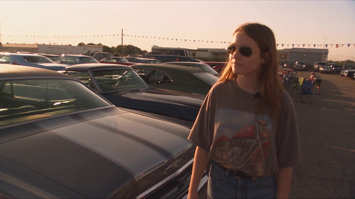
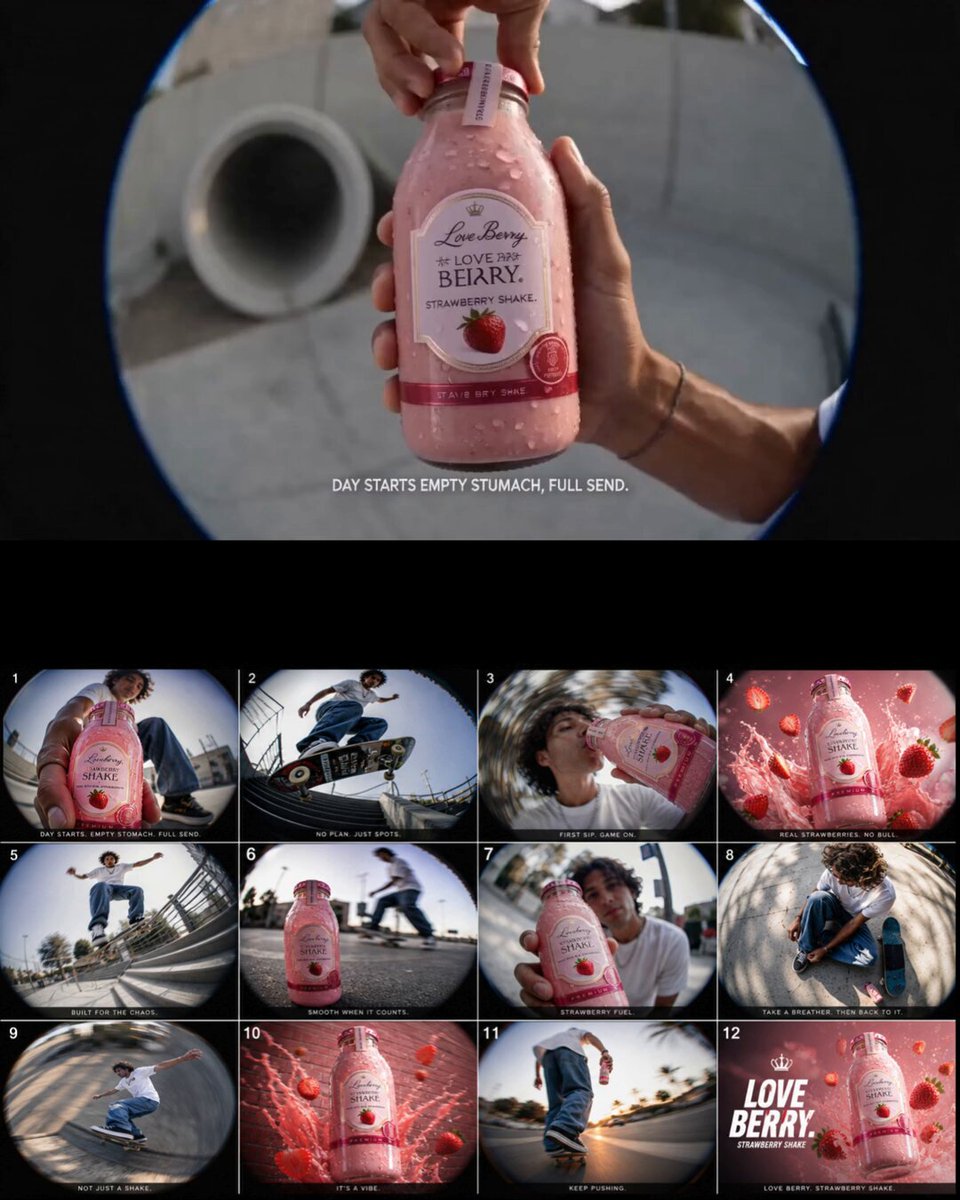

Realism Is Now a Workflow Problem, Not a Prompt Problem
A few years ago, a convincing synthetic portrait was mostly luck. You typed a long prompt, rolled the dice, and kept whatever came back with the fewest melted fingers. That era is over. Modern generators handle skin pores, brushed aluminum, condensation on glass, and the soft falloff of studio light with startling competence.
The bottleneck has moved somewhere less glamorous: consistency. Teams still ship campaigns that look obviously assembled, not because any single frame is bad, but because the face shifts between shots, the bottle floats half a centimeter above the tabletop, or the label turns into alien script the moment the camera pushes in. Realism is no longer about one beautiful image. It is about holding a person or an object steady across dozens of angles, formats, crops, and eventually frames of video.
That reframing changes how you should choose a tool. The useful question is not "which generator makes the prettiest still?" but "which generator fits into a repeatable pipeline where I can put references in, get controlled outputs out, and hand the result to a motion stage without the illusion collapsing?" This guide walks through the capabilities that genuinely matter, how to test them in an afternoon, and a step-by-step workflow for photorealistic character and product visuals that survive the jump to video.
How to Judge an Image Generator for Character and Product Work
Marketing pages all claim photorealism, so the claims are useless as a filter. You need tests that expose the specific failure modes that ruin commercial and narrative work. Three categories cover almost everything.
Character consistency and identity drift
Generate the same described person in six different framings — wide environmental shot, medium portrait, tight close-up, profile, three-quarter turn, and low-angle action shot. Then lay them side by side at thumbnail size and ask whether you would believe it is one human being. Pay attention to the details that carry identity: ear shape, hairline, brow ridge, tooth spacing, the asymmetry of the mouth. Strong tools keep the face recognizable while allowing expression and lighting to change. Weak tools produce siblings, not the same person.
Next, repeat the test with a reference image attached instead of a text description. This is where tools separate sharply. Some treat the reference as loose inspiration and drift within two generations. Others use it as a structural anchor and let you push pose and wardrobe while the identity holds.
Material, texture, and light accuracy
Ask for a product shot with a specific, testable material: matte ceramic, anodized titanium, woven linen, or frosted glass. Then look for three things. First, micro-texture: does the surface have believable grain when you zoom to 100 percent, or is it a smooth gradient pretending to be texture? Second, specular behavior: highlights on curved metal should stretch and compress with the curvature, not sit as a soft blob. Third, contact shadows: the darkening where an object meets a surface is what stops a product from looking pasted onto a background.
Reflections are the classic giveaway. A correct reflection of a bottle shows the object distorted by the bottle's shape, with the reflected horizon line bending in a physically plausible way. Many generators produce a reflection that is essentially a flipped copy of the product, which reads as wrong even to viewers who cannot explain why.
Control mechanisms that matter
Text prompts are the least precise way to direct an image. Evaluate what else a tool offers: image references for identity and style, depth maps and pose skeletons, inpainting and outpainting, regional control so you can tell one part of the frame to do something different from the rest, and deterministic seeds so a client approval does not get lost on the next export.
For video pipelines, two features deserve extra weight. First, aspect ratio flexibility without re-cropping the subject — you will need vertical, square, and widescreen versions of the same setup. Second, output resolution that holds up when a frame is used as a keyframe and then interpolated, because a slightly soft still becomes noticeably soft motion.
A Working Shortlist and What Each Tool Is Actually Good At
Rather than a ranking, think in terms of tool classes and where each one earns its place.
Midjourney remains the strongest option for stylized, editorial-grade aesthetics out of the box. Its default rendering has a confident lighting sensibility that flatters fashion, lifestyle, and character work.
Adobe Firefly is the pragmatic choice for teams already inside a Creative Suite workflow, with generative fill and expand tools that slot directly into retouching and compositing.
Stable Diffusion and its ecosystem (including SDXL-class checkpoints and Flux models) gives you the most control, because community fine-tunes, LoRA adapters, ControlNet variants, and upscalers let you train a look or a specific face. The tradeoff is setup time and hardware cost.
Leonardo and Ideogram are useful for fast iteration and for anything involving legible text on packaging, signage, or apparel — a historically weak spot that has improved considerably.
Recraft appeals to design teams because it produces clean vector-friendly shapes and consistent iconographic language.
DALL·E-class tools are strong generalists with excellent prompt comprehension, which makes them good for rapid concept exploration before you commit to a heavier pipeline.
The practical answer for most teams is not one tool. It is a primary generator for hero imagery, a control-heavy tool for identity lock, and a fast generalist for exploration. Switching between them is normal and healthy.
Building a Character Bible Before You Generate Anything
Celebrity-adjacent and brand-character work fails most often at the briefing stage, not the generation stage. Before you touch a prompt, write a character bible.
Start with a fixed identity block: age range, ethnicity, face shape, distinguishing features, hair color and texture, eye color, and any permanent marks. Write it as a spec, not a poem. "Late thirties, narrow face, strong jaw, deep-set dark eyes, thick straight black hair swept back, mole on left cheekbone" gives a model something to hold onto. "Striking and charismatic" does not.
Then define a wardrobe palette with hex-level specificity, a small set of lighting setups (soft key with background separation, hard side light, warm practical interior), and a shot list mapped to formats. Six setups cover most campaigns: hero portrait, three-quarter working shot, hands-and-product detail, walking mid-shot, seated conversation, and a wide environmental frame.
Once you have a frame you like, lock it. Save the seed, the exact prompt, the reference images, and the model version. Version drift is real: the same prompt on an updated model can produce a different face. Keep a reference folder of the five best character images and attach them as identity anchors in every future generation.
Product Visualization: Scale, Materials, and the Details That Sell
Product work has a different failure profile. Faces look wrong in a way anyone can articulate; products look wrong in a way people feel but struggle to name. Four checks cover the majority of problems.
Scale cues. Without a reference object or a known dimension, generators default to an ambiguous scale. A perfume bottle and a fire extinguisher can render identically. Add a human hand, a coin, a table edge, or a label with readable proportions to anchor size.
Label integrity. Text on packaging warps in perspective. Generate the product without text where possible, then composite real typography in a design tool. It is faster and far more accurate than fighting a generator into correct letterforms.
Material separation. When a single frame contains three materials — say matte cardboard, glossy plastic, and brushed steel — each needs its own highlight character. If everything has the same sheen, the image reads as plastic regardless of subject.
Environmental plausibility. Shadows must agree on a light direction. A common artifact is a soft shadow to the left and a highlight to the right. Pick one key light and check every element against it.
For hero shots, generate a clean plate with generous margin around the product. Then use outpainting to extend the scene rather than generating the full composition at once. Cropping into a larger generated frame almost always yields better detail than asking for a tight framing directly.
From Stills to Video: Keyframes, Motion, and Sound
The moment a still becomes motion, small inconsistencies become obvious. A face that reads fine in isolation becomes uncanny when it rotates. Plan for this by generating video-ready keyframes.
Use a two-stage approach. First, generate a small set of anchor frames — a start frame, a mid frame, and an end frame for each shot. Keep the camera language simple: a slow push in, a lateral dolly, a rack focus. Second, feed those anchors into an image-to-video model and let it interpolate. Tools like Runway, Kling, Luma, Pika, and Google's Veo-class models all accept a still as a starting condition, and starting from your own keyframe gives far more control than prompting motion from text alone.
A few practical rules. Keep shots short — three to six seconds — because longer generations accumulate drift. Avoid fast rotations of faces. Prefer motion that the subject initiates (a head turn, a hand reaching for the product) over motion imposed by the camera, since subject-driven motion is easier for interpolation models to keep coherent. And generate at the highest resolution available, then deliver at target size rather than upscaling soft footage.
Audio is the last layer and the one most often neglected. Ambient sound, a subtle whoosh on a transition, and correctly timed dialogue do more for perceived production value than an extra hour of color grading. If you need talking characters, use a dedicated lip-sync or avatar tool built for speech rather than pushing an image-to-video model beyond its design.
Rights, Likeness, and Disclosure: The Non-Negotiable Checklist
Photorealistic people raise questions that technical quality cannot answer. Handle them before production, not after a client sees the draft.
- Real people require consent. If a generated image is recognizable as a specific living person, you need documented permission covering the intended use, channels, and duration. "Inspired by" is not a defense when the face is identifiable.
- Public figures are not fair game. Commercial use of a recognizable likeness without permission invites legal trouble regardless of how the image was made.
- Prefer synthetic identities. Build a fictional character with the character bible method. It is more flexible, cheaper, and dramatically less risky. Keep a record of how the identity was constructed so you can demonstrate it is not a real person.
- Mind training-data and commercial terms. Check the licensing terms for the specific model you use, especially for advertising and paid media.
- Disclose where required. Several jurisdictions and most major ad platforms now expect AI-generated imagery in advertising to be labeled. A simple, honest label costs nothing and protects the brand.
- Never imply endorsement. A synthetic person holding your product is fine. A synthetic person who appears to be a known athlete endorsing it is not.
A Repeatable End-to-End Pipeline
Here is a sequence that works for both character and product projects.
- Brief and spec. Write the character bible or product spec, including materials, dimensions, and lighting setups.
- Mood and reference board. Collect eight to twelve references for lighting, palette, and composition. References do more for consistency than adjectives.
- Style calibration. Generate twenty low-cost test images to find a look. Do not fall in love with any of them yet.
- Identity lock. Attach references and generate the six core setups. Save seeds and prompts.
- Detail pass. Upscale the winners, then inpaint problem areas: hands, eyes, label edges, contact shadows.
- Compositing. Bring the hero frames into a design tool. Replace typography, unify color, add grain.
- Format expansion. Outpaint or re-crop for each delivery ratio rather than stretching.
- Motion stage. Create start/mid/end keyframes per shot, animate in short clips, then assemble.
- Audio and finishing. Add ambience, music, and dialogue; grade for consistency across shots.
- Archive. Store prompts, seeds, model versions, and references. Your next project will be faster because of it.
Common Mistakes and How to Fix Them
Overloading the prompt. Long prompts dilute attention. Keep the identity spec detailed but the scene description short, and use references for anything visual.
Chasing a single perfect image. One great frame with no siblings is a dead end for video. Generate in sets from the start.
Ignoring hands and eyes. These are still the weakest regions. Budget time for a manual fixing pass instead of rerolling endlessly.
Mixing model versions mid-project. A version change can alter faces and materials. Freeze your toolchain for the duration of a campaign.
Skipping the contact shadow. It is the single most common reason a product looks fake.
Animating before locking the look. Motion is expensive. Settle the visual language in stills first.
Forgetting delivery ratios. If vertical and square versions were not planned, you will end up reframing hero shots badly under deadline.
FAQ
Can AI generate truly photorealistic human faces? Yes, at close to photographic fidelity in many cases, particularly for portraits with simple lighting. The remaining weaknesses show up in fast motion, extreme angles, hands, and reflections. Judge a tool by its worst case, not its best sample.
How do I keep the same character across many images? Combine three things: a written identity spec, a folder of reference images used as anchors in every generation, and fixed seeds with a frozen model version. Text-only consistency is unreliable; references plus text is reliable.
Do I need to train a custom model? Only if you need an extremely specific face or a proprietary product look, and only if the project justifies the setup cost. For most work, reference conditioning plus inpainting is sufficient.
Is it legal to generate images that look like celebrities? Not for commercial use without permission. Recognizable likeness is protected in most markets, and platform policies often go further than the law. Use fictional identities unless you have documented consent.
What resolution do I need for video work? Generate higher than your delivery target. If the final output is 1080p vertical, aim for at least 2K on the keyframe so interpolation has detail to work with. Soft keyframes become noticeably softer once they move.
Can I use one tool for both images and video? Increasingly, yes, but the best results still come from generating keyframes in a strong image model and animating them in a dedicated video model. Treat them as two stages of one pipeline rather than choosing a single app.
How long does a typical campaign take? A disciplined solo operator can produce a six-shot character set with three animated clips in a couple of days once the character bible exists. The first project is slower because calibration eats time. The second is dramatically faster.
The throughline across all of this is that realism stopped being a magic-word problem and became an engineering problem. Build the spec, lock the identity, verify the materials, then animate. Tools will keep improving; the discipline is what makes the output look expensive.
