
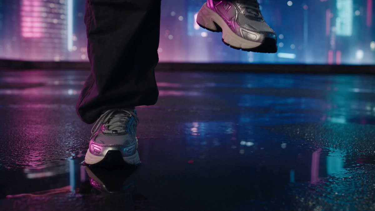

Why the Thumbnail Is Still the Highest-Leverage Frame in Video Marketing
Every video competes on a shelf, not in a cinema. Viewers do not arrive with intent; they scroll, glance, and decide. The thumbnail is the one asset that works before a single second of footage plays, and it is the only part of your production that gets seen by far more people than the video itself. A strong thumbnail multiplies the value of everything downstream — scripting, shooting, editing, sound design — because it determines how many people ever reach that work.
The practical consequence is simple to state and hard to practice: treat the thumbnail as a distribution asset, not a packaging afterthought. It should be briefed alongside the script, budgeted like a scene, and versioned like code.
Three properties make thumbnails unusually high-leverage:
- They are cheap to change. Unlike a filmed scene, a thumbnail can be regenerated in minutes, which makes it the most testable element of an entire channel.
- They compound. A library of thumbnails that shares a recognizable visual language trains returning viewers to spot your work in a crowded feed.
- They fail quietly. A weak thumbnail does not produce an error message. You simply convert fewer impressions, and the loss is invisible unless you measure it.
Two failure modes dominate. The first is invisibility: technically fine, competently designed, and completely forgettable. The second is dishonesty: it wins the click and loses the viewer. Most advice conflates these two problems, which is why the instruction to make something more clickable is so useless in practice. The real target is a credible hook — a thumbnail that stops the scroll and is fully redeemed by the video it represents.
A useful mental model is a promise chain: the thumbnail makes the promise, the title refines it, the first thirty seconds begins delivering it, and the rest of the video repays it. Break one link and the chain snaps. A brilliant thumbnail with a flat opening produces the worst outcome available, a click that immediately regrets itself.
The Psychology of a Thumbnail Hook
The curiosity gap needs a lid
The strongest thumbnails open a small, specific question in the viewer's mind. Not what is this? but how did that happen? The difference matters enormously: a vague question reads as noise, while a specific one reads as a puzzle worth thirty seconds of attention.
The critical constraint is closure. Every gap you open must be closed inside the video, ideally within the first two minutes. Open a gap you cannot close and you have purchased one click with your reputation.
Emotion is a stop signal
Scroll speed is high, so thumbnails are processed emotionally long before they are processed rationally. Faces dominate this process: gaze direction, eyebrow position, and mouth shape communicate faster than any caption. A genuinely surprised expression outperforms a generic smile almost every time, because the smile reads as advertising and the surprise reads as something actually happened.
Useful emotional registers, roughly in order of reliability:
- Surprise with specificity — a result that seems impossible at first glance.
- Tension or stakes — a visible before-and-after, a countdown, a threshold about to be crossed.
- Recognition — the viewer sees their own problem represented accurately.
- Delight or absurdity — humor, scale distortion, unexpected juxtaposition.
Overstimulation is the trap. Three competing ideas, six arrows, and neon text produce noise rather than urgency. One emotion per thumbnail, executed cleanly, beats four emotions fighting each other.
Where clickbait becomes a liability
Misleading thumbnails produce a predictable signature: a high click-through rate paired with collapsing retention. Platforms read that pattern as a mismatch and reduce distribution. Audiences read it as betrayal and stop trusting the next impression. The cost is not abstract — the second click you lose is frequently worth more than the first click you gained.
A practical honesty test: describe the thumbnail in one sentence. If that sentence is not an accurate description of something that genuinely happens in the video, redesign the thumbnail rather than rewriting the description.
Visual Composition That Survives a Phone Screen
Focal point and the three-second read
A thumbnail has roughly one glance to do its work. Design it so the eye lands in exactly one place. Use a single dominant subject, a clear value contrast, and a background that visibly recedes. The reliable tools:
- Rule of thirds for subject placement, reserving dead center for tension shots only.
- Depth cues — foreground blur, rim light — to separate the subject from the backdrop.
- One directional cue (gaze, pointing gesture, implied motion) aimed at whatever you want read second.
Faces, gaze, and orientation
When a person appears, the eyes are the anchor. Choose a frame from the footage where the expression peaks; do not settle for the first technically clean frame. Directional gaze works well: a subject looking at an off-frame object creates anticipation, while a subject looking straight into the lens creates confrontation. Both are effective, but pick deliberately rather than by accident.
Avoid cropping limbs at the joint, cutting a face at the mouth line, and using faces so small they cannot be read at the width of a feed card.
Contrast, color, and negative space
Squint at the design. If it collapses into a uniform gray mass, contrast has failed. Solutions that work consistently:
- Vary value: light subject on a dark field, dark subject on a light field.
- Limit the palette to two dominant colors plus one accent.
- Reserve empty space for text instead of cramming it over busy detail.
- Remember platform surfaces: bright white text on a bright background disappears in light-mode interfaces.
Text placement and safe zones
Text must survive cropping and overlays. Keep it inside the central safe area, never in the lower-right where duration badges sit, and never flush against the bottom edge where progress bars appear. Two to five words, one line if possible, two at the absolute maximum. The size must remain legible at thumbnail scale — if you have to lean toward the screen, it is too small.
Before publishing, drop your design into a mock of the actual feed next to several competing thumbnails. Context changes everything: a thumbnail that looks bold in isolation can vanish beside three high-contrast neighbors, and a design that feels quiet on its own can dominate a muted feed.
Writing Thumbnail Text That Compresses a Promise
Hierarchy over quantity
Text supplements the image; it is not a transcript of the title. Give it one job: sharpen the promise the image makes. Structure it as a headline plus an optional qualifier, with a deliberate size difference between the two. If every word is the same size, nothing is emphasized and nothing is remembered.
Concrete beats clever
Fixed it in four minutes outperforms The surprising truth about repairs. Specific numbers, outcomes, and constraints give the brain something to hold onto. Clever wordplay asks for effort, and nobody is doing extra work while scrolling past forty videos.
Thumbnail and title should not repeat each other
Treat them as two halves of a single sentence. If the title narrates a rebuild, the thumbnail should not repeat the word rebuild. Better: the thumbnail shows the ruined part with the text this was the problem, and the title carries the story. Complementary copy doubles the information a viewer absorbs per glance, and it costs nothing but a decision.
Building a Repeatable Thumbnail Production Workflow
Step 1: Write the brief before the design
The brief is one short paragraph containing five lines:
- Promise: what the viewer will get, in a single sentence.
- Emotion: one register from the earlier list.
- Visual anchor: the one object or face that must dominate.
- Text: two to five words.
- Proof: the specific moment in the video that redeems the promise.
If you cannot fill in the proof line, the thumbnail concept is not ready — it is a poster, not a hook.
Step 2: Capture dedicated frames
Thumbnails made from random video stills look like video stills, and viewers can feel the difference even if they cannot name it. During production, capture a dedicated set of stills: the subject at peak expression, the cleanest background angle, and one or two props arranged for clarity rather than narrative continuity. Ten extra minutes on set routinely saves an hour in editing.
Step 3: Build a template system, not a template
A rigid template produces a channel where every thumbnail looks identical and therefore nothing stands out. Instead, fix the invariants — typeface, accent colors, framing logic, logo placement — and vary everything else. Over a hundred thumbnails, that combination creates family resemblance without monotony.
Step 4: Batch and name systematically
Export at 1280×720 or larger, keep file sizes reasonable for upload speed, and use a predictable naming convention such as series_episode_variant. Batch production — five thumbnails in one sitting — is measurably faster and produces more consistent results than making them one at a time whenever inspiration strikes.
Step 5: Preview at real size
Check the design at full size, at half size, and at the size it will actually appear in a feed. Most composition mistakes are invisible at full zoom and painfully obvious on a phone screen at arm's length.
Step 6: Close the loop after publishing
A week after release, compare the thumbnail against the video's retention curve. If the first thirty seconds bleed viewers, the thumbnail promised something the opening did not confirm. If retention holds but impressions stay low, the thumbnail is honest but not competitive enough for the feed. Two diagnostic questions, two different fixes.
A/B Testing Thumbnails Without Fooling Yourself
What to test, and what to freeze
Test one variable per round: expression, background, or text — never all three at once. Freeze the title, publish timing, and traffic source so the thumbnail is the only difference. If you change the title and the thumbnail in the same round, the result tells you nothing you can act on later.
Sample size, duration, and confounders
Thumbnail tests need volume. Smaller channels often lack the impressions to reach a meaningful conclusion, and testing during a launch spike, a trending topic, or a seasonal traffic anomaly contaminates results. Practical guidance:
- Let each variant accumulate comparable impressions before judging it.
- Prefer longer windows over short bursts; early clicks come disproportionately from loyal viewers, who behave differently from cold traffic.
- Rotate variants rather than running them strictly in sequence if your audience size fluctuates week to week.
Read results honestly
The metric that matters is not click-through rate alone but click-through rate combined with retention. A variant that lifts clicks by a tenth while cutting average view duration meaningfully is a net loss, not a win. Keep a simple log — date, variant description, impressions, click-through rate, retention — so patterns accumulate into intuition instead of scattered anecdotes.
Where AI Genuinely Helps in the Thumbnail Pipeline
Ideation and variant generation
Image and video generation tools are strongest at the front of the process: generating a dozen compositional directions from a written brief, or producing background plates you would otherwise have to shoot. Use them to explore broadly, then select two candidates for manual refinement.
Cleanup and finishing
Routine fixes are now fast: upscaling a soft frame, removing a distracting background element, relighting a subject so it separates from the backdrop, extending the canvas to create text space, or swapping a flat expression for a stronger one. Retouching tools and generative fill handle most of this in minutes rather than hours.
Prompt discipline for thumbnail assets
Write prompts the way you would write a shot list: subject, framing, lighting direction, background simplicity, color palette, and negative instructions. Vague prompts produce busy compositions, and busy compositions are the single most common reason a generated thumbnail fails at feed scale.
What AI still gets wrong — and how to compensate
- Text rendering. Generated lettering is frequently garbled. Set type manually in a design tool.
- Hands and fine detail. Check every finger, edge, and accessory at full zoom before publishing.
- Facial sameness. Generated faces converge on a house style that erodes your visual identity over time.
- Likeness and rights. Get consent before using anyone's face, and never present a synthetic likeness as real footage.
- Disclosure and honesty. A stylized illustration is fine; a fabricated event presented as documentation is not.
The rule of thumb: AI should accelerate the mechanical parts of the process and should not decide the parts that require judgment.
Decision Criteria When You Have Three Variants and Five Minutes
Score candidates on a short weighted rubric. It forces a decision under deadline and builds a shared vocabulary with collaborators.
| Criterion | Question | Weight |
|---|---|---|
| Thumb-stopping power | Does it stand out against the actual feed around it? | High |
| Promise clarity | Could a stranger state what they will get? | High |
| Honesty | Does the video deliver this, early? | Critical |
| Brand fit | Would a returning viewer recognize it? | Medium |
| Text legibility | Readable at phone scale, in light and dark mode? | Medium |
| Differentiation | Does it avoid copying a competitor's exact framing? | Medium |
If two candidates tie, choose the more specific one. Specificity is the cheapest reliable advantage available to a small team, and it is the hardest thing for a larger competitor to imitate convincingly.
Common Mistakes and Their Fixes
| Mistake | Why it hurts | Fix |
|---|---|---|
| Too many ideas | The eye has nowhere to land | One subject, one emotion, one text block |
| Title and thumbnail repeat | Wastes the second information channel | Split the message between them |
| Tiny text | Unreadable in the feed | Retype larger, cut words |
| Stock-looking frames | Reads as advertising and gets skipped | Capture dedicated stills |
| Misleading claim | Retention collapses, trust erodes | Apply the one-sentence honesty test |
| Testing everything at once | Results are unattributable | Change one variable per round |
| Identical layouts forever | The channel becomes invisible | Keep invariants, vary composition |
| No record of past tests | The same experiment repeats forever | Maintain a simple test log |
FAQ
How many words should a thumbnail contain?
Two to five, with two lines maximum. The image carries the concept; the text sharpens it.
Should I use the same thumbnail style for every video?
Keep a consistent typeface, palette, and framing logic, but vary composition, subject, and expression. Consistency should come from your design language, not from a copied layout.
How long should a thumbnail test run?
Until each variant has accumulated comparable impressions and the difference holds steady across several days. If the gap keeps flipping direction, you do not have a result yet.
Does a high click-through rate always mean a good thumbnail?
No. Pair it with retention and average view duration. A click that ends in an immediate bounce is a cost, not a win.
Can I use generated images for thumbnails?
Yes, as illustration and background. Keep text set manually, inspect fine detail, secure consent for any real likeness, and never present a synthetic image as documentary footage.
What resolution should I export?
At least 1280×720, with a composition that stays readable when scaled down to a small feed card.
How do I stay visually consistent without becoming repetitive?
Fix three things — typeface, accent color, subject scale — and vary three things — background, expression, composition. Over time that combination becomes recognizable without becoming wallpaper.
What if my video is genuinely hard to visualize?
Find one concrete consequence of the topic: the broken part, the finished result, the surprising number. Make that the anchor. Abstraction is usually a design failure rather than a topic problem.
Should I go back and update old thumbnails?
Yes, selectively. Evergreen videos with steady impressions but weak click-through are the best candidates. Update one at a time so you can still attribute any change. A thumbnail is a small piece of design with an outsized job: earning attention honestly, then handing that attention to content that deserves it. Get the brief right, build a system instead of a template, test one variable at a time, and let AI handle the mechanical work. Do that consistently and the thumbnail stops being the thing you make last — it becomes the reason the rest of your work gets seen at all.
