

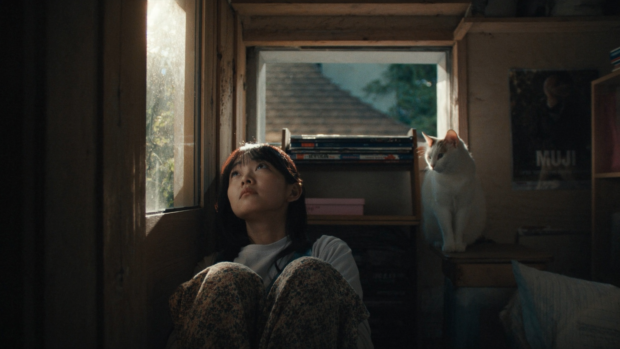

Why the Frame You Choose Decides Everything
A thumbnail is not decoration. It is the negotiation between your video and a scrolling viewer who owes you nothing. That negotiation happens in a fraction of a second, and it is won or lost on a single frame.
This is why pulling a still from your own footage is such a powerful habit. Instead of commissioning a static graphic that has no relationship to the actual content, you harvest the moment that genuinely represents the video. The result feels honest, specific, and alive — three qualities that generic stock compositions struggle to fake.
The catch: your footage contains thousands of frames, and the overwhelming majority of them are useless. Most are mid-blink, motion-blurred, awkwardly cropped, or emotionally flat. Finding the two or three frames worth building on is a skill, and it is the skill this guide is about. We will cover source preparation, frame selection, composition, typography, motion cues, tooling, testing, and the mistakes that quietly cost creators a large share of their potential audience.
If you only take one idea from this article, let it be this: thumbnails are a design problem with a measurable answer. Treat them as seriously as you treat your edit, and you will see the difference in your analytics within a few uploads.
What Changed: Video-First Visual Competition
A decade ago, a thumbnail competed mostly against other static images. Today it competes against moving pictures, autoplay previews, animated covers, and feeds that surface short vertical clips above and around your video. Attention is no longer contested frame by frame — it is contested in a noisy, moving environment.
The craft response to that environment is not louder graphics. It is more deliberate framing. When a viewer's peripheral vision is flooded with motion, a still image that implies motion reads as a promise: something is happening here, and you will see it if you click.
Three shifts matter for anyone designing thumbnails today:
- Production quality rose everywhere. Cameras, phones, and AI-assisted video pipelines now deliver footage that is genuinely beautiful at the source. Screenshots are no longer limited by your gear; they are limited by your selection.
- Plausibility became a filter. Viewers can spot a staged, over-processed face at a glance. Real frames from real footage carry small imperfections that read as authenticity, not as flaws.
- Speed of iteration defines winners. The creators who improve fastest are the ones who can generate ten thumbnail candidates in twenty minutes, publish, read the data, and try again next week.
None of this requires a design degree. It requires a repeatable process and enough taste to recognize a strong frame when it appears on your timeline.
Preparing Source Footage for Thumbnail Work
Great thumbnails usually start before you ever open a design tool. If your footage is disorganized, you will end up scrubbing randomly and settling for a mediocre frame simply because you are tired.
Build a candidate frame library first
Before editing the video itself, do a dedicated pass whose only purpose is collecting stills. Park the playhead, hit the export-frame shortcut, and save the result. Name files with the scene and a short descriptor. Aim for thirty to sixty candidates from a ten-minute video. That sounds excessive until you realize how quickly the list collapses once you view them at actual thumbnail size.
Get the technical basics right
Thumbnails live or die at small sizes, but they are delivered at large ones. Export your stills at the highest resolution your source allows, ideally at least 1920 pixels wide, and keep the aspect ratio that matches your target platform.
- Export as PNG when you plan heavy compositing; PNG avoids the blocky artifacts that show up around sharp text on compressed footage.
- Export as high-quality JPEG when file size matters and the frame has smooth gradients rather than crisp edges.
- Avoid re-encoding a JPEG screenshot multiple times. Every save cycle softens details you will want later.
If your footage is heavily compressed, grain and macroblocking will be baked into the frame. You can reduce the perceived damage by avoiding aggressive sharpening and instead leaning on contrast, color separation, and crop. Over-sharpened video stills look artificial in exactly the way that suppresses clicks.
Consider shooting with thumbnails in mind
If you control the shoot, you control the material. Plan two or three deliberate hero moments: a gesture toward the lens, a reaction, a held composition with clean negative space on one side. Those ten seconds of planning remove an hour of hunting later.
Finding the Decisive Moment
Every clip has a peak. The job is to identify the single frame where subject, expression, action, and composition align — and where a viewer who knows nothing about your video can still guess what it is about.
Signals of a strong candidate frame
Strong candidate frames usually share several of these traits:
- A clear emotion. Surprise, concentration, amusement, tension. Neutral expressions rarely earn clicks.
- Readable action. A hand mid-gesture, a product mid-turn, a door mid-swing. The brain completes the motion and leans in.
- Separation from the background. The subject should not dissolve into the scene behind them.
- A landing zone. Space where text can sit without covering the subject's face or the point of action.
- Clean edges on the subject. Hair and hands that blur into the background kill legibility at grid size.
A practical scanning workflow
Rather than scrubbing aimlessly, do this:
- Watch the clip once at normal speed and mark three to five emotional peaks with markers.
- Return to each marker and step frame by frame within a two-second window.
- Export four to six stills per peak, favoring frames where the subject's eyes are open, lips are in a natural position, and hands are not obscuring the face.
- Shrink every candidate to about 20 percent of its size for five seconds. The frames that survive that test are your finalists.
The shrink test is the most useful habit in thumbnail design. If a frame is unreadable when small, no amount of text will save it.
Composition Principles That Survive at Small Sizes
Thumbnails are viewed in a grid, often on a phone, often at a glance. Composition decisions that look subtle on a large monitor become decisive at 200 pixels wide.
Weight and balance
Place your subject off-center, roughly along a third line, and use the remaining space for supporting elements. A perfectly centered subject works only when the surrounding frame is very clean and the expression carries the entire message.
Depth and separation
Flat frames feel like snapshots. Depth feels like cinema. You can manufacture separation using a shallow depth of field in camera, or in post by subtly darkening and desaturating the background while keeping the subject warm and bright. A gentle vignette and a slight background blur can lift a mediocre frame into something that reads instantly.
Contrast is the real currency
At small sizes, viewers perceive contrast before they perceive detail. That means:
- Bright subject against a darker background, or the inverse.
- Distinct hue separation — warm skin tones against cool environments.
- Local contrast on the focal point, achieved with a soft dodge rather than with global brightness sliders.
Crop deliberately
A crop is a redesign, not a repair. Tightening a frame to a head-and-shoulders composition often adds more impact than any filter. Just make sure the crop respects the platform's safe zones so interface elements do not overlap your subject or your text.
Text, Hierarchy, and Legibility
Text on a thumbnail is scaffolding. It should make the promise clearer, not repeat what the image already says.
Keep the word count brutal
Three to five words is usually the ceiling. A number, a short question, or a two-word tension phrase works well. Long sentences are unreadable at grid size and they crowd the frame.
Establish a three-level hierarchy
The eye should travel through the thumbnail in a predictable order:
- Primary: the subject or the single strongest visual element.
- Secondary: the headline text, sized so it reads at a glance.
- Tertiary: supporting marks such as a small logo, an arrow, or a corner accent.
If everything competes at the same level, nothing wins.
Typography choices that hold up
Use a bold, wide typeface with generous counters. Heavy sans-serifs outperform delicate scripts at thumbnail scale. Add a subtle stroke, shadow, or a semi-transparent panel behind text when it sits over busy footage, but keep the effect restrained — heavy outlines push a thumbnail toward looking like clickbait.
Color and text contrast
Pick a text color that appears nowhere prominent in the background. Sample the background, then shift the text toward the opposite end of the value scale. If the background is mid-tone and murky, place a soft gradient panel behind the text rather than fighting it with outlines.
Motion Cues: Implying Movement in a Still
A still image can feel like it is moving. That implied motion is what makes harvested video frames so effective compared with posed photographs.
Motion cues fall into a few families:
- Postural direction. A body leaning or reaching implies travel and trajectory.
- Blur with intent. A little motion blur on limbs or props signals speed, as long as the focal point stays sharp.
- Open gestures. A hand beginning an action invites the viewer to finish it.
- Graphic arrows and vectors. A diagonal line, an arrow, or a directional gradient pushes the eye toward the next step. Use one at most.
- Frame-within-frame. Cropping a subject against an archway, window, or door adds a sense of depth and direction.
Avoid combining too many motion cues. One strong directional element is persuasion; three is clutter.
A Practical Production Pipeline
Here is a workflow you can repeat weekly without rebuilding your process each time.
Step 1: Harvest
Export thirty to sixty candidate stills from the final cut. Keep them in one folder named by episode or project.
Step 2: Triage
View them in a contact sheet at small size. Delete anything unreadable, blurry, or emotionally flat. You should be down to six to ten frames.
Step 3: Composite
Open your finalists in an image editor with layers. Build the subject, background treatment, and text as separate layers so you can iterate without starting over.
Useful capabilities to look for in a tool: non-destructive adjustment layers, quick background masking, text with stroke and shadow controls, and a small set of reusable templates. General-purpose design apps, dedicated thumbnail editors, and AI-assisted image tools all work; the deciding factor is whether you can produce a clean variant in under three minutes.
Step 4: Generate variants
Produce at least three directions: a clean version with minimal text, a high-contrast version with a bolder headline, and a version using a different frame entirely. Variants do not need to be finished designs — they need to be different hypotheses.
Step 5: Export and log
Export at native resolution in PNG or high-quality JPEG, then log which variant you published and when. Without that log, you will repeat the same test twice and learn nothing.
Step 6: Reuse templates
Keep two or three layout templates per channel. Consistent placement of logo, headline zone, and color palette means you can go from frame to published thumbnail in ten minutes. Consistency also trains returning viewers to recognize you in a crowded feed.
Consistency, Testing, and Iteration
A thumbnail is a design artifact and a hypothesis at the same time. Treat it as both.
Build a recognizable visual system
Pick two or three brand colors and use them in every thumbnail. Keep your typeface stable. Keep your logo in a predictable corner at a consistent size. Viewers who recognize your style from three tiles away are already halfway to clicking.
Test one variable at a time
If you change the frame, the headline, and the color palette simultaneously, you learn nothing about which change mattered. Rotate through tests: frame versus frame, text versus no text, warm versus cool grade. Run each for a comparable window of exposure before drawing conclusions.
Metrics worth watching
Impressions tell you how often your thumbnail was shown. Click-through rate tells you how it performed when shown. Watch both together, because a high rate on tiny impressions is not the same result as a high rate on a broad recommendation push. Also look at retention on the first thirty seconds — a thumbnail that overpromises will show up there as an early drop-off, and platforms notice.
Common mistakes that quietly cost clicks
- Too many elements. Three focal points is two too many.
- Text that repeats the title. Redundant text wastes the most valuable real estate you have.
- Faces too small. If the expression is the hook, the face must occupy a meaningful share of the frame.
- Low-contrast blue-on-blue grading. Stylish in a still, invisible in a feed.
- Ignoring safe zones. Interface overlays swallow text that sits too close to an edge.
- Designing at full size only. Always review at the size a viewer actually sees.
- Never revisiting old thumbnails. A thumbnail is not permanent. If a video underperforms, a new frame is often the cheapest fix available.
When to refresh instead of redesign
If a video underperforms but the content is solid, try a new frame from the same clip before commissioning a whole new graphic. Most of the time the message was right and the moment was wrong.
FAQ
How many candidate frames should I export per video?
Thirty to sixty from a typical ten-minute video is a healthy starting point. The triage step will cut that down to six to ten finalists quickly, so volume at the harvesting stage costs little and saves a lot.
Can I use a frame from a clip that has heavy motion blur?
Yes, if the blur sits on secondary elements rather than the focal point. A sharp face with a blurred arm reads as energy. A blurred face reads as a mistake.
Should I always add text to a thumbnail?
No. A strong expression, a clear action, and a well-separated subject can carry a thumbnail alone. Add text only when it clarifies the promise in a way the image cannot.
What resolution should I export?
Match or exceed the platform's recommendation, typically at least 1280 pixels on the long edge, and preferably 1920 or higher so the image stays crisp on large displays.
How often should I change my thumbnail style?
Keep the underlying system — colors, type, logo placement — stable, and vary the content: frames, crops, and headlines. Overhaul the system only when your audience or niche genuinely shifts.
Do AI image tools belong in a thumbnail workflow?
They are useful for background cleanup, upscaling a soft frame, extending a crop, and generating quick variants. Use them to support real footage rather than to replace it; authenticity is the reason harvested frames outperform illustration in the first place.
How do I know a thumbnail is actually working?
Compare click-through rate across comparable impressions, and check first-thirty-second retention for overpromising. If the rate rises without retention falling, the thumbnail is doing its job.
The through-line in all of this is simple. Your footage already contains the image that will make people click. Your job is to find it, frame it cleanly, and resist the urge to bury it under decoration.
