


Why Thumbnails Decide Whether Your Video Gets Watched
A thumbnail is the smallest piece of design that carries the largest share of responsibility in a video's life. It sits between a finished production and a distracted viewer, and it has roughly a quarter of a second to do its work. No other asset in your workflow is judged so quickly, so harshly, or so publicly.
Most creators treat the thumbnail as the last step — something to slap together after the edit is locked. That ordering is backwards. The thumbnail is a design problem with its own interface logic: it must survive being scaled down to the size of a postage stamp, compete against a wall of neighboring images, and still communicate a specific promise. Treating it as an afterthought produces the same result every time: a beautiful frame that nobody clicks.
This guide is for creators, editors, and designers who want a repeatable thumbnail system rather than a lucky one. It covers the UI/UX principles that make thumbnails function, the trends shaping visual expectations right now, the platform constraints that quietly break layouts, and a full production workflow from brief to export. It also covers the part most tutorials skip: how to test honestly and read the results without fooling yourself.
Thumbnail UI/UX Is Not Poster Design
A poster is designed to be looked at. A thumbnail is designed to be chosen. That distinction changes almost every decision you make.
When someone scrolls a feed, they are not reading. They are pattern-matching at speed, filtering for signals like familiar faces, sharp contrast, unusual color, and legible shapes. Their attention is triggered by difference, not by craft. A tastefully muted composition with subtle typography may be excellent graphic design and a terrible thumbnail, because it disappears into the surrounding interface.
Here is the practical translation of that idea:
- Small-size first. Design at the size it will actually be seen. Zoom out to roughly a fifth of your working canvas every few minutes. If the concept does not read there, no amount of detail will save it.
- One message per image. The thumbnail makes a single promise. Two ideas competing for attention produce zero ideas received.
- Interface awareness. Your thumbnail is embedded in someone else's UI. It lives next to timestamps, titles, duration badges, progress bars, and hover overlays. Design for that environment, not for a gallery wall.
- Emotional legibility. A viewer should be able to name the emotion in the image within a glance — surprise, tension, curiosity, delight.
A useful exercise: screenshot the place where your thumbnail will appear, then drop your design into that screenshot alongside eight to twelve competing thumbnails. This is your actual design context. Judge it there.
The Visual Hierarchy Model Behind High-Performing Thumbnails
Strong thumbnails almost always follow a three-layer hierarchy, whether the designer planned it or not.
Layer 1: The focal point
This is the single element that grabs attention: a face at peak expression, an object mid-action, an unexpected shape, a high-contrast silhouette. The focal point should occupy a significant portion of the frame — often 30 to 50 percent of the visual weight — and it should be positioned off-center in most cases, since centered subjects read as static and formal.
Layer 2: The supporting context
Behind and around the focal point sits the context that turns an image into a story. A blurred crowd, a storm sky, a half-finished sketch. Context also includes depth cues: foreground blur, mid-ground subject, background wash. Depth is what separates a flat graphic from a scene a viewer feels they could step into.
Layer 3: The informational layer
This is text, numbers, arrows, circles, or icons. It is the layer that most often gets abused. When the informational layer is too heavy, the image collapses into a slide instead of a scene.
A quick diagnostic: squint at your thumbnail until it becomes a blur. You should still be able to identify the focal point, sense a direction of attention, and perceive at least two distinct value ranges. If the blur is a gray mush, your contrast structure needs work before anything else.
Trend: Cinematic Minimalism and Immersive Storytelling
The dominant visual direction in thumbnail design is a shift away from busy collages toward single, cinematic moments. Two forces drive it: viewers have become expert at ignoring clutter, and higher-resolution displays reward clean composition.
Cinematic minimalism in practice looks like this:
- A frozen dramatic instant. Instead of an explanatory image, capture the frame just before or just after a peak moment. Anticipation is a stronger hook than resolution.
- Shallow depth of field. A sharp subject against a softened environment creates instant hierarchy without adding graphic elements.
- Directional light. A single strong light source — a window, a screen, a lamp — gives the image shape and tells the viewer where to look.
- Deliberate negative space. Empty areas are not wasted space. They give the eye somewhere to rest and give text somewhere to live.
- Restrained color. One dominant hue plus one accent hue. When everything is saturated, nothing stands out.
Immersive storytelling means the image hints at a narrative the viewer wants completed. A person mid-reaction, a hand reaching for something off-frame, a door slightly open. The goal is a question, not an answer. Thumbnails that pose a question outperform thumbnails that summarize a conclusion, because a summary tells you there is nothing left to see.
There is a real risk in this trend, though. Minimalism can slide into vagueness when the subject is not emotionally specific. "A person looking thoughtful" is vague. "A person realizing they forgot something important" is specific. Specificity is what makes minimalism work.
Trend: AI-Generated Realism and Surreal Composition
Generative image and video tools have changed what a thumbnail can depict. Scenes that would previously require a full production — a subject standing inside a storm, an impossible architecture, a hyper-real close-up of an object that does not exist — can now be produced in an afternoon.
The most interesting results come from a specific combination: photoreal rendering plus one deliberate impossibility. An ordinary room with an ocean visible through the doorway. A realistic face reflected in water that should be too shallow. A perfectly lit product shot floating in a cloud layer. This pairing gets more attention than pure realism, because pure realism is now abundant and therefore cheap in the viewer's eyes.
Where AI-generated imagery tends to fail:
- Plastic skin and dead eyes. Faces rendered without texture, pores, or natural asymmetry read as uncanny and push watch time down rather than up.
- Inconsistent lighting logic. Two light sources that cannot coexist on the same subject flatten the image and destroy credibility.
- Nonsense detail. Text-like scribbles, extra fingers, and melting geometry are instantly noticed at thumbnail scale because they create visual noise.
- Mismatch with the video. A gorgeous generated image that does not reflect the actual content produces clicks followed by instant exits. Platforms read that pattern as a relevance problem, and your distribution suffers.
The practical rule: use generated imagery for the environment, the metaphor, and the impossible, but consider compositing a real photo of the on-camera person on top. Human faces are the one element viewers are most sensitive to, and the one element where authenticity pays.
Platform Constraints: Safe Zones, Ratios, and Overlay Collisions
Every distribution surface imposes constraints on your design, and ignoring them is one of the most common causes of thumbnails that look fine in an editor and broken in a feed.
Duration badges. Most video interfaces place a duration in a lower corner. Anything important in that corner — a logo, a word, a key facial detail — will be covered.
Progress bars. On many platforms, a playback progress bar sits across the bottom of the thumbnail. Keep the bottom 8 to 10 percent free of critical content.
Hover states. Desktop interfaces often expand or animate the thumbnail on hover, sometimes adding preview motion. Design with the assumption that the image will move.
Aspect ratios. Landscape, vertical, and square crops all exist in the same campaign if you publish across platforms. Do not design a wide composition and crop it by eye later. Build three master versions and check each one independently, because a crop is a new composition.
Small-screen scaling. A 1280 by 720 canvas viewed on a phone at typical feed density is dramatically smaller than it appears on your monitor. Test your export at the size of a thumbnail-sized image on a phone screen and look at it in daylight.
Color environment. Some interfaces use light backgrounds, others dark. A thumbnail built around a mid-gray subject with thin white outlines will vanish on light mode. Choose contrast that survives both.
Keeping a reusable template with guides for the safe area, the badge corner, the text zone, and the focal area saves an enormous amount of rework. Build it once, then reuse it for every upload.
A Repeatable Thumbnail Production Workflow
Here is a workflow that scales from a solo creator to a small team. It runs in six stages.
Stage 1: Write the promise before the design
Before opening any tool, write one sentence: "If the viewer clicks this, they will get ___." That sentence becomes the brief. Pull it from the video's strongest moment, not from its title. If you cannot write the sentence without hedging, the video has a clarity problem that no thumbnail will fix.
Then gather references. Collect eight to fifteen thumbnails from your own niche, including three or four that you personally find annoying — those often reveal what the audience is tired of.
Stage 2: Sketch three directions
Do not design one thumbnail. Sketch three concepts as rough value studies — grayscale blocks only, no detail. Each concept should take a different angle on the promise: a reaction, a transformation, a contrast. Value studies take ten minutes and prevent you from polishing a concept that was never going to work.
Stage 3: Generate or capture the base image
For photographic bases, shoot with a fast lens, strong directional light, and a subject positioned off-center. For generated bases, write prompts with explicit structure: subject, action, emotion, camera angle, lens, lighting, environment, and mood. Prompt structure matters more than prompt length.
Two prompt habits pay off repeatedly. First, specify the camera and lens — "85mm portrait, shallow depth of field" produces materially different results from "close-up photo." Second, specify what should be out of focus, because depth is what makes a thumbnail readable at small size.
Stage 4: Maintain consistency across a series
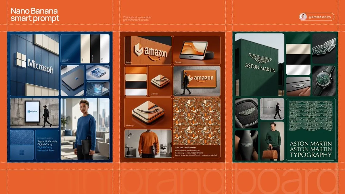
Series consistency is a UX feature, not an aesthetic preference. When five thumbnails share a layout, color family, and type treatment, returning viewers recognize your content before they read a word. Pick a fixed element — a subject position, a color accent, a typeface, a corner treatment — and repeat it across every upload. Then change everything else. Consistency in one variable plus variety in the rest is what keeps a channel recognizable without becoming wallpaper.
Stage 5: Composite and assemble hierarchy
Bring the base into your editor and build the three layers deliberately. Typical moves: dodge and burn to push the focal point forward, desaturate the background by 20 to 40 percent, add a subtle vignette, and place any graphic element along the natural direction of the subject's gaze. Keep a Photoshop, Affinity, or Figma file with grouped layers so you can swap the subject and reshoot nothing.
Stage 6: QA and export
Run a fixed checklist before every export: view at thumbnail scale, squint test, check the safe zones, check both light and dark backgrounds, verify text legibility on a phone, confirm the image matches the actual content, and export at the platform's recommended dimensions with compression that does not introduce banding in gradients. A hard-edged gradient in a dark sky will show visible steps after compression — add a small amount of noise to break it up.
Text, Legibility, and the Minimum Viable Overlay
The most reliable improvement most creators can make is deleting text. Thumbnail text is often used to repeat the title, which is a wasted layer. When text does belong, it should add information the image cannot carry.
Rules that hold up in practice:
- Three to five words maximum. Two or three is better.
- Heavy weight, high contrast, generous letter spacing. Thin elegant type disappears at small sizes.
- Place text in negative space, never over the focal point.
- One typeface across your channel. Variety in typography reads as inconsistency, not creativity.
- Avoid acronyms and insider jargon unless your audience uses them daily.
Icons and arrows can do work that text cannot: an arrow directs the eye, a circle isolates a detail, a before/after divider sets up comparison. But each added element costs attention. A useful discipline is to add one element at a time, viewing the result at thumbnail scale after each addition, and to stop as soon as the composition feels crowded.
Testing, Iteration, and Honest Metrics
Click-through rate is the headline metric, but it is not sufficient on its own. A thumbnail can win clicks and lose the audience in the first thirty seconds, which damages long-term distribution. Track click-through rate alongside average view duration, retention in the first thirty seconds, and returning-viewer share.
A practical testing method:
- Test one variable at a time. Subject, expression, background, text, or color — not all of them.
- Run tests long enough to be meaningful. A few hundred impressions tells you almost nothing. Wait for a stable pattern across a real sample.
- Compare against your own baseline first. Network-wide averages include niches, budgets, and audiences that have nothing to do with yours.
- Log every result. A simple spreadsheet with the thumbnail image, the variable tested, click-through rate, and retention turns guessing into a system within a few months.
- Refresh older uploads. Videos with steady impressions and weak thumbnails are the cheapest wins available, because the audience already exists.
Be careful of survivorship thinking. The thumbnail styles that dominate a niche are often the result of one large channel succeeding and dozens of smaller channels copying without the same audience. Test assumptions rather than adopting trends wholesale.
Common Mistakes, Fixes, and FAQ
Mistakes worth fixing first
Too many elements. Fix: remove one thing from every thumbnail you make and see whether it improves.
Illegible text. Fix: cut the word count, increase weight, and verify on a phone.
Wrong crop for the platform. Fix: build separate masters for landscape, vertical, and square rather than cropping by eye.
Ignored safe zones. Fix: place your resizable template guides on every file.
Thumbnail promises that the video breaks. Fix: write the promise sentence, then confirm the first minute of the video delivers it.
Endless redesign without testing. Fix: ship a version, gather data, and change one variable next time.
Frequently asked questions
How many thumbnail versions should I test?
Two or three is usually enough for a clear signal. More versions dilute the sample each one receives, which slows learning. Rotate tests across uploads rather than cramming them into one video.
Will AI-generated thumbnails hurt audience trust?
Not inherently. Viewers respond to whether the image is relevant and emotionally clear, not to how it was produced. Trust erodes when the thumbnail promises content the video does not deliver — that is a relevance problem, not a generation problem.
Should I always use a close-up face?
No. Faces are powerful because humans are wired to read expression, but they are also the most crowded visual strategy in most niches. Strong alternatives include high-contrast objects, unusual environments, and abstract metaphorical imagery.
What resolution and format should I export?
Match the platform's recommended dimensions precisely, export in a widely supported format, and check the file size against the platform's limit. Then inspect the exported file at feed scale rather than in your editing application.
How often should I update old thumbnails?
Review any video that still receives meaningful impressions but underperforms your channel baseline. A refresh every few months on those candidates is a low-effort, compounding improvement.
Do thumbnails matter as much for long-form as for short-form?
Yes, though the psychology differs. Short-form feeds rely on the first frame and motion, while long-form libraries rely on a static image competing in search and recommendation grids. Both reward a clear focal point and legible contrast.
Good thumbnail design is not about finding a secret visual formula. It is about building a disciplined system: a written promise, a three-layer hierarchy, platform-aware layouts, a consistent series language, and an honest testing loop. Get those five pieces in place, and the quarter-second judgment starts going your way.
