

Why Thumbnails Still Decide Whether Anyone Watches
A thumbnail is not artwork. It is an argument. It makes a claim in roughly a quarter of a second: this video is worth your attention, and here is the emotional reason why. Everything else in your production pipeline, from scripting to color grading, only matters if that argument lands.
This is why thumbnail production has become a genuine craft debate. Established creators tend to defend manual design in Photoshop, Affinity Designer, Photopea, or Figma. Newer creators increasingly lean on AI image generation to produce concepts, backgrounds, faces, and even full compositions. Both camps are right about something, and both are wrong about something.
The useful question is not which method is better. It is which method belongs at which stage of your workflow, and where mixing them produces a better result than either could alone.
This guide walks through both approaches honestly, then builds a hybrid pipeline you can actually run on a weekly upload schedule. It covers prompt patterns, layout rules, testing methods, common failures, and the decision criteria that tell you when to stop generating and start designing.
Two Workflows, Two Sets of Tradeoffs
Manual design and AI generation differ less in the tools they use than in where the creative decisions happen.
The manual path
In a manual workflow, you control the composition directly. You choose the crop, position the subject, set the type, adjust contrast, and decide exactly how much headroom the expression needs. The bottleneck is time and skill: a polished thumbnail might take 30 to 90 minutes, and a poor one wastes that time entirely.
The AI path
In an AI workflow, you describe what you want and iterate. You trade precise control for breadth. Ten variations arrive in minutes, but they arrive with inconsistent faces, questionable text rendering, and unpredictable edges. The bottleneck shifts from production time to selection and cleanup time.
Where they overlap
Both methods ultimately produce the same deliverable: a 1280x720 image that must survive being shrunk to the size of a postage stamp on a phone screen. That constraint should govern every decision you make in either workflow. If your composition only reads at full resolution, it is not finished.
Manual Design: Where Human Control Wins
Manual design remains unbeatable in four specific situations.
Expression accuracy. If your thumbnail depends on a very particular facial expression, such as a half-smile that reads as skeptical rather than smug, a photograph of a real person plus manual retouching beats generated faces almost every time. Generated expressions tend toward the generic extremes: broad shock, wide grin, mild surprise.
Typography. Text in thumbnails must be deliberate. Three or four words, heavy weight, tight tracking, high contrast, and a clear reading order. Design tools give you pixel-level control over that. Generated text is improving, but it still tends to produce plausible-looking letterforms with occasional errors, which is fatal when the words carry the promise of the video.
Consistency. Channels build recognition through repetition: the same color accent, the same typeface, the same subject placement. Manual templates enforce that consistency trivially.
Brand assets. Logos, mascots, product shots, and channel-specific iconography all belong in a layered document where you can move them independently.
The cost is real, though. Manual work scales linearly. Ten videos means ten design sessions, and if you are a solo creator, those sessions compete with editing, scripting, and publishing.
AI Generation: Where Speed and Volume Win
AI image generation is strongest where you need options rather than precision.
Concept exploration. Before committing to a thumbnail idea, generate five visual directions. You will quickly learn whether a concept reads clearly or collapses into visual noise. This alone justifies the tooling, because it prevents you from spending an hour polishing a bad idea.
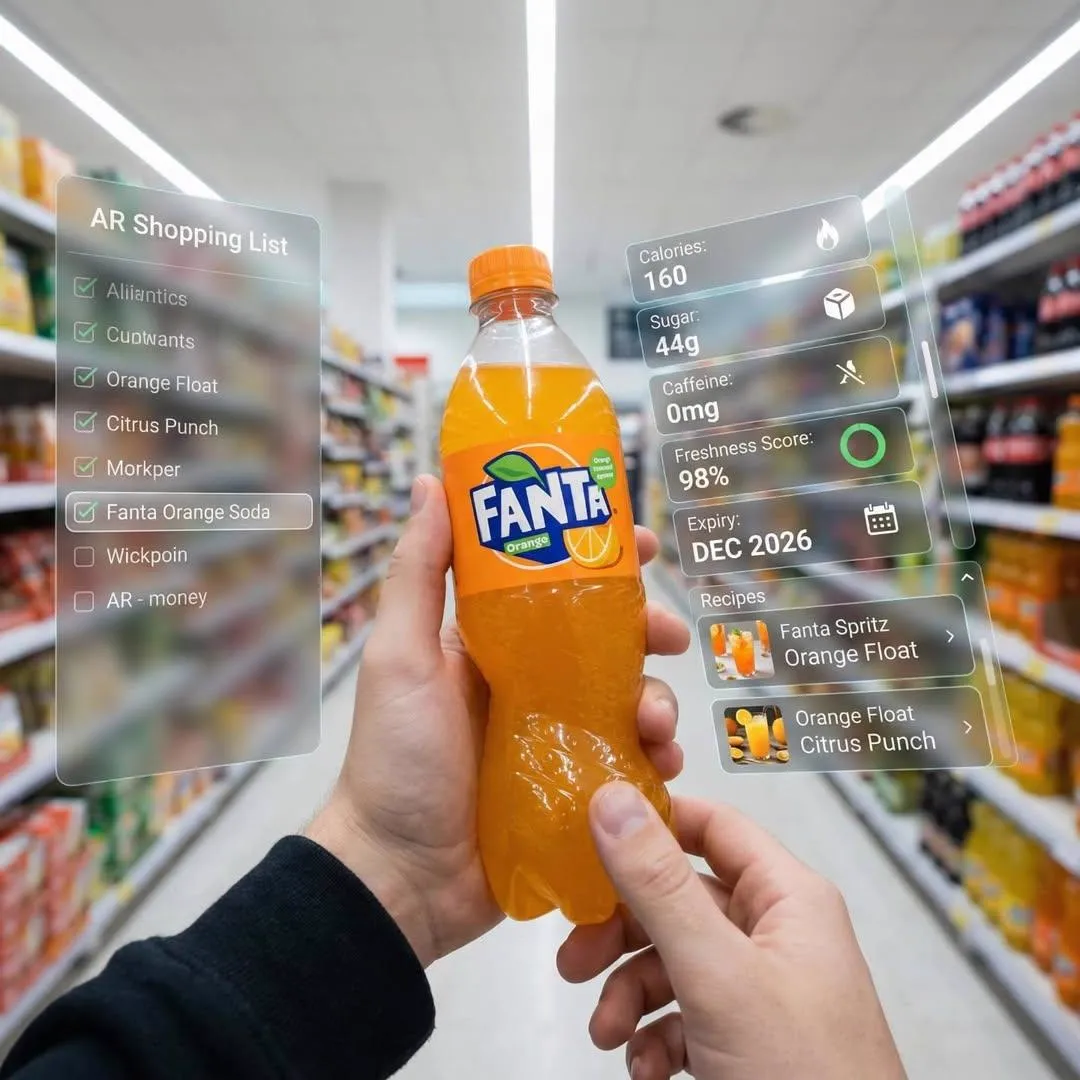
Backgrounds and environments. Complex scenes, stylized lighting, abstract textures, and atmospheric backdrops are exactly what diffusion models do well. A dramatic sky or a neon-lit interior can be generated in seconds and then placed behind a real photograph of the creator.
Volume channels. If your publishing cadence is high and your niche tolerates a consistent visual template, generation can keep you from falling behind. Faceless channels in particular benefit, since they have no presenter to photograph.
Iteration speed. Testing five thumbnail directions becomes practical when each direction costs minutes instead of hours. Better testing leads to better data, and better data leads to better intuition.
The limits are equally clear. Character consistency across a series is genuinely difficult. Fine typography is unreliable. And the sheer ease of generation encourages a subtle trap: producing attractive images that do not actually communicate a specific promise.
The Hybrid Workflow Most Creators Actually Use
The most durable production model combines both methods in sequence rather than choosing between them.
Use generation for the parts that are expensive to create and easy to judge: backgrounds, props, textures, mood lighting, and rough concept boards. Use manual design for the parts that are cheap to create and expensive to get wrong: faces, text, layout, and brand consistency.
A typical hybrid thumbnail starts as a generated background, gets a photographed or previously approved subject cutout placed on top, receives manually typeset text, and finishes with a grade and contrast pass. The generated layer provides novelty; the manual layers provide reliability.
This split also solves the consistency problem. Your subject and type treatment stay locked, so viewers recognize you instantly, while the environment changes enough to signal that this is a new video.
Step-by-Step: Building a Thumbnail in a Hybrid Pipeline
Here is a repeatable process you can run in under 30 minutes once the template exists.
Step 1: Write the thumbnail brief before the prompt
Before touching any tool, write one sentence: what specific promise does this thumbnail make? Then write the three words that will appear on it. If you cannot compress the video's hook into three words, the video concept may need work, not the thumbnail.
Step 2: Generate backgrounds, not headlines
Prompt for a scene, not a message. Describe lighting, camera angle, depth of field, color palette, and empty space. If you know the subject will sit on the left, ask for a composition with negative space on the right. Models respond well to that instruction.
Keep your prompt structured: subject and setting, then lighting, then mood, then camera language, then negative space. Something like a dim workshop with sparks in the air, dramatic side lighting, shallow depth of field, wide shot, empty space on the left side. That gives you a usable plate rather than a finished image competing for attention.
Step 3: Place the subject
Cut out your presenter or product shot, scale it so the head occupies roughly one third of the frame height, and position it on a third line. Avoid centering unless the composition is deliberately symmetrical. Check that the subject's edge separates cleanly from the background by adding a soft rim light or a subtle outline.
Step 4: Typeset last, and typeset large
Add three or four words maximum, in a heavy sans serif, with strong stroke or drop shadow for separation. Test readability at 20 percent zoom. If you have to squint, increase the size and delete a word. Never place text over a busy region of the generated background without a scrim or shape underneath.
Step 5: Export, then judge it small
Export at 1280x720 and view it on a phone before uploading. Most thumbnails fail at this stage because the creator only ever evaluated them on a large monitor.
Prompt Patterns and Composition Rules That Hold Up
Good thumbnail prompts share a few traits.
They describe light, not content. Light creates the emotional tone. Golden hour, harsh overhead fluorescent, cold blue rim light, warm practical lamps in the background. These phrases do more work than long lists of objects.
They specify emptiness. Ask for negative space, blurred regions, or clean walls. Generated scenes tend to fill the frame with detail, which fights your subject and your text.
They avoid named people and brands. Describing a style is fine; requesting a specific real person's likeness or a trademarked character is not, and it also tends to produce uncanny results.
They stay short. Twenty to forty words is usually the sweet spot. Extremely long prompts dilute the important instructions.
Composition rules worth applying to any generated plate:
- One focal point, not three.
- High tonal contrast between subject and background.
- Color accents that match your channel palette.
- No critical detail in the bottom-right corner, where the duration stamp sits.
- Faces large enough to read emotion at small sizes.
Mistakes That Quietly Destroy Click-Through
Many thumbnail problems are not aesthetic. They are structural.
Repeating the title. If the thumbnail text duplicates the video title word for word, you waste an opportunity to add a second layer of information. Use the thumbnail for the emotional hook and the title for the specifics.
Too much text. Four words is a ceiling, not a target. Every additional word reduces the size of the ones that matter.
Low contrast on mobile. Dark subject on a dark background looks moody in an editor and disappears in a feed. Push the separation harder than feels comfortable.
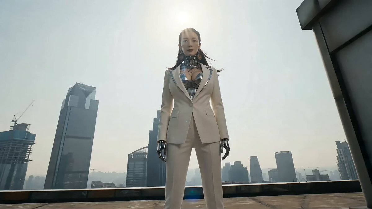
Generic AI faces. They are recognizable at a glance and they erode trust. Use photographed subjects when a person is central to the promise.
Inconsistent series. If each thumbnail uses a different typeface, palette, and layout logic, viewers cannot build recognition, and recognition drives repeat clicks.
Ignoring the feed context. Your thumbnail competes against a specific set of adjacent videos. Saturated warm tones may blend into one niche and stand out in another. Check what surrounds you before finalizing.
Generating without a brief. The most common failure is producing attractive images that communicate nothing specific. Beauty without a promise does not earn clicks.
Testing, Iteration, and Decision Criteria
Thumbnail work is only as good as its feedback loop.
Change one variable at a time. Test the expression, or the text, or the background, but not all three simultaneously, or you will learn nothing. Give each variation enough impressions to be meaningful before judging it; early numbers are noisy, especially on smaller channels.
Track click-through rate against your channel baseline rather than in absolute terms. A thumbnail that beats your average by a meaningful margin is a success even if the raw number looks modest.
Keep a swipe file of your own winners. When a thumbnail performs well, save the layered file and note what it had: expression type, palette, text length, subject placement. Over time this becomes a design system rather than a collection of one-off images.
Decision criteria for choosing an approach:
| Situation | Better starting point |
|---|---|
| Concept is unclear | AI generation for fast exploration |
| Expression is critical | Manual with real photography |
| Background is complex | AI generation |
| Text carries the hook | Manual typesetting |
| High publishing volume | Hybrid with locked template |
| Faceless channel | AI generation with a consistent style guide |
| Product or brand shots | Manual compositing |
A practical rule: if you can describe the thumbnail in one sentence and it still sounds compelling, generate freely. If the sentence sounds vague, stop and fix the concept before generating anything.
FAQ
Can AI generate the entire thumbnail, text included?
It can produce something that looks like a thumbnail, but reliable text rendering is still inconsistent. Use generation for imagery and add typography manually. The extra two minutes are worth the reliability.
How do I keep faces consistent across a series?
Use a real photograph of the same person as your locked subject layer, and let generation handle only the environment. Consistency across generated characters requires reference-image workflows that are still fiddly for weekly production.
Is manual design worth learning if AI keeps improving?
Yes. Composition, hierarchy, and contrast judgment transfer to every tool. The software changes; the principles do not.
How many thumbnail variations should I test?
Two or three is usually enough for a small channel. More variations split your data and slow your publishing rhythm.
What resolution and file size should I export?
1280x720 is the standard recommendation, exported as JPG or PNG under a couple of megabytes so it uploads cleanly and loads fast.
Should the thumbnail match the video's first seconds?
It should match the promise, not literally the frame. A slight visual continuity helps, but clarity beats accuracy every time.
What if my generated background looks flat?
Add a manual lighting pass: a soft radial gradient for a highlight, a subtle vignette, and a color grade that pushes warm tones into the highlights and cool tones into the shadows. Small moves, large impact.
How often should I refresh a thumbnail on an underperforming video?
After a reasonable window of impressions with no traction, a single well-considered swap is worth trying, especially if the original buried its promise. Do not churn endlessly; change one thing and evaluate again.
Bringing It Together
The debate between manual design and AI generation resolves once you stop treating them as competing philosophies and start treating them as stages. Generation is a concept engine and a background factory. Manual design is the finishing room where promises become legible.
Build a locked template with your typeface, palette, subject placement, and safe margins. Use generation to fill the environment layer with something fresh each time. Write the three-word promise before you write a prompt. Test one variable at a time and keep your winners.
Do that consistently and the tool question fades into the background, which is exactly where production decisions belong. What remains is the only thing viewers ever respond to: a clear, honest, instantly readable reason to click.
