


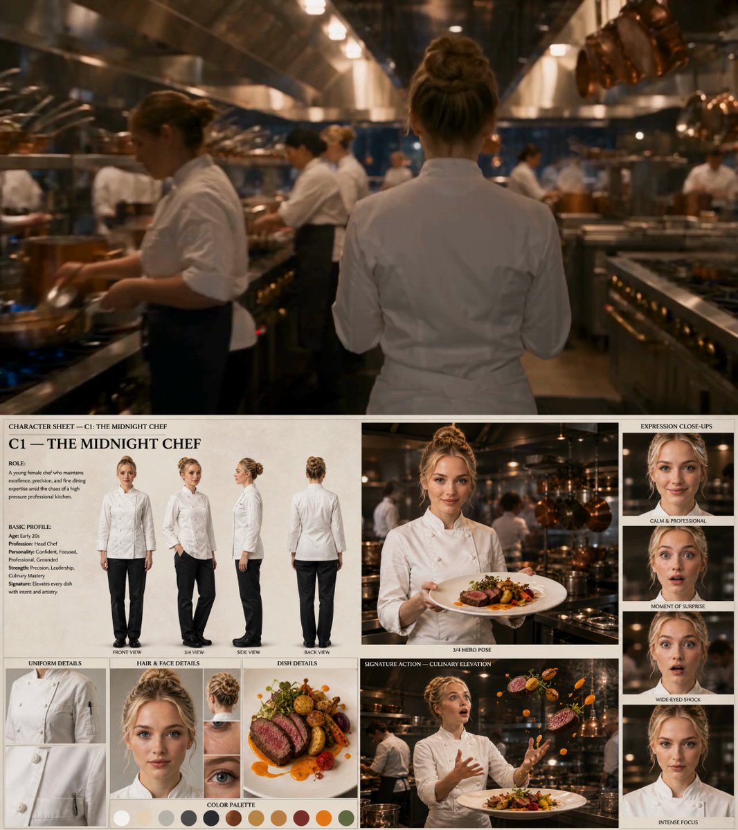
A video can be genuinely excellent and still go unwatched. On a crowded feed, the thumbnail is not decoration — it is the first sentence of your video's argument, delivered before anyone hears a word. Improving it affects click-through rate, impressions, and eventually the size of the audience your video can reach at all.
This guide is a practical walkthrough of the craft. It covers how viewers actually scan a feed, which composition rules survive a shrinking screen, how to use color and text without cluttering, and how to build a repeatable production workflow that leans on AI-assisted generation and upscaling without handing over creative control. It finishes with testing methods so you improve on evidence rather than taste.
Why the Thumbnail Carries More Weight Than the Title
Most creators treat the title as the headline and the thumbnail as the illustration. In practice the order is reversed. On mobile, where the majority of browsing happens, the image is processed before any text is read — and sometimes instead of it.
The three-second audition
A viewer scrolls past dozens of videos in a session. Each thumbnail gets a fraction of a second of attention before a decision is made: stop, or keep moving. That decision is emotional and almost instant. It is not a careful evaluation of your topic.
This means a thumbnail must communicate three things simultaneously:
- What kind of video this is (tutorial, reaction, review, story, comparison)
- What specifically is interesting (the twist, the result, the conflict)
- Whether it looks like it will be worth the time
If any of those three fails, the viewer keeps scrolling. There is no second chance, because the algorithm reads that scroll as a signal that your video was less relevant to that viewer.
CTR is a multiplier, not a vanity metric
Impressions and click-through rate multiply. A video shown 100,000 times at 4% CTR gets 4,000 views. The same video with a 9% CTR gets 9,000 views from the same exposure — and the higher early CTR tends to trigger more impressions, widening the gap further. That compounding is why thumbnail work has an outsized return compared with almost any other production task.
The thumbnail is a micro-ad, not a frame grab
A common mistake is exporting a still from the video and calling it done. Random frames are usually mid-motion, poorly lit, and visually ambiguous. A thumbnail needs to be built: subject isolated, background simplified, lighting controlled, text added. Treat it like a small poster, not a screenshot.
How Viewers Actually Scan a Feed
Understanding the scanning behaviour changes the design brief.
The shrinking canvas
On a phone, a thumbnail can render smaller than a postage stamp held at arm's length. Details that look charming on a 27-inch monitor — a subtle expression, a thin outline, small decorative icons — vanish. Design at a large size for control, then evaluate at 20% zoom before you commit.
Peripheral vision and pattern interrupts
Human vision is far better at detecting change than reading detail. In a grid of mostly blue-grey and warm-toned images, one frame with a strong complementary colour or a bright isolated object breaks the pattern and pulls the eye. This is why a single high-contrast element usually beats a busy design.
Asking the "does this look like effort?" question
Viewers make quick judgements about production quality. A blurry, low-resolution, or cramped thumbnail signals a low-effort video, even if the content is strong. Sharpness, clean edges, and deliberate spacing do quiet work in the background of every click decision.
The Psychology of a Clickable Frame
Faces, emotion, and eye direction
Human faces receive priority processing. Used well, a face anchors attention and carries emotion — surprise, delight, concern, concentration. Used badly, it becomes generic stock imagery that reads as filler.
Two rules matter most:
- The emotion must match the video's promise. A shocked expression on a calm explainer creates a mismatch that loses trust when the viewer arrives.
- Eye direction is a pointer. If the person looks toward an object or text in the frame, the viewer's gaze follows. If they look off-frame, attention leaks out of the image entirely.
Curiosity gaps without clickbait
The strongest thumbnails create a specific, answerable question: what happened here? or what does that number mean? A partial reveal works better than a full explanation. Showing the finished cake is less compelling than showing one odd ingredient next to it.
The line to avoid is promising something the video never delivers. Curiosity gaps that close cleanly in the first minute build returning viewers. Gaps that never close build a channel that gets skipped on sight.
Recognition and consistency
Regular viewers recognise visual signatures: a colour palette, a typography style, a recurring framing. Consistency does not mean every thumbnail looks identical. It means the channel is identifiable in a fraction of a second, which lowers the cost of choosing your video over an unknown one.
Composition Rules That Survive Any Niche
Rule of thirds and asymmetric balance
The rule of thirds is a starting point, not a law. Place the subject on a vertical third line, leave space for text on the opposite side, and let the frame breathe. Perfectly centred subjects tend to feel static; slight asymmetry feels more dynamic and leaves room for information.
The visual hook and reading direction
Every thumbnail needs one dominant element — the visual hook — that the eye lands on first. Common hooks include a face mid-expression, a striking object, a bold shape, or an unusual juxtaposition. Everything else is support.
In left-to-right reading cultures, viewers scan from the upper left toward the lower right. Placing the subject on the left with the supporting text on the right follows that natural path. If your audience reads right to left, mirror the layout.
Depth, layering, and negative space
Flat designs look cheap; layered designs look produced. Three simple layers are usually enough:
- Background: simplified, blurred, or colour-blocked
- Subject: cut out, outlined, or subtly shadowed for separation
- Foreground accent: a shape, arrow, or bold text block
Negative space is not wasted space. It gives the eye rest and makes the hook elements louder. Thumbnails that fill every corner with objects force the viewer to search, and searching is what a scroll does.
Framing experiments worth trying
A few composition patterns earn repeated clicks across niches:
- Split frame: two contrasting states side by side (before/after, cheap/expensive, old/new)
- Isolated object: one clearly recognisable item on a plain, saturated background
- Close crop: the subject's face filling much of the frame, cropped tightly for intensity
- Scale contrast: something small next to something vast to signal stakes
- Hand or pointer: an implied action that directs attention to the thing that matters
Colour, Contrast, and Text Overlays
Colour theory that works at small size
Colour is doing two jobs at once: separating your thumbnail from its neighbours and organising information inside the frame. Practical guidelines:
- Use one dominant hue plus one accent that sits near it on nothing but contrast — complementary or split-complementary pairs create the strongest separation.
- Warm colours (red, orange, yellow) advance and feel urgent. Cool colours (blue, teal, green) recede and feel calm or technical. Choose based on the emotional promise.
- Saturation should be deliberate. Mildly saturated backgrounds with a highly saturated accent consistently outperform fully saturated everything.
- Check your palette against your last ten thumbnails and against the feeds your competitors appear in. If everyone uses the same teal-orange grade, going warmer or darker becomes a differentiator.
Text overlays: three words or fewer
Text should add information the image cannot carry alone, not repeat the title. Three words is usually the ceiling; two is often better. Beyond that, small-screen legibility collapses.
Rules that hold up:
- Heavy, wide, high-x-height sans-serif typefaces.
- Strong stroke, drop shadow, or a solid shape behind the text so it never sits directly on busy detail.
- Minimum readable size — test at the smallest size your audience will see.
- Avoid stylised scripts and thin weights entirely.
Accessibility and safe zones
Roughly one in twelve men has some form of colour vision deficiency. Contrast between text and its background matters more than hue. Avoid relying on red/green distinctions alone to separate elements, and consider a quick grayscale check: if the design still reads in black and white, it will read for almost everyone.
Keep text and key elements away from the corners, where platform overlays such as duration badges and progress bars can appear. A simple inner margin solves most of this.
Building a Thumbnail Workflow with AI Assistance
AI is most useful in the thumbnail pipeline when it handles generation, extension, and cleanup — leaving composition decisions to you.
Step 1: Harvest strong source frames
Scan your footage for expressive moments, clean backgrounds, and good lighting. Mark candidates as you edit rather than hunting later. Export several options at the highest available resolution.
Step 2: Generate or extend backgrounds
When your footage lacks a usable backdrop, an image model can create or extend one that matches your subject's lighting and perspective. Prompt for simplicity: a described location, a described light direction, and an explicit instruction for negative space where your text will go.
Step 3: Use image-to-image tools for style consistency
Style transfer and multi-image fusion help a channel that mixes footage from different sources — webcam, phone, screen recording, camera — look like one brand. Feed the model a reference frame from a past thumbnail so the colour grade and texture stay in the same family.
Step 4: Composite, then upscale
Do your compositing first: subject cut out, background placed, text added. Then run a single upscale pass on the finished frame rather than upscaling individual pieces. One clean pass produces fewer artifacts than stacking several.
Step 5: Retouch and export
Tighten edges, add a subtle shadow under the subject for separation, verify the small-size preview, and export. Keep layered source files so you can re-cut a variant quickly during testing.
A sensible toolchain for most creators looks like this: an image generator for backgrounds, a background remover for subject isolation, a compositing app for layout, and an upscaler for final sharpness. Specialised video generation tools can also produce short atmospheric clips that you screenshot for backgrounds when you need something specific.
Resolution, Mobile Optimization, and Platform Specs
Technical sloppiness silently costs clicks. Keep these in mind:
- Produce at a generous resolution so the image stays crisp on large displays, and always upload an image that matches the platform's recommended aspect ratio rather than letting the system crop it.
- Use an aspect ratio that fills the standard player slot; mismatched ratios get letterboxed or cropped in ways you cannot predict.
- Keep file size reasonable — compression artifacts in gradients are common and ugly.
- Verify the thumbnail on three screens: phone, laptop, and television. Gradients and thin lines are the elements that fail first.
The mobile check is the important one. If the subject and the text are not both identifiable at phone size, the design is not finished.
Testing, Iteration, and Reading Your Analytics
Test one variable at a time
Thumbnail testing is only informative if you isolate changes. Swap the subject expression, then the background colour, then the text — not all three at once. Otherwise you learn that something changed but not what.
Practical approaches:
- Publish with a design you believe in, then swap to an alternative after a measured window and compare click-through rate at similar impression volumes.
- Compare within a series rather than across unrelated videos — a tutorial and a vlog have different audience expectations.
- Give changes enough time. Judging a change after a few hundred impressions produces noise, not insight.
Metrics that matter
Click-through rate is the primary number, but read it alongside impressions, average view duration, and returning viewer share. A higher CTR with sharply lower retention usually means the thumbnail over-promised. A modest CTR with strong retention often means the packaging is underselling effective content, which is one of the easiest wins available.
Common mistakes and how to fix them
- Too many elements. Cut until the hook is unmistakable.
- Title repeating the thumbnail text. Use text to add a second piece of information.
- Low contrast subject on background. Add separation with an outline, rim light, or shadow.
- Unreadable small text. Reduce word count or increase size.
- Inconsistent branding. Reuse a template and palette; change only subject and text.
- Misleading promises. Match the framing to the actual payoff.
- Ignoring the thumbnail in the editing timeline. Build time for it into your production schedule so it is not rushed at upload.
Building a Channel-Level Thumbnail System
Once individual thumbnails work, systematise them. A simple system includes:
- A template family: two or three layouts reused with variation.
- A palette: two or three colour directions, each tied to a content type.
- A type system: one display typeface, two or three sizes.
- A subject library: a folder of pre-cut-out recurring hosts or objects for fast assembly.
- A naming convention: video ID plus variant letter, so testing history stays legible.
This is what separates channels that look consistent from channels that merely look busy. It also cuts production time per thumbnail to minutes, which makes frequent testing realistic rather than aspirational.
Frequently Asked Questions
How often should I change a thumbnail?
Change it when data suggests it is underperforming relative to its impressions, or when the video is evergreen and you want a second chance at discovery. Avoid constant swapping, which disrupts the data you need to learn from.
Should every thumbnail in a series look the same?
Related videos benefit from a shared visual family — same palette, typeface, and layout logic — with variety in subject and text. Sameness becomes a problem only when viewers cannot tell two videos apart at a glance.
Do faces always improve performance?
No. Faces help when they carry genuine, relevant emotion and direct attention to the hook. Generic or exaggerated expressions can reduce trust compared with a strong object or scene.
Can AI generate an entire thumbnail?
It can generate backgrounds, subjects, and variations, but composition, message alignment, and brand consistency still need a human decision. Treat AI output as raw material.
What is a good click-through rate?
It varies enormously by niche, audience size, and traffic source. The useful comparison is against your own recent baseline, not a universal number. Track the direction of change and protect retention at the same time.
How many words should the overlay contain?
Two to three. If the idea needs more, the image is not doing enough work and should be redesigned around a clearer hook.
The Bottom Line
Thumbnail design sits at the junction of art direction, psychology, and small technical details. The strongest frames share a few traits: a single unmistakable hook, high contrast, an emotion that matches the promise, minimal text, and a crisp render at phone size. AI tools accelerate the expensive parts — background generation, subject isolation, style consistency, upscaling — but the decision about what the frame should say remains yours.
Start with one change this week: pick your three lowest-performing recent videos, rebuild the thumbnails around a single hook each, and test them against their current versions. Then repeat with one variable at a time. That loop, run consistently, is what turns thumbnail design from guesswork into a compounding advantage.
