


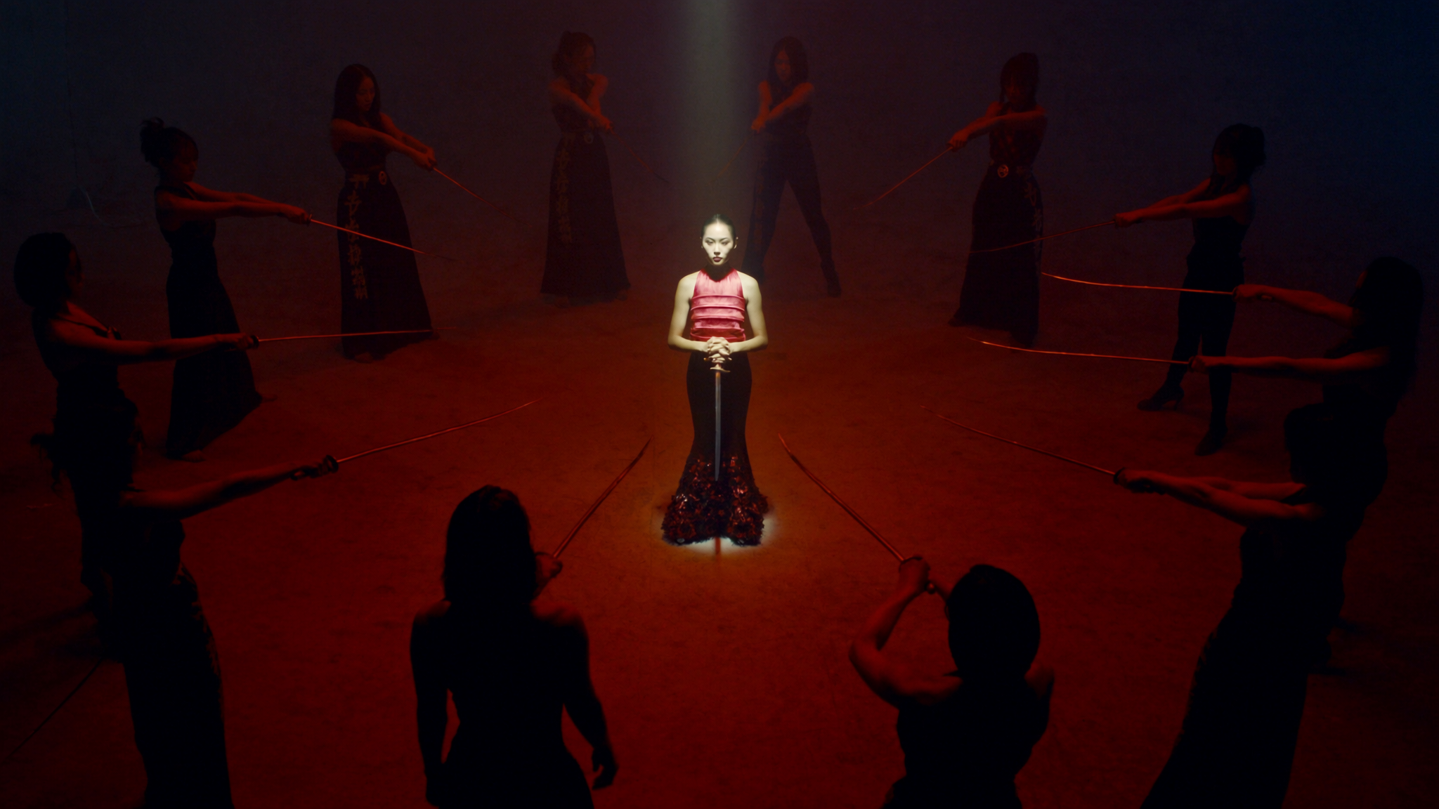
Why Thumbnails Decide Whether Your Video Ever Gets Watched
Most creators spend hours on the script, the lighting, the edit, and the sound mix — then throw together a thumbnail in the last ten minutes before upload. That inversion is expensive. On a platform where a viewer's eye lands on a suggested video and decides in a fraction of a second whether to keep moving or stop, the thumbnail is not decoration. It is the single highest-leverage asset in the entire publishing chain.
AI image generation has changed the economics of that decision. What used to require a designer, a stock subscription, and a two-day turnaround can now be sketched, iterated, and finalized in an afternoon — sometimes in twenty minutes. But speed alone does not produce clicks. The creators who consistently win are the ones who treat AI generation as one stage in a disciplined visual workflow rather than a magic button.
This guide lays out that workflow end to end: how to think about thumbnail design, how to pick an image engine, how to write prompts that produce usable frames, how to keep a series visually consistent, how to finish and test, and which mistakes quietly destroy click-through rate. It is written for people who publish regularly and want a process they can repeat, not a one-off trick.
What Actually Makes a Thumbnail Work
Before touching a generator, it helps to know what you are aiming at. Thumbnails are not small posters. They are attention instruments viewed at roughly the size of a postage stamp, often on a phone, often while the viewer is half-distracted.
Contrast, faces, and the curiosity gap
Three forces do most of the work. The first is contrast — luminance contrast, color contrast, or conceptual contrast. A bright subject on a dark field reads instantly; a mid-tone image on a mid-tone background disappears into the feed even if it is beautiful at full size.
The second is the human face, especially a face showing a legible emotion. Faces are processed faster than almost any other visual content, and a face plus a strong object creates a two-part composition the eye can parse without effort.
The third is the curiosity gap: a visual question the viewer cannot answer without clicking. A closed box, a before-and-after split, a missing piece, an unexplained reaction. The trick is to leave a gap without becoming cryptic. If the viewer cannot tell what the video is about, curiosity turns into confusion and the click never happens.
The three-second test
Run every candidate through a brutal test. Shrink it to 15 percent of your screen, look at it for three seconds, then look away and describe what you saw. If you cannot state the subject, the emotional tone, and the implied promise, the thumbnail is not finished — no matter how impressive the render looks at full resolution.
Where AI helps and where it does not
Generation is excellent at producing background environments, stylized subjects, lighting drama, and variations at speed. It is weaker at knowing your audience, judging your channel's tone, or deciding what is interesting about your specific video. Treat the model as a rapid visualization tool and yourself as the editor with final cut. That division of labor is what separates a channel that looks professionally branded from a channel that looks like a random gallery of AI outputs.
Choosing the Right AI Image Engine for Thumbnail Work
There is no single best engine, only engines that fit your genre, your tooling, and your patience. Compare candidates on a short list of criteria rather than on demo galleries.
The criteria that matter
Text rendering. Thumbnails almost always need short, punchy words. Some models still mangle letterforms, produce doubles, or invent alphabets. If you plan to render text inside the image, test three-to-five-word phrases repeatedly before committing.
Resolution and upscaling headroom. You need a crisp 1280x720 output at minimum, ideally generated larger and downscaled so edges stay clean. Check whether the engine produces natively large frames or requires a separate upscaler.
Style control. Can you lock a consistent look across dozens of images using a style reference, a reference image, or a trained style? Series consistency matters more than any single image's brilliance.
Compositional obedience. Some engines ignore spatial instructions. Test a prompt with a specific layout — subject left, negative space right — and see whether it respects it.
Editing and inpainting. You will almost always need to remove a stray object, extend a background, or swap a hand. Inpainting quality saves enormous time.
Cost and speed. Iteration is the core of the process, so per-image cost and generation latency directly affect how many variations you can explore. Choose a tool whose pricing lets you generate freely rather than one that makes you hesitate.
Matching engine to genre
A gaming channel wants sharp, saturated, high-contrast stylization with dramatic lighting. A finance channel wants clean, restrained, editorial imagery with plenty of negative space for text. A tutorial channel wants clear depictions of tools, screens, and hands. A reaction or commentary channel needs expressive faces that read at small size. Photoreal engines with strong face control suit the last case; stylized illustration engines often suit the first. Test each engine on five images in your actual genre, not on its showcase page.
Building a Repeatable Thumbnail Workflow
A workflow beats inspiration. Here is a sequence that keeps quality high without slowing you down.
Step 1: Write the promise before the prompt
One sentence: what does the viewer get, and why now? "This cheap tool replaced my expensive setup." "I tested the hardest level for ten hours." That sentence determines subject, emotion, and text.
Step 2: Sketch the layout on paper
Two boxes. Where does the subject sit? Where does the text go? Deciding this before generating saves dozens of unusable images. Most successful thumbnails are built on a simple split: subject occupying one third to one half, text or contrast field occupying the rest.
Step 3: Generate in batches of six to eight
Generate a wide pass first, changing one variable at a time — pose, camera angle, lighting, background. Resist the urge to perfect a single image before exploring the space.
Step 4: Select ruthlessly at thumbnail scale
View all candidates as a grid at small size. Whichever two or three still read clearly survive. Delete the rest immediately so you are not tempted to rescue a weak frame.
Step 5: Refine with inpainting and outpainting
Fix hands, remove clutter, extend backgrounds, adjust the subject's expression. This stage is where a good image becomes a great thumbnail.
Step 6: Composite and add typography
Move into a design tool for text, arrows, circles, borders, and your channel's visual signature. Keep text to three to five words, set it in a heavy weight, and give it a stroke or shadow so it survives compression.
Step 7: Export, check, and archive
Export at the platform's recommended dimensions, then check on an actual phone. Archive the final file along with the prompt that produced it, so the style can be reproduced later.
Prompt Craft for High-Click Thumbnails
Prompting for thumbnails differs from prompting for art. You are optimizing for legibility at small scale, not for detail at full resolution.
Modular prompting
Build prompts from interchangeable blocks: subject, action, expression, camera, lighting, background, palette, and output constraints. Then swap blocks one at a time to explore variations efficiently. A typical modular prompt might combine a subject block ("a surprised young man in a hoodie"), an action block ("holding a glowing device at chest height"), a camera block ("medium close-up, 35mm lens, slight low angle"), a lighting block ("strong rim light from the left, dark background"), and a palette block ("teal and orange, high contrast").
Stacking for depth
When an image looks flat, stack detail cues rather than adding new subjects: foreground blur, atmospheric haze, specular highlights, subsurface warmth in skin. Depth cues are what make a thumbnail feel expensive.
Negative cues
Most engines accept exclusions. Common ones for thumbnails: no text, no watermark, no extra limbs, no busy background, no low contrast, no cluttered composition, no distorted faces, no wide shot. Excluding clutter is often more valuable than adding detail.
Handling text
Two schools. Generate text inside the image for integrated, stylized typography, or generate clean negative space and add text in a design tool. The second is safer, more consistent, and easier to localize. Choose the first only when the engine reliably renders the exact words you need — and always proofread at small size, since an awkward letterform is a trust signal lost.
Iterating with intent
Change one variable per batch and note what changed. Within an hour you will have a personal map of which prompt blocks move the needle for your genre, and that map is worth more than any prompt library.
Consistency and Branding Across a Series
A channel's thumbnails should be recognizable before the title is readable. Consistency builds recognition, and recognition builds habitual clicks.
Style anchors
Define three to five fixed elements: a color palette, a lighting direction, a framing convention, a font, and a recurring graphic device such as a border or corner marker. Every thumbnail uses all five. Everything else varies with the video.
Character and subject consistency
If your channel features a recurring host or mascot, use reference-image conditioning or a locked character description so the same person appears across episodes. Keep a canonical description document: hair, clothing, age range, expression range, and preferred camera angles. Feeding the model the same description every time produces far more stable results than improvising.
Templates that do not look templated
Build two or three layout templates with fixed text zones and safe areas, then vary subject, pose, background, and accent color inside them. Viewers perceive a coherent brand; you get faster production. The failure mode is using a single rigid template for months — vary the composition enough that the feed does not look like a copy-paste wall.
Accessibility and legibility
Check contrast between text and background with a contrast checker, avoid relying on red-green distinctions alone, and keep essential content inside the safe margins so platform UI overlays never cover your subject. Legibility is a branding decision as much as an aesthetic one.
Finishing, Upscaling, and Platform Reality
The last ten percent of the work decides whether the thumbnail survives compression and mobile display.
Upscaling and sharpening
If your engine's native output is small, upscale before compositing rather than after. Apply mild sharpening at the end, then check for halos around text. Over-sharpened thumbnails look noisy in a feed and can read as low quality.
Safe zones and overlays
Keep critical elements away from corners and the lower-right region where duration stamps appear. Preview the thumbnail inside the actual interface — search results, suggested sidebar, and mobile home feed — because the same image can read differently in each context.
File discipline
Export at the platform's recommended resolution, keep the file size reasonable for fast loading, and save layered source files. Naming conventions like series-episode-thumbnail-v3 will save you when you need to revisit a visual direction months later.
Cross-platform reuse
If you publish to multiple platforms, generate a version with a wider safe area and a version tuned to vertical formats. Building this into the workflow from the start prevents rushed crops later.
Common Mistakes That Kill Thumbnails
Too much in the frame. AI makes it easy to add detail. Extra detail reduces the size of the focal point and slows recognition. Remove until it hurts.
Text that repeats the title. The thumbnail and title should combine, not duplicate. Use the thumbnail for emotion and the title for specifics.
Low contrast between subject and background. Fix with lighting prompts or a background replacement in post.
Inconsistent style between episodes. A feed of mismatched visual styles erodes recognition even when individual images are strong.
Ignoring mobile. Design at phone size first, then check desktop. Not the other way around.
No variation in testing. If every thumbnail in a test uses the same composition, you are testing nothing.
Uncanny faces. Distorted features, dead eyes, or asymmetric faces destroy trust instantly. If a face is not convincing at small size, replace it or crop it out.
Chasing trends that clash with your brand. Borrowing a popular visual gimmick can work once, but it costs recognition if it contradicts everything else on your channel.
Testing, Iterating, and Reading the Data
Thumbnails are hypotheses. Treat them that way.
What to measure
Track click-through rate alongside average view duration and impressions. A thumbnail that raises clicks but tanks retention is not a win; it attracts the wrong audience. Compare like-for-like: similar topics, similar publishing times, similar traffic sources.
How to test cleanly
Run A/B tests where the platform supports them, and where it does not, rotate variations across similar videos rather than changing several variables at once. Test one dimension at a time — face versus no face, warm versus cool palette, one word versus three.
Iterating after publication
Changing a thumbnail on an older video is a legitimate strategy for evergreen content, especially if the video has strong retention but weak impressions. Refresh the visual, keep the title, and watch what happens over the following weeks.
Building your own playbook
After twenty or thirty tests, patterns emerge: which emotions convert for your audience, which palette reads best in your niche, whether text helps or hurts. Write those findings down. Your documented playbook — not any tool's default settings — is the asset that keeps producing results.
FAQ
How long should a thumbnail take with AI?
A tuned workflow takes twenty to forty minutes per thumbnail: a short planning step, two or three generation batches, one refinement pass, and compositing. The first few attempts will take longer while you calibrate prompts and templates.
Do I still need a designer?
Not necessarily for production, but design literacy matters. Understanding hierarchy, contrast, and typography is what makes AI output usable. Many creators pair a fast AI workflow with a designer for occasional template and brand refreshes.
Should I put text in the thumbnail at all?
If the text adds information the title does not carry, yes. Keep it to three to five words, make it readable at small size, and never let it crowd the subject.
How many variations should I generate?
Six to eight per batch, two to three batches per thumbnail. Generating fewer than ten candidates usually means settling for the first acceptable image rather than finding the strongest one.
Can AI thumbnails look too generic?
They can, especially when prompts rely on generic descriptors like "cinematic" or "trendy." Specificity about subject, lighting, palette, and composition is what produces distinctiveness. Pair that with fixed brand elements and the generic look disappears.
What about copyright and likeness?
Use engines whose licensing terms permit commercial use, avoid generating recognizable real people without permission, and avoid mimicking another creator's protected visual identity. Check the terms of the tool you use, and keep records of what you generated.
How often should I refresh my visual style?
Revisit templates once or twice a year, or whenever click-through rate drifts downward across several uploads. Small evolutions — a new accent color, a different framing convention — keep the brand fresh without losing recognition.
Putting It All Together
A reliable thumbnail system is less about which generator you choose and more about the loop you run: define the promise, plan the layout, generate widely, select at small size, refine surgically, composite with restraint, test deliberately, and document what worked. AI compresses the slow parts of that loop — rendering, variation, iteration — so you can spend your attention on the decisions only a human with knowledge of the audience can make.
Start with one video. Build a template, write your prompt blocks down, generate more variations than feels necessary, and test two options against each other. Then repeat. Within a month you will have a personal playbook, a recognizable visual identity, and a process that turns thumbnail production from a last-minute panic into a fifteen-minute habit — which is exactly the kind of leverage that compounds across an entire channel.
