

Why Thumbnails Decide Whether Your Video Gets Watched
A thumbnail is not decoration. It is the first frame of your story, the promise you make before a single second of footage plays, and often the only thing a viewer consciously notices before scrolling past. On a phone — where most viewing happens — your cover image appears roughly the size of a postage stamp, wedged between a dozen competitors. Viewers decide to stop or scroll in a fraction of a second, and they decide on shape, color, and emotion rather than on fine detail.
Most creators get this backwards. They spend twenty hours scripting, shooting, and editing, then four minutes making a thumbnail at the end of the process, usually while tired. The result is a frame grab with three words slapped on top. Meanwhile, a smaller competitor with a weaker video but a sharper cover quietly collects the clicks.
AI does not change that underlying dynamic. It changes the economics of producing and testing visual ideas. Instead of one rushed thumbnail, you can explore thirty directions in the time it used to take to make one, then composite the best ideas into a cover you actually control. The strategy still belongs to you; the execution gets faster.
This guide walks through a practical, repeatable workflow: how to brief a thumbnail, how to prompt for usable candidates, how to compose for the tiny screen, how to test honestly, and how to stay on the right side of platform rules and copyright.
What AI Can and Cannot Do for Thumbnail Design
Before building a workflow, be clear about the division of labor. Most disappointment with AI thumbnails comes from asking a generative model to do a job that belongs to a designer.
Where generative models genuinely excel
- Rapid exploration. You can generate dozens of facial expressions, poses, camera angles, and background treatments in minutes. This is the single biggest win: you stop committing to your first idea.
- Cleanup and repair. Removing a distracting object, extending a background, fixing harsh lighting, sharpening a soft frame, or replacing a cluttered studio wall with a neutral gradient are tasks AI handles well.
- Asset creation. Props, textures, abstract shapes, particles, and stylized environments that would take an hour in a layer-based editor can be generated as isolated elements and composited in.
- Consistency at volume. If you publish several times a week, AI helps you keep a recognizable visual language — same color palette, same framing logic, same typographic rhythm — without rebuilding files from scratch.
- Variant production. Generating alternate expressions or color treatments makes genuine A/B testing realistic instead of theoretical.
Where human judgment still wins
- Knowing what the audience actually wants. A model does not know that your viewers respond to skepticism, surprise, or a specific recurring joke. You do.
- Truthfulness. The thumbnail must represent the video. A model will happily generate an explosion that never appears in your footage.
- Brand coherence. Typography, tone, and signature colors are editorial decisions.
- Final selection. Models produce options, not verdicts.
A useful mental model: AI is a fast junior designer with infinite patience and no taste. You supply the taste and the constraints.
A Repeatable AI Thumbnail Workflow, Step by Step
This workflow assumes you publish regularly and want something you can repeat weekly without burning out.
Step 1: Extract the single promise of the video
Write one sentence: "After watching, the viewer will ______." Then decide what visual proof of that promise can appear in a still image. If the video explains why a cheap tool beats an expensive one, the image might be the tool held side by side with a price comparison, plus an unmistakable expression. If the video is a story, the image is the moment of highest tension.
The single most common thumbnail failure is trying to represent the entire topic. Choose one idea and commit.
Step 2: Write a brief before you prompt
A brief is five lines:
- Subject: who or what is in frame.
- Emotion or action: the feeling the viewer should read in half a second.
- Background: simple, contrasting, or contextual.
- Text: the two to four words that appear, or "none."
- Constraint: what must not appear — logos, weapons, misleading props, uncanny hands.
This brief becomes your prompt scaffold and your quality checklist. Without it, you generate pretty images that do not sell the video.
Step 3: Generate a controlled set, not a random set
Generate in batches that vary one variable at a time. Batch one: five expressions on a fixed background. Batch two: five backgrounds behind the winning expression. Batch three: three color treatments. This is far more useful than twenty unrelated images, because you learn which variable is doing the work.
Step 4: Composite rather than hope
Treat generated images as ingredients. The winning workflow for most channels is: generate the subject, generate or source the background, then assemble the composite in a normal editor where you control crop, scale, contrast, text placement, and safe margins. Generating a finished thumbnail in one prompt is possible, but you lose the ability to fix the small things that matter at small sizes.
Step 5: Export and stress-test at thumbnail size
Shrink the file to roughly 320 pixels wide and look at it on a phone, outdoors if possible. If you cannot read the expression or the text at that size, the design is not finished. Then upload at the platform's recommended resolution — typically 1280×720, 16:9 — and keep the file under the platform's size limit so it compresses cleanly.
Writing Prompts That Produce Usable Candidates
Generic prompts generate generic images. Thumbnail prompts need specificity in three layers.
Subject, expression, and action
Name the person or object, the emotion, and the physical action. "A woman looking mildly interested" produces nothing. "A woman in her thirties leaning toward the camera, eyebrows raised, mouth slightly open in surprise, hands framing an object in front of her chest" produces something you can work with. Emotion reads through eyebrows, mouth shape, and body angle — describe all three.
Background, framing, and negative space
Say explicitly what the background should be and where empty space should sit. "Plain deep teal gradient background, subject positioned left of center, large clean empty area on the right" gives you a place for text. Without that instruction, models center the subject and fill every corner with detail, leaving you nowhere to put a headline.
Also specify framing: close-up, medium shot, or full body. For small-screen legibility, close-up and medium shots almost always outperform wide shots.
Style anchors, lens language, and negative prompts
Style anchors keep a channel consistent: "high-contrast studio lighting, saturated colors, shallow depth of field, editorial photography look." Lens language adds realism: "50mm lens look," "soft rim light," "crisp catchlights in the eyes."
Negative prompts matter just as much: no text, no watermarks, no extra fingers, no busy patterns, no muddy shadows, no duplicate limbs. Models still struggle with hands and fine text, so decide in advance that text will be added manually in your editor.
Finally, iterate in small steps. Change one phrase at a time and keep a note of what worked. Your prompt library becomes an asset as valuable as the images.
Composition Rules That Survive Algorithm Changes
Platforms change. Ranking signals change. Basic visual perception does not.
The three-element rule
A strong thumbnail usually contains three readable elements: a subject, a focal object or contrast, and a short text block. Four or more elements create noise at small sizes. If you cannot name your three elements out loud, remove one.
Contrast and color hierarchy
Thumbnails are read in a busy feed, so contrast matters more than palette elegance. Pick one dominant color and one accent that oppose each other — warm subject against cool background, dark foreground against bright backdrop. Avoid low-contrast pastels unless your entire niche uses them and you want to blend in deliberately.
The squint test
Squint at your thumbnail or blur it heavily. You should still be able to identify the subject, the emotion, and roughly where the text sits. If the image turns into an even gray mush, increase contrast, simplify the background, or enlarge the subject.
Text discipline
Two to four words, large, high contrast, placed in a corner or third that does not overlap the subject's face. Thick sans-serif weights survive compression better than thin serifs. Never repeat the video title verbatim — the thumbnail and title should complement each other, not duplicate each other.
Composition templates worth reusing
- Split frame: subject on one third, object or comparison on the other.
- Before/after: a clear dividing line with two contrasting states.
- Reaction: face large, emotion obvious, minimal text.
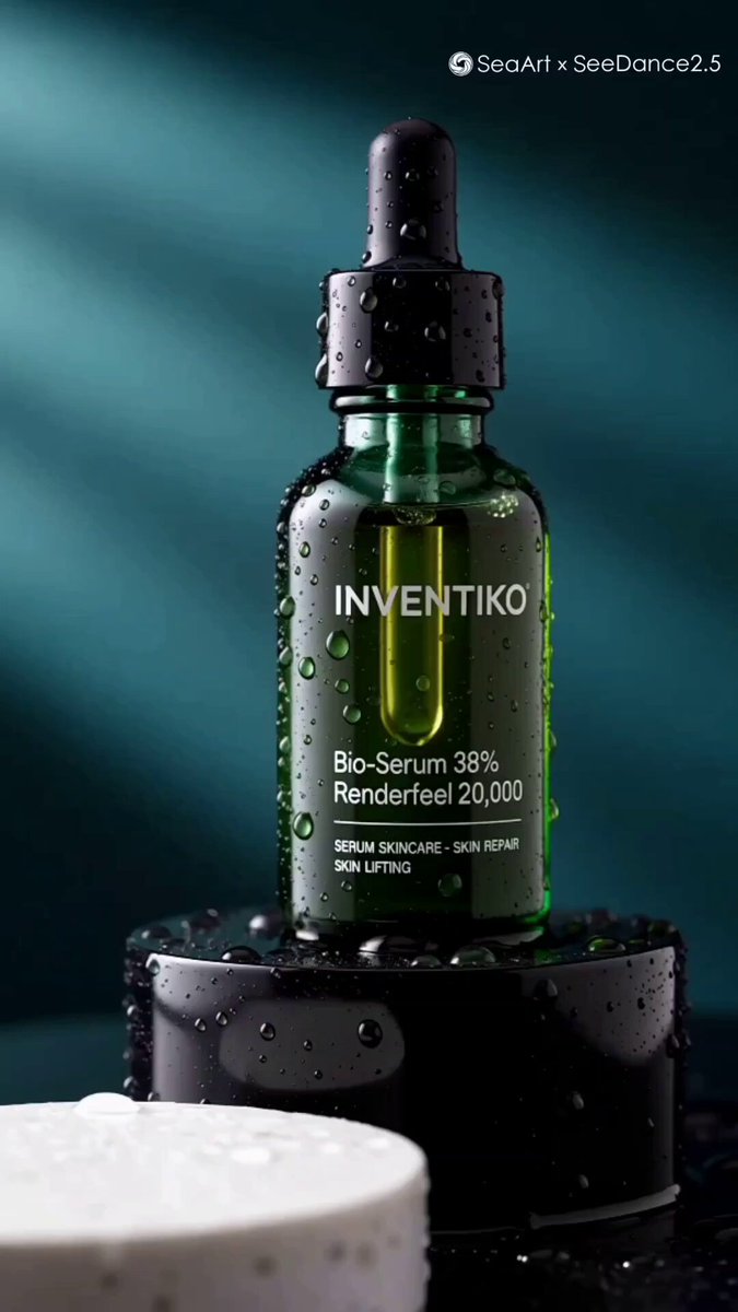
- Object hero: one product photographed dramatically with a short hook.
- Diagram tease: a simplified chart or arrow implying a reveal.
Rotate between two or three templates so your feed looks varied but recognizable.
Turning Metrics Into Better Thumbnails
Design opinions are cheap. Data is not — provided you read it honestly.
Running a simple A/B test
Change one thing per test: the expression, the background color, or the text. If you change all three, you learn nothing except that one version won. Give each version enough impressions before judging — a few hundred at minimum, ideally a few thousand, and ideally across a similar time window so day-of-week effects do not skew results.
Reading click-through rate in context
Click-through rate is a ratio: clicks divided by impressions. That means it moves when impressions move, even if your thumbnail did not change. A video that suddenly gets pushed to a broader, less-interested audience will show a lower rate with an identical image. Always compare like with like: same channel, same format, similar traffic source.
Watch a second signal too — average view duration after the click. A thumbnail that oversells gets clicks and then loses viewers in the first thirty seconds, which damages the video's long-term performance. The best thumbnail is the one that attracts the right viewers, not the maximum number of wrong ones.
Keeping a swipe file
Collect screenshots of thumbnails that made you stop scrolling, including competitors'. Note the subject, color scheme, text length, and emotion. Patterns will emerge within a niche faster than any general advice can teach you. Review the file monthly and update your templates accordingly.
Legal, Ethical, and Brand Safety Checks
AI generation raises questions that traditional design did not.
Likeness and copyright
Do not generate a recognizable real person, a celebrity, or a copyrighted character to imply endorsement. Avoid prompting for a specific living artist's style or a trademarked logo. If a generated image includes a logo or a face by accident, regenerate rather than crop and hope.
Platform rules on misleading covers
Most video platforms prohibit thumbnails that misrepresent content — fake nudity, fake violence, fake money, or claims the video never delivers. Repeated violations lead to strikes or removal from recommendation surfaces. The safe rule: everything visible in the thumbnail must be justified by something in the video.
Disclosure and audience trust
The practical question is not whether you must label an AI-assisted image, but whether your audience would feel deceived if they found out. Using AI to clean up lighting or build a background is unremarkable. Presenting a synthesized scene as documentary footage is not. Keep the boundary where your audience would keep it.
Brand consistency checklist
- Same font family across recent uploads.
- Same two or three accent colors.
- Consistent subject framing.
- Consistent emotional register — if your channel is calm and educational, do not suddenly scream.
Tool Stack Options for Different Workflows
You do not need an expensive suite. You need a stack that matches your publishing volume.
All-in-one editors with built-in generation
Tools that combine timeline editing, image generation, and background removal suit solo creators who publish weekly. Fewer exports, fewer format surprises, and one subscription. The trade-off is less control over generation parameters.
Generative image tools plus a classic editor
This is the most flexible combination: use a dedicated image generator for subjects and backgrounds, then composite in a layer-based editor. You control typography, masking, and color grading precisely. Best for channels where the thumbnail is a competitive advantage.
Template-driven batch pipelines
If you publish daily, build three to five layered templates with placeholder slots for the subject image, the accent color, and the text. Swapping the subject and updating the text takes minutes. This is the single highest-leverage investment for high-volume channels.
Choosing based on volume, not hype
Ask three questions: How many thumbnails per week? How much control do I need? How much time can I actually spend? A weekly podcaster benefits from automation. A daily news channel needs templates. A brand channel needs a designer in the loop.
Mistakes That Quietly Kill Click-Through Rate
- Repeating the title in the image. Duplication wastes the most valuable real estate you have.
- Too much text. Anything beyond four words becomes unreadable on a phone.
- Low contrast. Elegant, muted palettes disappear in a crowded feed.
- Faces too small. Emotion cannot be read from a distant figure.
- Cluttered backgrounds. Detail competes with the subject at small sizes.
- Inconsistent branding. Viewers should recognize your covers before reading your channel name.
- Ignoring the video's second half. A cover that promises something the video abandons hurts retention.
- Testing nothing. Publishing the same composition for a year leaves easy gains on the table.
- Judging on a desktop monitor. Almost everyone sees it small.
- Chasing trends outside your niche. Borrowing a style that does not match your content attracts the wrong audience.
FAQ: AI Thumbnails in Practice
How many variations should I test per video?
Two or three well-considered variants are enough for most channels. Testing ten dilutes your impressions and delays conclusions. If you have low traffic, test one variable per week across different videos instead of splitting a single video's audience.
Can AI-generated thumbnails hurt a channel?
Not because they are AI-generated. They hurt when they are misleading, contain problematic content, or misrepresent the video. Follow platform rules, avoid real likenesses and trademarked characters, and keep every promise the image makes.
Should I make the thumbnail before or after editing the video?
Before final export, and ideally before you finish shooting. Designing the cover first forces you to identify the single most interesting moment, which often improves the edit. At minimum, do not leave it to the last ten minutes before upload.
Do I still need a human designer?
If thumbnails are a major traffic source for your business, yes — at least for templates and periodic audits. A designer builds the system; you operate it with AI assistance between reviews. For hobby channels, a solid template plus AI generation is more than enough.
What about AI text inside the image?
Avoid it. Text generation still produces errors, especially with unusual spellings, numbers, and small sizes. Generate the image without text and add typography in your editor where you control kerning, weight, and contrast.
How do I keep thumbnails consistent across a series?
Lock three things: a color palette, a framing distance, and a text position. Then vary only the subject and the emotional beat. Consistency is what makes a channel feel like a channel rather than a collection of unrelated uploads.
Putting the Workflow Together
The practical takeaway is that AI turns thumbnail design from a bottleneck into a routine. Brief the promise, generate controlled batches, composite with intent, stress-test at phone size, test one variable at a time, and keep every claim honest. Do that consistently and the gains compound: better click-through, better-matched viewers, and a visual identity your audience recognizes before they read a single word.
