


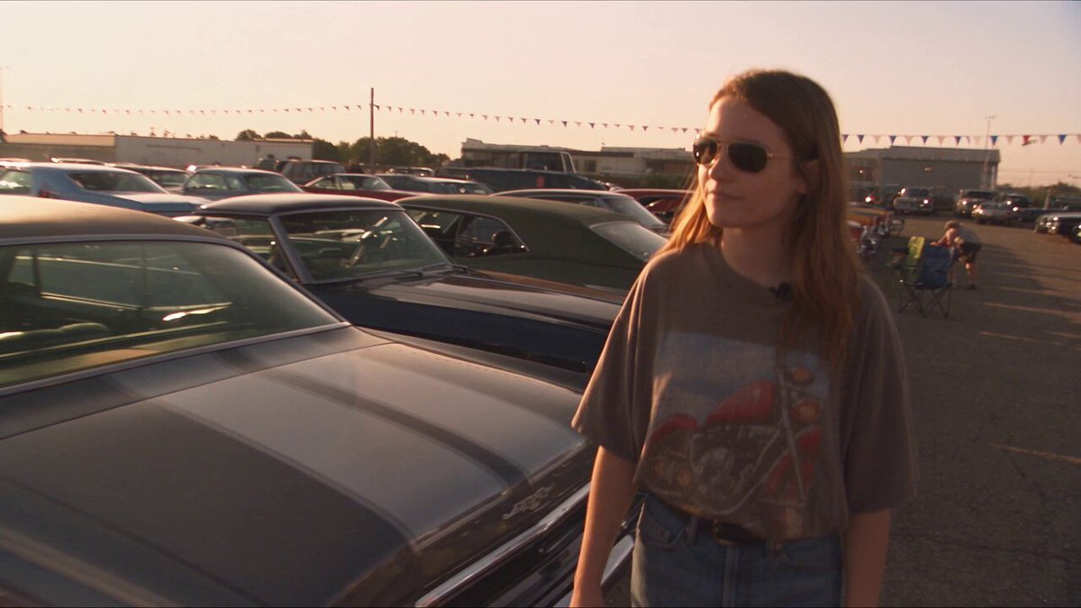
Why color and composition decide whether AI video feels cinematic
A generated clip can be razor sharp, motion-smooth and perfectly on-prompt, and still feel like a stock montage rather than a scene from a film. The gap is almost never the model. It is the two decisions human cinematographers obsess over: how color carries emotion, and how composition steers the eye. Modern text-to-video and image-to-video systems are competent at physics, skin tones and camera drift. They are not competent at knowing what your story means, which is why unguided generations default to a pleasant, generic, advertiser-friendly look that viewers scroll past without remembering.
Cinematography, stripped down, is control. Control of where light falls, what color that light carries, and where attention lands inside the frame. AI does not remove that control, it moves it earlier in the process. Instead of pushing wheels on a grading panel weeks after a shoot, you are writing intent into prompts, reference images and edit decisions before a single frame renders. Teams that understand this produce work that looks deliberate. Teams that don't end up with forty clips that each look fine and together look like nothing.
The practical takeaway: treat color and composition as inputs you design, not as qualities you hope for. Everything below is about turning those two abstract ideas into concrete, repeatable decisions you can make in ten minutes per scene.
A working vocabulary for color that models respond to
Generative video models do not parse color theory. They parse language patterns associated with images, so vague words get vague results. "Make it cinematic" is the single most useless instruction you can give a model, because it has been trained on millions of contrasting examples tagged that way. Precise physical and stylistic language works far better.
Here is a vocabulary that reliably moves output in a direction:
- Light source temperature: tungsten practicals, golden hour, cool overcast daylight, sodium vapor street lamps, blue moonlight, fluorescent office green.
- Palette type: complementary teal and orange, monochromatic amber, muted earth tones, pastel high-key, desaturated with a single saturated accent, high-contrast noir.
- Contrast and rolloff: low-contrast milky shadows, deep crushed blacks, gentle highlight rolloff, clipped specular highlights, lifted matte blacks.
- Texture of color: film grain, halation around highlights, slight chromatic aberration at frame edges, faded film emulation, digital cleanliness.
- Emotional mapping: warm interiors read as intimacy or safety, cool exteriors read as isolation or threat, green casts read as unease, magenta reads as artificiality or nightlife.
A prompt that uses this vocabulary might read: "interior diner at night, warm tungsten overhead practicals against cold blue window light, muted green shadows, gentle highlight rolloff, shallow depth of field, 35mm film grain." That is four color decisions and one texture decision, all of which a model can interpret.
What you should avoid is stacking contradictory color instructions. "Neon cyberpunk lighting, soft natural golden hour, black and white noir" gives the model three mutually exclusive looks and it will average them into mud. Pick one dominant palette, one secondary accent, and one texture. That is enough for a visual identity.
Color psychology as a shot-level tool, not a mood board
The most common mistake is choosing a palette for the whole film. Color works harder when it changes with the story. A character's apartment can be warm and amber in the first act and slowly shift to cold, desaturated blue by the third. In a generative workflow this is easier than in traditional production, because you can specify the shift per shot rather than relighting a set.
Write it down explicitly: for each scene, name a dominant hue, a secondary accent, and one color that appears only when something is wrong. Then keep that mapping consistent across every generation for that scene.
Composition rules that survive generation randomness
Composition is how you structure the frame so the viewer's eye travels where you want it to, in the order you want. Models obey explicit spatial language better than they obey aesthetic adjectives, so describe placement, scale and layers rather than "nice framing."
Useful levers, roughly in order of reliability:
- Subject placement: centered for symmetry, power or confrontation; rule-of-thirds placement for dialogue and observation; extreme off-center for tension or loneliness.
- Depth layering: name a foreground element, a midground subject and a background environment. Models that receive all three produce far more dimensional images than models asked for a single subject.
- Leading lines: corridors, railings, roads, window frames, rows of lights, stairwells. These pull the eye toward the subject and make static shots feel directed.
- Negative space: ask for the subject occupying one-third of the frame with empty space on one side. This is the fastest way to make a shot feel intentional rather than cropped.
- Framing devices: subjects seen through doorways, mirrors, blinds, car windows or reflections. These add narrative layers and hide the artifacts models struggle with in wide open compositions.
- Scale contrast: a small figure against a large structure communicates vulnerability instantly, no dialogue required.
One caveat specific to generative video: composition tends to drift during motion. If you set a perfect rule-of-thirds frame at second zero, the subject may wander toward center by second four. Counter this by asking for a locked-off camera or a slow dolly, which keeps the composition stable, and save your dynamic camera moves for shots where composition matters less than energy.
Aspect ratio is a composition decision, not an export setting
A 2.39:1 frame and a 9:16 frame demand different staging. Wide formats reward horizontal depth: layered planes, lateral movement, ensemble blocking. Vertical formats reward vertical hierarchy: full-body framing, ceilings, foreground occlusion, rising movement. Shoot your shot list in the ratio you intend to deliver, and if you need both, plan which element is expendable before you generate.
Build a look bible before you generate a single frame
A look bible is a one-page document that turns taste into instructions. It takes twenty minutes and saves hours of re-generation. It should contain:
- Three reference stills you would be happy to match, ideally from different sources so you're not copying one film wholesale.
- A five-swatch palette with hex values or plain descriptions: dominant, secondary, accent, skin tone treatment, shadow color.
- A lighting statement: time of day, key direction, quality of light (hard or soft), practical sources visible in frame.
- Lens language: focal length feel, depth of field, distortion, whether the camera is handheld or locked.
- Texture layer: grain, halation, sharpness, whether the image should look digital-clean or film-like.
- Composition rules for the project: where the subject usually sits, how much headroom, how much negative space.
- Language you will reuse verbatim in prompts, so every shot inherits the same look.
The last point matters more than it sounds. Consistency across generations comes from copy-pasting the same color and texture phrases into every prompt, not from writing fresh poetic descriptions each time. Variation belongs in the action, the subject and the camera movement, not in the look.
A repeatable production workflow, step by step
Here is a pipeline that works for narrative shorts, branded films, music videos and social series alike.
Step 1: Lock the color and composition intent per scene
Write one line per scene: what the palette is, what it becomes by the end, and how the subject is framed. Example: "Kitchen scene, warm amber, soft window key, subject left third, heavy negative space right. Ends colder, subject centered, tighter framing." That single line governs every shot in the scene.
Step 2: Generate reference stills before video
Stills are cheap and fast. Generate ten to twenty stills per scene using the look bible language, then choose two or three that nail the palette and framing. These become the anchors for image-to-video generation, which is dramatically more controllable than text-to-video for anything with a specific look.
Step 3: Generate short clips and protect composition
Generate in short bursts. Long clips drift in both color and composition. If the shot needs eight seconds, consider generating two four-second segments with the same anchor image and joining them, rather than asking the model to hold one look for eight seconds.
Step 4: Select ruthlessly on color and framing first
Review your takes with the sound off and the color intent in mind. Reject anything that violates the palette, even if the motion is beautiful. A beautiful shot that breaks the palette costs you more in grading time than a plain shot that fits.
Step 5: Normalize before you grade
Generated clips rarely share exposure or white balance. Before creative grading, apply a normalization pass: match black levels, white levels and neutral midtones across shots. This is the step most creators skip, and it is the reason their AI edits feel like a slideshow.
Step 6: Grade creatively, then refine color per shot
Apply your look, then check each shot individually. Generative video often needs a slight hue rotation, a shadow lift, or a selective saturation pull on skin tones. Small corrections per shot are normal; the goal is that no single shot announces itself as different.
Step 7: Finish with texture, sound and rhythm
Add grain, halation or a subtle bloom at the end of the chain, not the beginning, so the effect stays consistent across the cut. Then cut to sound. Color and composition set the mood; rhythm and audio decide whether the mood lands.
Adapting one scene to every aspect ratio and platform
Once a scene works in one ratio, reframing is mostly about protecting the subject. Two approaches work well. The first is generative outpainting or inpainting, where you extend the frame and let the model fill the new space. The second is deliberate re-staging: re-generate the shot in the target ratio with adjusted composition language, keeping the palette identical.
Re-staging generally looks better but costs more generation time. Outpainting is faster but can produce soft or inconsistent edges. For social cuts, the hybrid works: re-stage hero shots, outpaint supporting shots, and accept slightly softer edges in background coverage.
Practical rules for vertical delivery: keep faces in the upper third, avoid wide group staging, choose subjects with vertical silhouettes, and use foreground occlusion to fill the top and bottom of frame. For square delivery, center-weighted compositions with strong radial symmetry hold up better than rule-of-thirds staging.
Choosing tools by job, not by hype
Different stages of the pipeline need different categories of tool, and the best creators mix them.
- Text-to-video for exploratory shots and establishing beats where exact framing is negotiable.
- Image-to-video for anything where color and composition must match a reference. This is the workhorse of controlled cinematography.
- Motion and camera control tools, such as motion brushes and depth or pose conditioning, when you need a specific camera path or subject action.
- Upscaling and detail tools to reach delivery resolution without softening texture.
- Relighting and cleanup tools to fix a shot whose lighting contradicts the scene.
- A real grading suite, because timeline-level color management beats any single-clip filter.
Evaluate tools on three criteria only: does it respect a reference image, does it hold color across a clip, and does it give you a way to correct rather than only re-roll. Pricing models, subscription tiers and feature counts matter far less than those three.
Continuity: making separate generations feel like one film
Continuity is the invisible craft that separates a demo reel from a film. Three things break it in AI work: palette drift, lens drift and blocking drift. Palette drift is solved by the look bible. Lens drift is solved by naming a focal length and depth of field in every prompt. Blocking drift is solved by writing down where the subject stands in each shot before you generate.
Build a simple continuity sheet: shot number, subject position, camera height, lens feel, palette, and what changes between shots. Then check every accepted clip against it. Twenty seconds of inspection per shot catches the drift before it reaches the edit.
Common mistakes and how to fix them
Over-prompting color. Five palettes in one prompt produce average brown. Fix: one dominant, one accent, one texture.
Ignoring contrast structure. Many AI clips have no true black and no real highlight, which reads as flat. Fix: specify shadow depth and highlight rolloff explicitly.
Centering everything. Center framing is powerful because it is rare. Fix: default to off-center and reserve centering for confrontation, symmetry and final beats.
No negative space. Full-frame subjects feel like thumbnails. Fix: request empty space on a named side.
Mixing ratios in one project. Different ratios read as different films. Fix: pick a delivery ratio and re-stage for secondary formats.
Grading before normalizing. Creative grades on unmatched shots amplify inconsistency. Fix: normalize exposure and white balance first.
Chasing motion over meaning. A dramatic camera move in a shot that breaks the palette is a net loss. Fix: judge takes on color and framing first.
FAQ
Do I need color grading skills to improve AI cinematography?
You need three skills: reading a waveform or histogram, matching black and white points across shots, and knowing how to shift hue selectively. Everything beyond that is taste, and taste develops by comparing your grade against reference stills.
Should I generate in the final aspect ratio or reframe later?
Generate in your primary delivery ratio and reframe only for secondary formats. Generating wide and cropping to vertical almost always destroys composition, because vertical framing needs different staging, not a smaller window.
How many generations should a single shot take?
For a controlled shot with a good anchor image, expect three to eight attempts. If you are past fifteen, the prompt or the anchor is wrong. Change the input rather than re-rolling the same instruction.
Why do my AI clips look flat even after grading?
Usually because the source has no contrast structure: lifted blacks, rolled-off highlights and mid-saturation everything. Fix it at the prompt stage by specifying shadow depth and highlight behavior, then grade.
Can I match a specific film's look?
You can match its palette, contrast and texture, which is what most people actually want. Copying an exact grade across a whole project tends to look derivative. Take the color logic and the lighting logic, then build your own five-swatch palette.
What is the fastest way to make a scene feel intentional?
Reduce the number of decisions. One palette, one lighting direction, one lens feel, one composition rule. Restraint reads as authorship, and authorship is what makes generated footage feel like cinematography instead of output.
Cinematography with AI is not about finding the model that magically produces film-quality images. It is about deciding what your film looks like before you type, writing that decision into prompts and references, and then protecting it through selection, normalization and grading. Color gives the story its emotional temperature; composition gives it direction. Get those two right and the technology becomes invisible, which is exactly the point.
