

Why Streaming Promos Live or Die in the First Three Seconds
A streaming promotion has an unusual job. It is not selling a product a viewer can hold, test, or return. It is selling an hour of attention and the promise that the next sixty minutes will feel worth the subscription. That promise has to land before the viewer's thumb reaches the skip button, which means the opening beat carries almost all of the persuasive weight.
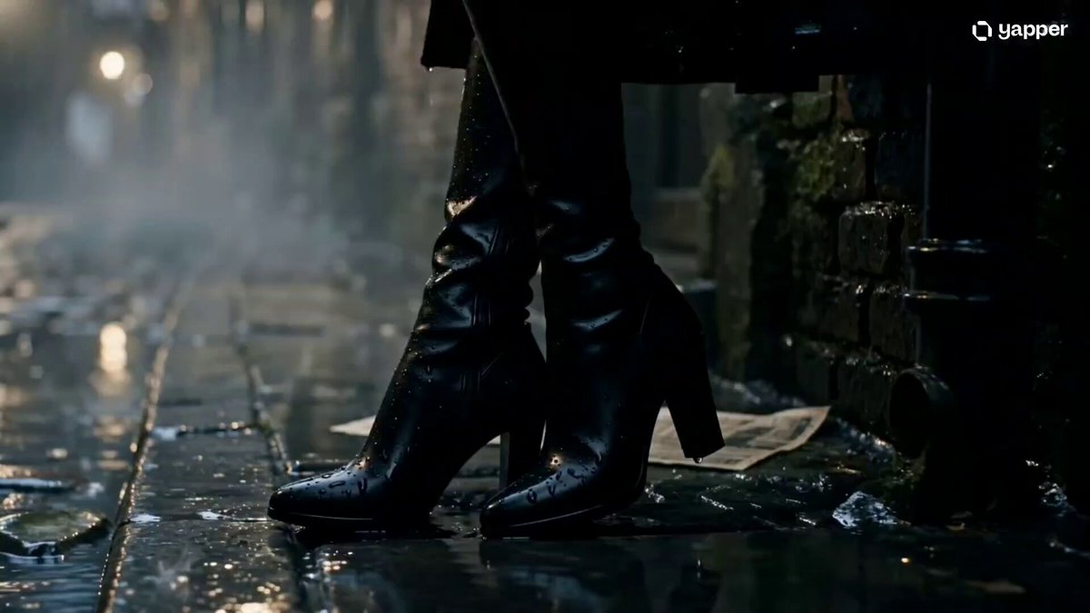
Watch how major platforms structure their in-app promos and the pattern repeats: no slow logo card, no leisurely establishing shot, no orchestral swell before anything happens. The first frame already contains a face, a conflict, or a visual oddity the brain cannot immediately file away. Curiosity does the work that a voiceover used to do.
The practical takeaway for anyone producing ad video is blunt: design your first three seconds as a standalone asset. If the spot were cut off there, would it still create a question in the viewer's mind? If the answer is no, the rest of the edit is negotiating from a losing position. A well-built hook is a small, complete story beat, not a runway to the real content.
Three seconds is also where platform economics bite. Autoplay feeds, muted defaults, and mobile-first placements mean the hook must work with sound off, on a five-inch screen, in a vertical or square frame. Test every cut as a silent vertical preview before you fall in love with the sound design. If the spot only works with headphones in a horizontal player, it is not finished.
The Anatomy of a High-Performing Streaming Ad
Strip away genre differences and most effective promos share the same structural parts: a hook, a promise, an emotional proof point, and a final action. The interesting question is not what the parts are, but how much screen time each one deserves.
Hook, promise, payoff
In a fifteen-second cut, the hook should own the first three seconds, the promise the next seven, and the payoff and call to action the final five. Longer cutdowns stretch the middle rather than the opening, because a slow second act is survivable while a slow first act is fatal. A sixty-second trailer can afford a beat of world-building at the twelve-second mark; a six-second bumper cannot afford a beat of anything.
The promise is where most in-house creative fails. Teams default to feature descriptions: a new season, a returning cast, a premiere date. None of those are promises. A promise is a feeling the viewer can anticipate: the satisfaction of a mystery closing, the comfort of a familiar ensemble, the tension of a story that could go wrong in an interesting way.
Audio, aspect ratio, and the mute test
Deliver every ad in at least three aspect ratios: 16:9 for connected TV and desktop, 1:1 for feed placements, and 9:16 for mobile reels and shorts. Do not simply letterbox one master file. Reblock the frame so faces stay inside the safe area, captions sit above the interface chrome, and motion reads vertically.
Captions are not optional. A large share of social and in-app viewing happens muted, and burned-in subtitles measurably increase completion rates on short cuts. Keep them high-contrast, two lines maximum, and timed to the edit rather than to the script.
The call to action
The call to action should be one sentence and one visual. "Watch the first episode free" paired with a single button animation outperforms three stacked prompts about plans, pricing tiers, and bundle options. Decision fatigue kills conversion more reliably than weak copy does.
Building Ad Variants for Different Viewer Personas
A single promo cannot serve a new viewer, a lapsed subscriber, and a long-term fan at once. The signal-to-noise ratio collapses: you end up explaining the premise to people who already know it and skipping the premise for people who need it.
Segmentation signals worth using
- Subscription age: trial, first month, long-term, lapsed
- Genre affinity: what the viewer actually finished, not what they clicked
- Household composition: family profiles versus solo profiles
- Device context: living room versus phone versus laptop
- Language and region: subtitle preference, dubbing preference, local talent recognition
A simple messaging matrix
| Viewer state | Lead message | Proof point | Closing prompt |
|---|---|---|---|
| Never subscribed | What the service is | One trailer-grade sequence | Start a trial |
| New subscriber | What to watch next | Three titles in three genres | Add to watchlist |
| Long-term fan | What is returning | Character or creator return | Set a reminder |
| Lapsed | What changed | New catalogue highlights | Come back for this |
The mistake here is producing five fully separate campaigns with five separate budgets. Build one master edit with modular blocks: swap the opening three seconds, the middle montage, and the closing card. The rest of the timeline, including music bed and grade, stays identical. This keeps production cost sane while still giving each persona a message built for them.
Short-Form Formats: Bumpers, Teasers, and Interactive Cutdowns
Attention spans have compressed, and the ad formats have followed. The current working set looks like this:
- Six-second bumper. One idea, one image, one line of text. Best for retargeting viewers who have already seen the full trailer.
- Fifteen-second teaser. Hook, one proof point, date. The workhorse of in-app promo inventory.
- Thirty-second trailer. The classic. Enough room for tone, cast, and a rising score.
- Vertical first-look clip. A single uninterrupted scene, subtitled, ending on a question.
- Interactive cutdown. A choice-based branch where the viewer picks between two characters or two genres; both paths converge on the same subscribe prompt.
Interactive variants are expensive to build well and cheap to build badly. The rule that keeps them useful: the branch must change the emotional register, not just the footage. Choosing between "romance" and "thriller" should visibly change the music, pace, and colour grade. If both paths feel like the same trailer with different clips, viewers notice the trick and disengage.
AI Video Tools in the Promo Production Pipeline
Generative video has moved from novelty to a legitimate part of the promo pipeline, particularly for inserts, transitions, stylised concept shots, and rapid variant production. The teams getting value out of it treat it as one tool among several, not as a replacement for a director.
Pre-production: script, boards, and animatics
Language models are genuinely useful at the boring middle of pre-production. Feed them a premise, a target persona, and a duration, and ask for ten hook variations, each under twelve words. You will throw away eight. The two survivors often unlock an angle the room had not considered.
For storyboards, image generation gives you a cheap visual language to argue with. Boards built from generated frames let stakeholders react to composition and colour before anyone books a stage. Generate eight frames per scene at the same aspect ratio as the final deliverable, and assemble them into an animatic with rough timing. This catches pacing problems on day one rather than in the edit suite.
Shot generation and the consistency problem
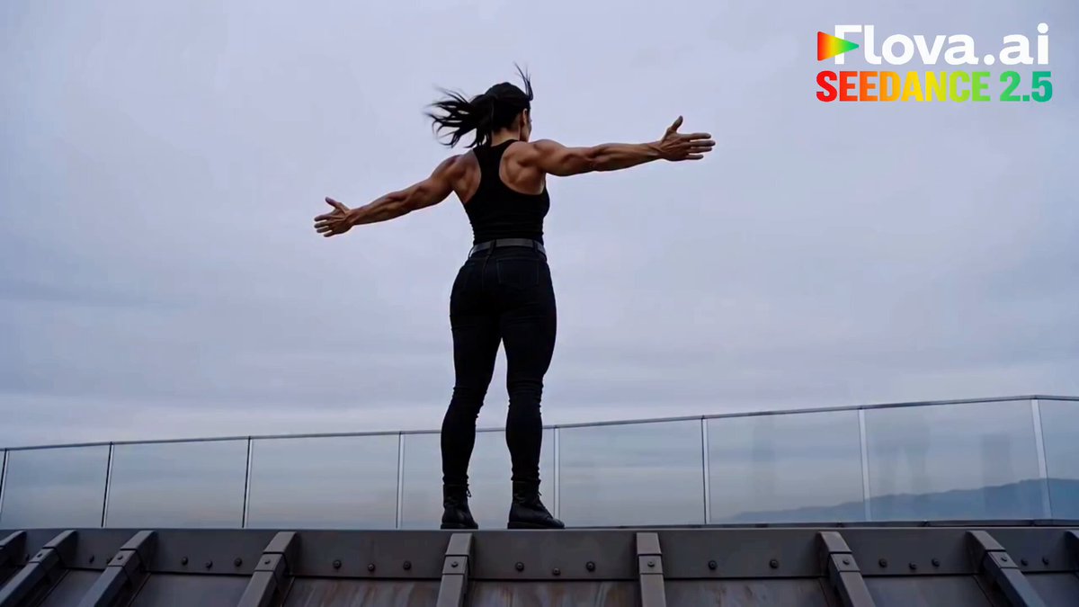
Where generation pays off fastest is the shot you could not otherwise afford: a wide establishing frame of a fictional city, an abstract transition, a stylised historical insert. Treat these as B-roll with intent, and keep human-shot footage as the emotional spine of the piece.
The hard problem is consistency. Characters, wardrobe, and lighting drift between generated shots, and drift is instantly visible in a fifteen-second cut. Three practices reduce it substantially:
- Lock a reference sheet. One approved image per character with fixed wardrobe, hair, and lighting direction. Every generation prompt references it explicitly.
- Keep the camera language fixed. Specify lens length, height, and movement in the prompt, and reuse the exact same phrasing across a sequence.
- Grade everything last, together. A single colour pass over generated and live-action shots hides more seams than any per-shot fix.
For longer sequences, tools that carry a character or environment forward from one shot to the next are worth the extra setup time. They trade flexibility for continuity, which is exactly the right trade inside a single scene.
Matching the model to the shot
Not every shot needs the most expensive model. A quick decision heuristic:
- Highly realistic faces in motion. Use a top-tier cinematic model, and expect multiple takes.
- Stylised or animated looks. Mid-tier models with strong style adherence often beat realism-first tools.
- Fast iteration on timing. Use fast, lower-resolution drafts until the edit locks, then regenerate final shots.
- Long continuous movement. Prioritise models with strong temporal coherence over those with the sharpest single frames.
Budget the generation step in iterations, not shots. A realistic working ratio is three to five generated attempts for every usable two seconds.
Measuring Performance Without Drowning in Data
Streaming ad measurement has a trap: the dashboard offers hundreds of columns and the useful signal lives in about six of them.
Metrics that actually change decisions
- Three-second view rate. Did the hook work?
- Completion rate at each quartile. Where does attention break?
- Click-through or watchlist add rate. Did intent move?
- Incremental signup or reactivation. Did behaviour change?
- Skip rate within the first five seconds. The single most actionable creative metric.
- Sound-on versus sound-off completion gap. Tells you whether the edit depends on audio.
Quartile curves are the most underused tool in the set. A sharp drop between 25% and 50% almost always means the middle act introduced new information too slowly. A drop in the last quartile usually means the ending was a logo card rather than a payoff.
A testing cadence that survives real workflows
Run one structured test per cycle with a single variable changed: opening three seconds, music bed, or closing card. Testing three variables at once produces a winner you cannot explain, which means you cannot repeat it.
Keep a creative log with the hook transcript, the format, the persona target, and the primary metric. After a dozen entries, patterns emerge that no single test reveals. Most teams discover that their best-performing hooks are not the most polished ones, but the ones that pose the clearest question.
Reducing Ad Avoidance and Fatigue
Viewers do not hate advertising; they hate repetition and irrelevance. Fatigue is measurable: performance decays across exposures, and the decay curve is steepest for the simplest creative.
Four levers reduce it:
- Frequency capping by creative, not just by campaign. Rotate three hooks for the same title so the tenth impression is not the first impression again.
- Sequenced storytelling. Run a teaser, then a character piece, then a full trailer. Each exposure adds information rather than repeating it.
- Relevance gating. Suppress family-oriented promos for solo profiles and horror promos for family profiles. Mismatched tone irritates more than it informs.
- Front-loaded value. If the ad is skippable, the value must arrive before the skip window closes. Structure the edit so the skip point is not the moment where the story finally starts.
Common Mistakes in Streaming Ad Production
Most underperforming promos fail for predictable reasons.
Opening on a logo. The single most common error. Brand recall matters, but it cannot come before attention.
Explaining instead of showing. A voiceover describing a plot is weaker than a scene that implies it. If the copy can be replaced by a look between two characters, replace it.
Treating each ratio as an afterthought. Cropped masters lose faces at the edges and captions under interface chrome. Rebuild, do not crop.
Overloading the end card. Prices, tiers, dates, and three calls to action in four seconds. Pick one.
Skipping the animatic. Teams that jump from script to shoot spend the edit discovering structural problems they could have seen in a rough board.
Ignoring the mute test. A spot that depends entirely on a music cue fails in most mobile placements.
Chasing realism everywhere. Generated photorealism is expensive and brittle. Stylised inserts often look better and cost less.
A Practical Workflow From Brief to Final Cut
A repeatable pipeline keeps quality high when volume increases.
- Brief. Define the persona, the single promise, the duration, and the primary metric. One page maximum.
- Hook workshop. Generate fifteen to twenty opening lines and three visual hooks. Select one.
- Boards and animatic. Eight frames per scene, assembled with rough timing and temp music.
- Shot plan. Split the board into live-action, stock, and generated shots. Mark which shots need a reference lock.
- Generation sprints. Produce drafts at low resolution, review in context, then regenerate finals only for locked shots.
- Edit. Cut for the shortest version first, then expand. The bumper teaches you what the trailer cannot lose.
- Ratio pass. Reblock 16:9, 1:1, and 9:16. Burn in captions for each.
- Colour and sound. One unified grade, one mix with a mute-safe version.
- Test. One variable per cycle, logged against the persona and hook.
- Archive. Store the project with prompts, reference sheets, and the winning hook transcribed. The archive becomes your fastest creative asset next time.
FAQ
How long should a streaming promo be?
Lead with the shortest useful cut and build outward. If the message survives six seconds, that becomes the retargeting asset. Fifteen seconds is the default in-feed length; thirty to sixty seconds is for warm audiences who already know the premise.
Do I need generative video tools to compete?
No, but they expand what you can afford. They are most valuable for establishing shots, stylised inserts, transitions, and producing many variants of the same concept quickly. The emotional core of a promo still benefits from real performance.
How many variants should one campaign include?
Three hooks, one body, two closing cards is usually enough to learn something useful without fragmenting your data. Rotate hooks for frequency management rather than building entirely separate campaigns.
What is the fastest way to improve a failing ad?
Change the first three seconds. Hook edits move completion rates more than any other single change, and they are cheap to produce once your pipeline supports modular openings.
How do I keep characters consistent across generated shots?
Fix a reference sheet, reuse identical camera and lighting phrasing in every prompt, generate in small batches, and apply a single colour grade to the whole sequence at the end.
Should captions be burned in or uploaded separately?
Burn them in for short-form placements where styling control matters, and keep a separate caption file for platforms that require accessibility tracks. Do both; the file size cost is trivial.
How often should creative be refreshed?
Watch the decay curve rather than the calendar. When completion rate drops meaningfully against your own baseline for the same placement and audience, it is time to swap the hook, not the whole campaign.
What is the biggest missed opportunity in most promos?
The middle. Teams obsess over hooks and end cards while the second act repeats what the viewer already understood. Every beat in the middle should add a new reason to care, or it should be cut.
