

Why thumbnails decide whether your video gets watched
A thumbnail is not decoration. On a crowded feed it is the only part of your video that almost everyone will see. Impressions are counted when a thumbnail appears on a home page, a suggested rail, or a search result; the click is the moment of conversion. Everything downstream — watch time, retention curves, session length, and how often the platform decides to recommend you again — depends on winning that first moment.
This is why thumbnail production deserves the same operational rigor as scripting or editing. A channel that publishes weekly needs a visual idea, a subject or face, a short text hook, and a legible composition at 320 pixels wide, every single time. Doing that manually is slow, and slow systems produce inconsistent results during busy weeks. AI image and video models change the math because they compress the expensive part — exploring visual directions — from hours into minutes.
What they do not change is the need for judgment. A generative model will happily produce a beautiful frame that communicates nothing, uses a palette that disappears against the platform interface, or renders a face that looks subtly wrong at small sizes. The winning workflow treats AI as a fast concepting and rendering engine, then applies human selection, typography, and testing on top.
It also helps to remember that thumbnails are a packaging problem, not an art problem. Viewers are not evaluating your image; they are deciding whether your promise is more interesting than the nine other promises on the same screen. That is a competitive comparison, and it happens in a fraction of a second.
What AI can and cannot do for thumbnails
It helps to separate the job into three distinct activities, because different tools solve different ones.
Generation, editing, and compositing
Generation creates a new image from a text prompt: a person reacting, a product on a pedestal, a stylized cityscape, an abstract graphic with strong shapes. Editing transforms an asset you already have — removing a background, relighting a portrait, extending a frame to a wider aspect ratio, swapping a sky, cleaning up skin and fabric. Compositing is where the thumbnail is actually assembled: subject cutout, background, text, logo, arrows, borders, and a consistent color treatment.
Modern image models are strong at generation and increasingly capable at editing. Compositing is still better in a normal graphic editor where you control layer order, alignment, and export quality. Channels that try to force the whole pipeline into one generative tool usually end up with soft text, odd crops, and inconsistent branding.
Where automation still fails
Three failure modes show up repeatedly:
- Text rendering. Many models handle short words reasonably well now, but kerning, hyphenation, and multi-line slogans remain risky. Generate the visual, then set the text yourself.
- Hands, eyes, and teeth. Small anatomical errors are invisible in a large preview and glaring in a feed. Always inspect at 320 × 180 before publishing.
- Context blindness. A model does not know your audience, your running jokes, or which faces your viewers already recognize. Those are decisions you make.
The honest value proposition
AI reduces the cost of exploring. Instead of commissioning one illustration or shooting one photo setup, you can spin up a dozen directions, compare them side by side, and invest your manual effort only in the two or three that have a real hook. That is the whole advantage: more attempts, faster, with the same amount of taste applied at the end. Value comes from volume plus selection, not from pressing a button and accepting the first output.
The thumbnail brief: inputs that drive output quality
Most disappointing AI thumbnails are caused by a bad brief, not a bad model. Before opening any tool, write down five things.
- The single idea. One thumbnail, one message. "He tried it for a month" beats "review, tips, results, and warning."
- The subject. A recognizable face, a product, a place, an object, or an abstract shape. If a person, specify expression, framing, wardrobe, and gaze direction.
- The emotional register. Shock, curiosity, delight, tension, calm expertise. Emotion determines lighting, saturation, and crop tightness.
- The composition. Where the subject sits, where negative space goes for text, and which corner the eye should land on first.
- The palette. Two dominant colors plus one accent. Thumbnails fight the interface, so contrast matters more than subtlety.
Write the brief in your own words, then convert it into a prompt. Keeping the brief in a shared document makes your channel's thumbnails look related instead of random, and it lets a collaborator produce a new one without guessing your style. A useful test: if a stranger can read your brief and predict the thumbnail, the brief is finished.
Choosing the right model for the job
Not every project needs the same engine. Here is how to think about the decision.
Photoreal people and products
For talking-head channels, unboxings, fitness, food, and anything where a viewer must believe the image is real, prioritize models with strong skin texture, believable lighting, and reliable hands. Look for pose guidance or image-to-image conditioning if you need a specific gesture. If you have real footage, generate a background or a stylized treatment and composite your actual frame on top — authenticity usually beats a fully synthetic person.
Illustration, 3D, and stylized looks
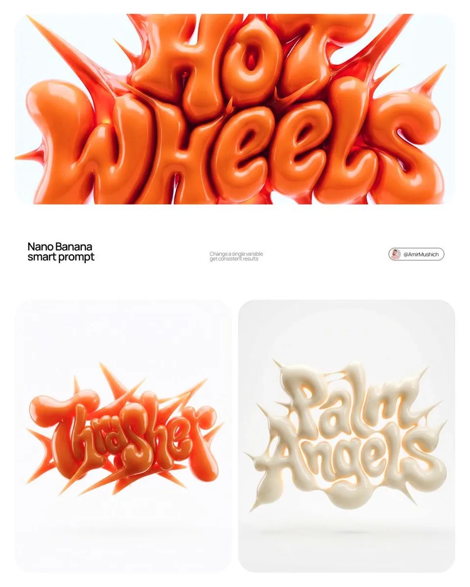
Gaming, finance explainers, tech reviews, and education channels often do better with illustration or 3D-render styles because the visuals stay legible at small sizes. Look for models that hold a consistent style across a batch, and lock a style reference image so your videos look like a series rather than unrelated one-offs.
Video models for motion-based thumbnails
Short animated thumbnails and looping previews can lift engagement on certain platforms, and short video models are useful for producing the source frames. The practical approach: generate a clean still first, animate only if the motion adds comprehension, and keep the file small. Animated thumbnails that are hard to read on a phone are worse than a sharp static image.
Resolution and aspect-ratio basics
Generate larger than you need. A 16:9 frame at 1280 × 720 is the minimum; working at 1920 × 1080 or higher gives you room to crop for verticals and to reposition a subject. Always check the safe area for the duration stamp and any interface overlays.
A quick decision rule
If a viewer must trust the image, go photoreal or use real footage. If a viewer must understand it instantly, go stylized, flat, and high contrast. If you are unsure, generate both directions for the same hook and compare at phone size before deciding.
A repeatable AI thumbnail workflow
This is the pipeline that survives a real publishing schedule.
Step 1: lock the hook before the pixels
Write one sentence a viewer would say out loud when they see the thumbnail. If you cannot write it, no model will save you. Then decide whether that sentence is carried by a face, an object, a comparison, or a number.
Step 2: write a structured prompt
Structure beats poetry. Use a consistent order: subject, action or expression, framing, lighting, background, palette, style, and technical constraints such as aspect ratio and camera. Keep a template and swap variables so results stay comparable across attempts.
Step 3: generate a wide batch
Produce eight to twelve variations rather than two. Change one variable at a time — expression, then framing, then background — so you learn what the model responds to. Save the prompts next to the images; you will want to re-run a direction later when a follow-up video needs a matching thumbnail.
Step 4: select ruthlessly
Review the batch at 320 pixels wide. At that size, anything fussy disappears. Look for a clear silhouette, a single focal point, and enough contrast between subject and background. Reject fast; keeping weak options wastes more time than regenerating.
Step 5: fix before you decorate
Upscale the chosen frame, clean up artifacts, and correct exposure and color. If you are compositing a real person, cut them out cleanly at this stage and prepare the background plate separately. Do the boring technical work now so the design layer is easy to adjust later.
Step 6: add typography and brand elements
Set text in a real editor. Three or four words maximum, heavy weight, generous spacing, and a treatment that survives on both a light and a dark background — a soft drop shadow or a subtle outline usually does it. Add your recurring element: a face crop in the corner, a colored bar, a consistent arrow style, a logo mark. Consistency makes your videos recognizable in a feed even before the text is read.
Step 7: export and test
Export at the highest quality the platform accepts within the file-size limit, then compare the finalists against each other at real display size on a phone and a desktop. If the platform offers thumbnail testing, use it; if not, rotate thumbnails on older videos and watch the impression-to-click ratio.
Prompt patterns that produce clickable thumbnails
A few reusable patterns cover most needs.
- The close-up reaction: tight crop, eyes to camera, strong key light, blurred background, one dominant accent color.
- The split comparison: two panels, clear before/after, arrow or divider, matching lighting so the contrast reads as real.
- The object hero: product centered at a low angle, dramatic rim light, dark gradient background, space reserved on one side for text.
- The scale gag: a normal object next to an oversized version, wide-angle feel, strong perspective lines.
- The diagram look: simplified flat shapes, two or three colors, one bold icon, no photographic detail.
For each, write the negative constraints too: no watermarks, no busy patterns near where the text will sit, no competing highlights. Negative prompts are as strategic as positive ones, and they are usually what separates a clean thumbnail from a cluttered one.
A practical habit is to keep a prompt journal. One line per generation batch, noting the hook, the variables you changed, and which output you chose. After a few months this becomes a private playbook of what works for your audience specifically.
Design rules AI will not enforce for you
Models optimize for a pleasing image, not for a thumbnail that works in context. Enforce these yourself.
Contrast against the interface. Many viewers browse in dark mode and light mode. Check both. A dark, moody image can vanish on a dark background.
One focal point. If a viewer's eye has three places to go, it goes nowhere and scrolls.
Text as hierarchy, not decoration. The largest word should be the idea. If a small word cannot be read at 320 pixels, delete it or make it big and drop something else.
Faces with clean emotion. A half-second read is all you get. Ambiguous expressions underperform clear ones in most niches.
Consistent series design. Numbering, color coding, and a fixed text position help returning viewers find the next episode.
Mobile-first framing. Put the subject and text inside the central safe area so nothing important is clipped by overlays or aspect-ratio crops.
Room to breathe. Empty space is not wasted space. If every pixel is filled, the eye has nowhere to rest and the message gets lost.
Common mistakes and how to avoid them
Generating before writing. If you open the tool first, you will get attractive images with no argument. Write the hook, then generate.
Chasing realism into the uncanny valley. If a synthetic face is 90 percent convincing, viewers feel something is off. Either push toward a deliberate illustration style or use real footage with a generated background.
Over-cluttering with effects. Glow, lens flares, and heavy gradients reduce legibility. Remove one effect from every draft and see whether it improves.
Ignoring the thumbnails of competitors. Search your topic and look at the top results. Your thumbnail must be distinguishable in that specific row, not in isolation.
Treating the thumbnail as finished when it is uploaded. Thumbnails are variables, not conclusions. Keep the layered file so you can swap text, color, or crop after a week of data.
Forgetting repurposing. One good composition can become a vertical cover, a community post image, a chapter marker, and a podcast tile. Design with that reuse in mind.
Skipping proofreading. A misspelled word is the fastest way to lose trust on an otherwise strong thumbnail. Read it out loud before exporting.
Measuring performance and iterating
Track three numbers per video: impressions, click-through rate, and average view duration for the first 30 seconds. A high click rate with weak early retention means the thumbnail overpromised. A low click rate with strong retention means the packaging failed while the content worked — that is the cheapest problem to fix, because the video itself is already good.
Compare in cohorts. Group videos by topic, format, and publish window so you compare like with like. Then change one variable at a time: expression, text length, color, or subject. Keep a swipe file of your top five performers and use them as style references for new generations; the model can match a look it can see.
If your platform supports multiple thumbnail tests, run them on high-impression videos where small percentage differences translate into meaningful reach. On low-traffic videos, testing is mostly noise — spend that effort on the next upload instead.
Finally, be patient with the data. A single video is an anecdote. Ten videos with a consistent design hypothesis are a signal. Write down what you expected before you check the numbers, so you cannot rewrite your own reasoning after the fact.
Building a reusable thumbnail system for a channel
Once the workflow is stable, turn it into a system. Create a prompt library with named presets: "reaction close-up," "split comparison," "product hero," "map reveal." Keep a template file with your fonts, text positions, and brand colors already set up. Document the review checklist: legible at 320 pixels, one focal point, contrast in both themes, no artifact near the face, text spelled correctly with no orphan letters.
Then set a budget of time per video and protect it. Fifteen minutes of generation, ten minutes of selection, twenty minutes of compositing and text, five minutes of quality checks. With a system, most thumbnails should be finished in under an hour, and the quality will be more consistent than a heroic three-hour session done once a month.
Handoffs matter too. If an editor, a designer, or a virtual assistant produces thumbnails, give them the brief template, the prompt presets, the layered file, and three examples of approved work. Ambiguity is what makes outsourced packaging drift away from a channel's identity.
Finally, treat the whole thing as a feedback loop. Every upload is a test you were going to run anyway. Capture the data, keep the winners, and refine the presets. Channels that iterate on packaging as deliberately as they iterate on content are the ones that compound.
FAQ
Do I need a paid image tool, or can free options work? Free tiers are enough to learn prompting and to test styles. Move to a paid plan when you need higher resolution, batch generation, or clear commercial licensing terms.
Can I use AI-generated images of real people? Use real people only with permission, and be careful with public figures — platform policies and local law both apply. Synthetic faces are safer, but must not be deceptive in context.
How many words should a thumbnail have? Three to four. Fewer is usually better. If the image already communicates the idea, one punchy word is enough.
Should every thumbnail include a face? No. Faces help in niches built on personality. In tutorials, comparisons, and list content, objects, numbers, and diagrams often outperform.
How often should I change a thumbnail? Give a new upload a meaningful test window, then rotate only when you have a specific hypothesis and enough impressions for the data to mean something.
Can one workflow serve long-form and vertical video? Yes, if you generate large and compose inside a central safe area. Build a vertical preset so you are not redesigning from scratch each time.
What is the biggest mistake beginners make? Optimizing the image instead of the idea. A plain thumbnail with a strong promise beats a beautiful one that says nothing.
How do I keep AI thumbnails from looking generic? Feed the model your own references, lock a palette, keep one recurring brand element, and set the text yourself. Generic output usually comes from generic inputs.
