
Why aesthetic quality quietly decides who gets seen
Two creators can post the same idea on the same day and get wildly different results. One video gets a few hundred views and dies. The other keeps climbing for a week. The idea was not the difference. The difference was how the video felt in the first two seconds — the light on the subject, the temperature of the color, the speed of the cut, the space between sounds.
Short-form feeds are competitive in a specific way: they are not competing for attention so much as competing for a pause. A viewer's thumb is already moving. Your job is to make it stop, and aesthetics are the fastest available brake. Before anyone reads a caption or processes a message, the frame has already communicated taste, mood, and production value. That judgment happens in well under a second, and it is mostly visual.
This is why aesthetic videos outperform technically correct but visually flat ones. A phone-shot clip with disciplined lighting, a coherent palette, and confident pacing can beat a camera-and-lights production that never decided what it wanted to look like. Aesthetics are not decoration on top of the content. They are the delivery system for the content.
That is also why viral success is rarely random. Behind most breakout videos is a repeatable visual system: a small set of rules the creator applies to every clip, so the audience starts recognizing the work before they read the username. The rest of this guide walks through how to build that system, from theme selection to export settings.
Start with a visual thesis, not a trend list
Most creators begin with a trend. That is backwards. Trends are formats; they change weekly and they carry no identity. Start instead with a visual thesis — one sentence that describes how your videos should feel. "Warm, quiet, slightly overexposed, slow." "Cold, fast, high contrast, industrial." "Soft, creamy, natural light, gentle motion."
A thesis does two things. First, it makes decisions fast: when you know the video should feel "cold and industrial," you already know the answer to fifty small questions about color, location, clothing, and pacing. Second, it makes your work recognizable. Recognition is what turns a viewer into a follower.
Defining your palette, texture, and motion language
Write down three things before you shoot anything. Palette: the two or three colors that will appear in nearly every frame. Texture: the surfaces the camera will see most — concrete, linen, glass, brushed metal, moss. Motion: how the camera and the subject move — locked-off and still, slow drift, handheld energy, whip pans.
These three choices constrain each other usefully. A palette of beige, sage, and cream pairs naturally with linen and slow drift. A palette of black, cyan, and electric magenta pairs with wet asphalt and fast handheld movement. If your texture contradicts your palette, you will feel the mismatch even if you cannot name it.
Building a three-frame reference board
Collect exactly three reference frames you want your video to resemble. Not thirty — three. Ten references create confusion; three create direction. Keep them on your phone and check them on location when you are deciding where to put the camera. Ask of each shot: does this frame look like it belongs on the board? If not, change the shot, not the board.
Choosing themes that still work
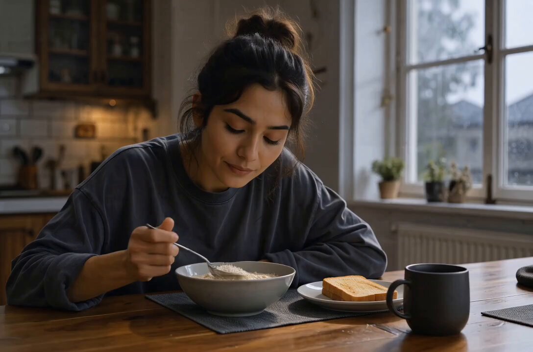
Certain visual themes have long lives because they map to emotions, not to a specific audio clip. You can adapt them endlessly without them feeling dated: dark academia (moody interiors, warm lamp light, paper, wool, slow reveals), cyber neon (night streets, reflective surfaces, high saturation, motion blur), minimalist nature (negative space, muted greens, one moving element), and soft domestic realism (window light, imperfect rooms, gentle handheld shots).
Each theme carries different production costs. Minimalist nature requires patience and good locations. Cyber neon requires a city with reflective surfaces and a tolerance for noise. Soft domestic realism requires almost nothing except a window and the discipline to wait for the right hour. If you are starting out, pick the theme you can shoot tomorrow.
Matching theme to your niche and audience
The theme should serve the content, not replace it. A cooking account can use soft domestic realism and become the most soothing food account in its niche. A tech account can use cyber neon and look like it belongs in a design magazine. A study account can use dark academia and hold attention for a full minute of silent writing.
The test is simple: if you removed the theme, would the content still be useful? If yes, the theme is working as a delivery system. If the content only works because the visuals are pretty, you have built a mood board, not an account.
Keeping the theme consistent across a series
Consistency means a viewer can identify your videos with the sound off and the username hidden. Standardize: the same opening shot type, the same text font and placement, the same transition style, the same audio family. Change the topic every day; change the look almost never. Small evolutions are fine over months, but week-to-week whiplash resets recognition.
Lighting and color: the two levers you actually control
If you have any budget for gear, put it into light. Not cameras. Light determines whether a frame reads as amateur or intentional, and a mid-range phone with a controlled light source beats a flagship phone in a dark room every time.
Practical lighting setups without a studio
Three setups cover most aesthetic content. Window light with a sheer curtain, subject placed at a 45-degree angle to the glass, gives softness that costs nothing. A single portable LED panel through diffusion at roughly 45 degrees gives control at night and indoors. A bare bulb placed deliberately in frame gives atmosphere when the light source itself is part of the composition.
Avoid overhead ceiling light whenever possible. It flattens faces, creates hard shadows under the eyes, and pushes a green-yellow cast that is difficult to grade back. If you must use it, mix it with a warmer practical lamp to break the uniformity.
Grading for phone screens, not monitors
Your video will be watched on a phone, often at reduced brightness, often in a bright room. Grade for that: raise midtone contrast slightly, keep shadows lifted enough to see detail, and avoid heavy saturation in reds and oranges because skin tones will clip first. Reduce sharpening — mobile platforms often add their own, and stacking sharpening creates a brittle, noisy look.
Build one saved preset and apply it to every clip. Set the temperature between roughly 4800K and 5600K depending on mood, keep a slight desaturation in greens, and use a subtle film-like curve rather than a heavy filter. The goal is not a visible effect. The goal is a video that looks like it was made by someone who knew what they were doing.
Rhythm and editing: pacing that keeps thumbs still
Aesthetic videos are cut with intent, which means the edit has a logic the viewer can feel even if they do not notice it. Two logics dominate. Beat cutting syncs cuts to the music's pulse and produces energy; breath cutting syncs cuts to pauses in the action, producing calm and texture. Choose one per video and commit.
Pacing rules for retention
Keep shots between 1.2 and 2.5 seconds for energetic content, and between 3 and 6 seconds for calm content. Cut on motion rather than after it — if a hand is reaching, cut mid-reach, not once it stops. Remove the first and last half-second of every shot in the edit; beginnings and endings are where hesitation lives. Never let a static frame sit longer than it needs to.
Transitions that feel intentional
Use three transitions maximum, and use them consistently. A match cut on shape or color reads as intelligent. A slow whip pan reads as energetic. A simple cut on the beat reads as clean. Skip the flashy effect library — spinning 3D transitions and zoom blurs date quickly and signal that the visuals need help.
Sound design as a visual tool
The fastest way to make footage feel cinematic without touching the picture is to change the audio. A clean bed of ambient sound plus one well-placed foley element does more than a music track alone. A page turn, a shutter click, a liquid pour, a footstep on gravel — these sounds create physical presence and make the image feel heavier than it is.
Build a small audio kit: three ambient beds (indoor room tone, outdoor wind and leaves, city hum), five foley sounds, and a handful of low-key instrumental tracks you can loop. Keep music levels low under voice or foley. If you are using trending audio for reach, layer your foley beneath it so the video still sounds like you.
Using AI tools for consistency across a series
The hardest part of a series is consistency: the same face, the same room, the same lighting across ten videos. That is exactly where AI-assisted tools have become genuinely useful, not as replacements for shooting, but as ways to fill gaps and hold continuity.
Character and scene consistency
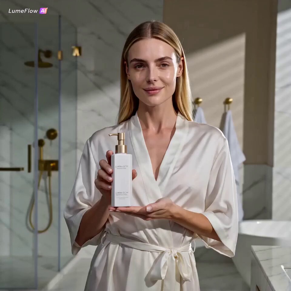
Modern image and video generation tools can take a reference image of a subject and reproduce that subject across new angles, expressions, and settings. The practical workflow: create one strong reference frame, then generate variations that match your palette and lighting. Use these for B-roll, inserts, transitions, and establishing shots you could not practically film.
Keep the AI footage short — one to three seconds — and always grade it with the same preset you use on real footage. If the generated clip has different grain or sharpness, add a matching grain overlay and a light blur to blend it. Mismatched texture is what makes AI footage obvious, not the content itself.
Where AI helps and where it hurts
AI helps most with texture, atmosphere, abstract motion, and sequences that would otherwise require expensive locations. It hurts when it replaces the human element audiences connect with — a face speaking, hands doing skilled work, a genuine reaction. Viewers forgive synthetic background elements. They are much less forgiving when the synthetic element is the person.
A safe ratio for most creators: no more than 20 to 30 percent of total runtime, used for atmosphere and connective shots, with real footage carrying the narrative and the human presence. Storyboard first, generate second, and edit everything through one grade so the seams disappear.
Hooks, captions, and search visibility
The first second of an aesthetic video has to answer one unspoken question: why should I keep watching? Visual beauty alone is not an answer. Pair the visual with a reason. Show the result first and then the process. Open mid-action. Put a short line of text on screen that names the payoff — "three-second lighting fix," "the shot that took five tries," "before and after."
Keep on-screen text to one sentence, positioned away from the bottom third where interface elements sit. Use two fonts at most, and one accent color taken from your palette. If your visuals are quiet, your text should be quiet too: small, centered, generous spacing.
Hashtags and keyword phrasing for in-app search
In-app search now sends significant traffic, so treat captions as search content. Describe the video the way a viewer would type it: "aesthetic desk setup with warm lamp light," "how to shoot soft window light on a phone." Write the keyword naturally in the first sentence of the caption, add two or three adjacent phrases in the body, then add a small set of hashtags: two broad, three specific to your niche, one tied to your series name.
Repeat a consistent series hashtag so your own videos accumulate in one searchable place. Then check the analytics for search terms that brought people in, and write your next caption using the phrasing your audience actually used.
A repeatable production workflow
Aesthetic output is rarely the result of inspiration. It is the result of a process short enough that you will actually repeat it three times a week.
Pre-production checklist
Choose one visual thesis for the video, in one sentence. Pick the location from a short list you already know works at a specific time of day. List four to six shots: one wide establishing frame, two medium action frames, two detail inserts, one closing frame. Prepare the audio bed and foley before you shoot, not after.
Shoot day
Lock exposure and white balance manually so shots match when edited together. Shoot each setup twice — once as planned, once slightly wider for safety. Capture fifteen seconds of ambient audio at each location with the camera still and quiet; you will use it in the edit. If a shot does not match the reference board, reshoot it immediately rather than trying to save it later.
Edit and export
Assemble to the beat or the breath, trimming the heads and tails of every clip. Apply your saved preset to everything, including generated inserts, then add grain and a subtle vignette for cohesion. Mix audio so dialogue or foley sits clearly above the music bed. Export at the highest quality your editing app supports, keep the frame rate consistent with what you shot, and avoid re-exporting an already exported file.
Posting and iteration
Post at consistent times so your audience learns when to expect you, write the caption for search, and let the video run for at least several days before judging it. Track three numbers per video: average watch time, share rate, and saves. Saves and shares tell you the aesthetic is working. Low watch time with high likes usually means the visuals impressed but the content did not hold — fix the structure, not the grade.
Common mistakes that flatten aesthetic videos
Mixing three themes in one video is the most common failure. The result looks like a collage and communicates nothing. The second most common is over-grading: crushed blacks, clipped highlights, and saturation pushed until colors band. Third is audio neglect — clean visuals over muddy or uneven sound feel unfinished immediately.
Other reliable killers: zooming and panning on static footage to fake movement; on-screen text that covers the subject; abrupt changes in white balance between shots; and copying a trending format without adapting it to your palette. Each of these breaks the continuity that makes aesthetic content feel intentional.
Finally, resist the urge to change your look after every video. Consistency compounds. A viewer who recognizes your style in the first half-second is already halfway to watching the whole thing, and that half-second is where reach is actually won.
FAQ
Do I need an expensive camera? No. Controlled light, a stable frame, and a consistent grade matter far more than sensor size. Many successful aesthetic accounts shoot entirely on phones with one cheap LED panel and a window.
How long should an aesthetic video be? Long enough to deliver the payoff and no longer. Calm, textural videos can run 45 to 70 seconds if the pacing holds. Energetic edits usually land better between 12 and 25 seconds.
How many hashtags should I use? A small, relevant set — roughly five to eight — beats a wall of generic tags. Prioritize niche and series tags over broad ones, and put the strongest keyword in the caption text itself.
Can AI-generated footage fit an aesthetic feed? Yes, if it is short, graded with the same preset as your real footage, and used for atmosphere rather than human presence. Keep it under a third of runtime and blend the texture with grain.
How often should I post? Three times a week is a sustainable rhythm for most solo creators. Consistency of look and schedule matters more than volume; five rushed videos with mismatched grades will underperform three deliberate ones.
What if a video flops? Check watch time first. If people leave in the first two seconds, the hook or opening frame failed. If they leave in the middle, the pacing or structure failed. If they watch but do not share, the visual thesis may be too generic to be worth passing on.
