

Why 4K Wallpapers Became an AI Generation Problem
A wallpaper used to be something you found. Now it is something you make. That shift happened quietly, driven less by AI hype and more by hardware reality: phones ship with 1440p and 4K panels, laptops default to 3K, monitors are cheaper at 4K than they have ever been, and headsets render stereoscopic scenes at resolutions that would have sounded absurd five years ago. Every one of those surfaces needs imagery that holds up when a viewer is thirty centimeters away from it and staring for hours.
Stock photography does not scale well to that demand. Neither do generic AI outputs. If you have ever generated an image that looked stunning in a thumbnail and fell apart the moment you set it as a desktop background, you have already met the core problem: a wallpaper is not judged at thumbnail size. It is judged at full screen, where every smoothed texture, every plastic-looking highlight, and every slightly mushy edge becomes visible.
This guide is about closing that gap. It covers what actually separates a realistic 4K wallpaper from an AI image that only looks good in a grid, how to evaluate image and video generators against that standard, and how to build a repeatable workflow that produces consistent results across devices, moods, and seasons.
What Actually Makes an AI Wallpaper Look Real
Realism in a wallpaper is not one property. It is the sum of several properties that fail independently. Understanding them separately makes it much easier to diagnose why a particular generation did not work.
Detail density and the upscaling trap
A true 4K wallpaper has roughly 8.3 million pixels in a 3840 x 2160 frame, or more in taller aspect ratios. Many generators produce something closer to 1 to 2 megapixels natively and then upscale. The upscaling step is where realism is usually won or lost.
Naive upscaling simply interpolates, which means it invents no new detail — it just makes existing softness bigger. Detail-aware upscalers instead hallucinate plausible micro-structure: pores, fabric weave, gravel grain, leaf veins, paint texture. When that works, the result reads as photographic. When it overreaches, you get the classic "AI crunch," where every surface has an identical fractal-like pattern and the whole image feels coated in plastic.
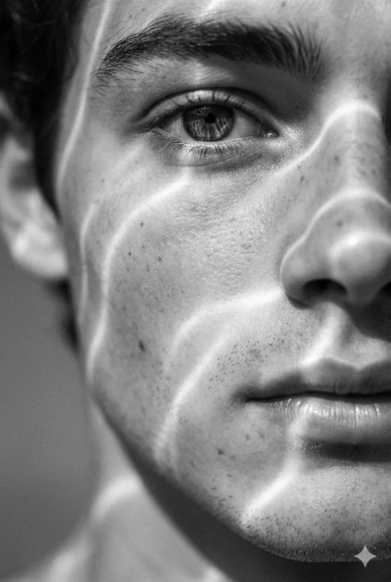
The practical test is simple. View the image at 100 percent zoom on a 4K display and look at three zones: the darkest shadow area, the brightest highlight, and a mid-tone textured surface like stone or skin. If all three hold distinct, non-repeating detail, the asset is usable. If they share the same texture signature, regenerate rather than upscale further.
Light behavior and material accuracy
Photorealism lives in how light interacts with surfaces. Three things separate convincing renders from fake ones:
- Specular falloff. Real highlights have a gradient. AI images often produce hard-edged white blobs on metal, glass, and wet surfaces.
- Subsurface behavior. Skin, foliage, and translucent materials let light bleed through. When that is missing, faces look like painted masks and leaves look like paper.
- Shadow consistency. Every shadow should agree on a single light direction, even if there are secondary bounce lights. Multiple contradictory shadow directions are the single most common tell in AI-generated scenes.
When you review a candidate wallpaper, trace the light. Pick the brightest object and ask where the light source must be. Then check whether the shadows in the far corner of the frame agree.
Composition and negative space
A wallpaper is not a poster. It sits behind icons, windows, dock bars, and a clock. That changes what good composition means: you want visual interest around the edges and quiet space where interface elements will land. A perfectly centered subject with busy texture behind the desktop icons is technically impressive and practically unusable.
Cinematic composition principles transfer well here. Strong framing lines, a clear focal hierarchy, and deliberate use of negative space make an image feel intentional. Many modern generators include agent-style or director-style features that help enforce framing rules, but you can achieve the same effect manually by describing camera position, lens equivalent, and where the empty area should sit.
Choosing a Generator: Decision Criteria That Matter
There is no single best tool. There is a best tool for your specific wallpaper type, your hardware, and how much iteration you are willing to do. These are the criteria worth scoring.
Native output resolution
Ask what the model produces before any upscaling. A model that natively outputs around 2K and upscales cleanly will often beat a model that claims 4K but produces smoothed, detail-poor output. Transparency about native resolution is a better signal than a marketing number.
Photorealistic bias
Some models are trained toward illustration, anime, or stylized concept art. Others lean photographic. For wallpaper work you generally want the photographic bias, because you can always stylize afterward but it is very hard to remove a stylized look. Test each candidate with a boring prompt — a plain concrete wall at golden hour, for example. Models that make boring prompts look real will handle interesting prompts well.
Text and structure accuracy
If your wallpaper concept includes signage, architecture, or mechanical detail, structure accuracy matters. Failing to render a straight line as straight is fatal in architectural and industrial scenes. Test with a simple grid or horizon line and examine it at full zoom.
Video and motion support
Motion wallpapers are increasingly common on desktop and in headset environments. A generator that can produce a short, seamless loop from the same prompt family as your still images lets you build matching static and animated sets, which is a huge advantage for consistency.
Speed and iteration cost
Realism requires iteration. A model that produces excellent output in one attempt but takes ten minutes is often worse in practice than a model that takes thirty seconds and needs four tries, because the fast model lets you explore the prompt space. Optimize for iteration speed early in a project and for final fidelity late.
Control features
Keyframe control, image-to-image editing, inpainting, regional prompting, and pose or depth conditioning all matter more for wallpapers than for one-off illustrations. You will almost always want to fix one region without regenerating the whole frame.
A Model Landscape Overview
Rather than declaring a winner, it is more useful to describe what different families of models are good at.
Photoreal stills. The Flux family has become a common baseline for realistic still imagery, particularly with fine-tuned variants aimed at photographic output. It tends to handle skin, fabric, and natural light convincingly, and it responds well to detailed prompt language.
Cinematic video-first models. Sora and similar video-first systems produce strong temporal coherence and physically plausible motion. For motion wallpapers — slow drifting clouds, water, traffic, dust — this class of model is often the best starting point, and you can extract a still frame from the result if you need a matching static version.
Character and human realism. Runway and Kling AI have earned a reputation for rendering human subjects with fewer anatomical errors and more natural motion than earlier generations. If your wallpaper features a person, these are worth testing early.
Efficiency and physical realism. MiniMax and Luma Ray models are frequently cited for producing believable physical scenes at reasonable generation times, which matters when you are producing a large batch of variations for a wallpaper rotation.
Illustration and stylized output. Midjourney remains strong for painterly and highly stylized work. That is a different product category — great for artistic wallpapers, less useful if your goal is photographic accuracy.
The honest conclusion is that most serious wallpaper workflows use two or three models: one for exploration, one for final fidelity, and one for motion.
The Workflow: From Idea to Finished 4K Asset
Step 1: Define the target surface first
Before prompting, write down the exact target: device, resolution, aspect ratio, and where interface elements will sit. A desktop at 3840 x 2160 with a left-edge dock and a top menu bar has a very different safe zone than a phone lock screen with a large clock block.
Note the dead zones. Compose so that the busiest, most interesting part of the image lands in an area that will not be covered.
Step 2: Build the prompt in layers
Effective wallpaper prompts have five layers:
- Subject and scene — what is in frame and where it sits.
- Light — time of day, direction, quality (hard, soft, diffused, overcast).
- Camera — lens equivalent, distance, angle, depth of field.
- Material and texture — the specific surfaces that must read as real.
- Mood and palette — the emotional register and color direction.
A weak prompt usually compresses all five layers into a vague sentence. A strong prompt separates them, so when a result goes wrong you know which layer to adjust.
Step 3: Generate at native aspect ratio
Generate at or near your final aspect ratio rather than cropping a square image. Cropping throws away resolution and often removes exactly the negative space you need. If the model only supports one aspect ratio, generate a wider frame and recompose deliberately rather than cropping to the center.
Step 4: Upscale, then repair
Upscale in two stages. First, apply a detail-aware upscaler to reach target resolution. Then zoom in and repair specific regions using inpainting: fix a warped edge, soften an over-sharpened texture, replace a broken reflection. Repairing at final resolution is far more effective than repairing at low resolution and upscaling the fix.
Step 5: Grade and export
AI images rarely arrive with final color. A modest grade in a proper color tool — adjusting black point, highlight rolloff, and saturation of specific hues — closes most of the remaining gap between "AI-generated" and "photographic." Export as a high-quality still plus, if needed, a compressed version for devices with limited storage.
Handling Motion Wallpapers and Video Loops
A motion wallpaper introduces problems that static images do not have.
Loop seamlessness. If the loop does not close, the jump is visible within seconds. Generate a clip that ends where it began, or create a palindrome-style loop by reversing and appending the clip. Test the loop point at least five times in a row before shipping it.
Low-frequency motion. Fast motion in a background is fatiguing. Wallpapers work best with slow, continuous movement: drifting clouds, gentle water, flickering candlelight, slow parallax.
Bitrate and battery. A 4K video loop at high bitrate drains laptop batteries fast. Export a version with a sensible bitrate and consider H.265 or AV1 encoding. If the destination platform supports it, a still image derived from the same frame is a good fallback for battery-saver modes.
Consistency with stills. Extract stills from the video for use as the static counterpart. Colors and framing will match automatically, which matters if you build a wallpaper set.
Prompt Patterns That Consistently Work
Some prompt habits reliably improve wallpaper realism:
- Name the medium. Saying "photograph" or "shot on 35mm" pushes output toward photographic treatment.
- Specify the light source direction. "Low sun from camera left" eliminates the multi-shadow problem.
- Request shallow depth of field sparingly. A blurry background looks soft at full screen, which reads as low quality on a wallpaper. Deep focus usually holds up better.
- Describe empty space explicitly. Phrases like "open sky occupying the upper third" give you interface room.
- Avoid contradictory modifiers. "Minimalist detailed" and "dark bright" produce muddy results.
Also keep a personal prompt library. When a composition works, save the exact prompt with the seed. Reusing a proven structure with a new subject is far faster than starting from scratch.
Common Mistakes and How to Avoid Them
Upscaling before choosing the right frame. Fix composition first. No upscaler rescues a bad composition.
Chasing maximum sharpness. Over-sharpened AI images look artificial. Slight softness with correct detail is more convincing than aggressive crunch.
Ignoring the safe zones. A beautiful image with a face behind the clock widget is not usable.
Using one model for everything. Exploration and final fidelity are different jobs.
Skipping color grading. Ungraded AI output tends to be slightly flat and slightly over-saturated in the same hues. A small grade makes a large difference.
Not keeping a changelog. When you produce dozens of variations, notes about which prompt, seed, and upscaler produced the best result become essential.
Quality Control Checklist
Before an asset ships, run through these checks at full resolution:
- Detail is present in shadows, highlights, and mid-tones without repeating patterns
- All shadows agree on light direction
- Lines that should be straight are straight
- No warped anatomy, hands, or architecture at the frame edges
- Safe zones are clear of critical subject matter
- Color has been graded and the black point is deliberate
- The file is exported in the correct resolution, format, and color space
- For video, the loop point is invisible after repeated viewing
FAQ
How much resolution do I actually need?
Match the native panel resolution of the target device. Upscaling beyond that adds file size without visible benefit. If you are producing for multiple devices, generate the largest size and downscale — downscaling always looks clean.
Can I use video generators to make still wallpapers?
Yes, and it is often a good idea. Video models produce strong physical plausibility, and a single extracted frame can be sharper and more coherent than a still-image generation of the same scene.
Why do my wallpapers look plasticky on a desktop but fine on a phone?
Phone screens are small and often viewed at arm's length, which hides texture problems. Desktop viewing distance and size expose them. Always review on the largest screen you have.
Should I use one model or several?
Several, chosen by role: one for fast exploration, one for final photoreal fidelity, one for motion. Locking into a single tool usually means accepting a compromise somewhere in the workflow.
How do I keep a wallpaper set visually consistent?
Fix your palette, light direction, and camera language across the set, then vary only the subject. Reusing a seed for structural consistency between related images also helps.
Are motion wallpapers worth the extra effort?
For desktop environments and headsets, yes — subtle motion adds a great deal of perceived quality. For phones, a well-made static image with strong composition is usually the better trade.
What is the fastest way to improve results?
Slow down on step one. Most disappointing outputs trace back to a vague target, an unconsidered safe zone, or a prompt that mixed light, camera, and mood into one undifferentiated sentence. Separate those layers and quality improves immediately.
