

Why Photo-to-Anime Conversion Became a Mainstream Creative Tool
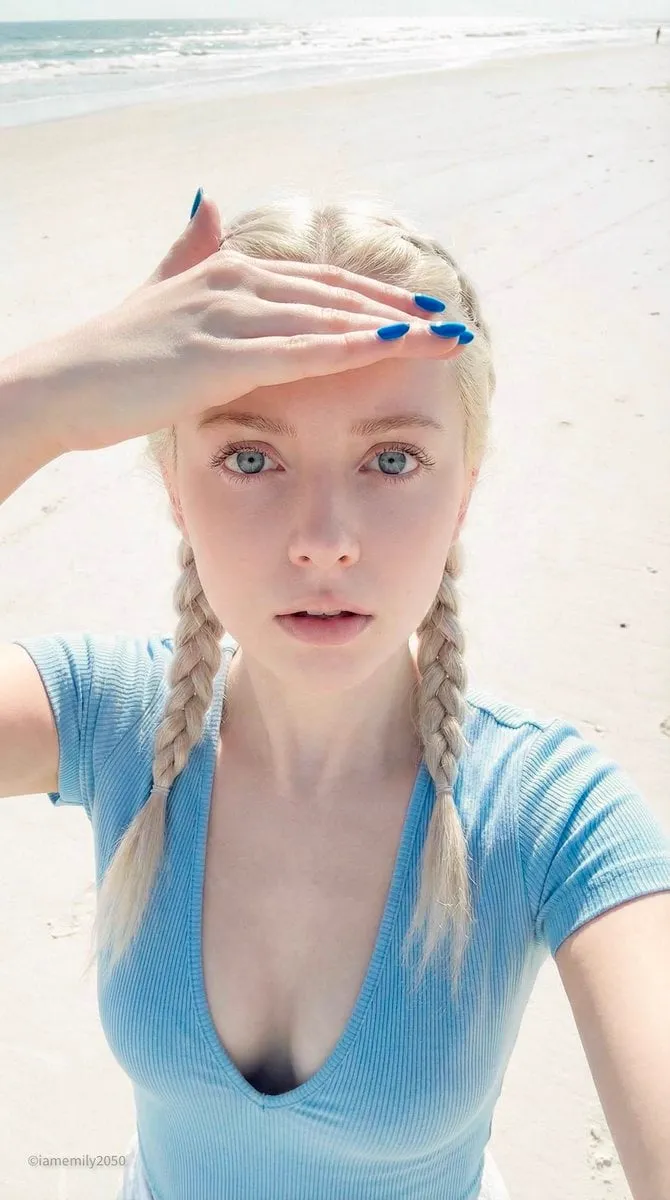
Turning a photograph into an anime-style illustration used to be a commission with a waiting list. Today, the same transformation takes a few minutes and a short text prompt. That shift has changed who can make stylized art and what they make it for. Photographers restyle portraits for clients who want a softer, illustrated look. Indie developers generate character sheets before they have an art budget. Musicians build anime-inspired cover art and looping visuals for short-form video. Tabletop players turn their own faces into adventurers. Teachers create friendly classroom characters from stock photos.
The appeal is not only speed. Anime styling is a compression format for emotion. Line weight, eye highlights, and exaggerated color palettes communicate mood faster than a realistic photograph often can. When you convert a portrait into that visual language, you are not just filtering pixels — you are translating expression into a graphic shorthand that viewers read instantly.
That also means a photo-to-anime tool is not a one-click magic button. The best results come from a deliberate process: choose the right model, prepare the source image, write a prompt that names a style instead of vaguely gesturing at one, and then clean up the details the model inevitably fumbles. This guide walks through that entire process, from technical foundations to prompt patterns to the quality checks that separate a shareable illustration from a melted mess.
How AI Anime Style Generators Actually Work
Most modern anime stylizers rest on diffusion models: systems trained to remove noise from images step by step until a coherent picture emerges. During training, the model sees enormous numbers of anime frames, manga panels, and illustrations alongside captions. It learns statistical associations between words like "cel shaded," "soft shading," or "screentone" and the visual patterns that accompany them.
When you supply a photo, the pipeline typically works in three stages: understand the source, restyle it, then repair it.
Image-to-image strength and identity preservation
In an image-to-image workflow, the source photo is partially noised and then re-denoised under the guidance of your prompt. The key control is strength (sometimes labeled "denoise" or "similarity"). Low strength keeps the photo's structure and only shifts color and texture — safe, but rarely looks like real anime. High strength produces a bold illustration that may abandon the person's actual features. Most good portraits land in the middle, then get refined through a second pass.
Identity preservation is the hard part. A general-purpose model will happily give your subject a different nose, jawline, or eye spacing. Tools counter this with face restoration passes, identity embeddings, or a mask that protects the face while the rest of the image is freely restyled.
Pose, line-art, and structure conditioning
Conditioning methods let you control composition rather than hope for it. A depth map from the original photo keeps the subject's pose stable. A line-extraction pass pushes the result toward cleaner ink outlines. A pose skeleton locks a body position when you want to change clothing or setting. For character consistency across many images, a small style adaptation trained on a handful of approved illustrations is the most reliable option, though it demands more setup time and cleaner reference material.
Post-processing: upscaling, denoise, and color grading
Generated images often arrive at modest resolution with subtle banding in flat color areas. An upscaler specialized for illustration handles line art better than a photographic upscaler, which tends to smear outlines. A light denoise pass cleans speckle in skin tones. Finally, a color grade — lifting shadows, warming highlights, or pushing toward a specific film stock look — unifies a batch so it reads as one coherent set rather than scattered experiments.
What Separates a Good Anime Portrait From a Bad One
Before comparing tools, define what "good" means. Otherwise you will chase resolution while ignoring the things viewers actually notice.
- Recognizable identity. A friend should recognize the subject without being told who it is.
- Consistent facial construction. Eyes the same size, pupils aligned, eyebrows sitting on plausible bone structure.
- Coherent hair. Hair should read as grouped shapes and strands, not as noodles or static.
- Clean line quality. Outlines should be continuous and vary in weight, the way a human inker would draw them.
- Separated subject and background. Anime relies on silhouette clarity; a busy background that merges with the hair ruins it.
- No anatomy failures. Hands, ears, collars, and glasses arms are where models break down first.
- Deliberate palette. Three to five dominant colors with one accent reads as intentional design; twelve random hues read as noise.
If a result scores well on identity and silhouette but fails on hands, fix the hands rather than regenerating from scratch. Inpainting a small region is almost always faster than a full reroll.
Choosing the Right Tool: Decision Criteria
There is no single best anime generator, only a best fit for a given job. Evaluate candidates against these criteria.
| Criterion | What to look for | Why it matters |
|---|---|---|
| Style range | Multiple named styles or reference-based styling | One trick gets stale fast |
| Identity retention | Face restoration, masking, or identity conditioning | Your subject must stay recognizable |
| Control options | Denoise strength, seed, aspect ratio, negative prompts | Control is what makes results repeatable |
| Resolution handling | Illustration-friendly upscaling | Line art breaks under photo upscalers |
| Batch behavior | Consistent seeds and saved presets | Essential for character sets |
| Editing tools | Inpainting, mask refinement, background removal | Saves round trips to other software |
| Export flexibility | Transparent PNG, layered output, high-res video frames | Determines where the art can live |
| Learning curve | Presets for beginners, parameters for experts | Both audiences need a path |
If you only need a handful of avatars, a preset-driven app with a strong default style is plenty. If you are building a comic, prioritize consistency controls and inpainting depth over style variety.
Building a Repeatable Photo-to-Anime Workflow
A dependable sequence beats random experimentation. The following seven steps work across most tools and can be adapted to either a preset app or a parameter-heavy interface.
Step 1: Prepare the source photo
Choose an image where the subject is well lit, facing the camera at least partially, and not wearing heavily patterned clothing. Anime stylization exaggerates patterns into visual noise. Crop to the composition you want rather than relying on the generator to compose for you. If the background is cluttered, note it — you will likely want to replace it in step five.
Step 2: Choose a style anchor before writing prompts
Pick the visual tradition you are targeting: retro cel animation, modern digital illustration, watercolor, shoujo with floral motifs, shonen with sharp angular lines, or cyberpunk neon. Naming the tradition in the prompt does more work than listing twenty adjectives.
Step 3: Set transformation strength conservatively
Start near the middle of the available range. Generate three variations at three strengths. Very often the sweet spot is one notch lower than your instinct suggests, because anime styling is more about line and color treatment than about redrawing the face.
Step 4: Lock the seed once you find a good composition
Note the seed value of your best result. Reusing it while you change clothing, palette, or lighting keeps you inside the same neighborhood instead of restarting the search.
Step 5: Repair the trouble zones
Mask the hands, eyes, ears, and any text in the image. Inpaint each area with a targeted prompt: "anime hand with five fingers, relaxed, cel shaded" or "two symmetrical eyes with highlight." Small, specific repairs outperform global rerolling.
Step 6: Handle the background deliberately
Either generate a simple gradient, a stylized room, or a distinct environment. Consistency between subject and background sells the illusion; a photorealistic kitchen behind a cel-shaded character looks like a compositing error.
Step 7: Upscale, then grade
Upscale with an illustration model at a modest factor such as two, sharpen lines lightly, and apply one unifying grade. Save a layered or transparent version if you plan to composite later.
Prompt Patterns That Improve Anime Styling
Prompts are not spells; they are signals. Structure them in four layers: subject, style, rendering, and mood.
Subject layer. Describe what is actually in the frame — "young woman, short black hair, denim jacket, three-quarter view, seated."
Style layer. Name the tradition — "retro cel animation," "modern digital anime illustration," "soft watercolor manga."
Rendering layer. Specify technique — "clean line art, flat shading with soft gradient, rim light, screentone accents."
Mood layer. Set tone — "calm evening, warm interior light, gentle atmosphere."
Add a sanity check: if a phrase does not change the output noticeably, drop it. Long prompts with contradictory instructions produce average, washed-out results as the model tries to satisfy everything at once.
Negative prompts worth keeping
Most tools accept a negative list. Reliable entries include "photorealistic, 3d render, plastic skin, extra fingers, deformed hands, watermark, signature, text, jpeg artifacts, blurry outline." Keep it short — an enormous negative list can suppress legitimate features like detail in hair.
Style preset cheat sheet
- Retro cel: visible flat shadows, muted film palette, slight grain.
- Modern digital: glossy highlights, saturated eyes, crisp outlines.
- Shoujo: soft pastel palette, decorative flowers, larger reflective eyes.
- Shonen: angular hair, bold action lines, high contrast.
- Watercolor: bleeding edges, paper texture, minimal black outlines.
- Cyberpunk: neon rim light, magenta-cyan split, rain and reflections.
Common Mistakes and How to Fix Them
Pushing denoise to the maximum. The result looks anime but stops resembling the subject. Fix: lower strength and use targeted inpainting for stylization details instead.
Using a low-quality source photo. Small faces, motion blur, and harsh flash all become exaggerated artifacts. Fix: source a sharper image or run face restoration on the input before styling.
Ignoring the background. A mismatched background breaks the illusion more than imperfect line work. Fix: generate the background separately and composite, or mask it into a simple gradient.
Generating one image and calling it done. The first result is rarely the best. Fix: generate a small matrix of four to six variations across two seeds before judging.
Chasing a specific artist. Naming a living artist in a prompt is both ineffective and ethically shaky. Fix: describe technique and era instead — the visual result is more controllable and the practice is cleaner.
Forgetting aspect ratio. Portrait crops cut off hair; square crops lose shoulders. Fix: decide the destination format before generating (avatar, poster, vertical video) and set the ratio first.
Skipping the print check. Illustrations that look great at thumbnail size can reveal stair-stepped lines at full resolution. Fix: view at 100 percent before publishing.
From Single Portrait to Full Character Set
A single portrait is easy; a consistent character across ten images is a project. The difference is process discipline.
Start by defining a character sheet: front view, three-quarter view, profile, and a grid of six expressions. Generate the front view first and treat it as the master reference. Then reuse the seed and, if your tool supports it, feed the approved front view back in as a reference image while you generate the other angles. Expect to inpaint eyes and hairline in every new angle — that is normal, not a sign of failure.
For clothing changes, keep the face mask protected and edit only the torso. For scene changes, keep the subject mask protected and regenerate around it. This masked approach keeps identity stable while allowing creative variation, and it is far more efficient than rerolling entire images and hoping for consistency.
If you need many images in one style, consider training a small style adaptation on eight to fifteen of your best approved outputs. Feeding clean, consistent examples produces a stronger adaptation than feeding a large, mixed set.
Animating an Anime Portrait
Still images are often just the first deliverable. Image-to-video tools can add subtle motion — hair drifting, blinking, a slow camera push — which is ideal for looped social clips and animated avatars.
Keep motion prompts restrained. "Gentle hair movement, soft blink, slight parallax" produces a believable loop; "dramatic action" produces distortion because the model has too little information to invent a full scene. Render at a short duration, check frame by frame around the eyes and mouth, then loop the clip by matching the first and last frame.
If you need lip sync, generate the portrait with a closed, neutral mouth and apply a dedicated lip-sync pass afterward. Trying to get a talking character directly from a single still usually ends in uncanny mouth shapes.
Ethics, Likeness, and Practical Boundaries
Stylizing a photo does not remove the obligations attached to it. If the subject is a real person, get permission before publishing — especially for commercial use. Be careful with public figures: even a highly stylized likeness can imply endorsement or spread misinformation when paired with captions.
Characters from existing franchises should stay in personal, non-commercial territory unless you have rights. When you post stylized work, a short disclosure that it was generated with AI is a small courtesy that prevents a lot of arguments. Keep your source photos and prompts organized too; clients increasingly ask to see the process, and having a tidy project folder makes that conversation easy.
FAQ
Do I need an artistic background to get good results? No, but you need visual vocabulary. Learning to describe line weight, shading style, and palette will improve output more than learning software menus.
Why do my results all look the same? You are probably reusing one prompt and one seed. Change the style anchor, the lighting, and the framing before you blame the tool.
How many variations should I generate? Four to six per concept is a reasonable starting point. More than that rarely adds new information until you change a parameter.
Can I use these images commercially? Check the terms of the specific tool and make sure you hold the rights to the source photo and any depicted person's consent. Rules vary by provider and jurisdiction.
Why do hands always break? Hands are structurally complex and underrepresented in typical training data. Mask and inpaint them rather than rerolling the whole image.
Should I generate at high resolution directly? Usually no. Generate at a comfortable working size, fix details, then upscale once. Generating huge images first just makes each iteration slower.
How do I keep a character consistent across scenes? Lock the seed, reuse an approved reference image, protect the face with a mask, and change one variable at a time.
Final Checklist Before You Publish
Run through this list every time: the subject is recognizable; eyes and hands are clean at full resolution; the outline is continuous; the palette has a clear dominant color; the background supports rather than competes; the aspect ratio matches the destination; the file is upscaled and exported in the right format; and the post includes any needed disclosure about AI generation.
Photo-to-anime conversion rewards iteration more than raw tool power. Pick a workflow, keep your variables controlled, and fix small regions instead of restarting. Do that consistently, and the difference between your first attempt and your tenth will be larger than the difference between any two generators you might compare.
