
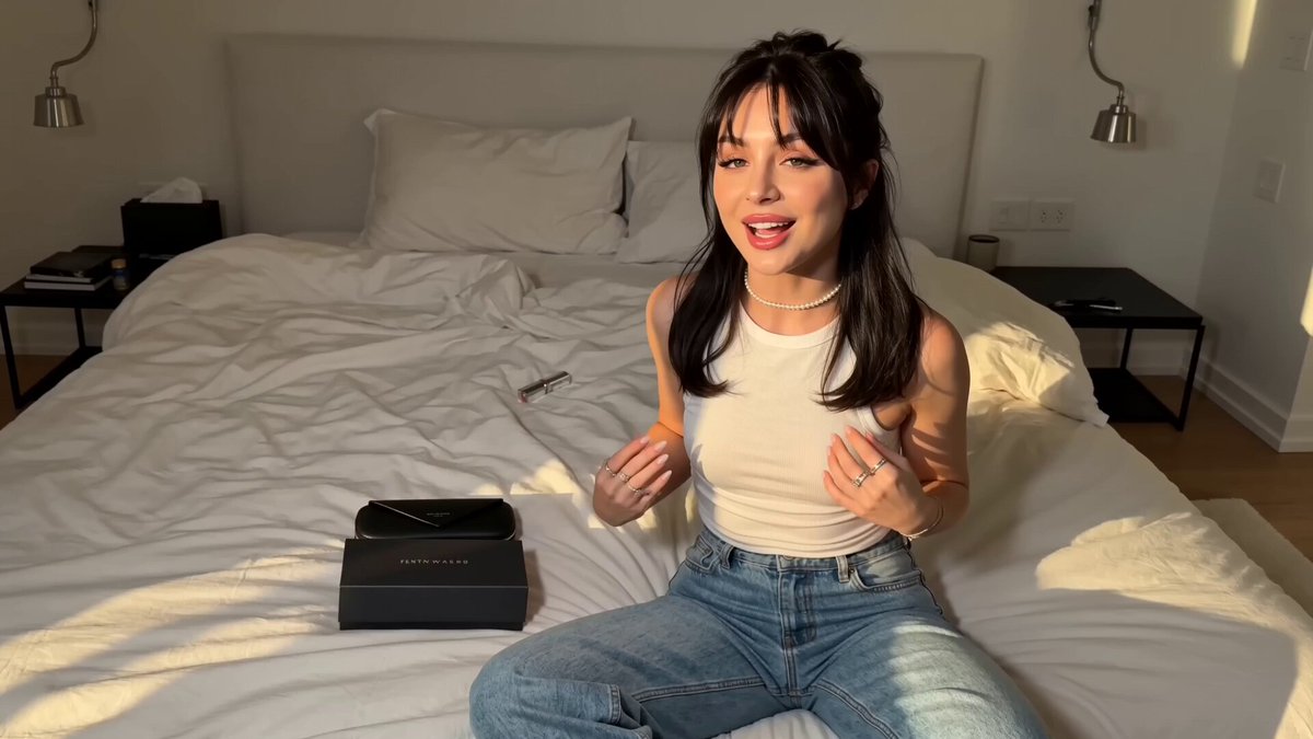
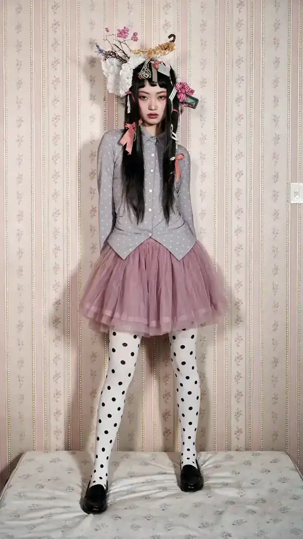
Why the boundary between anime and photorealism is disappearing
For years, AI image tools sorted themselves into camps. One camp chased skin pores, lens bokeh, and believable window light. The other chased clean linework, flat cel shading, and expressive eyes. You picked a model family and lived with its bias.
That separation has largely collapsed. Modern diffusion models train on enormous mixed datasets containing photography, illustration, manga panels, 3D renders, and concept art. As a result, a single checkpoint can produce a convincing studio portrait and a crisp anime portrait in the same session, with only a style phrase changed. Style is no longer a property of the tool; it is a parameter you set.
This changes how you plan work. Instead of asking which generator makes anime, you ask which workflow lets you lock a look and repeat it across fifty images. That question is about prompt architecture, control layers, and consistency technique — the parts of the craft that survive every model release.
Two practical consequences follow. First, your prompt library becomes the most valuable asset you own, more durable than any single model. Second, quality control becomes the bottleneck. When generation is nearly free, the scarce skill is knowing which of thirty outputs is genuinely usable.
How modern image generators actually work
Latent diffusion in plain language
Most current systems are latent diffusion models. The model does not paint pixels directly. It first compresses an image into a smaller mathematical representation — the latent space — then learns to remove noise from that compressed version step by step. Text guidance tells it which direction to denoise. After the final step, a decoder expands the latent back into a full-resolution image.
This matters practically because the prompt does not describe a picture the way a human illustrator reads a brief. It steers a statistical process. Vague words such as beautiful or high quality push weakly. Concrete nouns, materials, light sources, and camera language push strongly. If you want a specific result, describe the physical scene, not your emotional reaction to it.
Conditioning layers: text, image, and structure
Text is only one input. Mature workflows stack several conditioning signals:
- Text prompt — subject, style, lighting, and composition described in concrete terms.
- Image reference — a style or character anchor, usually injected through an adapter so it influences texture and palette rather than layout.
- Pose, depth, or edge control — a skeleton, depth map, or line map that fixes silhouette and body position.
- Segmentation masks — region-level control so background, hair, and clothing stop bleeding into each other.
- Fine-tuned adapters — small trained weights that encode a specific character, product, or illustration style.
When an image fails, diagnosing which layer is weak is more useful than rewriting the whole prompt. A character with correct anatomy but wrong style means the reference layer is too weak. A character perfectly on-model but in an impossible pose means the structural control is missing.
Why resolution and aspect ratio matter
Generation happens at a working resolution, typically between 768 and 1536 pixels on the long edge. Aspect ratio matters more than raw pixel count. Widescreen ratios suit cinematic composition; tall ratios suit character portraits and vertical feeds. If you force an unusual ratio, expect duplicated limbs or stretched anatomy, because the model has seen few examples of that shape. Generate near the final ratio and crop slightly rather than generating square and hoping a crop works.
Choosing the right setup for the job
Photorealistic portraits, products, and environments
Photorealism rewards models with strong photographic priors and heavy real-image training. Look for checkpoints that handle skin texture, hair strands, fabric weave, and lens behavior well at moderate resolution. For products, the priority shifts from beauty to accuracy: label text, material finish, and edge geometry must survive scrutiny. Depth control and a clean reference image of the actual product are usually more valuable than a longer prompt.
For environments, composition control dominates. Depth maps let you fix horizon lines and architectural perspective, which matters when the same scene must appear across a sequence.
Anime, manga, and stylized illustration
Anime output depends on line quality, color flatness, and the discipline of the palette. Strong anime models are trained on illustration datasets rather than photographs, and they respond well to named medium language: cel shading, screen tone, wet-on-wet watercolor, ink wash, limited palette. They also respond badly to photographic terms. Asking for 85mm lens and shallow depth of field on an anime prompt usually produces a muddy hybrid rather than a clean illustration.
Manga-style black and white is its own discipline. Line weight variation, hatching density, and panel-safe framing need explicit instruction, and the negative prompt should exclude stray color and soft gradients.
Hybrid looks: semirealism and cinematic anime
Some of the most commercially useful output sits between the two poles. Semirealism keeps realistic lighting and proportion while simplifying detail. Cinematic anime keeps illustrated character design while borrowing photographic camera language for composition. These blends are where prompt craft matters most, because you are deliberately asking the model to hold two visual grammars at once.
A practical trick: describe the character in illustrated terms and the environment in photographic terms, or vice versa. That gives the model a clear split rather than a muddled average.
Decision criteria in one pass
- Deliverable type — marketing photo, character sheet, storyboard frame, or key art.
- Consistency requirement — one-off image or a series of twenty.
- Text in image — if labels or signage matter, plan for manual compositing.
- Resolution ceiling — will you upscale, and does the model survive upscaling?
- Control needs — pose, depth, or mask precision required.
- Time budget — exploration-heavy or refinement-heavy.
Prompt architecture that scales
The five-slot frame
A repeatable prompt structure beats clever wording. Five slots cover most needs:
- Subject — who or what, with age, build, clothing, and expression.
- Action and pose — what the subject is doing, plus body orientation.
- Environment — location, time of day, weather, background complexity.
- Lighting and camera — key light direction, contrast, lens, framing.
- Style and medium — photographic, anime, painterly, or hybrid.
Keeping the slots in the same order every time makes iteration scientific: when something breaks, you change one slot and observe the effect. This is far more efficient than rewriting the whole prompt and guessing which phrase caused the change.
Negative prompts: what to actually exclude
Negative prompts are usually wasted on generic quality words. Better to exclude the specific failure modes you keep seeing. For photorealistic people, that often means extra fingers, distorted hands, plastic skin, and watermark artifacts. For anime, it means photorealism bleed, muddy gradients, and inconsistent line weight. Keep the negative list short — five to ten terms — and prune anything that never affects your output.
Locking a look across a series
The hardest problem in production is consistency. Three techniques do most of the work:
- Fixed seed with small prompt variation — keeps lighting and palette stable while the pose changes.
- Character adapters — trained weights that reproduce a face, outfit, or mascot reliably.
- Reference-image conditioning at moderate strength — anchors style without copying composition.
Combine a fixed seed with a character adapter and you can generate a believable series without repainting anything by hand.
A repeatable end-to-end workflow
Start with a brief and a reference board
Write down the deliverable, the ratio, the target style, and the three qualities that must be true. Then assemble six to twelve reference images. Half should show the style, half should show the subject or product. Naming what you like about each reference turns vague taste into controllable attributes: warm rim light, matte finish, low camera angle, muted teal palette.
Explore wide, then narrow
Generate a batch at low resolution with short prompts and a high variation setting. Your goal is not finish; it is direction. Sort outputs into three piles: promising, salvageable, and discard. Only the promising pile moves forward. Resist the urge to polish the first halfway-decent image — that is how projects stall.
Refine with control layers
Take the best composition and add structure. Fix the pose with a skeleton, the silhouette with a depth or edge map, and the palette with a reference image. Rewrite the prompt so it describes exactly what you see, rather than what you originally imagined. This step is where most of the visible quality gain happens.
Upscale and repair
Upscale in two stages rather than one large jump. A moderate pass preserves structure; a second pass adds micro-detail. After that, repair small artifacts manually — a hand, an eye, a piece of text, an earring. Even ten minutes of retouching outperforms another hundred generations.
Post-process and deliver
Color grade for consistency across the set, not for individual images. Add grain, bloom, or chromatic aberration sparingly to unify photographic outputs. For anime, check line weight at final size and correct any hairline that disappears when scaled down. Export at the required format with sensible naming.
Quality control: the tells that break an image
Photorealistic failure modes
Skin is the first giveaway. Over-smoothed skin reads as plastic, while over-sharpened skin reads as a filter. Look at hairline edges, ear anatomy, jewelry clasps, and teeth. Background text is almost always wrong, so either remove it or replace it. Check shadow direction: inconsistent shadows across a single frame instantly signal synthesis.
Anime failure modes
In illustration, the tells are different. Watch for line weight that changes randomly along one stroke, gradients where flat color should be, and eyes whose pupils do not align across a series. Palette drift is common in batches — image one teal, image twenty blue-green. Fix it with a consistent color reference or a grading pass at the end.
A fast pass-or-fail checklist
- Anatomy plausible at a glance and on closer inspection.
- Lighting direction consistent across every element.
- No legible text that was not intentionally designed.
- Style coherent with the rest of the set.
- Correct aspect ratio and safe margins for cropping.
- No accidental brand marks or recognizable faces.
Common mistakes that quietly ruin output
Overloading the prompt. Long prompts dilute attention. Twenty concrete words beat eighty vague ones.
Mixing photographic and illustrative language by accident. If you want anime, do not ask for a 50mm lens. If you want a photo, do not ask for cel shading.
Skipping the reference board. Reference gathering feels slow until you realize it saves entire days of blind iteration.
Ignoring the negative prompt. A tight exclusion list is often worth more than another fifty words of description.
Chasing resolution instead of structure. Upscaling a badly composed image produces a large badly composed image.
Generating square and cropping late. Compose in the final ratio from the first batch.
No naming convention. Without versioned filenames, you will lose the exact settings that produced your best frame.
Ethics, rights, and disclosure
Style imitation sits in a gray zone. Copying a living artist's signature style for commercial work is legally risky in many jurisdictions and reputationally worse. Naming a medium instead of a person — ink wash, 90s cel animation, retro airbrush — gets you close to the look while staying defensible.
Likeness matters too. Generating recognizable real people without consent, particularly in commercial or sensitive contexts, invites legal exposure. For characters, check the terms of the model and adapter you use, since fine-tuned weights carry their own license. Finally, disclose synthetic imagery where audiences could reasonably be misled, and always when the image could be mistaken for documentary evidence.
Frequently asked questions
Do I need different tools for anime and photorealism?
Not necessarily. One flexible workflow with a strong prompt library and a couple of style-specific adapters usually covers both. Separate tools make sense only when you need very different control pipelines.
Why do my photorealistic faces look slightly off?
Usually it is lighting inconsistency or a weak reference layer. Add a light-direction phrase to the prompt and anchor the face with a reference image at moderate strength.
How many images should I generate per concept?
For exploration, twelve to thirty low-resolution variants. For refinement, four to eight at final settings. More than that without a specific hypothesis to test is usually wasted effort.
Can I fix bad hands later?
Yes, and it is often faster than regenerating. Regenerate with pose control if the whole gesture is wrong; retouch if only a finger is malformed.
How do I keep a character consistent across scenes?
Combine a fixed seed, a character adapter, and a short style clause that never changes. Consistency comes from what stays identical, not from what varies.
Should I upscale every image?
No. Upscale the ones you will actually deliver. Upscaling is a finishing step, not a discovery step.
What resolution should I generate at?
Match the ratio you need and stay within the model's comfortable working range, then upscale in two moderate passes.
Putting it together
The most useful mindset shift is to treat generation as sampling rather than authoring. You are not drawing the picture; you are searching a vast space of possible pictures and steering the search with words, references, and structural controls. Everything in this guide — the five-slot prompt frame, the staged workflow, the pass-or-fail checklist — exists to make that search faster and more repeatable.
Start small. Pick one deliverable, build a reference board, write a five-slot prompt, and run a batch of low-resolution variants. Add one control layer at a time and note what changes. Within a few sessions you will have a personal recipe that travels across model updates, because it depends on your process rather than on any single tool's quirks. That recipe, not the generator you happen to be using this month, is what makes the difference between random pretty images and reliable visual output.
