
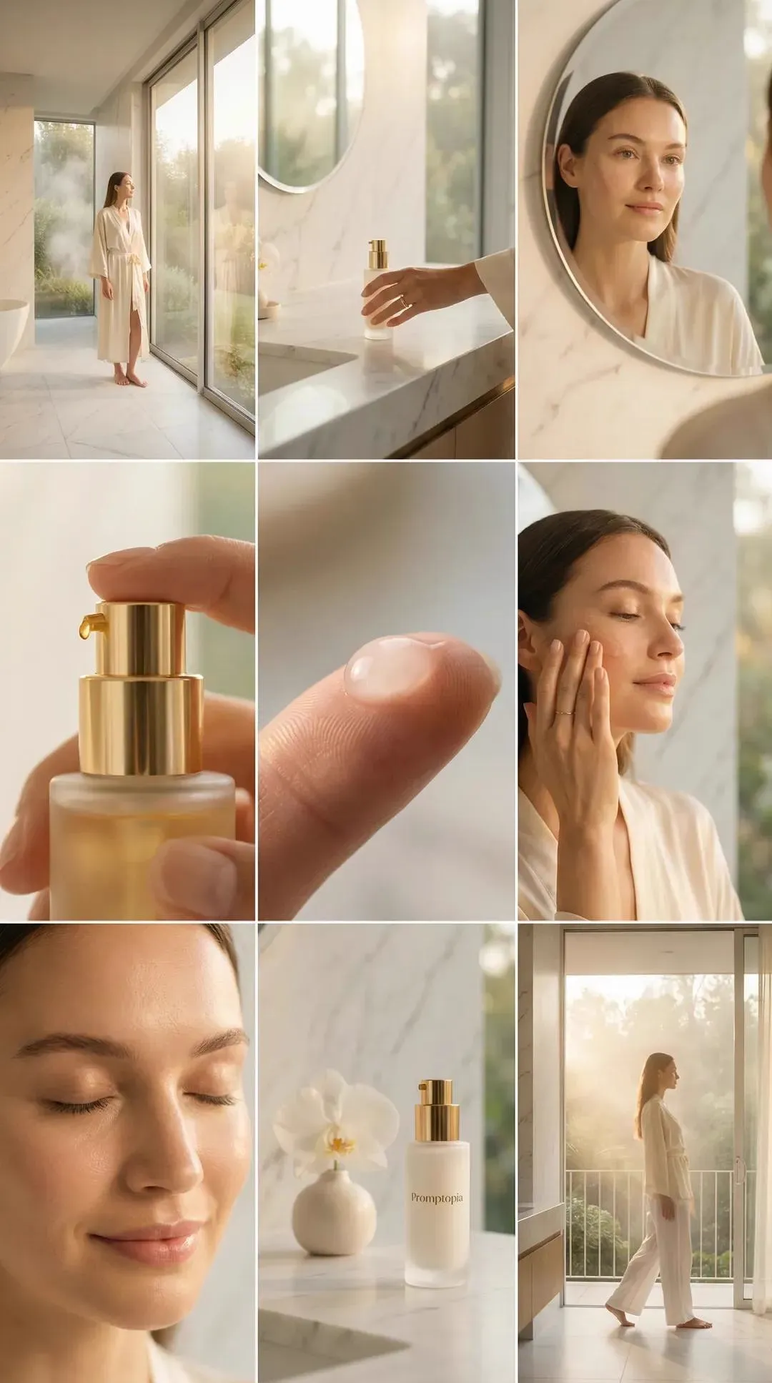
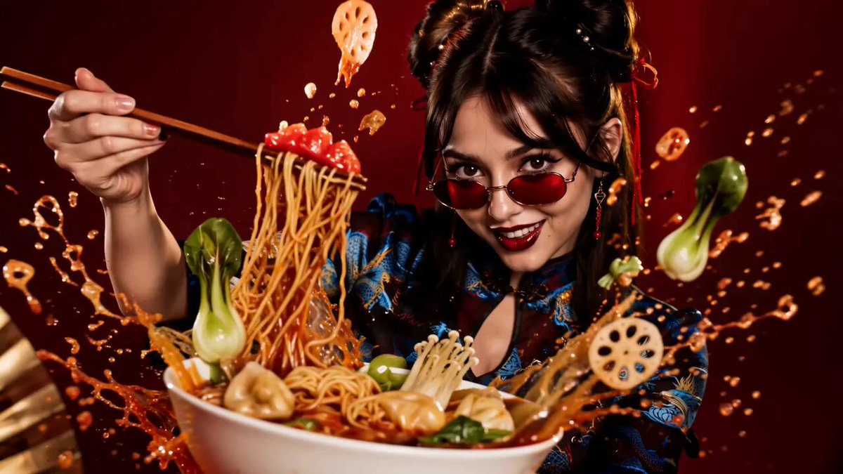
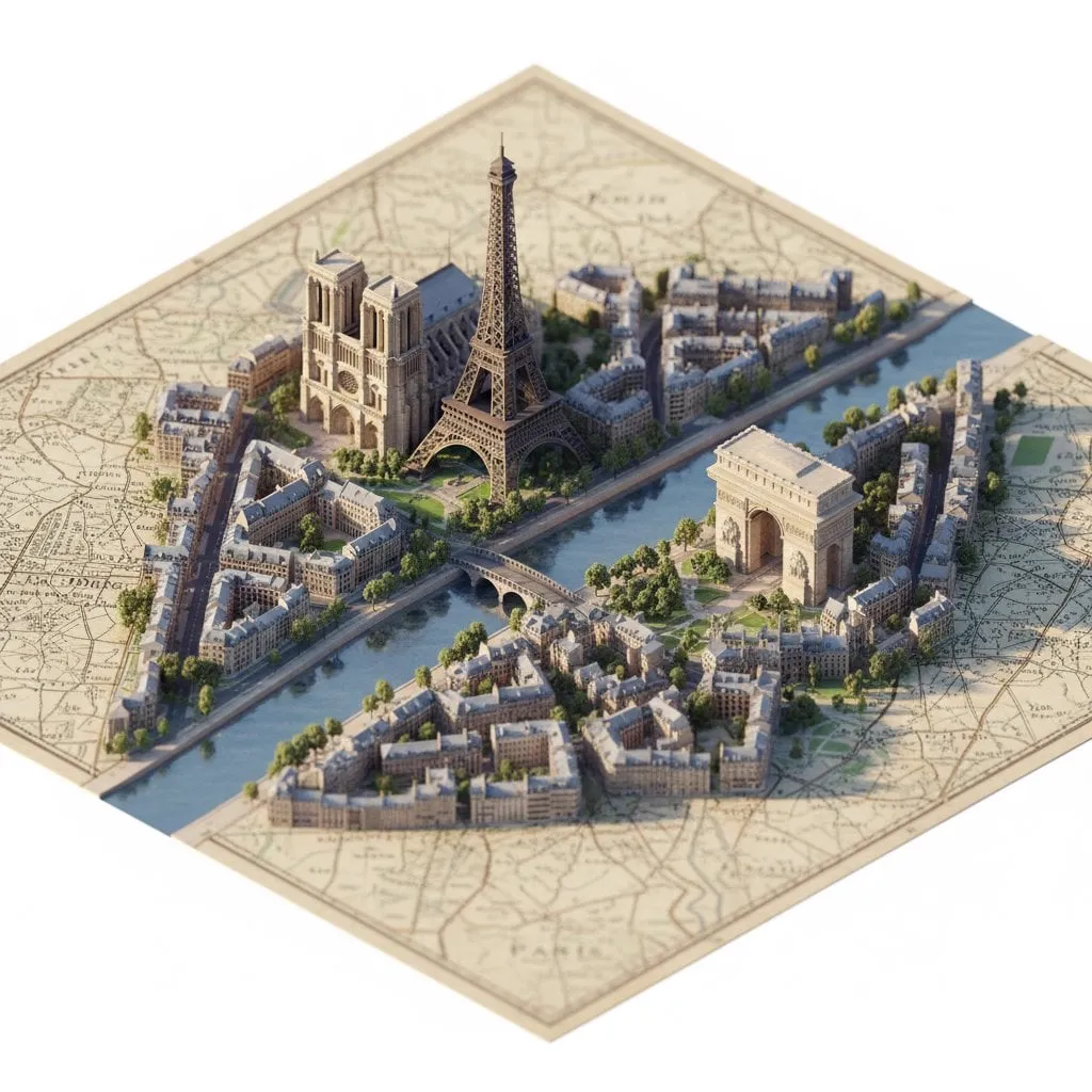
Still images carry mood, but motion changes how viewers read them. A portrait can become a short scene, a product shot can reveal texture, and a stylized poster can animate like a tiny film. The modern workflow combines two capabilities: turning a still frame into a controlled video clip, and applying a block-based pixel look that makes the result feel playful, graphic, and designed. This guide walks through both halves as one repeatable production pipeline.
Why image-to-video and blocky style transfer belong together
Image-to-video is not animation for its own sake. It is a way to test an idea quickly. You begin with a frame you already like, then ask a model to infer plausible motion. That inference can be delicate or dramatic, but the best results come from a clear intention.
Block-based styling adds a second layer of meaning. A realistic clip can look expensive but generic. A pixelated, brick-like treatment creates a strong visual identity. It turns organic motion into something more graphic, almost like a moving mosaic. Motion keeps the eye engaged while the style keeps the frame readable.
Used together, the workflow suits title sequences, social spots, explainer inserts, album visuals, game trailers, and experimental shorts. It also helps teams prototype scenes before committing to a full live-action or 3D production.
Core workflow: from still image to motion clip
The reliable path is not a single button press. It is a short sequence of decisions: start with a strong frame, define the motion in plain language, generate small tests, then refine.
Prepare the source frame
The source frame does most of the heavy lifting. If the image is soft, noisy, or badly cropped, the model will amplify those problems. Clean the image first. Correct exposure, remove distracting objects, and decide what the viewer should notice.
A useful checklist includes:
- A clear subject with separation from the background.
- Readable edges around hair, fabric, and product contours.
- Balanced lighting that does not clip highlights.
- A composition with room for motion, especially if the camera will push or pan.
- A resolution high enough for the target format but not so large that generation becomes slow.
If you plan a blocky style pass, simplify the image before generating motion. Reduce tiny textures, smooth skin slightly, and group similar colors. Those choices make the later style mapping cleaner.
Write a motion brief
Most image-to-video tools respond better to a short, specific motion brief than to a long paragraph. Describe the camera, the subject, and the environment. For example: slow push in, subject turns slightly toward camera, fabric moves in gentle wind, background lights flicker softly.
Avoid stacking conflicting instructions. A camera that pushes in, pulls out, orbits, and tilts at the same time will usually produce a messy result. Choose one primary motion and one secondary motion. That gives the model a clear hierarchy.
Generate short clips and inspect
Generate clips in short durations first. Two to four seconds is often enough to judge motion quality, stability, and style compatibility. Longer generations can drift, morph, or lose detail. Once a short clip works, extend it or generate overlapping segments.
Inspect each test for subject recognition, camera smoothness, edge stability, background consistency, and motion accuracy. Keep notes. A small document with prompt, settings, and result helps you repeat what works.
Assemble the first cut
Place the best clips on a timeline before you perfect them. Sequence matters. A clip that looks odd alone may work as a transition or a reaction shot. Add simple cuts, then adjust timing. The goal is to find the rhythm before adding polish.
Making motion look intentional
Motion quality is less about raw model power and more about directorial choices. The model can infer movement, but you decide what the movement means.
Camera moves that sell the illusion
Simple camera moves are more convincing than complex ones. A slow push in creates intimacy. A gentle pan reveals environment. A slight tilt can add unease. A handheld shake can make a static frame feel documentary.
For blocky styles, camera moves should be slower than usual. Fast motion can turn pixel blocks into noise. Let the style breathe. If you need energy, use cuts, sound, or subject motion rather than a rapid camera swing.
Subject motion and physical cues
Subjects need physical logic. If a person turns their head, shoulders should follow. If fabric moves, it should move in one direction. If a vehicle moves, the background should shift consistently.
Use references when possible. A short video of a similar motion, even a rough phone capture, can guide your prompt. Describe weight, speed, and direction. Words like drift, settle, turn, lean, and sway are more useful than generic words like move.
Managing faces, hands, and fine edges
Faces and hands remain the hardest areas. Keep them small in frame when possible, or use close-ups with very slow motion. If the model warps a face, try a shorter clip, a simpler background, or a different starting expression.
Fine edges such as hair, leaves, and transparent objects also cause trouble. A blocky style pass can hide some of these issues because it quantizes detail. That is one reason the pixel treatment is practical: it turns weaknesses into part of the aesthetic.
Lego pixel style transfer without losing the subject
Block-based style transfer is often described as a filter, but it is closer to a translation. The image is rebuilt from larger units, and those units follow rules about color, shape, and contrast.
What block-based style mapping really does
A block-based style pipeline samples the image, groups pixels into tiles or bricks, and assigns each tile a representative color or texture. Some tools also add bevels, shadows, or plastic highlights to mimic physical bricks.
The result is not simply mosaic. Good style mapping preserves the subject silhouette, keeps important features readable, and uses a limited palette. It should feel constructed, not blurred.
Build the style pass in layers
A clean style pass usually has three layers: structure, color, and surface. Structure defines edges and silhouettes. Color uses a reduced palette that matches the mood. Surface adds highlights, shadows, and texture that suggest material.
You can apply these layers in a single tool or split them across several. Splitting gives more control. For example, prepare a high-contrast structural pass, then color it with a separate palette, then add subtle surface details in a compositing app.
Tune block size, palette, and edge contrast
Block size is the most important control. Small blocks preserve detail but may look like noise. Large blocks create a stronger toy-like effect but can erase faces and text. Start medium, then test small and large versions.
Palette size matters too. A limited palette of six to twelve colors feels intentional. Too many colors create a muddy result. Too few colors can make the image flat. Use contrast to guide the eye: bright blocks near the subject, darker blocks in the background.
Edge contrast should be selective. If every edge is sharp, the image becomes busy. Soften internal edges and keep outer silhouettes crisp. That separation helps the subject pop.
Avoid over-styling
Over-styling is the most common mistake. If the blocks are too large, the audience loses the subject. If the palette is too wild, the mood breaks. If the surface highlights are too strong, the image looks plastic rather than designed.
Test the style at thumbnail size. If the subject is still readable when the image is small, the style is working. If not, reduce block size or increase contrast around the subject.
Consistency across shots
A single clip can be a proof of concept. A series needs consistency. The audience should feel that every shot belongs to the same world.
Reference locking and shot bible
Create a shot bible with key references: character design, color palette, lighting direction, camera height, and block size. Use the same reference images across generations. When a tool supports image references or style references, use them consistently.
Write down the exact settings that worked. Note seed values, motion strength, style strength, and resolution. Small changes can cause large shifts.
Color, light, and grain continuity
Color is the easiest place for inconsistency to appear. Apply a unified color grade after generation. If one clip is warmer, correct it before assembly. Match black levels, white balance, and saturation.
Light direction should also stay consistent. If the key light comes from the left in one shot, it should not come from the right in the next unless the scene motivates the change. Grain and texture should be similar across shots, especially when mixing generated clips with live-action plates.
Reusing prompts without copying mistakes
Reuse prompt structure, not every word. A prompt template can include subject, action, camera, lighting, and style. Fill in the variables for each shot. This keeps the language consistent while allowing each shot to have its own purpose.
If one generation fails, do not paste the same prompt repeatedly. Change one variable at a time. Adjust motion first, then style, then lighting. That isolates the cause.
Tool selection and settings that matter
There is no single best tool for every job. The right choice depends on control, speed, and the kind of motion you need.
Simple image-to-video models
Simple models are best for quick tests, mood pieces, and shots where the camera movement is subtle. They usually need less setup. They work well when the source image is already strong and the desired motion is simple.
Look for controls for motion strength, camera direction, and duration. If the tool offers a seed, use it. A fixed seed helps you compare changes without random variation.
Motion-brush and camera-control tools
Some tools let you paint motion arrows, define a camera path, or set depth layers. These are useful for product shots, architectural reveals, and scenes where the subject must follow a specific route.
These tools have a steeper learning curve, but they give you more predictable results. Use them when the shot needs precision rather than surprise.
Hybrid compositing and 2D animation
For complex projects, combine generated clips with traditional compositing. You can rotoscope a subject, place it over a generated background, or animate block elements by hand. Hybrid work is often the fastest way to fix a stubborn generation.
A simple 2D animation tool can also create transitions, title cards, and overlays that match the pixel style. This keeps the visual language unified without forcing every element through the same model.
Quality control, artifacts, and fixes
Every generated clip needs a review pass. Learn the common artifacts and the fastest fixes.
Flicker and shimmer
Flicker appears when brightness or color changes frame to frame. It is common in backgrounds with fine texture. Fix it with a mild temporal denoise, a deflicker filter, or by regenerating with a simpler background. In blocky styles, flicker can look like crawling pixels, so keep block size stable across the clip.
Morphing and warping
Morphing happens when the model cannot track a shape. Faces stretch, hands melt, and objects change identity. Shorten the clip, slow the motion, or use a different source frame. If the subject must move a lot, break the action into smaller beats and cut between them.
Edge chatter and background drift
Edge chatter is a vibrating outline around the subject. Background drift is when the environment slides even though the camera should be locked. Both often come from weak depth cues. Add foreground or background elements that clarify depth, or use a tool with depth controls. A slight vignette can also hide edge movement.
Resolution, compression, and export
Generate at a resolution that matches your final output. Upscaling after generation can soften the style, especially with hard pixel edges. Export with a high-quality codec for editing, then compress for delivery.
For pixel styles, avoid heavy compression during intermediate steps. Compression artifacts can blur block boundaries and create unwanted gradients. Keep a master file with low compression, then create platform-specific versions from that master.
A practical project walkthrough
Here is a complete example you can adapt. Suppose you are creating a thirty-second promo for a fictional toy line. The look is colorful, playful, and built from blocky shapes.
Brief and storyboard
Define the story in five shots: an establishing shot, a character introduction, a product close-up, an action beat, and a logo end card. For each shot, write one line of motion: slow push in, character turns, camera glides across product, blocks scatter, logo assembles.
Frame prep and style exploration
Create or select a still for each shot. Prepare the frames with consistent lighting and composition. Then test the block style on one frame. Try three block sizes and three palettes. Choose the version that stays readable at thumbnail size.
Generation passes
Generate short clips for each shot. Use the same style reference and similar prompt structure. Review each clip for subject stability and motion quality. Replace any clip that drifts or flickers.
Edit, sound, and delivery
Assemble the clips on a timeline. Add cuts on motion, not just on beats. Layer sound effects for block clicks, whooshes, and ambience. Add music that matches the playful tone. Finally, color grade the whole sequence, add the logo, and export.
Ethical, legal, and brand safety notes
AI video workflows raise practical questions. If you use a real person likeness, get permission. If you reference a protected character or brand, do not present the output as official. If you fine-tune on images, respect the rights of the original creators.
For block-based styles, avoid copying a specific commercial toy design too closely. A generic brick aesthetic is different from a protected product trade dress. When in doubt, simplify, abstract, and add your own visual identity.
Also consider how the output will be used. A playful style can be inappropriate for serious topics. Match the treatment to the message. Disclose synthetic media when the context requires it, and keep records of your process for client review.
FAQ
How long should each generated clip be?
Start with two to four seconds. Short clips are easier to control and faster to review. Once you have a stable result, extend it or create overlapping segments and cut them together. Longer clips often drift, especially with faces and fine details.
Can I use the style on live-action footage?
Yes, but the workflow changes. You will need to track the subject, stabilize the shot, and apply the style pass frame by frame or clip by clip. Live-action footage with simple backgrounds and slow camera movement works best. Fast action and complex crowds are much harder.
What if the subject morphs?
Shorten the clip, reduce motion strength, or change the source frame. If the subject is a face, use a smaller face in frame or a more neutral expression. You can also generate the motion first, then apply the style pass afterward. Some morphing becomes less noticeable once the image is reduced to blocks.
Do I need a high-end GPU?
Not necessarily. Many tools run in the cloud, so your local hardware matters less. If you work locally, a modern GPU helps with style transfer and compositing, but the biggest gains come from a clean source frame and a clear motion brief. Plan your generation passes so you are not wasting time on random tests.
How do I keep a series consistent?
Create a shot bible with references, palette, lighting, and settings. Reuse prompt structure and seeds where possible. Grade all clips together at the end. Consistency is rarely a single setting; it is a collection of small decisions repeated across every shot.
Before you export, run through a short checklist. Is the subject readable in every shot? Does the motion match the brief? Is the block style consistent? Are colors and lighting unified? Does the sound support the rhythm? Is the export compressed appropriately for the target platform?
A good image-to-video and block-style workflow is not about chasing the most complex model. It is about controlling the variables you can control: the source frame, the motion brief, the style pass, and the edit. When those pieces line up, the result feels deliberate rather than accidental. That is what makes the technique useful for real projects, not just experiments.
