

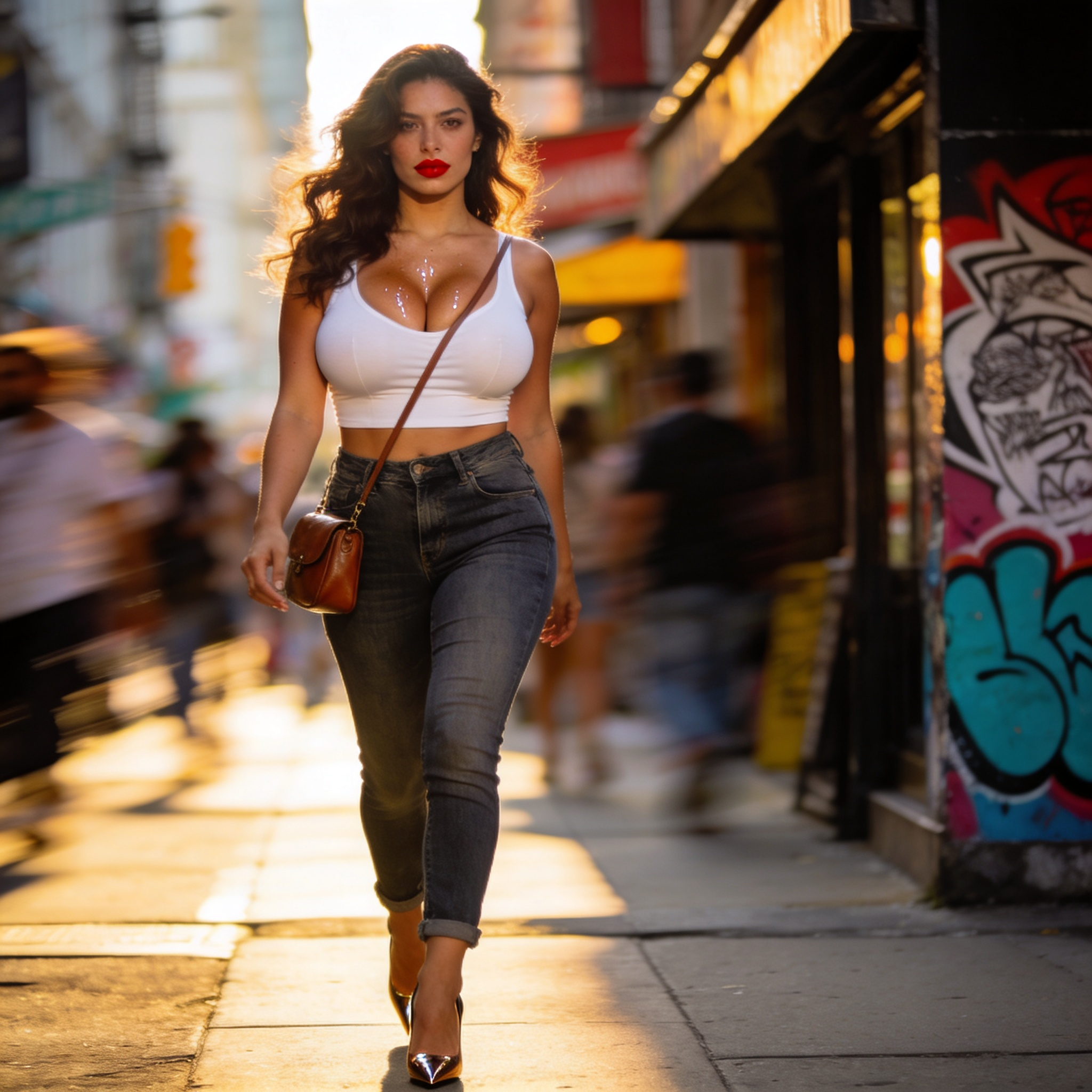

Why the Thumbnail Is the Real Gatekeeper
Every upload competes inside a feed where a viewer's thumb moves faster than their curiosity. The thumbnail and the title are the only two elements that exist before the click, and the eye lands on the image first. A strong thumbnail compresses an entire promise into a rectangle that has to survive being viewed at roughly 320 pixels wide on a phone, on a bright screen, at speed, while someone is standing in a queue.
That constraint is exactly why AI image tools became useful so quickly. They let a designer explore twenty visual directions in the time it once took to sketch one, and they can reproduce a consistent visual identity across dozens of assets without a photoshoot, a studio, or a graphic designer on standby. But the tools did not remove the need for judgment. They moved it. Instead of spending hours rendering, you spend your time on selection, framing, testing, and iteration — the parts that actually move click-through rate.
This guide is a workflow, not a list of features. It covers the design principles that AI can amplify, the data you should read before you open any tool, how to choose the right model for each task, a repeatable production process, and the mistakes that quietly kill performance.
The Design Principles AI Amplifies
AI does not invent strategy. It accelerates whatever strategy you bring to it. If your direction is weak, you will get a hundred polished versions of a weak idea, which is worse than one rough sketch because it feels like progress. So start with principles.
Contrast, Hierarchy, and the Three-Second Rule
Assume a viewer gives your thumbnail less than a second of peripheral attention before deciding whether to focus. Within that window, the image must answer three questions instantly: what is this about, who is it for, and what changes if I watch it. Contrast — in luminance, color temperature, and subject scale — is what makes those answers readable at small sizes.
A practical test: shrink your thumbnail to 25 percent of its final size, squint, and ask what you see first. If the answer is anything other than your main subject or your key visual idea, the hierarchy is broken. Generative tools are excellent at producing dramatic lighting and depth of field, which is exactly the kind of contrast that survives downscaling. Lean into that. Ask for strong rim light, clear subject separation, and a restrained background.
Faces, Emotion, and Gaze Direction
Human faces remain one of the strongest attention magnets in a feed, and AI models generate them with impressive nuance. The useful detail is not just presence but direction and intensity. A face looking toward the center of the frame pulls the viewer's eye inward. A face looking directly out creates confrontation and intimacy, which works for opinion, reaction, and commentary formats.
Emotion needs to be legible in a still. Subtle expressions disappear at thumbnail scale. When prompting, name the emotion explicitly — surprised, skeptical, delighted, focused — and describe the visible cues: raised eyebrows, a half-open mouth, a furrowed brow. Avoid neutral portraits unless the surrounding composition carries the tension.
Text Discipline
Text on a thumbnail can double comprehension or destroy it. The rule that survives every platform update is simple: three to five words, high contrast, and generous letter spacing. Never bake critical text into the generated image. Diffusion models still produce inconsistent letterforms, and you will be stuck with a typo you cannot fix without regenerating everything.
Generate the background and subject with AI, then add type in a layout tool. This also keeps your typography consistent across a series, which trains returning viewers to recognize you in a crowded feed.
Read the Data Before You Open a Design Tool
The instinct to jump straight into generation is strong, especially when the tools are enjoyable. Resist it for one hour per project. A short analytics pass changes what you build.
The Metrics That Actually Guide Design
Click-through rate is the headline number, but it is an outcome. The inputs you can design against include:
- Impression volume by traffic source. Browse and suggested traffic behaves differently from search traffic. Browse rewards curiosity gaps and novelty; search rewards clarity and literal relevance to the query.
- Device split. If most impressions come from mobile, your safe area shrinks and your text has to be larger than you think.
- Retention in the first thirty seconds. A thumbnail that overpromises produces a spike in clicks and a cliff in retention. Platforms notice, and so do viewers.
- Channel-level patterns. Compare your top five and bottom five performers on the same metric over the last ninety days. Look for recurring visual traits, not one-off winners.
Building a Simple Test Log
Keep a plain spreadsheet or a document table with four columns: asset name, hypothesis, visual variables changed, and result. Change one variable per test whenever possible — subject scale, background color family, expression, text length, or composition. Testing five things at once produces a winner you cannot explain and cannot reproduce.
A useful hypothesis reads like this: switching from a cool blue background to a warm amber background will increase click-through rate on mobile impressions because it separates the subject from the surrounding interface. That is testable. Compare it against a vague goal like make it pop, which is not.
Choosing the Right Tool for Each Job
There is no single best model. There are models that are good at different tasks, and professional workflows chain several of them.
Text-to-Image Generation
Use a strong general-purpose text-to-image model for hero imagery, backgrounds, and stylized scenes. These models handle lighting, materials, and composition well and give you the widest creative range. They are ideal for the first exploration round, when you want breadth rather than precision.
Instruction-Based Image Editing
Editing models that accept natural-language instructions are the workhorse of thumbnail iteration. Once you have a composition you like, you can ask for a wardrobe change, a background simplification, a lighting shift, or a new camera angle without rebuilding the scene. This is where most of your refinement time should go, because it preserves what already works.
Segmentation, Cutouts, and Background Replacement
Automatic subject masking has become reliable enough to use as a routine step. It matters for two reasons. First, it lets you drop a creator or product onto a new background tuned for contrast. Second, it makes local color grading possible, so you can lift the subject's saturation without shifting the background.
Upscaling and Detail Recovery
Upscalers matter more than most people expect. Platform compression is unforgiving, and soft detail turns to mush. A light upscale pass followed by careful sharpening keeps edges crisp without the halo artifacts that aggressive sharpening creates.
Frame Extraction From Video
If you already have footage, pulling candidate frames and refining them is often faster than generating from scratch. The expression is real, the lighting matches the video, and the thumbnail stays honest about what the viewer will get. Combined with segmentation and relighting, this hybrid approach produces some of the most coherent results.
A Repeatable AI Thumbnail Workflow
The following sequence is designed for teams producing several assets per week. It scales down fine for a solo creator.
Step 1: Write a One-Sentence Brief
Before prompting, write one sentence describing the visual promise. Example: a skeptical reviewer holding a damaged gadget against a dark background, warm light on the face, product slightly out of focus. That sentence becomes your prompt skeleton and your review criteria later.
Step 2: Assemble a Reference Board
Collect six to ten thumbnails from your own channel and from adjacent channels that perform well. Note what they share: subject scale, color temperature, text treatment, negative space. Reference boards keep a team aligned and reduce the number of rounds needed to reach approval.
Step 3: Build the Prompt in Layers
Structure prompts in a consistent order so results are predictable:
- Subject and action
- Expression and emotion
- Framing and camera angle
- Lighting direction and quality
- Background and environment
- Color palette and mood
- Technical finish — lens, depth of field, sharpness
Keeping the order stable makes A/B comparison meaningful, because you know which layer changed.
Step 4: Generate Wide Before Narrow
Produce a first batch that explores genuinely different directions rather than ten variations of the same idea. Evaluate them at thumbnail scale immediately. Most concepts die here, and that is the point — it is far cheaper to kill an idea in a contact sheet than after a full layout pass.
Step 5: Refine the Winner With Instruction Edits
Take the strongest two or three directions and refine them. Adjust the crop so the subject occupies a comfortable share of the frame, usually between 40 and 60 percent for talking-head formats. Push contrast between subject and background. Remove clutter that will not read at small sizes.
Step 6: Compose in a Layout Tool
Bring the image into a design tool that supports layers, guides, and reusable templates. Add text, brand marks, and any framing devices. Check the composition against the platform safe areas so interface elements do not cover your subject or your text.
Step 7: Export, Compress, and Verify
Export at the platform's recommended resolution, keep file size reasonable, and then look at the final file on an actual phone. Not a desktop preview scaled down — an actual phone, at arm's length, in daylight. This single habit catches more problems than any checklist.
Consistency Across a Series
Thumbnails are not individual artworks; they are a visual system. When a viewer recognizes your style before reading the title, you have built an asset that compounds.
Consistency comes from a small number of fixed variables: one or two typefaces, a limited palette, a consistent subject treatment, and a repeated compositional grid. Lock those, then let the imagery vary. AI makes this easier than ever, because you can reuse a prompt template with a style block that stays identical across every asset.
If your content features a recurring presenter, character consistency matters. Multi-image fusion techniques — generating several angles of the same person, then compositing or training a lightweight reference — let you keep the face recognizable across thumbnails. Save the best reference set once and reuse it; rebuilding it for every video wastes effort and produces drift.
Designing Thumbnails for Interface and Product Contexts
Not every thumbnail lives on a video platform. App store listings, course catalogs, dashboard cards, and software marketplaces all use small preview images that follow similar rules with different constraints. These interface thumbnails are often displayed inside a grid with rounded corners, tight padding, and a caption underneath.
The practical adjustments are worth knowing:
- Keep critical content away from the corners, since rounded masks will clip them.
- Design for the smallest card in the grid, not the largest.
- Avoid baked-in text that duplicates the caption below the card.
- Prefer a single, recognizable object over a busy scene, because interface thumbnails are often half the size of video thumbnails.
- Test the image against both light and dark interface themes. A thumbnail that only works on white will look broken in dark mode.
If you produce both kinds of assets, build one generation pipeline and two export templates. The creative work is shared; only the crop, padding, and text rules change.
Common Mistakes and How to Fix Them
Too many ideas in one frame. Every additional element competes for attention and reduces legibility. Fix: pick one idea, one subject, one focal point, and remove everything that does not support it.
Beautiful images that say nothing. Aesthetic polish without a clear subject or emotion produces low clicks. Fix: write the promise sentence first, then generate to it.
Text placed in dead zones. Captions, duration badges, and progress bars overlay the bottom of most thumbnails. Fix: keep the lower strip visually calm and move text into the upper or middle band.
Identical compositions across a series. Viewers stop noticing. Fix: alternate framing — wide shot, tight close-up, object-only, split composition — while keeping the style constants intact.
Chasing a competitor's look too closely. Borrowing structure is fine; copying visual identity creates confusion and looks derivative. Fix: extract the principle, not the pixels.
Skipping the mobile check. A thumbnail that reads well on a large monitor frequently fails on a phone. Fix: make the phone check mandatory before publishing.
Ignoring retention. Clickbait thumbnails inflate clicks and damage the channel over time. Fix: make sure the visual promise is delivered in the first minute of the video.
Quality Control and Handoff
When more than one person touches the asset, a short checklist prevents regressions. Use it at the end, not the beginning.
- Does the thumbnail read clearly at quarter size?
- Is the subject separated from the background by luminance or color?
- Is the text four words or fewer and free of spelling errors?
- Does the composition respect the platform safe area?
- Is the file within size limits and exported at the correct aspect ratio?
- Does it match the established series style?
- Is the visual promise honest about the content?
- Has it been viewed on a physical phone?
Keep the checklist under ten items. Longer lists get skipped. Alongside it, maintain a naming convention that includes the project, the variant, and the version number, so that testing data can be traced back to a specific file months later.
Building Speed Without Losing Judgment
The temptation with generative tools is to produce enormous volumes and pick the least bad option. That approach burns time and produces inconsistent output. A better pattern is a fixed production cadence: one exploration batch, one refinement round, one layout pass, one review. Constraints on quantity force better briefs, and better briefs produce better images.
It is also worth keeping a small library of reusable components: a background set, a lighting preset described in text, a template file with type already positioned, and a saved prompt skeleton. Most of the speed improvement in an experienced workflow comes from reuse, not from faster generation.
Finally, treat every published thumbnail as data. Record what you made, what you changed, and what happened. Over a few months, that record becomes more valuable than any tool subscription, because it tells you what your specific audience responds to — something no model can know on its own.
FAQ
How much of the thumbnail should be generated versus designed?
Generate the imagery and design the composition. Leave text, brand elements, and final cropping to a layout tool where you have precise control.
Can AI keep a recurring character consistent across thumbnails?
Yes, with a saved reference set and a fixed style block in your prompt template. Consistency usually requires a small amount of manual compositing to be truly convincing.
What is the biggest cause of low click-through rate?
Unclear subject hierarchy. If a viewer cannot identify the main subject in under a second, nothing else about the image matters.
Should I use AI-generated people or real footage frames?
Use real frames when authenticity matters, such as tutorials, reviews, and documentary content. Use generated imagery for concepts, dramatization, and scenes that are impossible to shoot.
How many thumbnail variants should I test?
Two is usually enough, and one variable per test is ideal. Larger batches dilute your ability to learn anything specific.
Does a clean, minimal thumbnail always win?
Not always, but it fails less often. Minimal designs scale better across devices and are easier to read in a cluttered feed.
How do I keep quality high when producing at volume?
Lock your style variables, reuse templates and prompt skeletons, and enforce a short fixed review checklist before anything is published.
