

Why Photographic Style Is the Hardest Part of AI Video
Ask anyone who has shipped an AI-generated sequence what actually breaks it, and the answer is rarely "bad animation." It is drift. Shot three has warm skin tones; shot seven turns cyan. Grain appears in one clip and disappears in the next. The camera seems to swap bodies between cuts, and the light stops behaving like it belongs to a single location.
Generating one beautiful frame is easy. Generating forty frames that look like they came off the same camera, on the same day, with the same crew, is the real craft. Photographic style is not a filter applied at the end of the pipeline. It is a set of decisions — lens, light, color, texture, framing — that you repeat with discipline across every shot until the audience stops noticing the seams.
The problem is structural. Most AI video tools generate each clip independently. Each generation is a fresh interpretation of your prompt, and small interpretive differences compound: a slightly different focal length here, a slightly different white balance there. Multiply that by twenty clips and you get a sequence that feels assembled rather than shot.
This guide is a practical workflow for locking a photographic look across an AI-generated video project. It covers how to define style before generating, how to use reference images instead of adjectives, how to structure generation sessions, which shots break continuity most often, how to pick a model per shot, and what to verify before export.
What Photographic Style Actually Means in a Generative Workflow
Before you can control style, you have to describe it precisely enough that a model can act on it. "Cinematic" and "moody" are useless instructions — they mean a hundred different things. Break style into four controllable layers, and suddenly you have something you can write down, test, and repeat.
Texture and grain
Texture is what the sensor and film stock contribute: grain size, noise pattern, micro-contrast, halation around highlights, and how much fine detail survives in shadows. A clean digital look, a soft 16mm look, and a harsh high-ISO look can all depict the same scene and read as completely different films.
In practice, you control texture through a combination of prompt language, reference frames, and post-processing. Pick one texture family per project and never mix it silently. If two scenes genuinely happen in different formats, that difference should be a deliberate narrative choice, not an accident.
Lens behavior and perspective
Lens choice determines how space feels. A 24mm lens exaggerates depth and pulls the background away; an 85mm lens compresses faces and flattens distance. Wide lenses make interiors feel large and slightly aggressive; long lenses make crowds feel intimate and observational.
Most style drift in AI video is actually lens drift. The model generates a wide-feeling frame in one clip and a telephoto-feeling frame in the next, and no amount of color grading can hide it. Write the focal length into every prompt and, better, into every reference frame.
Color science
Color is the most visible layer and the easiest to over-correct. Define a palette in terms of behavior, not just hues: how warm the highlights are, how cool the shadows run, whether skin tones stay accurate under mixed light, how saturated mid-tones are allowed to get.
A useful exercise is to name three reference looks you can point to — for example, "neutral and slightly desaturated with warm highlights," "high-contrast teal-shadow, amber-highlight," or "flat, log-like, low saturation to be graded later." Then commit to one for the entire project.
Lighting logic
Lighting logic is the part people forget. Where is the light source in the scene? Is it motivated — a window, a practical lamp, the sun — or is it a stylized key from off-screen? What direction does it come from, and how hard are the shadows?
If shot one is lit by soft window light from camera left, shot nine should not suddenly have a hard key from camera right. Audiences may not articulate why a cut feels wrong, but they feel it immediately.
Build a Style Bible Before You Generate a Single Clip
A style bible is a short document — one or two pages — that defines the project's photographic rules. It exists because you will forget what you decided two hundred generations ago, and because anyone else joining the project needs to match your look without guessing.
A workable style bible includes:
- Format and texture: the film or sensor look, grain behavior, aspect ratio, and any halation or bloom.
- Lens set: two to three focal lengths you allow, and what each is used for.
- Palette: highlight temperature, shadow temperature, saturation ceiling, and skin-tone handling.
- Lighting rules: primary direction, hardness, motivated sources, and how night scenes are lit.
- Camera behavior: handheld versus locked-off, movement vocabulary, and shutter feel.
- Reference images: three to five stills that demonstrate all of the above.
The reference images matter more than the words. A model that can accept image input will extract texture, palette, and lens character from a still far more reliably than from a paragraph of description. Treat the written rules as documentation for humans and the images as instructions for the model.
Keep the bible short enough to reread before every session. A five-page document you never open is worse than a one-page card taped next to your monitor.
Reference Frames Beat Adjectives Every Time
This is the single highest-leverage change most creators can make. Instead of describing a look in words and hoping the model interprets it the same way twice, you supply a still image and let the generation inherit its photographic DNA.
Choosing reference frames
Good reference frames share three properties. First, they are technically clean — sharp, well-exposed, no compression artifacts or watermarking. Second, they demonstrate the specific layer you care about: a frame chosen for its color palette should not have wildly different lighting from your scene. Third, they are emotionally close to what you want; if the reference is a melancholic dusk portrait, do not expect a bright comedic scene to come out feeling right.
Avoid references with distinctive faces, logos, or highly recognizable compositions. Models tend to pull those through into your output, which creates both continuity problems and rights problems.
Preventing reference bleed
Reference bleed is when unwanted traits from your reference leak into the generation — an unexpected outfit, a signature lighting shape, a background element that keeps reappearing. You reduce it by keeping references minimal and role-specific: one image for palette, one for grain, one for a character's face. Do not stack five references that each say something different.
If bleed persists, crop the reference to remove the offending element, desaturate it, or convert it to a texture-only swatch. A grayscale version of a frame is still a highly effective instruction for grain and contrast.
A Repeatable Workflow, From Moodboard to Final Cut
Here is a sequence that holds up on projects ranging from a thirty-second social clip to a five-minute narrative short.
Step 1: Define the look in writing
Spend twenty minutes writing the style bible. If you cannot describe the look in six bullet points, you do not yet know what you are making, and the model will decide for you.
Step 2: Lock three anchor keyframes
Generate or select three still frames that represent the project: a wide establishing shot, a mid-shot, and a close-up. Iterate only on these until they all clearly belong to the same film. Do not proceed until they do. These anchors become your comparison standard for everything that follows.
Step 3: Generate in blocks, not one-offs
Generate all shots of the same scene, same lighting setup, and same location in one session, ideally back to back. Models hold context better within a session, and you will catch drift earlier. Grouping also makes your failures cheap: if a look is not working, you discover it after four clips rather than forty.
Step 4: Run a continuity pass
Before you animate anything further, lay every clip on a timeline in order and watch it with the sound off. Look for: changes in color temperature, changes in apparent focal length, shifts in grain, changes in shadow hardness, and jumps in character appearance. Flag each problem with a note rather than fixing it immediately — patterns will emerge and tell you which prompt phrase or reference is causing the drift.
Step 5: Regenerate the outliers, then grade
Regenerate only the flagged clips, using the nearest clean clip as an additional reference. Once the sequence is visually coherent, do the final grade. Grading should be gentle at this stage: you are unifying, not rescuing.
Shot Types That Break Consistency Most Often
Certain shots are structurally harder to keep consistent, and it helps to know which ones will demand extra attention.
Character close-ups
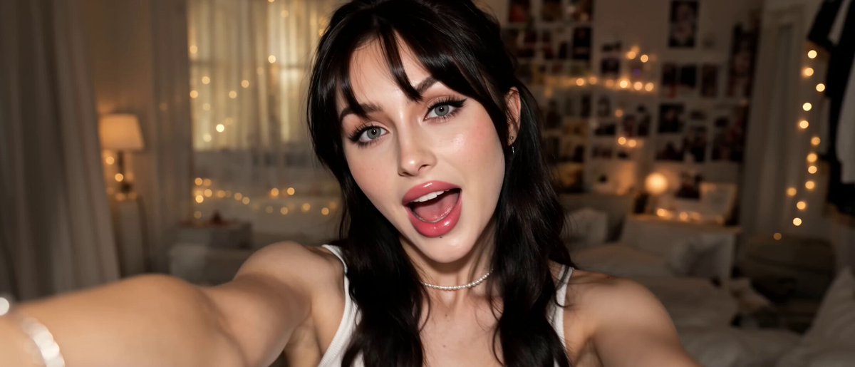
Close-ups expose everything: skin texture, eye color, hairline, and subtle shifts in facial structure. If your project has a recurring character, lock their look with a dedicated reference set and treat any shot featuring their face as a high-risk generation.
Practical rules: keep focal length fixed for close-ups across the whole project; keep lighting direction consistent; avoid mixing a fresh character reference with a new style reference in the same prompt. Change one variable at a time.
Street and documentary sequences
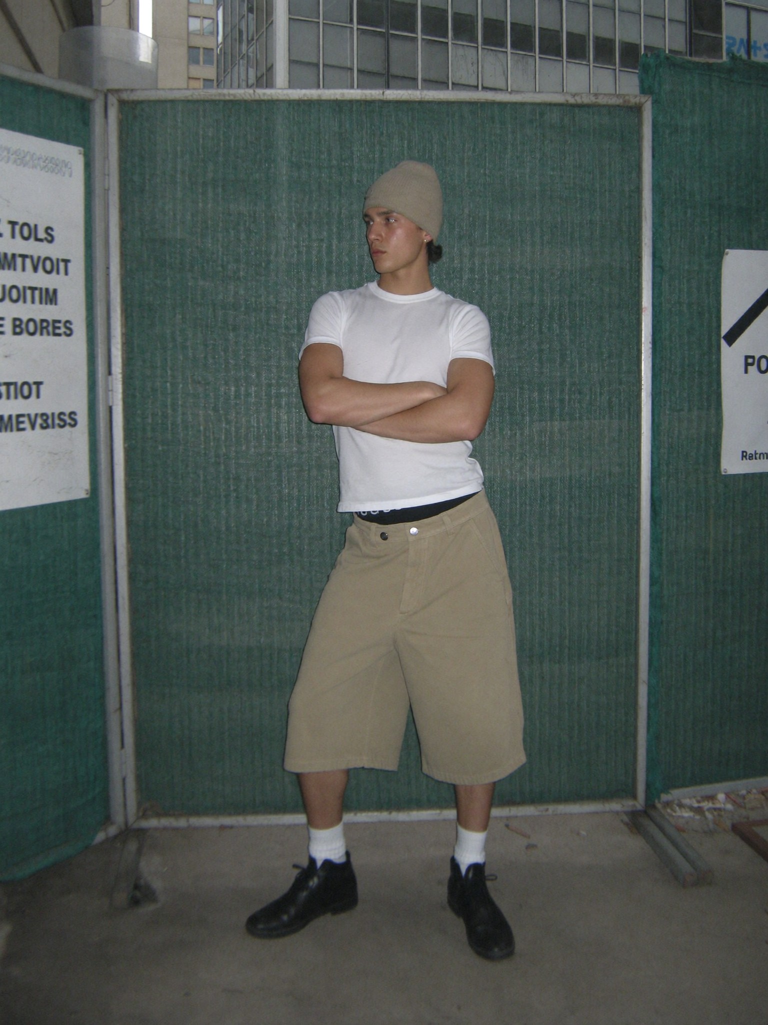
Street-style footage lives on texture, natural light, and imperfection. It is also where models love to insert unwanted polish. The fix is to specify imperfection explicitly: mild motion blur, slight underexposure in shadows, practical light sources in frame, and a handheld feel with restrained movement.
Because street sequences usually involve many short clips, drift accumulates quickly. Generate them in a single block, keep the same focal length for every clip in a sequence, and treat color as fixed unless a location genuinely changes.
Commercial product beats
Product work is the opposite problem: it demands cleanliness. Grain must be minimal, background gradients must be smooth, and reflections must behave. Consistency here is mostly about lighting discipline — one key, one fill, one rim, same positions in every shot — plus a single repeatable camera height and angle set.
If a product shot needs to rotate or showcase detail, keep the lighting rig identical and change only the camera. This mirrors how real tabletop photography works and produces a much more coherent sequence.
How to Choose the Right Model for the Shot
Modern AI video platforms offer a menu of generation models, each with a different bias: some excel at photorealism, some at stylized motion, some at precise camera control, some at long takes. Style consistency is easier when you deliberately assign models to tasks rather than using whichever one is fastest.
Use these criteria:
- Image fidelity: does the model preserve fine grain and skin texture, or smooth everything into plastic?
- Motion restraint: for photographic looks, subtle motion usually beats dramatic motion. Pick models that do not add unnecessary camera flourish.
- Reference adherence: how closely does the model follow a supplied image for palette and texture?
- Determinism: some models produce more predictable results from the same prompt, which is valuable when you need twenty similar shots.
- Duration: longer clips reduce the number of cuts and therefore the number of drift opportunities, but they also give the model more chances to wander.
A pragmatic strategy is to pick one primary model for a project and stay with it, then use a second model only for specific problem shots that the primary cannot handle. Switching models mid-sequence is one of the fastest ways to introduce visible style breaks.
Common Mistakes and How to Fix Them
Mistake: describing style with mood words only. "Moody, cinematic, dramatic" gives the model nothing measurable. Fix it by converting every adjective into a technical instruction: highlight temperature, shadow hardness, grain size, focal length.
Mistake: changing multiple variables at once. If a clip looks wrong and you rewrite the prompt, swap the reference, and change models simultaneously, you learn nothing about which change helped. Change one thing per iteration.
Mistake: grading before continuity. Heavy grading can mask color drift, but it cannot fix lens drift or grain mismatch, and it makes the underlying problem harder to see. Lock the look first, then grade.
Mistake: inconsistent aspect ratio or resolution between generations. Mixed sources produce subtle sharpness differences that read as style breaks. Standardize output settings at the start.
Mistake: no anchor frames. Without a fixed comparison standard, every clip is judged in isolation and the project slowly becomes an anthology. Keep the three anchors open in a second window while you work.
Mistake: ignoring motion as a style element. Speed of movement, amount of camera shake, and how long a shot holds before cutting all contribute to style. A perfectly graded sequence with erratic pacing still feels incoherent.
Model-Free Style: Practical Habits That Pay Off
Some habits matter regardless of which tool you use. Keep a single project folder with subfolders for anchors, references, approved clips, and rejects. Name files with scene and shot numbers so you can trace which prompt produced which output. Log the exact prompt and settings for any clip that comes out well — a good result you cannot reproduce is worth very little.
Also, preview on the target device. A look that reads beautifully on a calibrated monitor can fall apart on a phone, where grain disappears and shadow detail crushes. Export a short test and watch it where your audience will.
Finally, protect yourself from perfectionism. Photographic consistency is about plausibility, not identity. Audiences forgive small variations between shots; they notice whiplash. Aim for a sequence where no single cut pulls attention away from the story.
Pre-Export Quality Checklist
Run through this list before rendering the final file:
- Do all clips share the same grain character and level of sharpness?
- Does color temperature stay stable across cuts, except where a location genuinely changes?
- Is apparent focal length consistent within each scene?
- Does lighting direction stay motivated and stable?
- Does the recurring character read the same in every appearance?
- Are movement speed and camera behavior consistent in feel?
- Does the sequence hold up watched at normal speed with audio off?
- Does it still work on a phone screen?
FAQ
How many reference images should I use?
Three to five, each with a clear job: one for palette, one for grain and texture, one for the character, and optional ones for lens character or lighting pattern. More than that usually causes conflicts rather than clarity.
Can I fix style drift in post-production?
Partially. Color grading and grain overlays can unify tone, and sharpening or softening can narrow differences in perceived detail. Lens drift and lighting direction drift, however, are very difficult to fix convincingly. Prevent them at generation time.
Should I use the same prompt template for every shot?
Yes, with one section that changes. Keep a fixed block describing format, texture, lens, palette, and lighting, then a variable block describing the action and framing. This alone reduces drift dramatically.
How long should AI video clips be for consistent style?
Shorter clips are easier to control and easier to regenerate, but more cuts mean more chances for discontinuity. Five to eight seconds per clip is a practical middle ground for most photographic looks.
What if my project genuinely needs two different looks?
That is fine, as long as the switch is intentional and motivated — a flashback, a different time period, a different location. Define both looks in the style bible, generate each in its own block, and never interleave them casually.
Do I need a color-managed workflow?
For serious work, yes. Working in a consistent color space prevents you from chasing problems that only exist because your monitor and your export pipeline disagree.
Is consistency more important than variety?
In a single project, yes. Save the variety for lighting and composition within the established look. That is how real cinematography works, and it is the fastest route to AI video that stops looking generated.
