
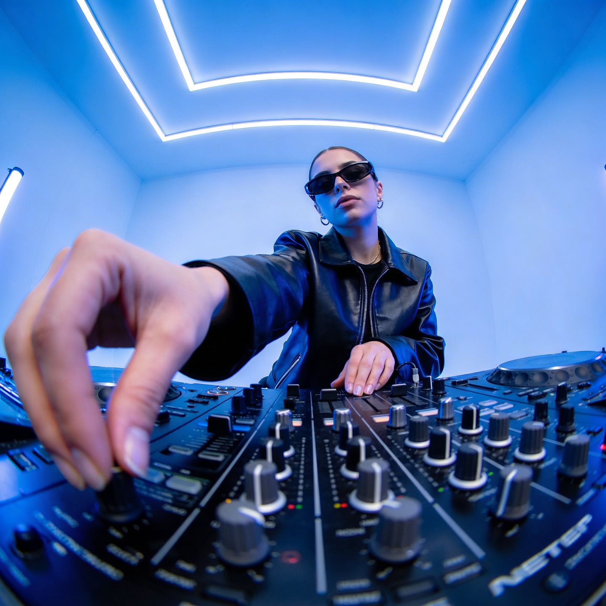

Graphic concept videos occupy a strange, lucrative middle ground between a storyboard, a mood reel, and a finished commercial. They usually run twenty to ninety seconds, and they exist to answer one question before anyone commits real production money: does this idea feel right? Generative video tools have compressed the time it takes to answer that question from weeks to an afternoon. They have also introduced a new craft problem. Almost anyone can generate one beautiful clip. Very few people can generate eight beautiful clips that look like they came from the same film.
That gap between a single impressive shot and a coherent sequence is where modern concept work actually lives. This guide walks through a practical, tool-agnostic workflow for closing it: defining the idea, locking the look, building a shot list a model can execute, generating in passes, layering motion design, cutting to sound, and running reviews without losing your mind.
What a graphic concept video actually is
A graphic concept video is not a trailer and not a finished film. It is a designed argument. It uses a handful of moving images, typography, transitions, and sound to communicate tone, pacing, and visual identity. Think of a title sequence that never ends, or a brand film compressed to its emotional essentials.
Because the goal is persuasion rather than narrative completeness, the rules are different from conventional filmmaking. You do not need coverage. You do not need a scene that plays from beginning to end. You need a sequence of moments that accumulate into a feeling. That constraint is liberating: a concept piece can be built from six shots and a type animation if those six shots land.
The practical implication is that concept work rewards planning more than shooting. Before you open a generator, you should be able to describe the piece in three sentences: what the viewer sees first, what changes in the middle, and what image you want burned into their memory at the end. If you cannot write those three sentences, no amount of prompt engineering will save the edit.
Locking visual consistency across shots
Consistency is the single hardest problem in AI-driven concept work, and the one that separates a professional-looking reel from an obvious experiment. Inconsistency shows up in three places: subjects that drift, color that shifts, and camera language that changes personality shot to shot.
Character and object persistence
If a person appears in more than one shot, they need an identity anchor. Build a character sheet with four to six reference images covering a front view, a three-quarter view, a profile, and a couple of varied lighting conditions. Then describe the character the same way in every prompt, using the same nouns in the same order. Changing "silver-haired architect in a charcoal coat" to "older woman in a dark jacket" between shots is how you get two different people.
For products and objects, the equivalent is a geometry lock: fix the shape, the material, and the accent color in text, and always seed the generation with the clearest reference frame you have. Do not rely on the model to remember an object it has never seen twice.
Palette, grade, and type locks
Choose a palette of three to five colors and write it down. Then apply it twice: once in your prompts, and once as a grade at the end of the pipeline. Prompting for a palette gets you close; a final color pass makes it exact. This is the cheapest consistency win available, and it is the one most often skipped.
Typography deserves the same treatment. Pick one display face and one text face, define the exact casing and tracking, and reuse those settings everywhere. A single consistent type system will make a scrappy concept reel look intentional even when the footage varies.
Reference frames beat adjectives
Adjectives are weak constraints. "Cinematic" means nothing to a model that has been trained on ten thousand definitions of the word. Reference frames are strong constraints. When a shot must match a previous one, feed the previous frame back in and describe only what changes. Keep a folder of approved stills and treat it as your visual bible; every new shot should be traceable to something in that folder.
Building a shot list the model can execute
Traditional shot lists describe camera position, action, and duration. AI-friendly shot lists describe those things plus the inputs, the constraints, and the acceptance criteria. A workable template for each row is: shot number, story beat, subject, action, camera move, lighting, duration, reference image, and what "good" looks like.
That last column matters more than people expect. "Good" is not a vibe; it is a checklist. For example: face is visible and matches the character sheet, product label is legible, motion blur does not obscure the logo, background contains no accidental text. When you define acceptance criteria up front, review becomes fast and objective instead of an argument about taste.
Keep the list short. Eight to fourteen shots is the sweet spot for a sixty-second concept piece. Longer lists dilute attention and multiply consistency risk. If your idea genuinely needs thirty shots, you are probably making a short film, and you should split it into two concept pieces rather than one bloated reel.
Finally, group shots by setup. Generate all the wide establishing shots together, then all the close-ups, then all the product beats. Batching similar shots keeps your prompt language stable and makes it much easier to spot which pass went wrong.
Choosing the right generation approach per shot
Not every shot deserves the same method. Concept work benefits from mixing techniques, because different shot types have different failure modes.
Text-to-video is best for atmosphere: landscapes, abstract motion, textures, transitions, and anything where the viewer will not scrutinize a specific face or product. It is fast and forgiving, and it produces the loosest, most surprising imagery.
Image-to-video is best for anything that must match. Start from a still you already approved — a keyframe, a render, a photograph, a type layout — and animate it. This is the workhorse for character shots and product shots because the composition is decided before the model touches it.
Video-to-video and reference-driven workflows are best for style transfer and for extending an existing look across new material. If you already have footage with the right mood, restyling it is often cheaper than generating from scratch.
Motion graphics and 2D compositing are best for typography, diagrams, UI moments, and anything with exact geometry. A model will never render your logo as crisply as a vector layer will, and pretending otherwise wastes hours. Use the generator for the world, and use a compositor for the brand.
The decision rule is simple: if a human will read it, measure it, or recognize it, control it manually. If it only needs to be felt, let the model improvise.
A practical end-to-end workflow
Here is a repeatable loop that works whether you are a solo creator or part of a small team.
Step one: write the beat sheet. Three to seven beats, one line each. No imagery yet.
Step two: collect the visual bible. Reference images, palette swatches, type choices, and two or three existing films or reels that define the target register.
Step three: build the shot list using the template above, with acceptance criteria filled in.
Step four: generate keyframes first. Still images are cheap to iterate and easy to judge. Approve the look at the still stage before you spend time on motion.
Step five: animate in passes. One pass per shot group. Save every version with a naming convention that includes the shot number and pass, because you will want to go back.
Step six: assemble a rough cut with temp music. Do this before polishing anything. Rhythm problems are invisible until you cut to sound.
Step seven: replace weak shots. In a fourteen-shot reel, you will usually replace three to five. Budget time for it; it is normal, not a failure.
Step eight: finish. Grade, add type and overlays, mix audio, export a master plus a couple of aspect ratio variants.
The discipline that makes this loop fast is refusing to move forward on unapproved stills. Fixing a face in a still takes minutes. Fixing the same face in a finished animated shot takes an hour.
Motion design, typography, and overlays
Graphic concept videos lean on design elements, and those elements should be built in a compositor, not requested from a generator. Treat generated footage as a background plate and design on top of it.
Start with the type hierarchy. One line of display text, one supporting line, everything else subordinate. Animate with restraint: a single clean reveal, a mask wipe, or a slow scale reads as confident. Five simultaneous animations read as student work.
Overlays do heavy lifting for cohesion. A consistent grain plate, a subtle vignette, a scanline texture, or a colored gradient wash applied across every shot will unify footage that came from different prompts. This is the trick that makes a mixed-source reel look deliberate.
Transitions deserve their own thinking. Match cuts on shape or motion feel intentional; a hard cut on a similar composition feels like a film; a stock zoom transition feels like a template. Prefer fewer transitions and let a strong cut do the work.
Finally, reserve one shot for pure graphic abstraction — animated type, a moving diagram, a data visual — so the reel has a visual rest between heavier imagery. Concept pieces rarely fail because they lack spectacle; they fail because they never pause.
Sound, pacing, and the edit
Sound is not the polish step. It is a structural tool, and it should arrive early in the rough cut.
Choose music that has a clear structural change — a drop, a break, a shift in instrumentation — and build your shot list around that change. If the piece is sixty seconds, place your strongest image at the musical peak, not at the end. Endings work better as resolutions than as climaxes.
Cut on motion rather than on dialogue beats or lyric lines, unless the lyrics are doing intentional work. When a camera move or a subject's gesture completes, that is your edit point. Cutting slightly before the move finishes creates forward momentum; cutting exactly on the finish feels mechanical.
Sound design fills the gaps that the image cannot. Whooshes, low rumbles, paper textures, mechanical clicks, and room tone all help the audience accept generated imagery. The eye forgives a lot when the ear is convinced. Add at least one diegetic sound per shot in the first half of the reel, then thin the density toward the end so the closing image can breathe.
Keep a temp mix at a consistent loudness as you work, and check the piece on a phone speaker early. Concept videos are usually watched on phones, muted, in a hurry. If it does not read without sound, the design is not finished.
Review, versioning, and delivery
Review cycles kill more concept projects than technology does. Structure them before they start.
Set two review gates. Gate one is the keyframe board: stills only, no motion. Gate two is the rough cut with temp sound. Between gates, no one comments. This sounds rigid and it is exactly why it works — it prevents the classic spiral where every new note triggers a new generation pass.
Version everything with a naming convention that encodes shot, pass, and date. Keep an approved folder that only contains shots that survived review. When someone says "the earlier version was better," you want to be able to find it in ten seconds.
Deliver in the formats the work will actually be seen in: a horizontal master for presentations, a vertical crop for social, and a square or short version for internal sharing. Vertical crops are not simple crops — re-frame type and key subjects for the narrow aspect ratio rather than letting the composition fall apart.
Export captions or a subtitle file even if the piece has little dialogue, because presentation decks are often shared without sound. Label the master clearly with the version and the approval date so nobody shows an outdated cut in a meeting.
Mistakes that quietly ruin concept reels
Most weak concept videos fail for mundane reasons rather than creative ones. Watch for these.
Generating before writing. If you cannot summarize the piece in three sentences, your outputs will wander.
Changing prompt vocabulary between shots. Synonyms are the enemy of consistency. Write your prompt language once and reuse it verbatim.
Asking the model for typography. It will approximate letterforms and produce something almost legible, which is worse than illegible. Composite real type.
Overloading every shot. Three ideas per shot means zero ideas remembered. One focal point per shot, always.
Ignoring aspect ratios until delivery. Re-framing at the end forces re-generation, which costs far more than planning for both formats at the start.
Treating the first output as the final one. The professional move is to generate more options than you need and cut the weakest twenty percent without sentiment.
Skipping the grade. An ungraded mix of generated shots looks like a folder of tests. A thirty-minute color pass makes it look like a film.
FAQ
How long should a graphic concept video be?
Forty-five to ninety seconds is the reliable range for a pitch or brand concept. Under thirty seconds rarely communicates enough; over two minutes demands narrative payoff that concept work is not designed to deliver.
Do I need a shot list if I am generating everything?
Yes, and more urgently than in live action. Without a shot list, every generation becomes its own creative decision, and the resulting reel has no through-line.
How do I keep a character consistent across shots?
Use a reference sheet with multiple angles, repeat identical descriptive phrasing in every prompt, start each shot from an approved still rather than from text alone, and finish with a single grade that unifies skin tones and contrast.
Should I generate at the final aspect ratio?
Generate at the widest framing you will need, then compose the narrower crops from approved stills. Generating separately for each format doubles the consistency risk.
What is the most common reason a concept reel feels amateur?
Inconsistent color and inconsistent type. Art direction, not model choice, is what makes a sequence feel like one piece of work.
How many shots should I generate per final shot?
Plan on three to five candidates for each shot that must land, and fewer for transitional or abstract shots. Budget accordingly so you are not forced to accept a weak take.
Can I use generated footage in a client deliverable?
Usually yes, but verify the licensing terms of the specific tools you use and keep records of your inputs. Many teams also keep a hybrid approach — generated backgrounds with photographed or designed foreground elements — for maximum control.
What is the fastest way to improve at this?
Finish small pieces and show them to people who will give blunt feedback. Ten finished twenty-second reels will teach you more about consistency and pacing than any amount of prompt experimentation in isolation.
Concept work rewards the same things it always did: a clear idea, a disciplined look, and a strong edit. Generative tools simply moved the bottleneck from production capacity to art direction. Teams that treat consistency, shot planning, and sound as first-class craft will produce work that looks intentional — and intentional is the only thing an audience actually responds to.
