
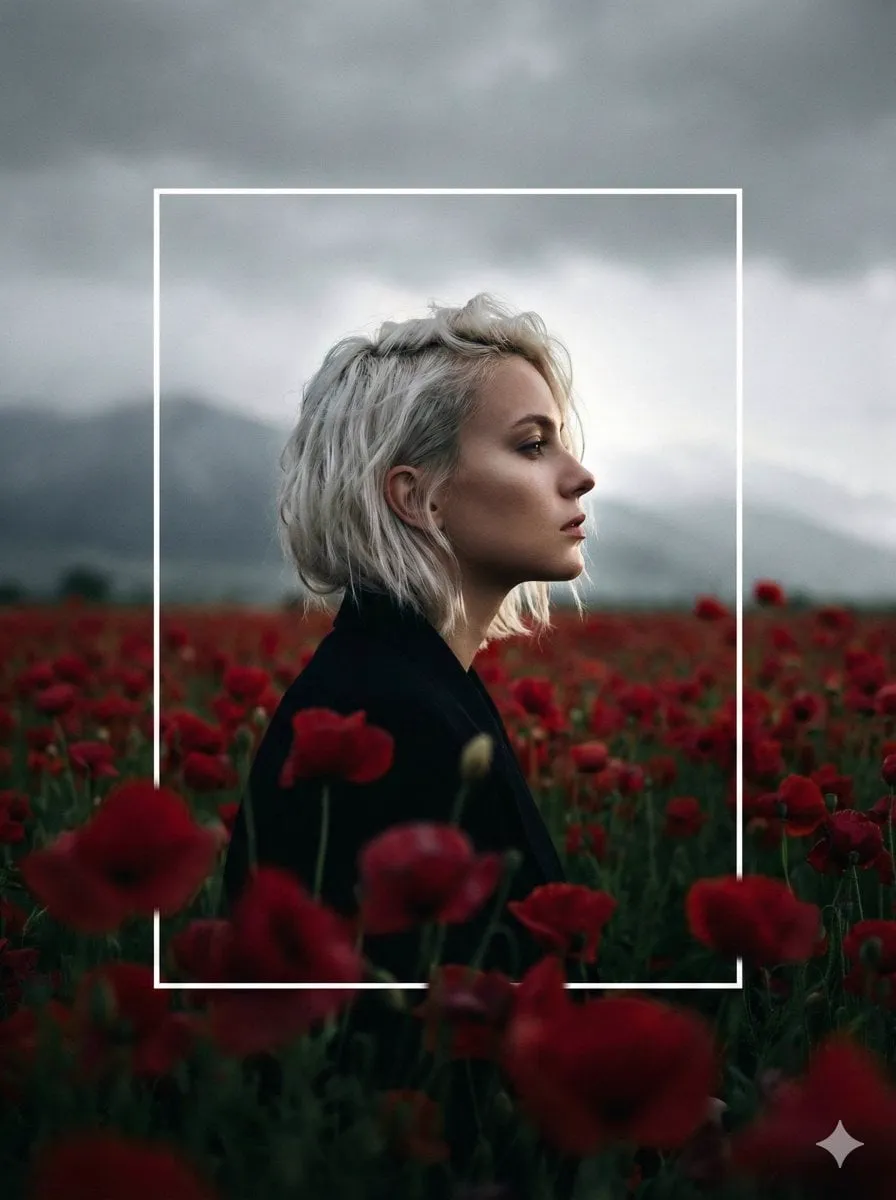
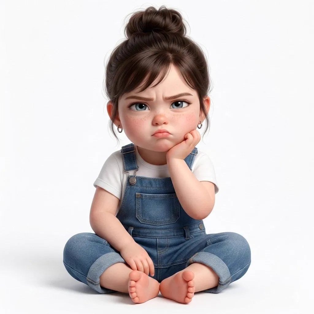
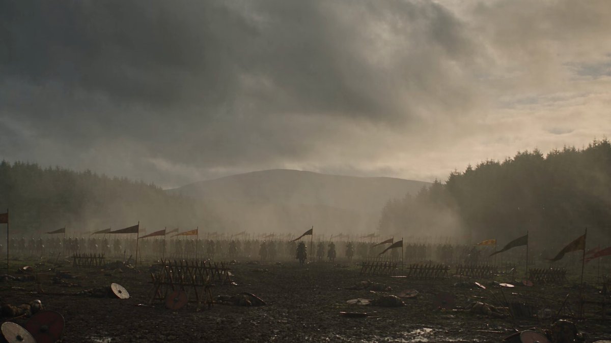
Every generative video tool sells the same promise: type a sentence, receive cinema. The reality is messier and far more interesting. What actually separates a forgettable clip from a shot that holds up on a big screen is not the model you picked, but how precisely you described a visual world and how stubbornly you defended that description across every shot that followed.
Style has become the central craft problem in AI video. A model can render a face, a street, a spaceship, a sunflower field. What it cannot do on its own is decide whether that sunflower field should feel like a Monet canvas dissolving into light or a hyper-real documentary frame with visible pollen. That decision belongs to you, and it has to survive translation into text, parameters, reference images, and finally edit decisions.
This guide is a working manual for that translation. It maps the major visual families available to AI filmmakers, explains the vocabulary that actually moves a model, and lays out a repeatable process for holding one look steady across an entire sequence. It assumes you want to direct rather than just generate.
Why visual style is now a directing decision, not a post-production one
In traditional production, a look was assembled in layers: production design chose the palette, the cinematographer chose the lens and lighting, the colorist unified everything in post. Each layer cost money and time, and changes late in the process were expensive. AI video inverts that economy. The look is decided up front, in text, and then re-decided on every single shot unless you build systems to prevent drift.
That inversion has two consequences worth internalizing.
First, the bottleneck moves from access to articulation. Almost anyone can produce a technically clean clip now. Far fewer creators can describe why a reference feels the way it does and then reproduce that feeling on demand. The skill is observation, not button-pushing.
Second, consistency becomes the real currency. Audiences forgive an imperfect frame. They do not forgive a sequence where the palette shifts, the lens character changes, and the character's face subtly becomes someone else between cuts. Half of this article is therefore about style, and half is about the plumbing that keeps style from leaking.
The style map: what each visual family actually asks of you
Different aesthetics fail in different ways. Knowing the failure mode of a style tells you what to specify and what to check.
Impressionism and Post-Impressionism
The impressionist look is not a filter. It is a set of decisions about light and edge. Soft, broken color, visible brushwork, edges that dissolve rather than cut, shadows that carry blue and violet instead of black. When you prompt for this, describe the light first: hazy morning sun through leaves, dappled, warm highlights with cool shadow. Then describe surface: visible short brushstrokes, canvas texture, pigment separation.
The common failure is over-smoothing. Models default toward clean, glossy rendering, which kills the hand-made quality. Counter it with explicit texture language and by keeping subjects relatively simple. A crowd of twenty people in an impressionist style usually becomes mush, because the style lives in suggestion, and suggestion needs room.
Expressionism and Surrealism
Expressionism asks for distortion with intent: warped perspective, high-contrast emotional color, shadows that stretch at impossible angles. Surrealism asks for internal logic that is coherent but wrong. Both benefit from naming the emotion rather than the technique. "Dread carried in the architecture" steers a model better than "expressionist" alone, because it tells the model what the distortion is for.
The failure mode here is randomness. Models will happily produce nonsense that reads as a mistake rather than a choice. Anchor the surreal element at exactly one point in the frame and keep the rest of the composition disciplined. One impossible door in an ordinary corridor is unsettling. Six impossible doors is noise.
Pop art, graphic and minimalist styles
Flat color, hard edges, bold silhouettes, halftone dots, high-key contrast. This family is the most forgiving for AI video because it hides detail errors — the model's weakness in rendering tiny texture is masked by design. It is also the best choice for text overlays, branding, and social formats where legibility at small sizes matters.
The tradeoff is motion. Flat graphic styles reveal repetition fast, so keep camera movement simple and deliberate: a slow push, a lateral slide, a snap cut. Elaborate parallax in a two-tone palette looks like a rendering glitch rather than a style.
Cyberpunk and neo-noir
This is the most requested and the most frequently botched family. The popular shorthand — neon, rain, city — produces generic results. What actually creates the feeling is contrast management: pools of saturated color inside large areas of near-black, wet surfaces acting as mirrors, practical light sources visible in frame, atmosphere (fog, steam, rain) to give the light something to hang on.
Specify sources explicitly: signage bouncing off a puddle, a single sodium lamp behind a figure, headlights smeared across a windshield. Neo-noir adds restraint — deeper shadows, cooler overall palette, minimal saturated accents, faces half-lost to darkness. The difference between cyberpunk and neo-noir is mostly how much color you allow.
The failure mode is neon soup, where every surface glows and nothing reads. Fix it by reducing light sources and increasing black.
Space opera, fantasy and retro-futurism
Large-scale science fiction asks for two contradictory things: believable scale and visible detail. A shot of a station the size of a city needs small human elements to establish scale — a docking bay with a shuttle, a window with a silhouette. Then it needs texture on the surface to keep it from looking like a smooth toy.
Steampunk and dieselpunk lean even harder on material realism. Brass, rivets, oil residue, canvas, soot, worn leather. The genre lives or dies on whether those materials read as physical. Name them directly. Also name the era of engineering: late Victorian steam, mid-century diesel, analog vacuum-tube. Vague "steampunk" prompts produce the same clichéd clockwork gears every time.
Prompt architecture: how to describe a look precisely
Most weak prompts are weak because they mix layers. A model receiving a sentence that describes subject, mood, camera, and color at once will average them. Build in layers instead.
The five-layer prompt
Use a consistent order every time:
- Subject and action — who or what, doing exactly what, at what moment.
- Style and medium — oil on canvas, 35mm film, cel-shaded animation, matte painting, hand-drawn ink.
- Camera and lens — wide, telephoto compression, macro, low angle, handheld, locked-off tripod, focal length equivalent.
- Light — source, direction, quality, color temperature, and where it falls.
- Texture and imperfection — grain, dust, halation, canvas weave, sensor noise, lens breathing.
Layer five is the one most creators skip, and it is the layer that makes generated footage feel photographed rather than computed.
Reference images as style anchors
A reference image communicates palette, contrast curve, and surface quality faster than any paragraph. Use them for style only, never for content — if your reference is a painting of a harbor, you want its light and color, not its boats. When combining references, separate their jobs explicitly: one image for palette, one for lighting behavior, one for lens character. Blending three images that all try to define everything produces a muddy average.
What belongs in negative prompts
Negative prompts are your style insurance. Instead of rejecting concepts, use them to reject rendering artifacts that break a look: plastic skin, over-sharpened edges, HDR glow, watermark text, duplicated limbs, warped hands, flat lighting, floating objects. For painterly styles, explicitly reject "photorealistic" and "CGI render." For photoreal styles, reject "illustration" and "painterly." Mutual exclusion keeps the model from splitting the difference.
Choosing a model: criteria instead of hype
Model comparison charts age badly. Criteria do not. Evaluate any video engine against these five questions, and re-evaluate whenever you change style family.
Stylistic range. Some engines are tuned toward cinematic photorealism and quietly fight painterly prompts by adding detail. Others excel at illustration and struggle with skin. Test your specific style, not the tool's demo reel.
Motion coherence. Watch how fabric, hair, and water behave. These reveal whether the model understands physics or merely interpolates pixels.
Shot length and control. Determine the practical clip length before artifacts appear, and whether you can control camera motion separately from subject motion.
Reference fidelity. If character consistency matters, test how faithfully the tool holds a face, a costume, and a color palette across separate generations.
Iteration speed. Fast, cheap iterations beat slow, perfect ones at this stage of the craft. You will generate far more than you keep.
Run the same three test shots through every candidate: a moving human face, a complex environment push-in, and a fast action beat. That trio exposes most weaknesses quickly.
Consistency across shots: the hardest problem in the room
A single beautiful clip is a demo. A consistent sequence is a film. Three mechanisms keep a sequence coherent.
Write a style bible before you generate anything
Keep it under one page and make it operational rather than poetic. List the exact palette with values, the lens character, the grain level, the lighting rule (for example: always one key source, motivated, from frame left), the camera height rule, and the three phrasings you will reuse in every prompt. Copy-paste beats improvisation.
Freeze parameters and seeds where possible
When a tool exposes seeds, aspect ratio, motion strength, or guidance scales, treat them as part of the look. Change one variable at a time when troubleshooting. If a shot drifts, you want to know whether the prompt, the seed, or the reference caused it.
Blend references for characters
For recurring characters, generate a small set of canonical views — front, three-quarter, profile — and feed two or three of them into every subsequent shot as references. Describe costume and hair in identical words every time, in the same position in the prompt. Small wording changes quietly change faces.
Motion, frame rate and the feel of the style
Style is not only visual. It is temporal. A painterly look usually reads better with slow, fluid motion and a softer cadence, because fast cuts expose the absence of fine detail. Graphic and anime-influenced aesthetics tolerate — and often need — punchy, snappy timing, with short holds and abrupt transitions.
If your tool allows frame rate control, treat it as a style parameter. Lower frame rates create a deliberate, hand-made stutter that suits retro and stylized work. Higher rates suit realism and action. If you cannot control it in generation, control it in the edit: retiming, frame blending, and duplicate-frame holds all shift the perceived aesthetic more than most color grades do.
Match motion to genre expectations as well. Space opera wants slow reveals and long lenses. Cyberpunk chase sequences want handheld energy and quick reframing. Documentary-flavored realism wants almost no camera movement at all, letting the subject move instead.
A practical workflow, start to finish
Step 1 — Collect and deconstruct. Gather five to ten references for the project. For each, write one line describing light, one line describing palette, one line describing texture. You now have vocabulary.
Step 2 — Write the style bible. Reduce those notes into a one-page ruleset with reusable phrases and fixed parameters.
Step 3 — Storyboard on paper or in a simple grid. One frame per shot, with the camera note. This costs minutes and saves hours.
Step 4 — Generate style tests. Three shots, low resolution, no narrative pressure. Confirm the look is achievable before committing.
Step 5 — Lock the look with a hero frame. Generate the most important shot of the film first. This becomes the visual reference for everything else.
Step 6 — Batch shots by style similarity. Generate all day-exterior shots together, then all night-interior shots, so you can spot drift in one place rather than in the final edit.
Step 7 — Assemble a rough cut before polishing. Sequence coherence problems are easier to see than to describe, and you will only find them in motion.
Step 8 — Fix at the source. If a shot breaks the look, regenerate it rather than grading it into place. Color correction cannot restore missing brushwork or recovered contrast.
Step 9 — Finish globally. Add grain, halation, subtle vignette, and a unified grade across the whole sequence so individual differences smooth out.
Common mistakes and cheap fixes
Style drift between shots. Usually caused by rewriting prompts instead of reusing them. Fix by pasting your style block verbatim and only changing the action line.
Over-specification. Long prompts with fifteen style adjectives produce averaged mush. Cut to the three elements that define the look.
Fighting the model. If an engine renders everything photoreal, do not demand a watercolor aesthetic from it. Either accept its grain of realism or switch tools for that sequence.
Neon overload. Reduce light sources. Increase shadow area. Say "one practical light" out loud in the prompt.
Character drift. More reference images, fewer descriptive adjectives, identical costume wording every time.
Motion sickness. If the camera moves in a stylized shot, keep the subject relatively still — and vice versa.
Ignoring sound design. Stylized visuals need matching audio. Painterly sequences with aggressive percussion feel wrong; sparse ambience and long reverb do more for a soft look than any grade.
Quality control checklist before final render
Run this list on every sequence, in this order: palette consistency against the style bible; lighting direction consistency between adjacent shots; character identity across cuts; grain and texture uniformity; motion cadence; aspect ratio and safe areas; absence of artifacts in hands, eyes, and text; audio-visual rhythm; and finally, a full watch-through at small size, where stylistic breaks become obvious.
A useful trick is the squint test. Shrink the timeline to thumbnail size and look at the frames as a strip. If the strip reads as one film, the look is locked. If one thumbnail jumps out, that is your problem shot.
FAQ
Can one project mix styles deliberately? Yes, but treat the transition as a designed moment — a hard cut, a match on shape, a change in aspect ratio — so the audience reads it as intent rather than inconsistency.
Do I need separate tools for painterly and photoreal work? Often, yes. Different engines have different tuning biases, and forcing one to do everything costs more time than switching.
How many references per shot is too many? Three distinct references with clearly separated jobs is a practical ceiling for most workflows. Beyond that, the model averages and detail collapses.
How do I keep faces stable across many shots? Build a canonical reference set, reuse identical wording, and regenerate the whole set from the same style anchor rather than patching single shots.
Is it worth learning art history for this? Genuinely, yes. You do not need scholarship, but knowing what impressionism and expressionism actually changed gives you a vocabulary that models respond to and audiences feel.
What is the fastest way to improve? Recreate one reference image as a ten-second sequence, then compare frame by frame. The gap between your output and the reference is a precise list of what to learn next.
Stylistic range is the most exciting and most underestimated capability in AI video. It is not a menu of filters. It is a directorial language, and like any language it rewards precision, repetition, and a clear idea of what you are trying to say.
