
Why Your Thumbnail Decides Whether the Video Gets Watched
On YouTube, the thumbnail is not decoration — it is the first sentence of your video. It works alongside the title to answer one question in under a second: is this worth the next eight minutes of my life? If the answer is unclear, the viewer scrolls, and everything you invested in scripting, filming, and editing never gets a chance to matter.
This creates an unusual design problem. You are not designing for a full-screen image viewed calmly in a browser. You are designing for a small rectangle, usually seen on a phone, competing with a dozen other rectangles that all use similar colors, faces, arrows, and shocked expressions. Attention is the scarce resource, and the thumbnail's only job is to earn a fraction of it.
Three constraints shape every successful thumbnail: clarity at a glance, emotional pull, and honesty about the content. Clarity means one focal point, strong contrast, and a short text overlay — or none at all. Emotional pull means a face, an unexpected object, or a visual contradiction that creates curiosity. Honesty means the image actually represents the video; a mismatch may win one click but loses the viewer and signals to the platform that people leave early.
AI is useful here not because it replaces judgment, but because it collapses the distance between having an idea and seeing it rendered. Instead of sketching, sourcing stock photos, cutting out subjects, and rebuilding a layout for every upload, you can generate options in minutes and spend your time on the decisions that actually move click-through rate.
What AI Actually Changes in Thumbnail Design
AI does not design thumbnails for you. It accelerates three specific stages, and it is worth understanding which is which so you do not expect the wrong tool to do the wrong job.
Ideation and exploration
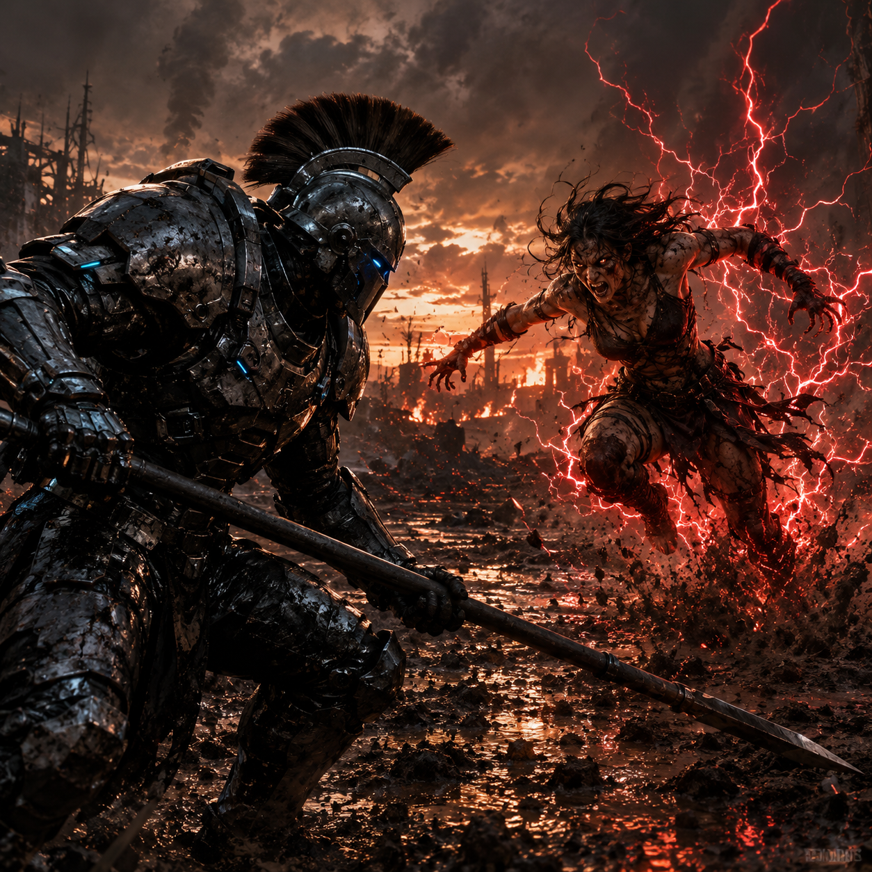
The first stage is divergence: producing many rough directions fast. A text-to-image model can render ten different compositions of the same concept — a person holding a strange object, a split-screen before-and-after, an extreme close-up with a surprised expression — in less time than it takes to open a design file. You are not looking for a finished thumbnail. You are looking for a composition that makes you think, "that could work."
Generation and variation
The second stage is iteration on a promising direction. Once a composition works, you want controlled variation: same subject, different angle; same angle, different background; same scene, warmer light; same image, space reserved on the right for text. Parameters like aspect ratio, seed, and style strength let you explore that space systematically instead of starting over each time.
Cleanup, cutouts, and compositing
The third stage is the one AI handles most reliably and where most creators waste the most time manually: isolating a subject from its background, expanding a background to fill a wider frame, removing a stray object, and upscaling a small asset so it survives a 1280×720 export. These are mechanical tasks. Automating them frees hours per month.
What AI still does badly is judgment. It cannot tell you whether your thumbnail will read at 168 pixels wide, whether your text is legible against a busy background, or whether your concept is honest. Those remain your responsibility.
A Repeatable Thumbnail Workflow From Idea to Export
Ad-hoc thumbnails produce inconsistent results. A short, repeatable pipeline produces better work in less time and makes it easier to train a collaborator or a virtual assistant on the process.
1. Lock the concept before opening any tool. Write one sentence: what is the single most interesting thing in this video? If you cannot answer in a sentence, the thumbnail problem is actually a content problem.
2. Choose the emotional register. Decide whether the thumbnail should read as surprising, useful, tense, funny, or beautiful. One register per thumbnail. Mixing two usually produces mush.
3. Generate 8–15 rough options. Use short prompts, broad styles, and a consistent aspect ratio of 16:9. Do not obsess over quality yet; you are hunting for compositions, not finished art.
4. Shortlist two or three. Judge them at thumbnail size, not full size. Squint at them. If the focal point is not obvious when the image is small, discard it.
5. Rebuild the winner cleanly. Recreate the chosen composition at high resolution with the subject on a separate layer, the background on another, and empty space reserved for text.
6. Add typography last. Three to five words maximum, high contrast, heavy weight, positioned where the composition already leads the eye.
7. Export and pressure-test. Save at 1280×720, then view it on an actual phone at feed size. Check it against a light and a dark interface theme.
8. Publish, then measure. Track click-through rate over the first 48 hours and compare it to your channel baseline, not to an absolute number.
The whole loop takes 30–60 minutes once you are practiced. The most common failure is skipping step one and jumping straight into generation, which produces attractive images with no point of view.
Writing Prompts That Produce Usable Thumbnail Frames
Prompting for thumbnails differs from prompting for illustration. You want images that are readable when tiny, which means simple scenes and strong silhouettes — the opposite of intricate, detailed artwork.
A workable prompt structure has five parts:
- Subject: who or what is in frame, described in concrete nouns. "A woman in her thirties holding a cracked ceramic mug" beats "a person with a cup."
- Expression or action: the emotional hook. "Eyes wide, mouth slightly open, leaning toward camera."
- Framing: shot type and crop. "Medium close-up, subject on the left third, empty space on the right."
- Lighting and palette: two or three colors maximum. "Warm key light, deep teal background, high contrast between subject and backdrop."
- Style and finish: "clean photographic look, shallow depth of field, no text, no watermark." Note whether you want photographic realism, stylized 3D, or flat graphic illustration, because consistency across your channel matters more than any single style being objectively better.
Two practical tips. First, negative prompts matter: exclude text, logos, extra limbs, and cluttered details, since AI loves to add them. Second, keep a personal prompt library. When a prompt yields a composition that performs well, save it with the thumbnail. Over a few months you build a house style that viewers start to recognize in the feed, which is one of the few durable advantages in a crowded niche.
Typography and Text Overlays That Read at 168 Pixels Wide
Text is where most AI-assisted thumbnails fall apart. Generated images rarely include clean typography, and the text that does appear is usually nonsense. The reliable approach is to generate a clean image with deliberate empty space and add the text yourself in a design tool.
Rules that hold up in practice:
- Three to five words. Long phrases become unreadable specks. If the idea needs a sentence, the thumbnail is doing too much.
- Two font weights maximum. One heavy display face for the hook phrase, optionally one lighter face for a small supporting word.
- Contrast over decoration. White text with a soft dark shadow, or black text with a light stroke, beats gradients and drop shadows that muddy at small sizes.
- Size for the phone. If the text is not comfortably legible at 20% zoom, it is too small.
- Avoid the bottom-right corner. The duration stamp sits there and will cover your work.
- Do not repeat the title. The thumbnail and title should complement each other, not say the same thing twice. The title can carry specifics; the thumbnail carries the emotional hook.
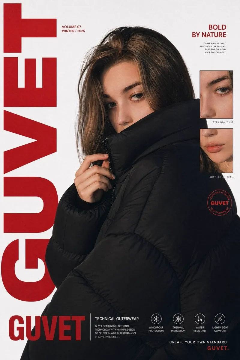
One useful trick: build three text variants for the same image — no text, a two-word hook, and a four-word hook — and test them. Text does not automatically improve performance. On some channels and topics, a clean, well-composed image with no text outperforms a busy overlay, particularly for lifestyle, ASMR, and aesthetic content where mood is the selling point.
Backgrounds, Cutouts, and Compositing Cleanly
Good compositing is invisible. The viewer should never notice that the subject was cut from one image and placed on another. Three details decide whether a composite looks professional or amateurish.
Edge quality. Hair, fur, and translucent objects are where cutouts fail. Zoom to 200% and inspect the edges after any automatic removal. A one-pixel halo of the old background is the single most common giveaway. Fix it with a quick manual refine on the layer mask rather than a full redo.
Light direction. If the subject is lit from the left, the background must be lit from the left too. Mismatched lighting is what makes composites feel wrong even when a viewer cannot articulate why. When you generate a background, describe the lighting in the prompt in the same terms you used for the subject.
Grounding. Subjects floating in space look pasted. Add a subtle contact shadow beneath the subject, or place them against a surface. Even a soft, low-opacity shadow creates the impression that the subject occupies real space.
Backgrounds also need to be quieter than subjects. Apply a slight blur, a gentle vignette, or a color overlay to push the background back visually. The subject should always win the contrast battle.
Composition and Psychology: Designing for the Click
Thumbnail design is applied psychology more than it is graphic design. A handful of principles account for most of the difference between a thumbnail that works and one that does not.
One focal point. The eye should land somewhere immediately. Two competing subjects halve the impact of both. If you have two ideas, make two thumbnails.
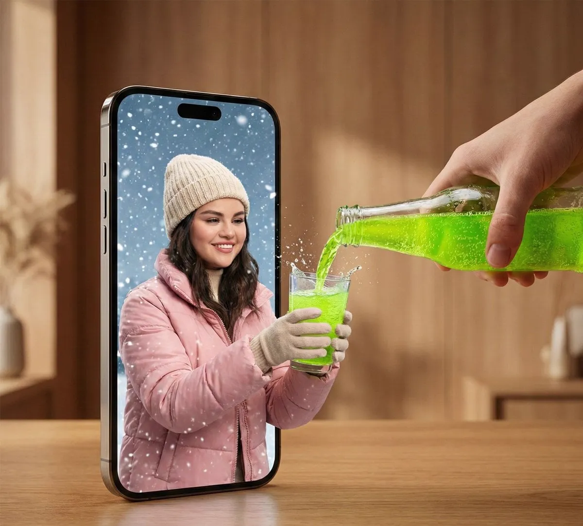
Faces work, but only expressive ones. Neutral faces are wallpaper. An expression that is clearly surprised, delighted, worried, or amused gives the viewer something to react to. Faces also do not need to be large: a small face in a strange context can be more compelling than a full-frame portrait.
Curiosity gaps beat explanations. Show the consequence or the strange moment, not the setup. A thumbnail that fully explains the video removes the reason to click. Reveal part of the story and let the title deliver the rest.
Color contrast creates separation. In a feed dominated by mid-tone images, a thumbnail with a genuinely dark background and a bright subject (or the reverse) separates itself. Avoid the low-contrast, pastel palette that vanishes against a bright interface.
Recognizable objects anchor abstract topics. For finance, hold a physical object. For tech, show the device or the result on screen. For software tutorials, showing a real interface beats an abstract shape, as long as it is legible.
Leave breathing room. Elements pressed against the edges feel cramped and get cropped by interface overlays. A little negative space around the subject increases perceived quality, and this is exactly the space you can reserve for text later.
Testing Thumbnails and Reading the Results
Guessing is expensive. Fortunately, YouTube gives you a structured way to test, and the discipline of testing teaches you more about your audience than any design advice.
Use the built-in thumbnail test feature when it is available to you. Upload two or three variants, let the platform distribute impressions evenly for a short window, and read the resulting click-through rate comparison. Keep the winner. Some channels do not have access to the native tool, in which case you can approximate it manually: swap the thumbnail after 24–48 hours on a video that has already found its audience, then compare the CTR in your analytics.
A few measurement cautions. Compare a thumbnail against your own channel baseline, not against a famous channel's numbers — CTR varies wildly by niche, subscriber mix, and traffic source. Look at the first 48 hours separately from the long tail, since browse and suggested traffic behave differently. And never judge a thumbnail on a video whose topic was never going to perform; a strong thumbnail cannot rescue a video nobody wants.
Keep a simple log: thumbnail image, title, publish date, and 48-hour CTR. After twenty entries, patterns emerge that no general article can give you — for example, that your audience responds to warm color palettes, or that text overlays consistently underperform on your channel.
Common Mistakes That Quietly Suppress CTR
These problems rarely announce themselves. They just produce average numbers that never improve.
- Reusing the same template with only the text changed. It reads as low effort and eventually becomes invisible in the feed.
- Too many elements. Logos, arrows, emoji, borders, and three text blocks. Every addition dilutes the focal point.
- Unreadable text. Thin fonts, low contrast, or long phrases. Test at phone size before publishing.
- Style drift. If every thumbnail looks like it came from a different channel, you never build recognition.
- Clickbait mismatches. A promise the video does not keep produces high impressions, low watch time, and long-term damage.
- Ignoring the title pairing. A thumbnail and title that repeat each other waste half of your available real estate.
- Skipping the mobile check. A thumbnail that looks great on a 27-inch monitor can be unreadable on a phone.
- Never testing. Without variants, you have no idea whether your instincts are good.
FAQ
Do I need design experience to make thumbnails with AI?
No, but you need taste and iteration. AI removes the technical barrier of executing a composition, not the judgment of choosing one. Expect your first twenty thumbnails to be noticeably weaker than your hundredth.
How many thumbnails should I make before choosing one?
Eight to fifteen rough concepts is a healthy range. Fewer than five usually means you have not explored enough directions; more than twenty is usually diminishing returns for a single video.
Should I put text on my thumbnails?
Test it. Text helps for tutorials, listicles, and comparison content, where a specific promise drives clicks. It often hurts for mood-driven, cinematic, or personal vlog content. Two to five words is the practical limit.
Can AI generate the entire thumbnail in one step?
Not reliably at publishable quality. Generation handles imagery well, but typography, spacing, and the final layout almost always need a human pass in a design tool. Treat AI as the image department, not the art director.
What resolution should I export at?
1280×720 pixels, 16:9 ratio, under the platform's file size limit. Export at higher resolution for reuse in other contexts, but always verify the downscaled version.
How often should I change a thumbnail after publishing?
Give a video 48 hours before judging, since early impressions come from your most engaged subscribers. If CTR stays well below your baseline after a week, a swap is reasonable. Avoid changing it repeatedly, because each change resets what you can learn.
Can AI help if I film myself on camera?
Yes, and this is one of its best uses. Generate backgrounds, add context elements, clean up distracting objects in the frame, and create a consistent color grade across thumbnails. Keep your real face as the focal point — audiences trust recognizable hosts, and consistency compounds.
