
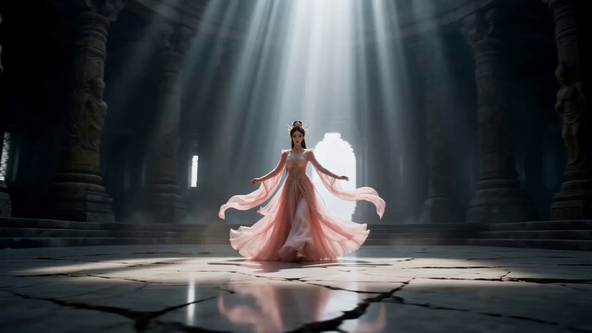
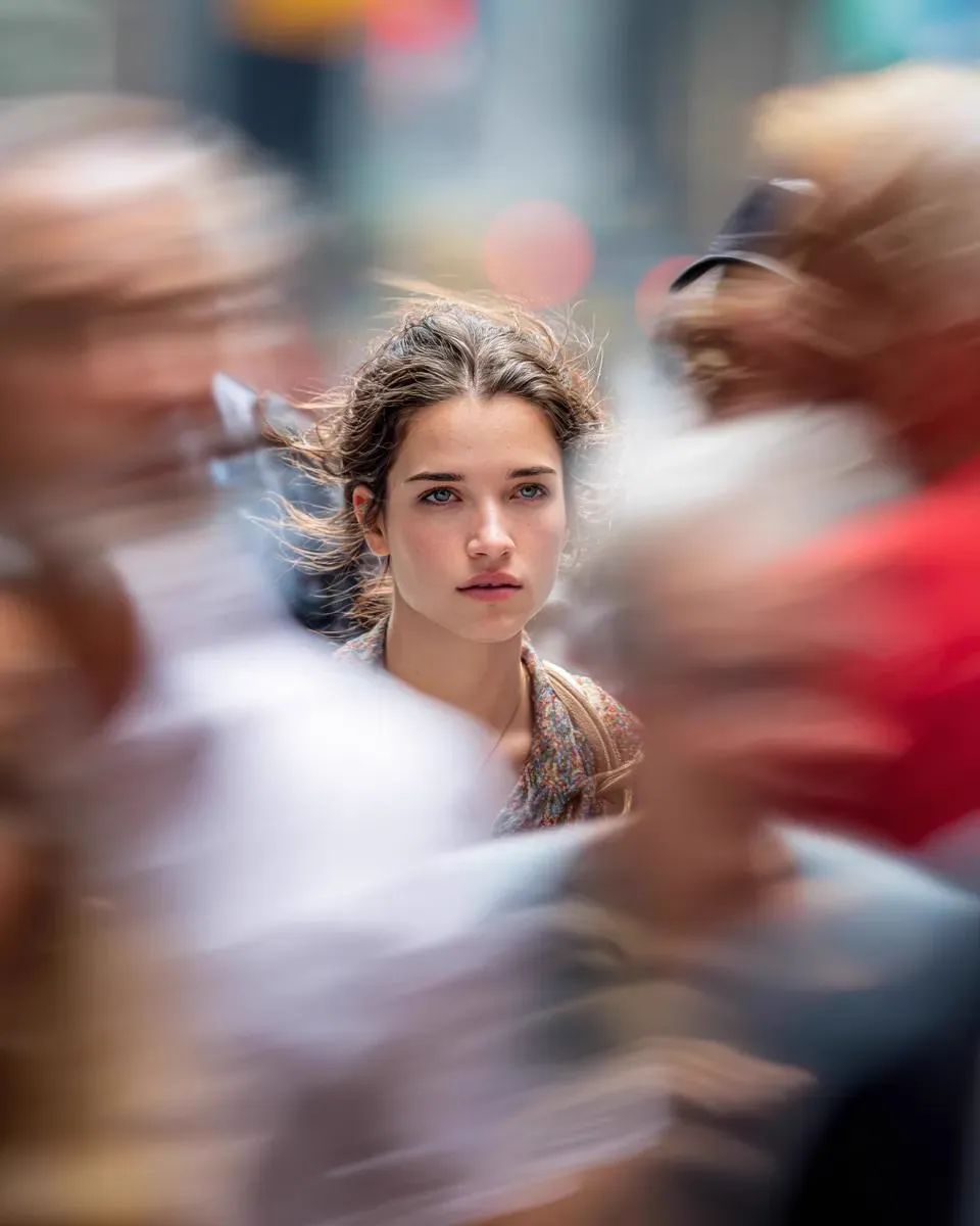
A Thumbnail Is a Promise, Not a Picture
Most creators treat the thumbnail as the final chore before publishing — a decoration bolted onto a finished video. That order is backwards. In a crowded feed the thumbnail does more work than the title, the channel name, or the first ten seconds of footage, because it is the only element a viewer processes before deciding whether to spend attention. It is not art for its own sake; it is a compressed promise: click this and you will get that.
That framing changes how you build one. If the promise is "you can pull a great espresso shot with cheap gear," the image needs a recognizable object, a visible outcome, and a small element of surprise. If the promise is "this strategy failed and here is why," the image needs a face, an emotion, and a symbol of the failure. Art direction follows the promise, never the other way around.
AI image generation has removed the bottleneck between idea and artwork. Someone who can describe a promise clearly can now produce a dozen polished candidates in the time it once took to open a design file. The skill that matters has shifted from rendering to briefing, selecting, and finishing — and that is the workflow this guide covers.
The Five-Stage Workflow at a Glance
Before diving into detail, here is the shape of a repeatable process. It is deliberately short, because the value is in repetition rather than complexity.
- Brief — write down the promise, the audience, the emotion, and the one object that carries the idea. Five minutes, not fifty.
- Prompt template — turn the brief into a reusable prompt skeleton with swappable slots, so tomorrow's thumbnail takes two minutes instead of twenty.
- Batch generation — produce 8–16 candidates per concept across two or three concepts. Volume is cheap; hesitation is expensive.
- Selection and compositing — score candidates against fixed criteria, pick the best, then fix faces, hands, and text manually.
- Publish and test — run two or three variants, measure click-through rate, retire the losers, and keep a library of winners.
Each stage has a natural stopping point. The temptation is to skip straight to stage three and start typing prompts, which is exactly why so many AI thumbnails look generic. The brief is the cheap part and the part that determines everything downstream.
Stage 1: Write a Thumbnail Brief You Can Reuse
A brief is not a script and not a mood board. It is a single block of text with fixed fields, and once you have the template you fill it in faster every time.
- Audience — who scrolls past this, and what do they already know? A beginner audience needs the object labeled visually; an expert audience needs the unusual detail highlighted.
- Core promise — one sentence, in plain language, that the video delivers.
- Emotional register — curiosity, alarm, delight, relief, disbelief. Choose one. Mixed emotions read as noise.
- Subject — who or what is on screen. One primary subject beats three supporting ones.
- Prop or symbol — the object that makes the promise tangible: a cracked phone screen, a graph line going vertical, a stack of notebooks.
- Background direction — studio gradient, blurred location, flat color, or textured environment.
- Palette anchor — one dominant color plus one accent that contrasts with it.
- Overlay text — three words maximum, or none at all.
- Forbidden list — everything you never want again: floating logos, lens flares, tiny unreadable labels, generic robot faces.
The forbidden list is the most underrated field. After a few months it becomes your channel's visual grammar, and it stops you from regenerating the same clichés you already rejected.
A worked example for a home-cooking channel: audience — people who cook for one; promise — a full dinner from five pantry items; emotion — pleasant surprise; subject — hands plating a bowl; prop — five ingredients lined up; background — dark wooden counter; palette — deep green with warm orange accent; text — "FIVE ITEMS"; forbidden — floating utensils, glowing steam, stock-photo smiles. That brief takes ninety seconds to write and saves an hour of aimless prompting.
Stage 2: Build Prompt Templates Instead of Typing Prompts
One-off prompts produce one-off results. Templates produce a recognizable channel style and make iteration fast, because you change one variable at a time.
The Four-Part Prompt Skeleton
Almost every strong thumbnail prompt can be broken into four blocks, in this order:
- Subject and action — "a young woman in a linen apron, mid-laugh, holding a cast-iron pan."
- Environment and framing — "centered chest-up framing, blurred kitchen background, shot from slightly below eye level."
- Lighting and color — "warm rim light from the right, deep green shadows, orange highlight on the pan, high contrast."
- Render style and technical constraints — "clean editorial photography, sharp focus on the face, 16:9, generous empty space in the upper left."
Keeping the blocks separate matters because it lets you swap one without disturbing the others. Change block three to a cool blue night palette and you have a series variant; change block one and you have a new episode.
Adapting the Skeleton by Niche
Gaming thumbnails usually need a character in motion, a bold color contrast (magenta against cyan is a reliable pairing), and a dramatic expression. Finance and business content rewards clean geometry, a single up-or-down visual, and a restrained palette that signals credibility. Tutorial and how-to content benefits from visible before-and-after states on the same canvas. Vlogs and personality-driven channels need the face large, the expression genuine, and the background readable enough to imply location without competing for attention.
Practical Prompt Hygiene
Write prompts in a consistent order, always. Save three or four templates per series in a plain text file so you are never starting from a blank box. Include an aspect ratio and a resolution instruction every time — thumbnails are landscape, and portrait crops waste composition. Add negative guidance for the recurring failures: extra fingers, warped text, duplicate limbs, watermarks, and that glossy plastic skin texture that instantly reads as synthetic. Finally, leave deliberate negative space. A prompt that fills every corner leaves you nowhere to put words.
Stage 3: Generate in Batches, Then Cut Hard
The fastest creators do not generate one image and judge it. They generate twelve, look at them as a grid, and delete ten in thirty seconds. Judging is a different cognitive task from prompting, and switching modes constantly is what makes the process feel slow.
A workable rhythm: three concepts, ten to sixteen images each, produced in a single sitting. Then a hard review pass with a scoring rubric you apply identically to every candidate:
- Focal clarity — is there exactly one thing your eye lands on first?
- Emotional read — does the feeling arrive before the text is read?
- Contrast — does the subject separate cleanly from the background at small sizes?
- Text room — is there a calm area for three words?
- Brand fit — would a returning viewer recognize this as yours?
- Truthfulness — does the image actually represent the video?
Score each from one to five. Anything below eighteen out of thirty leaves the pool immediately, no second-guessing. This is the single biggest time saver in the entire workflow: you stop trying to rescue mediocre generations and start choosing among good ones.
Keep the rejects in a dated folder rather than deleting them permanently. Six weeks later, a rejected composition sometimes fits a different episode perfectly.
Stage 4: Consistency Across a Series
Viewers do not read channel names while scrolling; they recognize shapes, faces, and colors. A consistent thumbnail system converts casual impressions into recognition, and recognition into clicks. The goal is not identical images — it is a family resemblance.
Techniques that produce reliable consistency:
- Seed and reference reuse. Many generators let you hold a seed or supply a reference image. Reusing both keeps facial structure and lighting stable across episodes.
- Character training. If a recurring persona matters, train a small custom model on twenty to thirty clean images of that character. It is overkill for one video and extremely efficient for a hundred.
- Fixed framing rules. Choose one of three compositions and stay inside it: subject left and text right, subject right and text left, or subject centered with text above.
- A locked typeface pair. One heavy display face for the three-word overlay, one clean sans for anything else. Do not rotate fonts for novelty.
- A recurring visual token. A colored border, a corner badge, a consistent background gradient. Small, repeated, and instantly yours.
- A palette of three colors maximum. More than three and the thumbnail starts to resemble a supermarket flyer.
Write these rules into a one-page style sheet and keep it open while you work. When a collaborator or an editor joins the channel, that page is the entire onboarding document.
Stage 5: The Last Ten Percent Is Typography and Contrast
AI generation gets you a strong image. It rarely gets you a finished thumbnail, because the final ten percent — type, contrast, and safe zones — is where the click is actually won or lost.
Text rules that hold up. Three words or fewer. No sentence case; use uppercase or bold title case for weight. Add a stroke, drop shadow, or a solid backing shape so the text survives against any background. Test at 15 percent zoom on a phone — if you cannot read it at that size, it does not exist. Never repeat the video title word for word; the overlay should add information the title does not carry.
Contrast rules. Convert the image to grayscale and check whether the subject still separates from the background. If the thumbnail turns to mud in grayscale, the color is doing all the work and it will fail on dim screens. Push the difference between subject luminance and background luminance, and use complementary color pairs for accents rather than rainbow palettes.
Safe zones. Keep critical elements away from the bottom-right corner, where the duration badge sits, and away from the bottom edge, where the progress bar appears in some surfaces. Leave a margin around the whole canvas so nothing important sits flush against the crop.
Technical finishing. Export at 1280×720 or larger and keep the file under a couple of megabytes so it loads instantly. Use a high-quality JPEG or a PNG when you need crisp flat text. If you upscaled a small generation, check for smeared detail around eyes and text before publishing — that artifact is the fastest way to look amateur.
Choosing Tools Without Locking Yourself In
There is no single tool that does all of this well, and pretending otherwise leads to mediocre results. Match the tool to the job.
| Job | What to look for | Representative options |
|---|---|---|
| Concept generation | Style range, strong lighting control, fast iteration | Midjourney, Flux, DALL·E |
| Text-heavy layouts | Accurate letterforms inside the render | Ideogram, layered compositing instead |
| Character consistency | Reference images, seeds, custom training | Stable Diffusion pipelines, ComfyUI |
| Upscaling | Detail preservation, no plastic smoothing | Topaz Gigapixel, built-in upscalers |
| Compositing and clean-up | Layer control, masking, healing brushes | Photoshop, Affinity Photo, Photopea |
| Layout and text | Snapping, easy font swapping, templates | Figma, Canva, Affinity Designer |
| Animated thumbnails | Short loop export, small file size | After Effects, CapCut |
Selection criteria that actually matter: how well the generator handles the kind of lighting you need, whether it exposes consistency controls, whether it outputs the right aspect ratio natively, how fast you can produce a batch, and whether the license permits the commercial use you intend. Check the licensing terms for client work specifically — that detail is easy to overlook and expensive to discover later.
A sensible stack for most creators is two generators (one for painterly or cinematic looks, one for clean photographic looks), one editor, one layout tool, and one upscaler. Resist adding a fifth generator until you have exhausted what the first two can do.
Testing Thumbnails Like an Experiment
Publishing one thumbnail and hoping is not a strategy. Treat the first days after upload as a test window.
Change one variable at a time. If you swap the face, the color palette, and the text simultaneously, you learn nothing about which change moved the number. Run two variants against each other — a face-led version and an object-led version is a strong first experiment — and let each accumulate enough impressions before drawing conclusions. Small samples produce dramatic-looking noise, and it is easy to "learn" a lesson that is purely random.
Read the metrics in context. Click-through rate on its own is misleading: a very high rate on tiny impression counts often means the video was only shown to subscribers. Look at impressions, average view duration, and the traffic sources together. A thumbnail that lifts clicks but tanks retention is a net loss, because the audience arrived expecting something the video did not deliver. Platform-native thumbnail testing features are useful here because they rotate variants without you manually editing after publication.
Keep a winner library. Each time a thumbnail clearly outperforms, save the image, the prompt, and the brief alongside a note about why you think it worked. Over a year, that library becomes a private playbook more valuable than any generic advice.
A Concrete End-to-End Session
Abstract advice is easy; here is what the process looks like in practice for a video titled "Five Pantry Items, One Real Dinner."
Minutes 0–5, brief. Audience: solo cooks on a budget. Promise: a complete dinner from five cheap items. Emotion: pleasant surprise. Subject: hands plating a bowl, steam visible. Prop: five pantry items arranged in a row. Background: dark counter, soft falloff. Palette: deep green plus warm orange. Text: "FIVE ITEMS." Forbidden: floating utensils, glowing steam, stock smiles.
Minutes 5–12, templates. Two concepts go into the generator. Concept A is a close overhead of the five items with a finished bowl entering frame. Concept B is a chest-up shot of a person holding the bowl, eyes on the food, warm rim light on the right. Each prompt keeps the four-block structure and specifies 16:9 with clean negative space in the upper left.
Minutes 12–30, generation. Twelve images per concept, twenty-four total, reviewed as a grid. Six survive the rubric, four of those are genuinely usable.
Minutes 30–45, finishing. The best candidate gets a healed hand, a slightly deepened background, three words of heavy type with a subtle stroke, and a small consistent corner badge. Two variants are exported — one with the face, one without.
Minutes 45–50, publish and queue the test. Variant A goes live; variant B is scheduled to rotate after a meaningful impression count.
That is under an hour for a finished, tested thumbnail, and most of it is judgment rather than labor. The next episode takes twenty minutes because the brief template and prompt templates already exist.
Common Mistakes That Quietly Suppress Clicks
- Too many elements. Three competing focal points read as visual noise at feed size.
- Text that repeats the title. The overlay should add a new hook, not echo what the viewer already read.
- Tiny faces. Faces need to be large enough to read emotion without zooming. Half a face beats a full-body shot.
- Low contrast on mobile. Everything looks fine on a large monitor and disappears on a phone. Always check small.
- Style drift. A channel that alternates between neon chaos and minimalist white loses recognition value.
- Uncanny generation artifacts. Warped hands, asymmetrical eyes, and melted background text destroy credibility instantly.
- Misleading promises. A thumbnail that oversells ruins retention and trains viewers to distrust your channel.
- Ignoring safe zones. Text under the duration badge is text nobody reads.
- Never refreshing. A thumbnail can fatigue; rotating a variant after weeks or months often restores performance without touching the video.
Most of these are fixable in a single review pass, and the fix is usually subtraction rather than addition.
FAQ
How many candidates should I generate per video? Twenty to thirty across two or three concepts is a comfortable range. Below ten you are choosing between weak options; above fifty the marginal gain flattens and you lose time to indecision.
Do I need design skills to make this work? You need three: judging composition, controlling contrast, and setting type. All three improve quickly with deliberate practice, and they matter more than any specific tool.
Should I use the same face on every thumbnail? A recognizable recurring subject builds channel recognition, but variety in expression and framing prevents fatigue. Keep the person consistent and vary the emotion and composition.
Can AI-generated thumbnails cause problems with platform policies? Misleading metadata is the real risk, not the generation method. If the image honestly represents the content and avoids shocking or deceptive framing, the tooling is irrelevant to policy.
What resolution and format should I export? At least 1280×720, landscape, with a compressed file size for fast loading. Use high-quality JPEG for photographic images and PNG when you need perfectly crisp flat type.
How often should I replace a thumbnail? If performance declines after a stable period, test an alternative. Otherwise leave winners alone — change for its own sake resets the recognition you have built.
Can I reuse these thumbnails for shorts or other platforms? Yes, but recompose for each aspect ratio rather than cropping the edges. Cropping usually removes the negative space that made the text work.
What is the fastest way to improve starting today? Write the brief before opening any generator, and build one reusable prompt template for your most common video type. Those two habits account for most of the time savings and most of the quality difference.
