
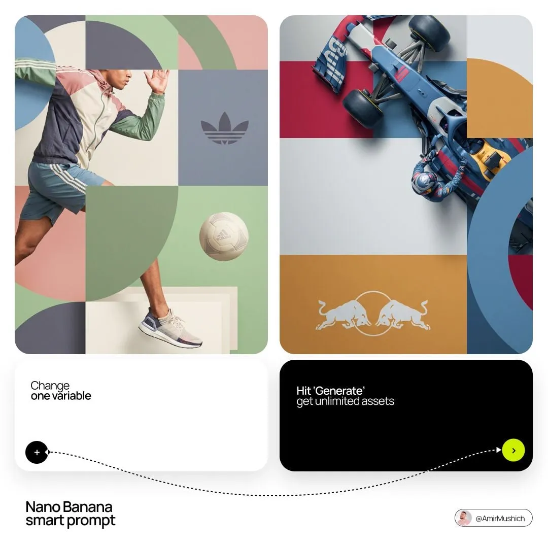

Most creators meet pixel-block style transfer the same way: they see one jaw-dropping clip, try to reproduce it, and discover that the magic was never in the effect itself. It was in the preparation. The effect is easy. Holding a visual identity steady across forty shots is what separates a portfolio piece from a series that can actually ship.
This guide is about that gap. It assumes you already know roughly what tile-based or block-based pixel processing does: you decompose a look into small, controllable units of style — colour, edge treatment, texture, light behaviour — then recombine those units consistently for every frame you generate. The interesting questions start after that. When is this approach worth the extra setup time? When is it overkill? How do you know whether your style is drifting before an audience notices? And what does a project diary for a mixed-language content series actually look like?
Rather than another feature walkthrough, what follows is a decision framework, a set of concrete workflow patterns, and a diagnostic method you can run on your own output in an afternoon.
What the technique actually buys you
Strip away the vocabulary and pixel-block processing delivers three things, and only three.
Control. Instead of describing a look in prose and hoping a model interprets it the same way twice, you define the look as a small kit of reusable attributes. The model still does the hard work, but the variables you care about are named and repeatable.
Speed of repair. When something drifts — a colour cast creeps in, an outline thickens, a texture turns muddy — you fix the attribute that failed rather than re-rolling the whole generation. This is the single biggest practical win, and it is the reason the approach survives contact with real deadlines.
Reusability. A locked style kit can be applied to a new subject, a new scene, or a different product entirely without redoing the discovery work.
What it does not buy you is taste, narrative instinct, or the ability to fix a weak story. It is a consistency system, not a creativity system. Teams that forget this end up with forty immaculate shots of nothing happening.
The decision test: four questions before you commit
Before building a style kit, answer these honestly. If you cannot get three clear yeses, use a simpler approach.
Does the project run longer than roughly eight to ten shots? A one-off hero clip does not justify a kit. Consistency problems scale with shot count, and below about eight shots a careful single reference image plus tight prompting is usually enough.
Will more than one person or session touch the project? Kits are documentation as much as technique. If a collaborator, a freelancer, or future-you in three weeks will generate shots, the kit is what keeps the output coherent. If it is a solitary sprint finished in one sitting, you can often carry the look in your head.
Is the look a brand asset rather than a mood? Recurring characters, product lines, channel identities, and campaign worlds all justify the setup. A single atmospheric scene does not.
Can you tolerate a slower first day? Building and locking a kit typically costs a meaningful chunk of a project's front end. You get it back across the run, but not on shot one. Teams that abandon consistency systems almost always quit during that first slow day.
If the answer to all four is yes, the technique pays for itself many times over. If two or more are no, a well-written prompt with two or three reference images is the honest choice.
Anatomy of a style kit
A working kit has five parts, and each one fails in a different way. Keeping them separate is what makes repair possible.
Reference tiles. Small, tightly framed images, each isolating exactly one attribute: a colour palette sample, a close-up of the edge or line treatment, a patch of surface texture, a lighting study, and a silhouette or shape-language reference. Keep them small and specific. A tile that tries to communicate two attributes gives you no way to tell which one went wrong.
The written spec. A short paragraph, under a hundred words, describing the visual grammar in plain language: how edges are treated, how saturated the palette runs, whether shadows are soft or hard, whether texture reads as grain, weave, or flat fill. This document matters more than any single image because it is what a collaborator can read.
The naming convention. Every asset gets a versioned name. Style kits change; if you cannot tell which kite produced which shot, your library becomes archaeology.
The application recipe. The repeatable prompt pattern or pipeline setting that applies the kit to a new subject. This is the thing you actually run dozens of times, so it should be boring and short.
The rejection list. Attributes you tried and deliberately abandoned, with a one-line reason. This is the most underrated part of a kit. Without it, you re-explore the same dead ends every few months.
Workflow patterns that survive real projects
Three patterns cover most situations. Pick by how much control you need versus how much iteration speed you want.
Pattern A: lock first, then generate
Build the kit fully, validate it on a test subject, freeze the version, and only then begin production. This is the slowest start and the most reliable run. It suits episodic content, brand series, and anything with a client review step, because you can get the look approved once instead of re-approving it per shot.
The tradeoff is rigidity. If you discover in shot twelve that the style needs a warmer cast, you are now versioning mid-project. Plan for that by leaving one attribute — usually the palette — deliberately loose, and keep everything else strict.
Pattern B: generate two, then lock
Produce two pilot shots with a provisional kit, compare them side by side, adjust once, and freeze. This is the pragmatic middle path and the one most working teams converge on. You get real evidence of how the style behaves in motion before you commit, at the cost of throwing away two shots.
The discipline here is to make the pilot shots genuinely representative. If your project contains both wide establishing shots and tight close-ups, your pilots must include one of each. Style kits frequently hold up beautifully in close-up and fall apart in wide shots, where texture and edge treatment compress into visual noise.
Pattern C: rolling kit with a locked core
Freeze the two or three attributes that define the identity, and allow the remaining attributes to evolve shot by shot. Useful for music videos, experimental pieces, and anything where the visual language is meant to develop across the runtime.
This pattern fails badly without documentation, because six weeks later you cannot tell deliberate evolution from accidental drift. Keep a one-line log per shot recording which attributes changed and why. If you cannot fill in the reason, it was drift.
Diagnosing style drift before your audience does
Drift is not a rendering error you can catch by staring at one frame. It is a perceptual property of a sequence, which means it needs a sequence-level check. Build one and run it every ten shots.
The contact sheet method. Export the first frame of every shot into a single grid, nine or sixteen at a time. Review it at thumbnail size, not full size. Small thumbnails strip away detail and leave exactly what your audience perceives: overall colour, contrast, and shape language. If one frame in the grid visibly pops as a different colour temperature or a different level of contrast, that shot is your drift, and you found it in seconds.
The attribute audit. For each shot, score four attributes on a simple three-point scale: palette match, edge treatment, texture density, and shadow behaviour. Three means indistinguishable from the reference, one means clearly off. Any attribute scoring one on two consecutive shots is a kit-level problem, not a shot-level problem — fix the kit, then regenerate both.
The blind pair test. Take a shot from early in the sequence and one from late, put them side by side, and ask someone who has not seen the project which one looks wrong. If they cannot tell, your drift is below the perceptual threshold and you can ship. If they pick one instantly, you have your answer.
These three tests take minutes and catch the failures that automated similarity scores routinely miss. A numeric similarity score will happily tell you two frames are 94 percent alike while your eye says the character aged five years.
Where block-based processing goes wrong
Four failure modes account for most disappointment, and each has a specific remedy.
Patchwork output. The result looks like several different artists contributed different regions. Cause: the reference tiles were created under inconsistent lighting or colour conditions, so the model is reconciling contradictory instructions. Remedy: rebuild the tiles in one session, under one described light, then re-fuse. If it still happens, cut the number of inputs — three or four strong tiles beat nine contradictory ones.
Grid slippage. Instead of a single coherent subject, the model renders a layout, a collage, or a visible tiling pattern. Cause: too many references at once, or prompt language that implies an arrangement rather than a merge. Remedy: reduce inputs and state explicitly that the output is one subject in one image.
Texture collapse in motion. The first frames look right, then surface detail smears as the camera moves. Cause: texture described only as a colour rather than a material behaviour. Remedy: name the material and its response to light — how it catches highlights, whether it stays crisp at the edges, how it behaves in shadow. Material language survives motion; colour language does not.
Style hardening. Three minutes in, everything starts to look like a filter — flat, over-consistent, lifeless. Cause: applying the kit uniformly to every element, including things that should breathe. Remedy: deliberately break the style in one place per shot, typically in a background element or a secondary light source. Perfect consistency reads as artificial. Controlled inconsistency reads as craft.
Practical examples across three content types
Abstract advice is cheap, so here is how the framework lands in three different projects.
An episodic animated series. Lock the palette and shape language permanently; let lighting flex per scene to signal time of day. Version the kit when a new location introduces a material the kit has never seen — for example, water or glass — because those surfaces will expose gaps in a texture spec built for fabric and stone. Approve the kit once per season, not once per episode.
A product campaign for a physical object. The object itself is your most important tile, and the tile you must protect hardest. Generate the object tile from the real product under controlled light, treat it as immutable, and vary only the world around it. When the campaign crosses into a second medium — print, packaging, a landing page — the kit doubles as an art-direction document, so write the spec for a reader who will never open your generation tool.
A mixed-language content series. This is where the discipline earns the most, because translations tend to reintroduce variation. Keep the visual kit entirely separate from the language layer. The kit governs how the visual world looks; the language layer governs text, duration, and pacing per locale. Never rebuild the visual kit for a new language — if you find yourself wanting to, the problem is almost certainly a text layout issue masquerading as a style issue. Reserve extra headroom in the composition for languages that expand in translation, since a tight composition that works in one language will crowd in another.
A tool stack that stays replaceable
The temptation is to find one tool that does everything. Resist it. Build layers where each one can be swapped, because models change faster than your project timeline.
Tile preparation. Anything with reliable seed control and strong preservation of an input image. This layer is boring and it should stay boring; changing it mid-project is rarely worth the disruption.
Style application and fusion. A tool that accepts multiple reference images in a single request and outputs one coherent subject rather than a montage. The critical capability is multi-reference input, not raw image quality.
Motion. An image-to-video tool that honours both a start and an end frame. Honouring an explicit end frame is the single most valuable capability in this layer, because it converts continuity from a hope into a constraint.
Review. A plain contact-sheet grid and your own eyes. Do not substitute a similarity score for looking at the sequence at thumbnail size.
Asset management. Folders with disciplined version names. A spreadsheet for the shot log. Fancy systems are optional; consistent naming is not.
When comparing options, weigh four criteria above all others: does it accept multiple references in one call, does it honour an explicit end frame, does it preserve material detail in motion, and can you reproduce an identical render from the same inputs after a week. Reproducibility outranks peak quality every time, because a slightly weaker model you can re-run beats a stronger one that gives you a different result each attempt.
Common questions
How many reference tiles is the right number? Three to five for a focused look, six to eight for a complex one. Beyond that you are usually adding contradictions rather than information, and patchwork output becomes likely.
Should the written spec be long? No. Under a hundred words, written for a human reader, not a model. Its main job is to let a collaborator understand the look without reverse-engineering your images.
Can I apply one kit to a totally different subject? Yes, and this is the technique's best feature. Validate with two pilot shots first, because subjects with very different material properties — skin versus metal, fabric versus foliage — will stress the texture spec differently.
What if the style looks perfect but boring? Loosen exactly one attribute and break it deliberately once per shot. Hardened style is the most common aesthetic failure in consistency-driven work, and it is also the easiest to fix.
How often should I version the kit? Whenever the change is deliberate and you cannot undo it by rerunning the same prompt. Deliberate evolution gets a new version number; accidental difference gets fixed and regenerated, not versioned.
Is this only for stylised work? No. Photorealistic projects use the same modular logic, with lighting behaviour and material response replacing line treatment and palette as the attributes you lock.
How do I know when the project is done drifting? When the blind pair test stops producing an obvious answer. At that point, additional consistency work is invisible to the audience, and your time is better spent on pacing and story.
Where to start this week
Pick the shortest project you can finish in two days that has a recurring look and more than ten shots. Build a five-attribute kit. Produce two pilot shots — one wide, one close — and compare them at thumbnail size before you look at either closely. Freeze the kit, write the spec, log every deliberate deviation, and run the contact-sheet check every ten shots.
By the end you will have something more valuable than a pretty clip: a repeatable process, a documented look, and a clear list of the dead ends you no longer need to revisit. That is what turns an eye-catching technique into a production method you can rely on when the schedule gets tight and the client asks for twenty more shots by Friday.
