

Why Cinematic Craft Still Decides Whether a Video Works
A viewer decides in a couple of seconds whether your educational lesson or product ad deserves attention. That decision is rarely intellectual. It is sensory: the way light wraps a face, the way a frame is weighted, the way a cut lands on a beat. Cinematic craft is the discipline of controlling those sensory signals on purpose rather than by accident.
Two formats dominate the demand for this skill. Educational video has to hold attention long enough for comprehension to happen, which means pacing, clarity, and visual variety. Advertising video has to compress persuasion into a very short window, which means impact, hierarchy, and a single unmistakable message. Both are served by the same underlying language: motivated lighting, deliberate composition, purposeful camera movement, and rhythmic editing.
What has changed is who can access that language. Cameras, lights, and post-production tools are cheaper than ever, and generative video models have removed entire categories of production cost. A solo creator can now produce a shot that would once have required a crew, a permit, and a lighting truck. The craft principles did not change, but the workflow around them did, and that is where most projects succeed or fail.
This guide walks through the durable cinematography principles, how they translate into an AI-assisted pipeline, how to structure educational and advertising edits differently, and where the common traps are.
The Principles That Survive Every Tool Change
Tools change every few months. The following principles have survived a century of filmmaking and they survive generative video too, because they describe how human perception works, not how a particular camera works.
Lighting: contrast, motivation, and shape
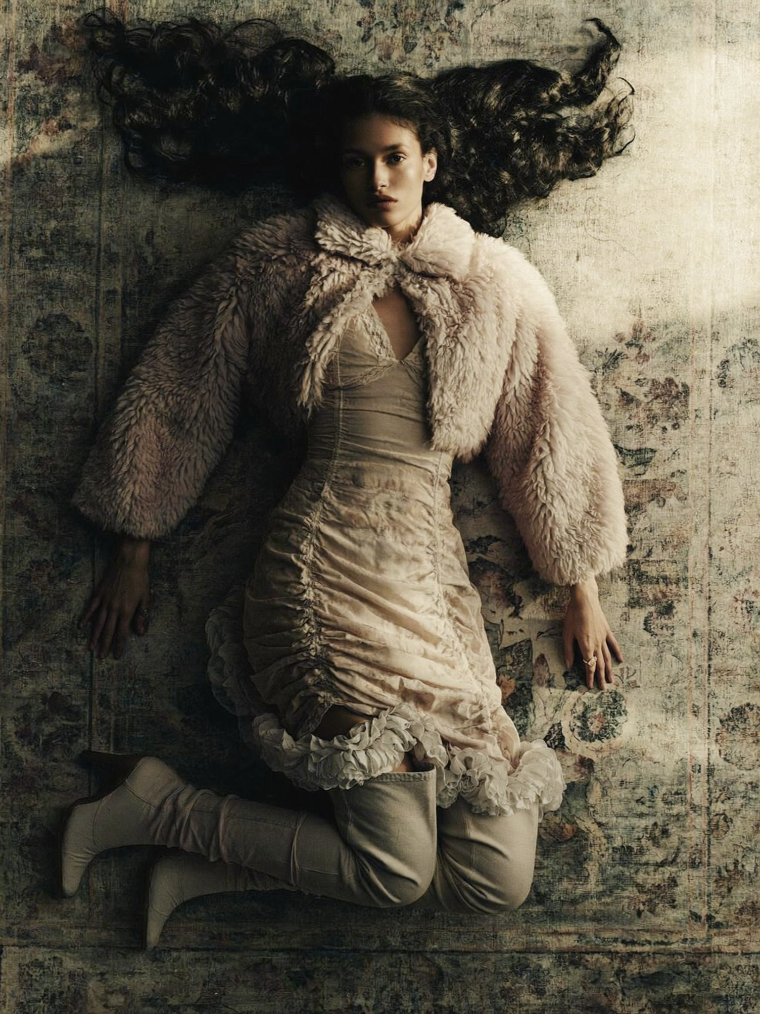
Cinematic lighting is mostly about contrast management. Flat, even light reads as documentary or corporate, which is sometimes exactly right. Shaped light, with a bright side and a shadow side, reads as dramatic and gives objects volume. Three decisions matter most:
- Key direction. Front key flattens. Side key sculpts. Back key separates the subject from the background.
- Motivation. Light should appear to come from something in the scene: a window, a lamp, a screen, a doorway. Unmotivated light feels artificial even when it is technically beautiful.
- Negative fill. Adding darkness on the shadow side increases contrast without adding a single light. It is the cheapest cinematic upgrade available.
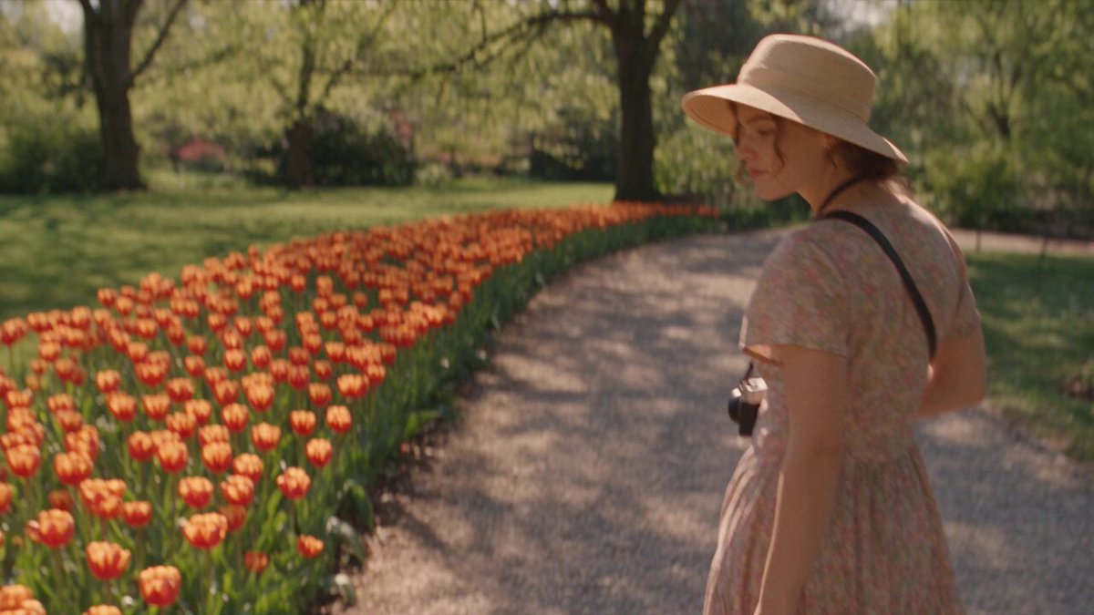
Color temperature tells its own story. Warm key with cool ambient reads as comfort. Cool key with warm accents reads as tension or technology. Keeping one consistent relationship across a sequence is what makes footage feel like it belongs together.
Composition: the frame as a sentence
Composition is grammar. A centered subject reads as formal, confrontational, or instructional. Rule-of-thirds placement reads as natural and conversational. Extreme negative space reads as isolation or anticipation. Each choice nudges interpretation before a single word is spoken.
For educational content, composition should serve legibility: generous headroom for on-screen text, clean backgrounds behind the presenter, and consistent subject placement so the viewer's eye does not have to re-learn the frame on every cut. For advertising, composition should serve hierarchy: one hero element per frame, and everything else subordinated.
Lens language: focal length as emotional distance
Wide lenses exaggerate space and pull the viewer into the scene. Long lenses compress space and create intimacy while physically distancing the camera. A quick test: shoot the same presenter at 24mm, 50mm, and 85mm. The 24mm feels like a room, the 50mm feels like a conversation, the 85mm feels like a confession. When you generate frames with AI models, you can request equivalent framing language — "tight portrait, long-lens compression, shallow depth of field" — and get much closer to the intent than by asking for "a nice shot."
Translating Cinematic Lighting Into an AI-Assisted Pipeline
Generative video models respond to lighting description the same way a gaffer responds to a lighting diagram, provided the description is specific. Vague prompts produce vague light.
Setups that read well in generated frames
- Rim plus soft key. A soft key at roughly 45 degrees and a hard rim behind the subject produces separation and depth. This reads reliably well across most models.
- Window light with negative fill. Describe a single large window on one side and deep shadow on the other. It is the most naturalistic and the hardest to make look wrong.
- Practical-driven night scenes. Name the practical source: neon sign, desk lamp, monitor glow. Naming a source improves both realism and consistency between shots.
Add technical anchors to prompts: lens type, aperture feel, film stock or digital look, and the direction light travels across frame. "Light falls from camera left" is far more useful than "dramatic lighting."
Failure modes and fixes
- Waxy skin and plastic texture. Usually caused by over-smoothing. Reduce beauty-style descriptors and add texture language such as "visible skin grain, natural pores."
- Blown highlights. Ask for "protected highlights, controlled specular roll-off" and avoid stacking multiple light sources in one prompt.
- Inconsistent light direction. If shot A lights from the left and shot B from the right, the sequence feels broken even when each shot is beautiful. Lock the light direction in your shot list and reuse the same phrasing.
- Mismatched contrast. High-contrast shots cut against low-contrast shots create an unintentional jolt. Normalize contrast in post with a shared look rather than fighting the model.
Camera Movement: Intent Over Decoration
Movement is the most overused tool in modern video. A slow push-in earns its place when it increases tension or intimacy. It becomes noise when every shot drifts for no reason.
A movement vocabulary
| Movement | Emotional effect | Best use |
|---|---|---|
| Slow push in | Growing attention, seriousness | Key lesson points, product reveal |
| Pull back | Reveal, release, conclusion | Ending an ad, closing a lesson |
| Lateral track | Discovery, parity, comparison | Showing a process, walking through a space |
| Handheld | Immediacy, authenticity | Testimonials, behind-the-scenes |
| Static lock-off | Stability, authority | Data, diagrams, precise instruction |
| Crane or drone rise | Scale, optimism | Openers, brand statements |
Making generated motion obey physics
Generative clips often fail by moving too much. Describe a single movement with a speed qualifier: "very slow dolly in, 5 percent of frame over the shot." Keep a subject anchor — a face, a hand, a product — that stays readable throughout the move. If a generated shot drifts, shorten it and cut earlier rather than trying to rescue a long take. In editing, a 1.5-second movement reads as intentional; a 6-second wandering move reads as an error.
Visual Pacing for Educational Video
Educational video lives or dies on cognitive load. The viewer is learning and watching at the same time, and both tasks compete for the same attention budget.
Rhythm patterns that work
- Alternating coverage. Cut between a talking-head wide, a tight facial shot, and a supporting visual every 4 to 8 seconds. The change resets attention without adding noise.
- Shot-length variation. Uniform shot lengths create monotony; wild variation creates chaos. Aim for a rhythm where 60 to 70 percent of shots sit in a comfortable mid-range and the rest break it deliberately at key moments.
- Breathing beats. Every 60 to 90 seconds, hold a shot longer than expected. This gives the viewer time to consolidate what they just learned.
On-screen text, B-roll, and cognitive load
Text and narration should reinforce, not duplicate. If narration says a full sentence, the screen should show a keyword or a diagram, not the same sentence. Place graphics in a consistent zone so the eye knows where to look, and keep motion graphics slower than you think is necessary — fast kinetic text is impressive once and exhausting by the third repetition.
B-roll should illustrate the specific point, not the general topic. A lesson about compound interest does not need generic footage of money; it needs a visual that shows accumulation. Specificity is what makes a shot feel placed rather than padded.
High-Impact Structure for Ad Creative
Advertising video has a different shape entirely. It is not a shortened lesson. It is an argument delivered through images.
The first three seconds
Open on the strongest frame you have, not a logo, not a slow establishing shot. That frame should contain a tension: a problem, an unusual visual, a face with a clear emotion, or a question the viewer cannot immediately answer. Motion in the first second helps; so does sound, because many feeds autoplay muted, so design the first frame to work silently.
The proof beat
Roughly a third of the way in, give the viewer a reason to believe. This is where cinematic craft pays off, because proof is delivered visually: a demonstration, a before-and-after, a close-up of a detail that implies quality. A macro shot of a hinge, a seam, or a texture does more persuasive work than a sentence of copy.
Closing frame and call to action
The last frame should be the cleanest frame in the video. Simple composition, uncluttered background, one instruction. If the viewer cannot describe what you want them to do after one viewing, the ending is doing too much.
Consistency Management Across Shots
Consistency is the single biggest technical challenge in AI-assisted production, and it is a craft problem as much as a tooling problem.
Character and wardrobe bibles
Create a reference sheet for each recurring character: face shape, eye color, hair, wardrobe, accessories, and any distinguishing marks. Write the description once and reuse it verbatim in every prompt. Small rewrites cause visible drift over a sequence, and viewers notice drift even when they cannot name it.
Location and light continuity
Lock the time of day, weather, and light direction for each location and note them in a continuity sheet. If a scene happens at golden hour, every shot in that scene should share the same warm, low-angle light and the same shadow direction.
Color pipeline
Apply one look across the entire piece during post-production. A simple shared curve, contrast adjustment, and white balance pass unifies footage from different sources faster than attempting to match each clip individually. Aim for a coherent palette of two or three dominant colors per project and resist adding a fourth mid-edit.
A Practical End-to-End Workflow
Pre-production
- Write the script first, in full sentences. Voice-over and narration determine runtime, and runtime determines how many shots you need.
- Convert the script into a shot list with four columns: shot number, description, duration, and purpose. If a shot has no purpose, delete it.
- Build a look book: six to ten reference frames that define contrast, color, and framing. This becomes your quality bar and your prompt reference.
- Decide per shot whether it is generated, filmed, or drawn from stock. Hybrid projects are the norm, not the exception.
Production and generation
Shoot or generate in an order that groups similar lighting and locations, so continuity is easiest to maintain. Generate more takes than you need — three to five per shot is a reasonable baseline — and log which prompt produced which result, because the prompt that worked is a reusable asset.
Post-production
Edit for structure first with placeholder audio. Lock the picture, then replace audio, then add graphics. Grading comes after graphics so that overlays can be matched to the final look. Sound design is not optional: room tone, subtle whooshes on transitions, and a consistent music bed do more for perceived production value than another hour of grading.
Decision Criteria: AI, Live Action, or Hybrid
Use these questions to choose a method per shot rather than per project:
- Does it require a real human performance? Spoken testimonials and nuanced emotion still favor live action.
- Is the shot physically impossible or prohibitively expensive? Historic settings, abstract concepts, and scale shots favor generation.
- Does it need a specific, accurate product? Real footage or high-quality product photography usually wins, because small inaccuracies in a product shot damage trust.
- How many revisions are likely? If stakeholders will change their minds repeatedly, generated footage is far cheaper to redo.
- What is the deadline? Live action has scheduling risk; generation has iteration risk. Pick the risk you can absorb.
Common Mistakes That Sink Cinematic Video Projects
- Chasing a look before locking the script. Beautiful footage with no argument converts nothing.
- Over-lighting. More lights rarely means more cinema. It usually means less contrast and less mood.
- Moving the camera because the shot is boring. If a shot is boring, the problem is the shot, not the movement.
- Breaking continuity for a single better frame. One inconsistent shot can make an entire sequence feel unreliable.
- Ignoring audio. Viewers forgive soft focus. They do not forgive bad sound.
- Skipping the first-frame test. Look at your first second on a phone, muted, at arm's length. If it does not stop you, change it.
FAQ
How long should an educational video be? As long as the idea requires and no longer. Most single-concept lessons work best between three and eight minutes, split into clear segments so viewers can re-watch a specific part.
Can generated footage match live action in the same edit? Yes, if you unify contrast, color, and grain in post. The most common giveaway is not resolution but motion cadence and lens consistency, so keep framing language consistent between filmed and generated shots.
What is the most important lighting rule for beginners? Light the subject from one clear direction, then remove light from the shadow side instead of adding more. Contrast is the fastest route to a cinematic image.
How many shots do I need per minute? For educational content, roughly 8 to 15 shots per minute. For advertising, 20 to 40. Both numbers are guides, not rules; rhythm matters more than count.
Do I need expensive gear? No. A single camera, one key light, a diffusion panel, and something to shape shadow will outperform an expensive kit used without a plan.
How do I keep characters consistent across many generated shots? Write one fixed description, store it, reuse it exactly, and keep a reference image beside you while reviewing each take. Consistency is a documentation habit before it is a technical one.
Bringing the Craft Together
Cinematic quality is a chain: a clear idea, a shot list with a purpose, controlled light with real contrast, framing that carries meaning, movement that earns its place, and an edit that respects the viewer's attention. Generative tools shorten the chain and remove cost, but they do not replace any link in it. The creators who get the best results treat models as a camera department rather than a magic button: they plan the look, describe it precisely, check continuity relentlessly, and finish the piece in the edit. Start with one well-lit shot, one clear idea, and one honest review of your first three seconds. That is the whole discipline, and it scales from a phone-shot lesson to a full campaign.
