

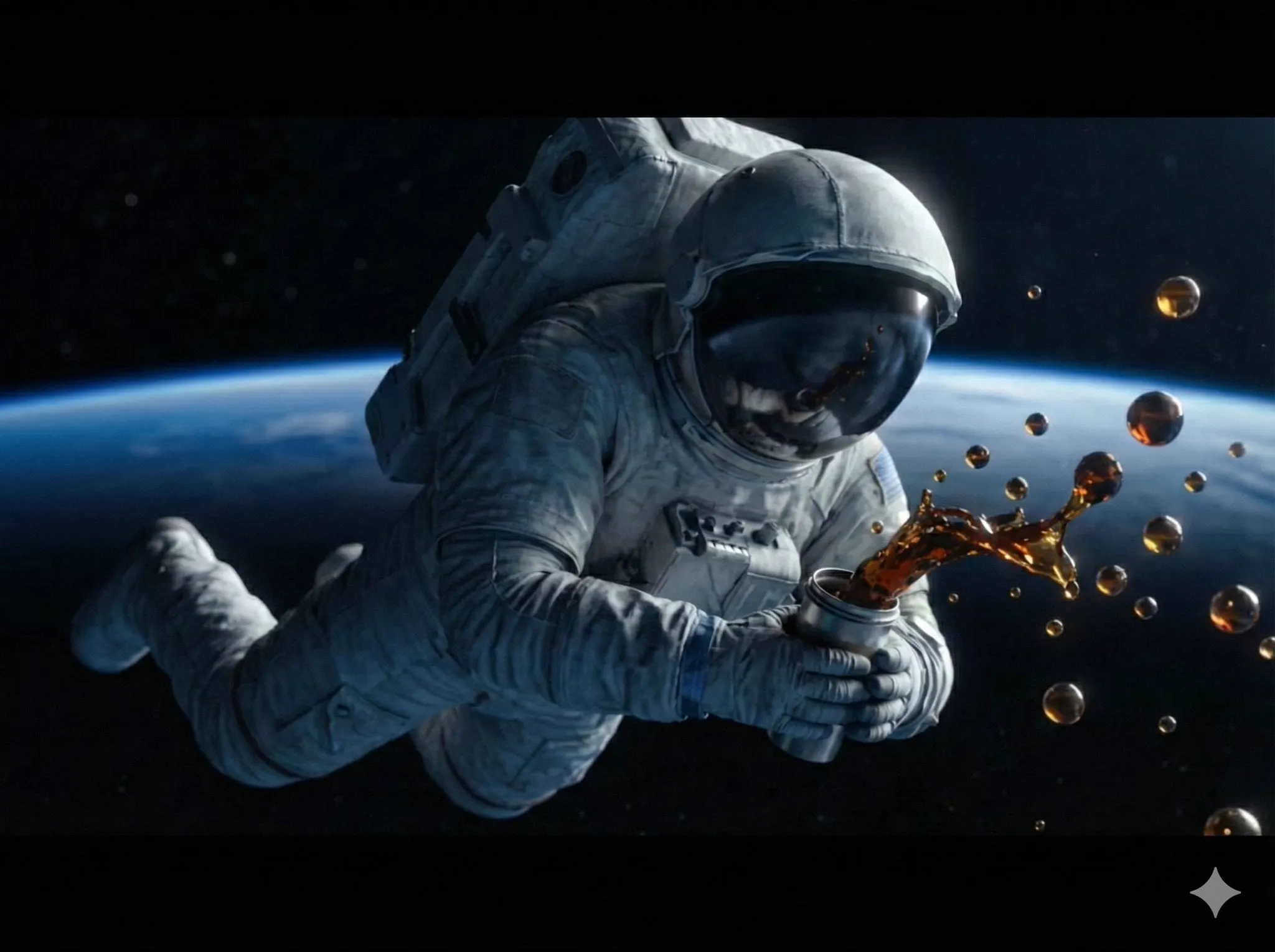

Why Instructional Video Quality Is Really a Teaching Problem
Every recorded lesson competes with a dozen other explanations of the same topic. Learners rarely abandon a video because the information was wrong. They abandon it because following the explanation cost more attention than they had available. Muffled audio forces them to strain. Flat, sourceless lighting makes a presenter look tired, which quietly lowers perceived expertise. A camera that drifts, a zoom that hunts, or a cut that lands mid-sentence all pull working memory away from the subject you are trying to teach.
That is the practical reason cinematography matters in educational content. Polish is not decoration; it is a reduction of friction. A well-framed shot tells the viewer where to look. A clean audio bed means nobody has to rewind. A deliberate cut lands exactly when a concept finishes, so the next idea arrives on a fresh beat. When those things are handled, the learner spends their attention on the material instead of on the delivery.
The technical bar has also dropped sharply. Tasks that once required a second editor — noise removal, transcription, rough cutting, matching color between two cameras — can now be handled semi-automatically, with a human making the creative calls. That does not remove the need for judgment. It moves judgment upstream, into decisions about structure, framing, and what to leave out. The rest of this guide walks through those decisions in the order you actually make them.
Cinematography Fundamentals That Transfer to Teaching
Cinematography in a teaching context is not about spectacle. It is about directing attention: showing the viewer exactly where to look, keeping the frame stable enough that they forget a camera exists, and giving graphics and captions room to breathe. Three skills do most of that work.
Framing and Composition for Screen-Led Learning
Start with the eyeline. A presenter should look slightly off-axis toward the thing being explained — a monitor, a whiteboard, a diagram — rather than straight into the lens for the entire lesson. Straight-to-lens builds connection but becomes intense over twenty minutes; a three-quarter angle feels conversational and leaves negative space on one side for slides, callouts, or a picture-in-picture screen capture.
Place the eyes in the upper third of the frame with modest headroom, roughly the height of a fist above the hair. Avoid cutting the frame at a joint: crop between chest and waist or mid-thigh, never at the neck, elbow, or wrist. Keep the lower third of the frame relatively empty so captions and lower-third graphics do not cover a hand gesture or a demonstration.
For screen recordings, decide the layout once and reuse it across the whole series. A webcam bubble at roughly 15–20 percent of the frame width, anchored in a corner that does not cover menus, toolbars, or the cursor's usual working area, reads as professional simply because it is consistent. Shoot in 4K and compose with a center-safe zone if you plan vertical crops for short-form clips; a talking head centered for 16:9 usually survives a 9:16 crop only if the subject stays inside the middle third.
Lighting Setups You Can Replicate in a Small Room
A soft key light placed about 45 degrees off the presenter's nose, slightly above eye level, does the heavy lifting. Add a fill — a bounce card, a white wall, or a second diffused source at half the intensity — to soften the shadow side without flattening the face. A rim or background light separates the subject from the wall and adds depth that viewers read as production value even when they cannot name it.
In small rooms, the most common mistake is mixing color temperatures. A cool daylight window on one side and a warm tungsten bulb on the other produces two skin tones in one frame, and no amount of grading fully fixes it. Pick one temperature, gel or power off the other sources, and set white balance manually with a gray card. Cheap diffusion — a shower curtain, parchment paper, a softbox — matters more than an expensive fixture.
Hands-on demonstrations need their own lighting logic. Overhead-only light casts shadows directly onto the object being manipulated. Add a low, soft source or a bounce card at table level so the work area reads clearly. For close-up work, lock focus manually rather than trusting autofocus, which will hunt every time a hand enters the frame.
Camera Movement and Why Restraint Wins
A locked-off tripod shot is not boring; it is calm, and calm is a teaching asset. Reach for movement only when it carries meaning. A slow slider push-in during a conclusion, a gentle gimbal walkthrough of a physical workspace, or a deliberate tilt down to a diagram all signal something to the viewer. Random drift signals nothing except that the operator was restless.
Avoid zooming during an explanation. Digital zooms degrade resolution, and optical zooms change the compression of the face, which is subtly distracting. If you need to emphasize a detail, cut to a genuine close-up instead. When you must stabilize footage after the fact, remember that stabilization crops the frame, so shoot slightly wider than your target composition. Finally, match the rhythm of movement to the rhythm of the lesson: long, steady holds during definitions, quicker cuts during worked examples.
Build a Repeatable Pipeline Before You Automate Anything
Automation multiplies whatever you already have. If your footage is organized, AI-assisted editing makes you fast. If it is not, automation produces a bigger mess in less time. Before touching a single smart feature, lock down four habits.
First, name files predictably: project, lesson number, camera, take. Second, create proxies so editing stays responsive on modest hardware, and keep a separate audio recorder running even when the camera captures sound. Third, build a master project containing your intro, outro, lower-third template, caption style, and music bed, then duplicate it for each lesson so the series stays visually identical.
Fourth, capture audio first in your planning. Viewers forgive a soft image; they do not forgive a room full of echo. Record in the quietest space available, get the microphone within a forearm's length of the mouth, and log a thirty-second room tone at the start of every session so noise reduction has a clean sample to learn from. A pre-export checklist — loudness, captions, spelling of names, chapter markers, thumbnail — catches the small errors that erode trust.
Where AI Genuinely Improves the Edit
The useful question is not whether a tool is impressive, but whether it removes a step you would otherwise do by hand without giving up control. In instructional editing, three categories consistently pay off.
Semantic Cutting and Pacing
Automatic silence and filler-word detection turns a forty-minute raw take into a first assembly in minutes. Scene detection marks the boundaries between camera angles and screen recordings so a multicam lesson can be roughed in automatically. From there, pacing is still an editorial decision. A reliable rule for teaching: let a new concept sit on screen for a beat longer than feels natural, then cut. Viewers who are writing notes need that pause more than they need momentum. Use chapter markers at every section change so learners can revisit a specific step instead of scrubbing.
Audio Repair, Sync and Loudness
Noise reduction, de-reverberation, and automatic level matching now work well enough for real production, provided you feed them clean samples. Keep a light hand: aggressive processing creates watery artifacts that sound worse than the original hiss. Sync multiple sources by waveform, then normalize the final mix to a consistent loudness target across the entire course so learners never touch the volume slider between lessons. Duck music automatically under narration, and keep the bed low enough that it is felt rather than noticed.
Captions, Graphics and Overlays
Automatic transcription is now accurate enough to be a starting point, not a finished product. Always review proper nouns, technical terms, and numbers, which are exactly the words a learner needs spelled correctly. Style captions for readability: high contrast, generous line length, and positioning that avoids faces and on-screen text. Beyond captions, AI-assisted motion graphics can generate keyword callouts, animated arrows, and highlight boxes that point at the precise part of a screen being discussed — the equivalent of a teacher's finger on a whiteboard.
Color Grading and Consistency Across a Series
Grading for education is a clarity exercise, not a mood exercise. The goals are natural skin tones, readable text, and shot-to-shot consistency that lets learners move between angles without noticing a jump in brightness or warmth. Match shots before you style them: bring every clip to a neutral base, fix exposure and white balance, then apply a single look across the series.
Save a reusable preset once you find settings that work with your lighting. If a lesson was shot under different conditions, generate a matching transform from a reference frame of the presenter's face rather than guessing. Avoid heavy contrast that crushes blacks, because dark interface screenshots lose detail fast. Keep saturation modest; over-saturated graphics look cheap and start to hurt after ten minutes. Finally, check your export on a phone at half brightness — that is how a large share of your audience will actually watch.
AI in Pre-Production: Scripts, Storyboards and Shot Lists
Most quality problems are decided before the camera is switched on. Use language models to turn an outline into a spoken-word script with short sentences and clear transitions, then read it aloud and delete anything you stumble over. Ask for a two-column storyboard: what the viewer sees on the left, what the narrator says on the right. That single artifact prevents the classic trap of a talking head explaining something visual.
Generate a shot list from the storyboard, including B-roll beats where a diagram, screen capture, or product close-up should replace the presenter. If you need a visual you cannot shoot, generative video and stock libraries can fill short connective shots — a rotating 3D object, a stylized map, an abstract transition — but keep them brief and clearly illustrative. Never use a synthetic shot where the learner might mistake it for real evidence, and never let a generated presenter deliver a claim you cannot support. Pre-production AI is a drafting partner, not a source of facts.
A Worked Example: One 12-Minute Lesson From Script to Export
Here is the sequence in practice for a single lesson module.
- Plan (30 minutes). Draft the script, mark three visual beats where a demonstration replaces narration, and write a six-item shot list.
- Set up (20 minutes). Key light on, white balance set, microphone tested, room tone recorded, slate clapped for easy sync.
- Shoot (40 minutes). Record the introduction twice — once to camera, once in three-quarter profile — capture the demonstration in two angles, and grab four B-roll inserts.
- Assemble (30 minutes). Import with proxies, run scene detection, remove silences, drop in the master project template, and place chapter markers.
- Refine (45 minutes). Fix audio, add captions and callouts, grade the shots to match, and confirm the loudness target holds across the lesson.
- Review and export (20 minutes). Watch once at normal speed, once at 2x while reading the captions, then export a 1080p master and a vertical cut for social.
The point of the timings is not speed for its own sake. It is that a defined sequence means each decision happens once, at the right moment, instead of being revisited in a panic during export.
Common Mistakes That Undermine Good Footage
Even well-shot lessons fail for predictable reasons. Watch for these.
- Over-cutting. Removing every pause makes a lesson exhausting. Silence is part of comprehension.
- Music that competes. If the bed is loud enough to notice during an explanation, it is too loud.
- Text too small. Anything below the size you would use in a slide deck will be unreadable on a phone.
- Reframing mid-series. Changing camera position or webcam bubble placement between lessons makes a course feel assembled from parts.
- Grading for style over clarity. Dark, moody looks destroy screenshot detail.
- Trusting autofocus and auto-exposure. Both change their minds at the worst moment, especially when a hand enters the frame.
- Skipping the caption review. One wrong technical term can send a learner down the wrong path for an entire lesson.
- Ignoring the first fifteen seconds. If the value is not visible immediately, retention drops before the teaching begins.
Accessibility, Clarity and Measurable Results
Clear video is accessible video, and accessibility work doubles as quality work. Accurate captions serve learners in noisy rooms and non-native speakers alike. High-contrast text, avoiding color as the only signal, and keeping animated transitions gentle all reduce strain. Provide a transcript for search and skimming, and describe on-screen actions in narration so the lesson still works with sound off.
Then measure. Retention graphs show exactly where attention breaks: a cliff at two minutes usually means a long introduction, a gradual slope often means pacing is too slow, and repeated rewinds suggest a step needs its own segment. Pair analytics with quiz results and support questions — if everyone asks the same thing, the video explained it poorly. Treat each lesson as a draft you will revise, not a document you finish.
FAQ
Do I need an expensive camera? No. Lighting, audio, and framing matter far more. A recent phone with manual controls, a stable tripod, and a decent microphone will outperform a cinema camera shot in bad light with bad sound.
How much can I rely on automatic cutting? Use it for the first assembly and silence removal, then edit pacing by hand. Automated cuts do not know which pause was pedagogically meaningful.
Should I use a synthetic presenter for my course? Only for short, clearly illustrative segments. Learners connect with real instructors, and generated presenters raise honesty and trust questions that are not worth the risk in teaching material.
What is the single highest-impact improvement? Audio. Clean, consistent loudness removes the most friction per minute of work invested.
How consistent does a series need to be? Consistent enough that learners never notice. Same framing, same caption style, same loudness target, same grade across every lesson.
How long should a lesson be? Long enough to complete one coherent idea, short enough to hold attention — often six to fifteen minutes, split with chapter markers when a topic genuinely needs more.
When should I stop polishing? When the remaining issues no longer affect comprehension. Review at 2x with captions on; if nothing pulls you out of the lesson, ship it and move to the next one.
