
Why the Thumbnail Still Decides Who Watches
Short-form video is a brutal attention market. A viewer scrolls past dozens of clips before one of them earns a pause, and the decision usually happens before a single second of audio plays. What triggers that pause is almost always a still image: the cover frame the platform chooses to represent your video in feeds, grids, search results, and recommendation carousels.
That image is doing three jobs at once. It has to be legible at the size of a postage stamp on a phone. It has to look sharp when someone taps into a profile grid where nine covers sit side by side. And it has to survive the platform's own compression pipeline, which quietly re-encodes every upload and can turn a carefully graded frame into a muddy smear.
Most creators treat the thumbnail as an afterthought — a frame grabbed at random, exported at whatever size the editor defaulted to. The creators who consistently pull large view counts treat it as a design asset with its own production checklist. This guide walks through that checklist: how discovery surfaces use visuals, how to build covers that stay sharp everywhere, how AI-assisted tools fit into the workflow, how to keep a series visually consistent, and how to test covers without burning a week of production time.
How Discovery Surfaces Actually Read Your Visual Signals
Different surfaces display your cover at wildly different sizes and aspect ratios. Understanding them is the first step toward a cover that performs everywhere instead of looking great in one place.
Feed, grid, search, and profile
A mobile feed card is typically rendered a few hundred pixels wide, cropped to a tall aspect ratio, and often partially covered by interface elements — a username, a caption, a row of icons. A profile grid shrinks the same cover further and crops it to a square or portrait rectangle. Search results may show it even smaller. Shares into messaging apps and embeds on websites introduce another set of crops entirely.
That means your cover needs a compositional hierarchy: one dominant subject that stays readable when everything else disappears. Faces, hands holding objects, and bold single words survive downscaling. Busy scenes with five competing elements do not.
The resolution and compression math
A practical baseline for export:
- Full-frame master: export your cover at 2160 × 3840 (vertical 9:16) if your editor supports it, then downscale rather than upscale.
- Platform cover upload: most platforms accept a separate cover image around 1080 × 1920 for vertical, with portrait crops such as 1080 × 1350 and square 1080 × 1080 prepared as alternates.
- File weight: keep final uploads under roughly 2 MB and avoid extreme quality settings. A 6 MB PNG will be re-compressed anyway, often with worse results than a clean 300–500 KB JPEG.
- Color space: export in sRGB. Wide-gamut exports can shift saturation after platform processing.
- Sharpening: apply light output sharpening at final size, not heavy sharpening early in the pipeline.
The rule of thumb is simple: give the platform more resolution than it needs, in a clean format, with contrast that survives re-encoding. Flat, low-contrast images are the first to turn to mush.
Why compression punishes detail
Video compression allocates fewer bits to areas it considers less important. Fine textures — hair strands, fabric weave, grass, dense text — get sacrificed first. High-frequency detail is expensive. This is why a cover that looks stunning in a full-resolution editor preview can appear smeared in the actual feed. Design for the compressed version: fewer micro-textures, stronger edges, cleaner separation between subject and background.
Designing a Cover That Stays Sharp on Every Screen
Safe zones and aspect ratios
Treat vertical 9:16 as the master and design inward. Reserve the top roughly 12% and the bottom roughly 20% of the frame for interface overlays and captions. Keep the primary subject and any critical text inside a centered safe rectangle. When the platform crops to square or portrait, that safe rectangle is what remains.
If you plan to publish across several platforms, prepare an export preset set:
- Vertical 1080 × 1920
- Portrait 1080 × 1350
- Square 1080 × 1080
- Landscape 1280 × 720, for blog embeds and press kits
Batch-exporting these from one master takes a couple of minutes once the preset exists and eliminates a lot of rescaling guesswork later.
Contrast, faces, and the three-second rule
Three design principles do most of the heavy lifting:
- Contrast over color. A bright subject on a dark background reads at any size. Two mid-tone colors next to each other do not.
- Faces with clear eyes. Human faces attract gaze automatically, but only when the eyes are visible and the expression is unambiguous. A neutral or slightly exaggerated expression beats a blurry candid.
- One idea per cover. If a viewer needs more than about a second to parse the image, the cover is too complex. This is the three-second rule compressed into one glance.
Text on the cover should be short — three to five words maximum — set in a heavy typeface with a stroke or drop shadow for separation. Anything longer becomes unreadable at grid size.
An AI-Assisted Workflow for High-Resolution Covers
Generative video tools have changed the economics of cover production. Instead of scrubbing a timeline for a usable frame, you can generate, upscale, and composite deliberately.
Step 1: Choose or generate the hero frame
Start from the strongest moment in your edit. If the footage is soft or the best moment is mid-motion, you have two options: pick a nearby frame that is sharper, or regenerate the shot. Modern generative video tools can produce a clean keyframe at higher resolution from a reference image or a text prompt, which is useful for branded intros, product shots, and stylized thumbnails that would be impractical to film.
When generating, match the lighting direction and color temperature of your actual footage. A cover that looks like it came from a different video creates a subtle trust gap.
Step 2: Upscale and clean
Upscaling is not a magic wand, but the current generation of models is genuinely good when used with restraint. A sensible sequence:
- Denoise lightly before upscaling; noise gets amplified along with detail.
- Upscale in one pass rather than two; repeated passes create artifacts.
- Inspect at 200% for halos around high-contrast edges and for melted facial features.
- Reduce the upscale strength if the result looks plastic. A slightly soft but natural frame beats a waxy one.
Step 3: Composite and brand
Bring the upscaled frame into an editor or a layout tool and add the layers that make a cover recognizable as yours: a consistent title treatment, a small logo mark, a color bar, or a recurring border. Keep the branding in the same position every time so returning viewers can identify your content before reading a word.
This is also where you fix composition. Cropping tighter on the subject, nudging the horizon, and darkening a distracting corner often matters more than any upscale.
Step 4: Export with disciplined presets
Create presets once, then reuse them forever. Consistent export settings are what keep a channel looking coherent across dozens of videos. Include:
- Format: JPEG for photographic covers, PNG only when you need transparency or flat graphics.
- Quality: roughly 80–85% for JPEG.
- Color profile: sRGB.
- Sharpening: light, applied last.
Keeping Characters and Branding Consistent Across a Series
A recognizable series is a compounding asset. When a viewer sees a familiar face, palette, and title position, recognition happens faster and the decision to watch gets easier.
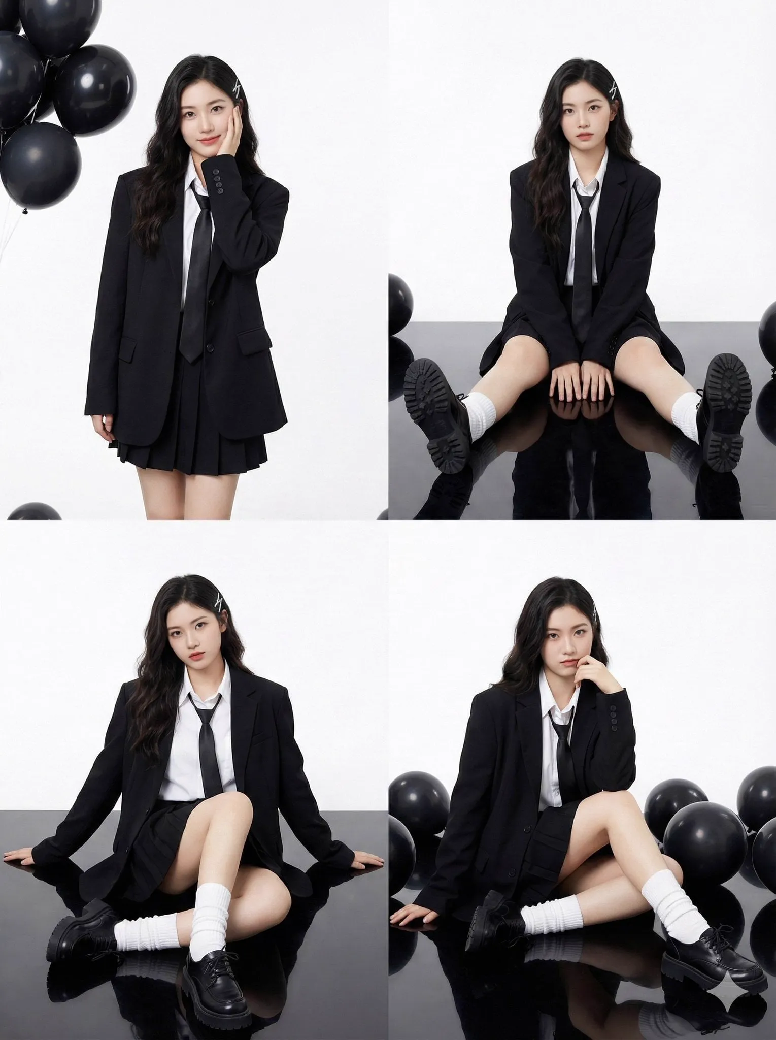
Consistency starts with a reference set. Save a small library of approved images of your main presenter or character — front, three-quarter, profile, and a couple of expressions. When you generate new cover art or new b-roll, feed those references in so the model keeps facial structure, hair, and wardrobe stable. Reusing the same reference set across a series is the single most effective trick for avoiding the uncanny drift that makes a channel look inconsistent.
Beyond the person, standardize:
- A two- or three-color palette used in every title card.
- The same typeface family and weight hierarchy.
- A fixed grid position for logos and episode numbers.
- A repeating visual motif, such as a frame border or a spotlight gradient.
Document these choices in a one-page style sheet. It sounds bureaucratic, but it turns cover design from a decision-heavy task into a mechanical one, which is exactly what you want when publishing several videos a week.
Metadata That Supports the Image
A thumbnail is a visual signal; metadata is the textual one. The two should reinforce each other, not repeat each other.
Titles that describe the payoff
Write titles that state what the viewer gets, not what the video is about. “Three lighting setups for product videos” outperforms “Lighting video part 4.” Keep the title under about 60 characters so it does not get truncated in feed cards, and front-load the specific noun that a searcher would type.
Captions, first lines, and hashtags
The first line of your caption appears next to the cover in some surfaces, so treat it as a headline extension. Use two or three relevant hashtags rather than a wall of them; relevance signals matter more than volume. If the platform supports alt text, write a short description of the cover image — it improves accessibility and adds another textual context signal.
On-screen text as a search asset
Platforms increasingly read on-screen text. If your cover includes a keyword, make sure it is spelled correctly and rendered in clean, high-contrast type. Hand-drawn scrawl or heavily stylized fonts may look distinctive but are effectively invisible to any automated reading.
Testing Covers Without Wasting Production Time
A lightweight A/B process
You do not need a laboratory. A workable loop looks like this:
- Produce two covers that differ in one meaningful variable — subject framing, text presence, or color temperature.
- Publish, and let the video run for a fixed window, such as 48 hours, before judging.
- Compare click-through or view-through rate on the same traffic source, not on total views, which are confounded by posting time.
- Log the result in a simple spreadsheet: date, variable tested, winner.
- Apply the winning pattern to the next three covers, then test something else.
Metrics worth tracking
Impressions-to-views ratio is the closest thing to a pure thumbnail metric. Watch time and average view duration tell you whether the cover over-promised. Saves and shares indicate whether the content matched the hook. If impressions are high but views are low, the cover is the problem. If views are high but retention collapses in the first three seconds, the cover is overselling and you should soften the promise.
Common Mistakes That Kill Click-Through
- Reusing the auto-generated frame. It is chosen by an algorithm optimizing for something other than your brand, and it is often mid-blink or mid-motion.
- Cramming text. Five lines of copy at 1080 pixels wide becomes gray static in a feed.
- Ignoring the bottom safe zone. Captions and interface elements cover the lower fifth of the screen.
- Low-contrast palettes. Pastel-on-pastel looks elegant in a design portfolio and disappears in a scrolling feed.
- Inconsistent branding. If every cover looks like a different channel, recognition never compounds.
- Over-processing. Heavy HDR-style grading and aggressive sharpening look artificial and worsen after platform re-encoding.
- Only designing for one aspect ratio. The vertical master gets cropped somewhere, and the crop is not always where you expect.
Choosing Tools for the Job
The tooling landscape splits into four layers, and most creators need at least three of them:
- Generative video and image models for producing or restyling keyframes and for filling gaps in footage you could not shoot.
- Upscaling and restoration tools for lifting a soft frame to a usable resolution without artifacts.
- A layout or graphic design tool for typography, branding, and multi-ratio export presets.
- A light color and sharpening pass, whether inside your editor or a dedicated utility.
Evaluate each layer against three criteria: how well it preserves identity across a series, how predictable the output is at export, and how quickly it fits into a batch workflow. A tool that produces one spectacular image in ten minutes is less useful than one that produces ten consistent images in the same time.
Practical FAQ
What resolution should a vertical cover image be?
Start from a 2160 × 3840 master and export a 1080 × 1920 delivery file. Also prepare 1080 × 1350 and 1080 × 1080 crops for grids and cross-posting.
Does a separate cover image matter if the platform picks a frame automatically?
Yes. Uploading a dedicated cover gives you control over composition, branding, and text — none of which the automatic picker considers.
How much text belongs on a thumbnail?
Three to five words. Anything more fails at feed size. Use a heavy typeface, high contrast, and a stroke for separation.
Is AI upscaling safe for faces?
At moderate strength, yes. Push it too far and features melt. Always inspect at 200% and compare against the original before committing.
How long should a cover test run?
About 48 hours per variant is a reasonable minimum for short-form content. Longer windows introduce too many external variables.
Can one cover work across every platform?
A single vertical master with a well-defined center safe zone can cover most placements. Prepare alternate crops for grids that force a square.
What file format is best?
JPEG at roughly 80–85% quality for photographic covers. Use PNG only when transparency or flat vector-like graphics are essential.
How do I keep a series looking consistent?
Build a reference image set for your presenter, lock a three-color palette and one typeface, fix logo placement, and export from saved presets every time.
Bringing It Together
High-resolution thumbnails are not a vanity detail. They are the front door of your content, and they are the one asset every viewer sees before deciding whether to spend time with you. Treat cover production as a repeatable pipeline: choose or generate a strong hero frame, upscale with restraint, composite with consistent branding, export from disciplined presets, and support the image with titles and captions that describe the payoff rather than restating it.
Then test. Two variants, one variable, 48 hours, logged result. Over a few months that loop produces something more valuable than any single viral cover: a documented, reusable design system that makes every new video easier to package — and more likely to be clicked.
