
Why Style Range Beats Single-Style Mastery
Most creators find one look that works and then repeat it until the feed stops responding. The look is good, the process is comfortable, and the results are predictable. The problem is that predictability is the enemy of retention in short-form video. Viewers scroll past content they feel they have already seen, even when the subject matter is new.
Style range solves that problem without forcing you to rebuild your entire channel. You keep the same subject, the same voice, the same editing rhythm, but you change the visual grammar of a series. One week your explainer runs as soft Impressionist oil painting, with broken brushwork and shimmering light. The next week the same script becomes crisp cel-shaded animation with flat color blocks and confident outlines. Audiences read the difference instantly, and they stay because the shift signals craft rather than randomness.
The catch is that switching aesthetics is not just a matter of swapping a few keywords. Impressionism and anime sit at opposite ends of a spectrum that includes texture, edge behavior, lighting logic, color theory, and motion. If you treat them as interchangeable style tags, you get mush: half-painted faces, drifting outlines, flickering backgrounds, and characters that change identity between shots.
This guide walks through the whole pipeline — how to describe each aesthetic precisely, how to keep a character recognizable across a style jump, how to choose tools, and how to avoid the mistakes that make AI-generated vertical video look cheap. It is written for creators who publish short vertical clips and want a repeatable process rather than lucky one-offs.
The Two Poles: Impressionist Painting and Anime Aesthetics
Before you type a prompt, it helps to understand what each style actually is at the level of image construction. Models respond to structural language far better than to art-history labels alone.
What makes an Impressionist frame work in motion
Impressionism is defined by visible, broken brushwork, an emphasis on light over outline, and color that vibrates through adjacency rather than blending smoothly. Edges dissolve. Shadows are rarely black — they are violet, blue-green, or warm ochre. Compositions favor ordinary moments: a café table, a riverbank, a figure walking away from camera.
In still images this reads as romantic and immediate. In video it introduces a specific technical risk: heavy texture flickers. When a model regenerates brush texture slightly differently from frame to frame, the whole shot crawls. The viewer may not identify the cause, but the clip feels unstable and low quality.
Practical mitigations that work consistently:
- Reduce texture emphasis in the prompt and let motion blur carry the painterly quality.
- Favor slower camera moves — a gentle push-in or a drifting parallax rather than a whip pan.
- Hold each shot slightly longer than you would with a clean style, because the eye needs time to parse the brushwork.
- Keep the palette limited to four or five dominant hues so the frame reads clearly at thumbnail size.
What makes anime read clearly at small sizes
Anime aesthetics depend on the opposite logic: strong silhouette, deliberate line weight, flat or two-tone shading, and color blocking. A character is recognizable from the outline alone. Hair shapes are graphic. Eyes carry most of the expression. Backgrounds can be detailed, but they are usually separated from the character by contrast and slight focus difference.
This structure is a gift for mobile viewing. Flat color survives compression. Bold outlines remain visible on small screens. High-contrast eyes read even at the size of a thumbnail.
The risk with anime is the reverse of Impressionism: it can look too clean, too flat, and therefore generic. If every shot is the same two-tone face against a gradient sky, viewers stop registering it as a style and start registering it as a filter.
A useful mental model: Impressionism asks the model to paint light, anime asks the model to draw shape. Every prompt decision should reinforce one or the other.
Building Prompts That Survive a Style Jump
Style-jumping fails most often because creators describe the style but forget to describe the shot. A prompt that only says "impressionist painting of a woman" gives the model enormous freedom, and a sequence generated from such prompts will drift. Anchor the constants first, then the style.
Describe light before style
Lighting is the shared language between both aesthetics. If the light setup stays identical while the rendering style changes, the two clips feel like part of the same series. Write the light down as a fixed token — "low golden light from camera left, long soft shadows" — and reuse it verbatim.
Use a reusable prompt skeleton
[medium and technique], [subject and wardrobe], [action or pose], [environment], [lighting], [palette], [camera and lens], [aspect ratio], [negative list]
An Impressionist version might read: "oil painting with visible broken brushwork, a baker in a linen apron carrying a tray of bread, mid-stride, small village street at dawn, low golden light from camera left with long soft shadows, palette of dusty rose, cream, sage and violet, medium shot at eye level, 50mm feel, vertical 9:16, no harsh black shadows, no digital sharpening."
The anime counterpart for the same beat: "cel-shaded animation, a baker in a linen apron carrying a tray of bread, mid-stride, small village street at dawn, low golden light from camera left with long soft shadows, palette of dusty rose, cream, sage and violet, clean line art with two-tone shading, medium shot at eye level, vertical 9:16, no photorealistic skin texture, no gradient mesh."
Notice what stayed the same: subject, wardrobe, action, environment, light, palette, framing, aspect ratio. Only the medium tokens changed. That is the entire trick. Style lives in the medium clause; continuity lives everywhere else.
Build a tiny style dictionary
Rather than inventing phrasing each time, keep a short list of medium tokens that reliably produce each look. You will add to it as you test.
Impressionist-leaning tokens: broken brushwork, impasto texture, visible strokes, optical color mixing, soft dissolving edges, plein air, pastel ground, hazy atmosphere.
Anime-leaning tokens: cel shading, two-tone shadow, clean line art, flat color fill, graphic silhouette, anime key visual, limited palette background painting, expressive eye highlights.
Fusion tokens (useful for background/character separation): painted background with animated character, gouache background plate, watercolor environment, brush-textured backdrop behind flat-shaded figure.
Keep the dictionary in a text file and paste from it. Consistency comes from repetition, not from creativity in the prompt box.
Consistency Across a Sequence
A single beautiful frame is a demo. A sequence of frames that share a character and a world is a video. Consistency is where most short-form AI projects collapse.
Lock identity with language, not just references
Reference images help, but they are not a substitute for explicit description. Whenever possible, write the character's permanent attributes into every prompt in the same order: hair shape and color, eye color, skin tone, signature garment, accessory. Models weight early tokens more heavily, so identity details belong near the front.
Reuse seeds and anchors deliberately
When a generation nails the look you want, keep the seed and change only the action clause. This produces variation within a stable aesthetic instead of a new aesthetic every shot. If your tool supports style reference or image-to-image, build one anchor frame per series and carry it through every beat.
Separate the character from the world
For fusion looks, generate backgrounds and characters as separate layers where the workflow allows, then composite. A hand-painted Impressionist background plate behind a cel-shaded character gives you the best of both aesthetics and removes the model's temptation to smear one into the other.
Track palette drift
Palette drift is the quiet killer. You start with dusty rose, cream, and sage, and by shot four the scene has gone teal and orange. Re-read your prompt list before rendering and check that the palette tokens are identical across the batch. If a shot drifts, fix the palette rather than re-rolling everything.
A Practical Workflow From Idea to Vertical Clip
Here is a workflow that scales from a single clip to a weekly series without turning into a full-time job.
Step 1: Write a beat sheet before you prompt
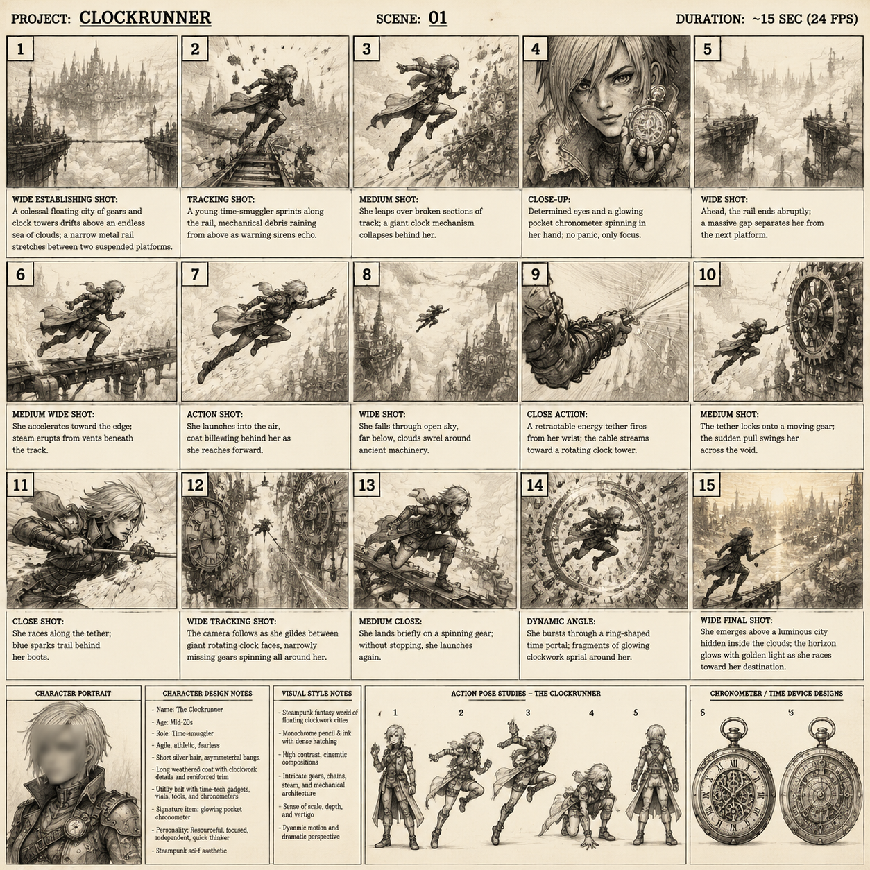
Twenty to thirty seconds of vertical video holds roughly six to nine beats. Write them as one-line actions: the baker steps out, the tray tilts, a cat crosses, the bread steams, she laughs, the door closes. Every beat becomes one generation or one short shot. Writing the beats first prevents the classic mistake of generating ten gorgeous unrelated images and then trying to force a story out of them.
Step 2: Produce one style anchor frame
Render a single frame that defines the series: the character, the environment, the light, the palette, and the medium, all in one image. Do not move on until this frame feels right. Everything downstream inherits from it.
Step 3: Generate keyframes per beat
Use image-to-image or reference conditioning with the anchor frame, changing only the action and framing clauses. Generate two to three variations per beat and pick the one that maintains silhouette clarity and palette alignment.
Step 4: Add motion with restraint
Animate using short clips, then slow them slightly in the edit. What you want is weight and follow-through, not spectacle. A trembling hand, drifting steam, moving light, and a subtle camera push will feel more cinematic than a flying camera move, especially in a painterly style where aggressive motion destroys the texture.
Step 5: Assemble for rhythm
Cut on action and on beat. Vertical edits benefit from a visible rhythm — roughly one shot per two to three seconds for fast sections, longer holds for painterly beauty shots. Add a transition only when it carries meaning; a hard cut works almost everywhere.
Step 6: Grade, caption, and sound
Apply one grade to the whole sequence so the differing styles sit inside a single visual world. If you are alternating Impressionist and anime shots in one video, a shared grade plus a shared grain layer will make the switch feel intentional. Add captions above the vertical safe zone, and build the audio bed with one clear rhythmic anchor so cuts land cleanly.
Tool Choices and Decision Criteria
Tool selection matters less than process, but the wrong pipeline will fight you every step.
Image-first versus video-first
Image-first pipelines give you precise control over style, character, and composition, then add motion. Video-first pipelines are faster but harder to control, and style drift between shots is common. For style-jumping series, image-first almost always wins. For single-shot mood pieces, video-first is fine.
Text-only versus reference-driven
Text-only prompting is fast and portable but struggles with character consistency. Reference-driven workflows — style reference images, character sheets, control images for pose and depth — cost more setup and pay back immediately in reusable series.
Resolution, duration, and aspect ratio
Generate at the highest reasonable resolution and downscale for delivery rather than upscaling small frames. Keep native vertical framing rather than cropping landscape renders, because cropping ruins composition and clips heads. Aim for short base clips and assemble duration in the edit; long single generations tend to drift.
Hosted versus local
Hosted tools win on convenience, iteration speed, and access to the newest models. Local setups win on privacy, unlimited experimentation, and fine-grained control through node-based workflows, but they demand hardware and patience. A hybrid approach is common: iterate quickly on hosted tools, then reproduce the winning recipe locally for full sequences.
Style Fusion: Brushwork Plus Cel Shading
Mixing the two poles is the most interesting creative territory, and it is also where things go wrong fastest.
A reliable approach is separation by layer: painted backgrounds, flat-shaded characters, and a shared grade over the top. This mirrors traditional animation practice, where background artists and character animators deliberately worked in different media.
Another approach is separation by depth: keep the subject in crisp cel shading and let the far background dissolve into loose brushwork. The eye reads the contrast as atmospheric perspective rather than as a mistake.
A third approach is separation by time: open the clip in Impressionist paint and transition into anime as the narrative shifts. A match cut on a brushstroke that becomes a line, or a palette flash, makes the change feel authored.
What never works is describing both aesthetics in the same clause with equal weight. "Impressionist anime" as a bare phrase produces an averaged mush. Specify which element gets which treatment, and be explicit about it.
Common Mistakes That Break the Illusion
- Over-prompting. Stacking thirty adjectives collapses the render toward an average look. Four to six strong tokens beat twenty weak ones.
- Style drift across a sequence. Usually caused by changing multiple prompt clauses at once. Change one axis per generation.
- Excessive motion. Painterly styles break under fast camera movement and heavy animation.
- Wrong aspect ratio. Generating landscape and cropping to vertical destroys composition and amputates heads.
- Ignoring temporal flicker. Texture and line weight need to be stable between frames or the clip reads as unstable.
- Incompatible lighting. A hard-edged anime rim light next to a diffuse Impressionist scene looks pasted together.
- No visual throughline. If the styles change, something else must stay constant — palette, subject, grade, or sound design.
- Caption collision. Facial detail in vertical video belongs in the upper-middle third, away from platform interface elements.
Publishing: Hooks, Ratios, and Sound
The first second decides everything. In a painterly clip, open on the most striking light in the sequence. In an anime clip, open on the strongest silhouette or the most expressive eyes. Do not open with a wide establishing shot unless the environment itself is the hook.
Keep captions short, high-contrast, and clear of the bottom quarter of the frame. Loop where possible: if the last beat flows into the first, watch time increases measurably. Sound design carries more weight than most creators expect — a single ambient bed plus two or three well-placed effects will do more for perceived production value than another round of renders.
Finally, treat the style itself as the series branding. If your audience knows that Monday means brushwork and Thursday means cel shading, the aesthetic becomes a schedule they tune in for rather than a gimmick.
Frequently Asked Questions
Can one model handle both Impressionism and anime well?
Many general-purpose models handle both acceptably, but quality is uneven. Test the same prompt skeleton across two or three models and compare edge behavior, texture stability, and palette accuracy. Specialized fine-tunes often beat general models for the specific look you need.
How do I stop my character from changing between shots?
Write identity attributes in a fixed order at the start of every prompt, reuse seeds, and carry one anchor frame through the sequence with reference conditioning. If identity still drifts, simplify the wardrobe and hair — fewer distinguishing details are easier to hold.
Why does my painterly video flicker?
Texture is being regenerated slightly differently each frame. Lower texture emphasis, slow the camera, hold shots longer, and add a light grain or motion-blur pass in the edit to unify frames.
Is a brush-painted background behind an animated character practical?
Yes, and it is one of the most effective fusion looks. Generate background plates and characters separately, composite them, then apply a single grade to bind them.
How many beats should a thirty-second vertical clip have?
Six to nine. Fewer feels slow unless the visuals are exceptional; more becomes a blur and loses the story.
Should I generate long clips or short ones?
Short base clips assembled in the edit. Long generations drift in style and motion quality, and they are harder to fix.
Do I need reference images to get a consistent style?
Not strictly, but text-only consistency requires disciplined prompt reuse. References cut iteration time dramatically for recurring series.
How do I choose between Impressionist and anime for a given topic?
Match the emotional register. Impressionist treatments suit memory, nostalgia, nature, food, and quiet character moments. Anime treatments suit action, fantasy, technology, comedy, and expressive dialogue. When in doubt, test the same beat sheet in both and compare retention in a small rollout.
Key Takeaways
Style-jumping is a production discipline, not a lucky prompt. Fix your light, palette, subject, and framing, then change only the medium tokens. Separate identity language from style language. Build an anchor frame and reuse it. Layer your fusion looks instead of describing them in one muddled clause. Keep motion restrained, grade everything together, and treat each aesthetic as a series rather than a novelty.
Do those things and the same script can carry two completely different visual worlds — which means your channel gets twice the range without twice the audience fatigue.
