

Why vertical framing breaks so often
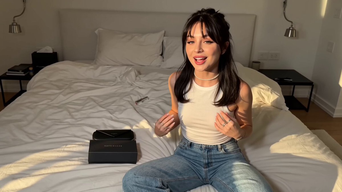
Almost every creator runs into the same wall. You shoot something beautiful in 16:9, upload it to Instagram, and the app slices the sides off. A hand disappears mid-gesture. A logo gets cut in half. Subtitles land under the caption overlay. The edit you spent hours polishing suddenly looks like a mistake.
The root cause is simple: horizontal video stores information across the width of the frame, while vertical video stores information down the height. Instagram's Reels and Stories surfaces are tall and narrow. When you push a wide frame into a tall window, something has to give — and the platform's default behavior is to crop, not to letterbox. That single design decision creates most of the frustration people describe as "the dimensions problem."
There is a second layer too. Cropping is not just a geometry operation. It changes storytelling. In a wide shot of two people talking, the crop might keep one face and delete the other. In a product demo, the crop might remove the exact detail you were demonstrating. In a talking-head interview, the crop might slice off the top of the head while leaving dead space at the chin. The fix is rarely a single setting. It is a way of planning, shooting, and finishing that assumes vertical delivery from the start.
This guide walks through the formats, the safe zones, the three practical ways to convert horizontal footage, the workflow that keeps quality high, and the mistakes that quietly cost you reach.
Instagram's format map: what actually gets shown
Instagram is not one canvas. It is several, and each one has its own preferred shape. Knowing the map before you edit saves enormous rework later.
Reels and Stories: the 9:16 standard
Reels and Stories are built around a 9:16 vertical frame. In practice, that means an export of 1080 × 1920 pixels. You can deliver larger, but 1080 × 1920 is the safe, efficient baseline that most encoders handle cleanly. Anything narrower or wider will be padded or cropped by the app, and you lose control of where the cut lands.
Because these surfaces occupy the entire phone screen, they also come with interface overlays that sit on top of your video: profile name and caption text near the bottom, action buttons along the right edge, navigation at the top. Those overlays are the reason safe zones matter more on vertical video than almost anywhere else.
Feed video: the flexible, awkward middle
Feed video is more forgiving but less predictable. A 4:5 portrait crop typically takes up the most screen real estate in the feed, which is why many marketers standardize on 1080 × 1350 for feed posts. Square 1:1 still works and remains a reasonable compromise when a clip has to live in multiple places. Horizontal 16:9 feed video is supported, but it occupies a smaller band and tends to perform worse in a scrolling feed because it looks like an advertisement rather than native content.
Carousels, covers, and thumbnails
Even when your video is perfect, the cover image is often seen first. A Reel cover is displayed in a grid, cropped to a square-ish tile, and overlaid with interface elements. If your cover is a 9:16 frame with text near the top and bottom, the grid crop will remove it. Design covers as a separate asset with the subject centered and a generous margin.
The practical takeaway
Pick one primary delivery format per campaign and build everything around it. If Reels are the goal, plan for 1080 × 1920 and treat feed versions as derivatives, not as the master.
Safe zones: the geometry you should memorize
Safe zones are the areas of the frame that survive cropping, overlays, and small-screen viewing. They are not official universal constants — Instagram changes its interface over time — but the working conventions below are reliable enough for production.
- Outer margin: keep roughly 5–8% of the frame width clear on all sides. Anything in this band risks being clipped when the video is displayed on a device with a different aspect ratio, or when the app applies its own crop.
- Top zone: the upper 10–14% is where the app may place navigation or a status bar. Avoid critical text here.
- Bottom zone: the lower 20–25% is where captions, usernames, and audio attribution tend to appear. This is the single most common place creators lose subtitles.
- Right edge: the action buttons (like, comment, share) live in a vertical strip on the right. Keep faces and key text out of that column.
A useful habit is to create a transparent overlay PNG with these bands marked, then drop it on top of your timeline while editing. Toggle it on and off. After two or three projects you will internalize the zones and stop needing it — but during a fast turnaround week, the overlay is faster than memory.
Three ways to convert horizontal footage (and when each wins)
Once you accept that Instagram wants vertical, you have three broad strategies. Each has a cost, and the right choice depends on how much of the original composition matters.
1. Crop and reposition
The simplest approach: scale the horizontal clip up until it fills a 9:16 frame, then animate the position over time so the frame follows the subject. This is often called pan-and-scan or keyframed reframing.
Advantages: fast, native-looking, no artificial borders, works with any editor.
Costs: you lose roughly 70% of the original horizontal field of view, effective resolution drops because you are enlarging a smaller area, and any horizontal motion in the shot becomes harder to follow.
Crop-based reframing works best for:
- Single-subject shots where the subject stays roughly in one place
- Product close-ups and detail shots
- Screen recordings where the important region is a window or panel
- Talking heads where the eyes and mouth are the entire story
It works poorly for wide establishing shots, group scenes, and anything where the relationship between left and right sides of the frame carries meaning.
2. Pad and blur
Instead of cropping, you place the full horizontal clip in the center of a vertical canvas and fill the empty top and bottom with a blurred, scaled copy of the same footage, a solid color, or a branded gradient.
Advantages: nothing is lost, motion stays readable, the edit is trivially fast.
Costs: it reads as less native, the subject occupies a smaller share of the screen, and repeated use across a feed can look repetitive.
Pad-and-blur is the right call for tutorial walkthroughs, screenshot-heavy explainers, and footage you do not have the rights or time to re-cut. It is a legitimate style, not a failure — but it should be a deliberate choice, not a default.
3. Generative reframing and outpainting
This is the newest and most interesting option. Instead of choosing between loss and letterboxing, you let a model analyze the frame and decide what to keep, what to move, and what to invent. Two techniques dominate:
- Intelligent reframing: the model tracks subjects, faces, and motion, then generates a smooth, intentional camera path through the original frame. It effectively acts as a virtual camera operator who knows the rules of vertical composition.
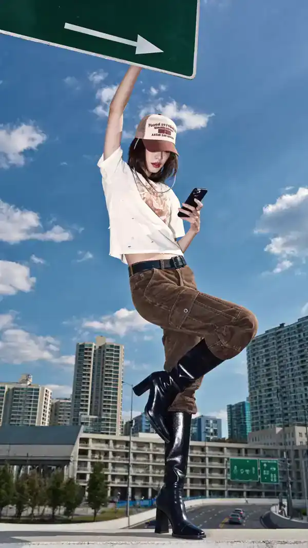
- Outpainting (generative fill): the model extends the scene beyond its original borders, painting plausible content into the empty top and bottom of the vertical canvas. A wide shot of a beach becomes a tall shot of a beach.
Generative approaches are strongest when the added area is simple: skies, walls, grass, water, blurred backdrops, fabric. They are weakest when they must invent precise structure — text, hands, architectural details, faces in the background. Always review generated areas frame by frame before publishing; a three-second hallucination in the background is the kind of detail audiences notice more than you would expect.
A production workflow: from 16:9 master to native Reel
The most reliable way to avoid crop disasters is to treat vertical delivery as part of production, not as a post-production rescue.
Step 1: Decide the vertical frame before you shoot
If you know a project will live on Instagram, frame the original shot with a vertical crop in mind. Keep subjects closer to the center than feels natural for a wide shot. Leave headroom that can survive a tighter crop. Avoid placing critical action at the extreme left or right edges.
Step 2: Capture at the highest reasonable quality
Because cropping enlarges a portion of the frame, you want as much source detail as you can get. Shoot 4K or higher even if you deliver 1080 × 1920. Slow motion is worth capturing at a higher frame rate than you plan to deliver, so you retain the option to retime.
Step 3: Build a vertical timeline, not a horizontal one
Create the sequence at 1080 × 1920 from the start. Bring in the horizontal master as a source clip and reframe within the vertical timeline. This forces you to confront framing decisions early, while you still have time to change them.
Step 4: Add guide overlays and check every shot
Scrub through the timeline with safe-zone guides visible. Ask three questions at each cut: Is the subject's face clear of the right-hand button column? Is any text inside the central safe area? Does the crop cut through any element that reads as a mistake rather than a choice?
Step 5: Handle audio before you polish
Vertical video is watched with sound on more often than feed video, but it is also watched in public spaces. Make sure dialogue is normalized, music is ducked under speech, and the first two seconds carry enough visual information to work even on mute.
Step 6: Export deliberately
Export H.264 or H.265 at a high bitrate — roughly 10–20 Mbps for 1080 × 1920 is a sane range — with a standard color profile. If you are delivering HDR, verify how it appears on a phone before committing, because HDR mistakes look far worse than a slightly soft image.
Step 7: Review on an actual phone
There is no substitute. A desktop preview lies about scale, contrast, and how much of the frame the interface covers. Watch the export on the smallest phone you can find, with the caption visible.
Building a repeatable pipeline
Once you have made ten or twenty vertical edits, the process becomes mechanical. Speeding it up further is mostly about systems.
Templates. Build a master vertical project with pre-made safe-zone guides, a lower-third style that sits above the caption area, a subtitle preset, an end card, and export settings already configured. Starting from a template removes dozens of small decisions.
Proxies. When working with 4K or higher source footage, generate lower-resolution proxies for editing and relink to full resolution at export. Reframing is GPU-heavy, and proxies keep the timeline responsive.
Reusable reframe presets. If your editor supports it, save keyframe paths for common shot types: a slow push toward a centered subject, a lateral drift for a product pan, a hold for a talking head. Applying a preset and nudging it is faster than keyframing from zero.
Batching. Group similar clips and process them together. Switching between creative work and mechanical work costs more time than most people realize.
Review loops. Share a rough cut on a phone-viewable link rather than exporting files. Feedback on framing is only meaningful when the reviewer sees the same crop the audience will.
Common mistakes that hurt vertical video
Cropping after you have already color graded and added titles. Titles placed for 16:9 will land outside the vertical safe area, and grain or sharpening applied at full width will look strange after enlargement. Reframe first, finish second.
Trusting a single keyframe. A static crop on a moving subject drifts. Even a slow, almost imperceptible position drift keeps the composition alive and prevents the subject from sliding toward an edge.
Ignoring the top and bottom entirely. Many creators protect the bottom from captions but forget the top, where the app may place interface elements. Both matter.
Using a 16:9 thumbnail. The grid crop will not respect it. Design covers separately.
Over-relying on generative fill. Generated regions are convincing in motion and only for a few seconds. Long static shots with obvious invented detail invite scrutiny.
Enlarging beyond what the source supports. If you start with 1080p horizontal and crop hard to vertical, you are upscaling heavily. Use a dedicated upscaling tool or accept softer output rather than relying on a default scaler.
Forgetting alternate aspect ratios. A clip that works at 9:16 may be unusable at 1:1 if the subject sits near the top. Check the derivative formats you actually plan to publish.
Choosing an approach: a decision framework
Use these questions to pick a strategy quickly.
- Does the composition depend on horizontal relationships? If two subjects interact across the frame, cropping will destroy meaning. Consider padding or generative extension.
- How much resolution headroom do you have? If the source is 4K or higher, aggressive cropping is viable. If it is 1080p, cropping hard to vertical will soften noticeably.
- How much motion is in the shot? Fast lateral motion is difficult to track with keyframes and even harder for automated reframing. Consider re-shooting or padding.
- Is the surrounding area predictable? Skies, plain walls, and blurred backgrounds extend convincingly. Text, signage, and hands do not.
- How fast is the turnaround? For daily posting, a saved preset plus pad-and-blur is often the pragmatic answer. For campaign hero content, invest in a proper reframe.
A realistic default: crop and keyframe for single-subject footage, pad and brand for explainers, generative reframe for hero clips where the extra polish justifies the review time.
Tooling notes
You do not need an exotic stack. A capable non-linear editor with keyframe support handles most reframing work: DaVinci Resolve, Adobe Premiere Pro, Final Cut Pro, and CapCut all manage it well. For automated tracking, Resolve's subject tracking and Premiere's auto-reframe features get you close quickly, and manual refinement handles the rest.
For generative extension and intelligent reframing, dedicated AI video tools vary widely in how well they preserve faces, text, and motion continuity. Test a short clip before committing a long sequence. Mobile-first editors are useful for quick turnarounds and template-based workflows, though they offer less control over keyframe curves and safe-zone precision.
Two supporting utilities are worth having: a subtitle tool that supports vertical safe-area presets, and a preview utility that simulates a phone screen with interface overlays. Both remove guesswork from the final check.
FAQ
What is the best resolution for Instagram Reels?
1080 × 1920 pixels at a 9:16 aspect ratio is the standard. Higher resolutions are accepted and can look sharper, but 1080 × 1920 keeps file sizes manageable and playback reliable.
Can I post horizontal video on Instagram?
Yes, but it will be displayed in a smaller band within the vertical canvas, often with padding. Reach and watch time tend to suffer because it looks less native in a scrolling feed.
Should I crop or letterbox?
Crop when the subject is a single focal point and you have resolution headroom. Letterbox or extend when horizontal composition carries meaning or the source is low resolution.
How much of my frame is actually safe?
Assume the outer 5–8% is at risk, and protect the bottom 20–25% and the right-hand strip from any critical content. Keep captions and key text inside a centered safe rectangle.
Does generative reframing really work?
It works well when the added area is simple and consistent. It fails on text, complex architecture, and hands. Always review generated regions closely at full speed, not just as stills.
Why does my video look softer after reframing?
Because cropping to vertical enlarges a smaller region of the original frame. Shooting at 4K or higher gives you the headroom to crop without visible quality loss.
How long should a Reel be?
Length should serve the idea. Short clips under fifteen seconds tend to loop well; longer clips are fine when the content holds attention. The framing problem, not the duration, is usually what suppresses performance.
Do I need to re-edit for feed posts?
If you plan to publish the same clip to feed, generate a second export at 4:5 or 1:1 and check that the subject is still fully visible. Reusing a 9:16 export in the feed usually means either heavy padding or an awkward crop.
Final checklist before you publish
- Confirm the export is 1080 × 1920 at 9:16
- Scrub the timeline with safe-zone guides enabled
- Check that no face or text sits under the bottom caption zone
- Verify the right-hand button column is clear
- Watch the full export on a phone with the caption on screen
- Confirm the cover image is designed for a square grid crop
- Check audio levels and confirm the first two seconds work on mute
- Export derivative formats only after the vertical master is approved
Framing problems are rarely about a single dimension number. They come from treating vertical delivery as an afterthought. Plan the tall frame early, protect the zones the interface occupies, choose the conversion strategy that matches the footage rather than the one that is fastest, and review on the device your audience actually uses. Do that consistently, and cropping stops being a recurring emergency and becomes just another step in production.
