
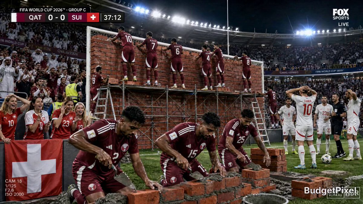

Why Photorealistic AI Images Fail Before the Model Even Runs
Most people blame the model when an AI image looks wrong. The skin is waxy, the eyes are glassy, the background melts into soup, and the hands look like they were drawn by someone who has heard about hands but never seen one. Swapping to a newer model helps for about a week, then the same problems return in slightly higher resolution.
The uncomfortable truth is that the majority of realism failures are input failures. Image models are extraordinarily literal machines. They do not know what a "professional photo" is in the abstract. They only know how you described light, distance, lens behavior, material, and moment. When those are missing, the model fills the gap with the statistical average of everything it has ever seen — and the statistical average of a photograph is a flat, evenly lit, slightly fake-looking picture.
So it helps to define photorealism operationally instead of as a vibe. A convincing synthetic photograph passes four tests at the same time:
- Optical plausibility. The depth of field matches the focal length. Bokeh has the right shape. Perspective is consistent between foreground and background.
- Light plausibility. There is an identifiable source, a direction, a colour temperature, and a reason for every shadow.
- Material plausibility. Skin has subsurface warmth, fabric has weave, metal reflects the environment rather than a generic gradient.
- Imperfection plausibility. Real photographs contain noise, dust, lens artifacts, stray hairs, wrinkles, and slightly imperfect framing.
If your prompt addresses two of those four, you get an image that reads as "AI-generated" even when the anatomy is flawless. The rest of this guide is about closing that gap — and about the specific prompt habits that quietly sabotage you.
The Prompt Mistakes That Flatten Realism
These are the recurring errors that show up again and again in failed generations. Each one is easy to fix once you can name it.
Mistake 1: Stacking quality adjectives instead of describing physics
Words like hyperrealistic, 8K, ultra-detailed, masterpiece, award-winning, best quality do very little work. They are not descriptions; they are wishes. A model has no reliable internal definition of "8K" and cannot verify "award-winning." Worse, adjective stacks often displace the tokens that would have actually controlled the image.
Replace adjectives with physical statements:
- Instead of "ultra-detailed portrait," write "visible skin pores on the cheekbone, fine peach fuzz catching the window light."
- Instead of "cinematic lighting," write "single warm window at camera left, soft falloff, cool blue ambient fill from an overcast sky behind."
- Instead of "sharp focus," write "focus plane on the near eye, background fades to soft circles at f/2."
You are not writing marketing copy. You are writing a lighting diagram.
Mistake 2: Mixing camera instructions that cannot coexist
"Wide angle macro shot with telephoto compression and full-frame depth of field at f/1.2 from ten metres away" is an instruction set no camera can satisfy. Models respond by averaging your contradictions into mush. Keep one coherent optical story per prompt: one focal length, one aperture, one distance, one point of view.
Mistake 3: Leaving the light source unnamed
Undeclared lighting is the single most common reason images look plastic. If you do not say where light comes from, the model defaults to frontal, even, source-less illumination — the visual equivalent of a passport photo taken with a flash.
Always answer three questions: what emits the light, where is it relative to the subject, and what is it reflecting off? "Overcast daylight through a north-facing window, bounced off a white wall" produces radically different results from "golden hour sun low behind the subject."
Mistake 4: Repeating keywords to force a result
Repeating a word five times is a blunt instrument. It eats your limited context, flattens sentence structure, and often produces an exaggerated, cartoonish version of the thing you wanted. If a concept is not landing, the fix is almost always better phrasing or a reference image, not more repetition. Weighting syntax exists in some tools, but it is a seasoning, not a strategy.
Mistake 5: Asking for a style when you want a photograph
Naming an illustrator, a painter, or a render engine pulls the output toward illustration. If you want a photograph, reference photographic language: film stock, sensor size, lens family, lighting setup, era of camera. "Shot on a 35mm rangefinder with Portra-style colour" gets you much closer than any painter's name.
Mistake 6: Describing a subject instead of a moment
"A woman in a red coat" is a subject. "A woman in a red coat stepping off a kerb mid-stride, coat hem still lifting, caught a half second before her foot lands" is a moment. Moments carry motion, weight, and micro-expression — the details that make viewers believe an image was captured rather than constructed.
Mistake 7: Ignoring negative space and framing intent
Real photographs are composed. They have a subject placed deliberately within a frame, headroom, and often some untidy background. Prompts that only describe a subject and never describe framing produce centred, symmetrical, catalogue-style images. Say what should be in the frame, what should be cropped, and what is deliberately out of focus.
A Prompt Skeleton That Survives Model Swaps
Different tools reward slightly different phrasing, but a block-structured prompt transfers well. Write in this order, and drop any block that does not matter for the shot:
- Medium and capture. "Photograph, 35mm, natural light."
- Subject and moment. Who or what, doing what, at which instant.
- Environment. Location, time of day, weather, background contents.
- Light. Source, direction, colour temperature, quality (hard/soft), bounce surfaces.
- Optics. Focal length, aperture, distance, focus plane, depth of field.
- Material and texture. Skin, fabric, metal, dust, wear.
- Mood and imperfection. Grain, slight motion blur, lens flare, imperfect framing.
A working example:
Photograph. A baker in a flour-dusted apron lifting a tray from a deck oven, hands mid-lift, steam curling upward. Small neighbourhood bakery interior at 6am, tiled walls, stacked metal trays out of focus behind. Warm tungsten overhead plus cool blue pre-dawn light through the front window, hard specular highlight on the tray edge. 50mm lens at f/2.8, subject three metres away, focus on the hands, background falls off softly. Fine flour particles suspended in the air, sweaty forehead, cotton apron weave visible. Slight grain, handheld framing, horizon tilted a touch.
Notice how little of that is adjective. Almost every clause describes something physically present.
Lighting Decides Realism
If you can only improve one thing, improve lighting. Lighting is not a mood setting; it is geometry.
Name the source, plus one bounce
A single light source plus one reflective surface immediately produces believable shading. "Soft light from a large window, bounced off a pale wooden floor" gives you a warm underlight that no generic "studio lighting" prompt will produce.
Separate key, fill, and rim
Professionals rarely light with one lamp. Even natural scenes have a key (the sun), a fill (the sky or a wall), and often a rim (a bright surface behind the subject). Mention at least two, and describe their relative strength. "Warm key at camera right, dim cool fill from behind" is a complete lighting recipe in nine words.
Respect colour temperature
Mixed lighting is what makes a photograph feel real and slightly imperfect. Tungsten interior warmth against daylight from a window is a classic. Pure single-temperature lighting looks like a rendering.
Decide hard versus soft
Hard light produces crisp-edged shadows and strong specular highlights. Soft light produces slow gradients and gentle transitions. Naming which one you want prevents the model from splitting the difference, which is the visual hallmark of synthetic imagery.
Camera, Lens, and Motion Language That Reads as Real
Optical language is the second lever. It tells the model how the scene should be seen, not just what exists in it.
- Focal length controls spatial compression. 24mm exaggerates depth and edges; 85mm flatters faces; 200mm stacks layers.
- Aperture controls how much falls out of focus. Shallow depth of field hides background detail, which is useful when your scene description is thin.
- Distance and angle control intimacy. Eye level at one metre feels personal; a high wide angle feels observational; a low angle adds weight.
- Shutter behaviour controls motion. "Slight motion blur in the hands" reads as a real capture; frozen everything reads as CGI.
- Sensor character controls texture. Slight luminance noise, mild vignetting, and a hint of chromatic aberration in the corners are subtle but persuasive.
For video prompts, add camera movement only when you need it. "Slow dolly in" or "static tripod shot" is enough. Stacking three simultaneous movements produces a drift that looks processed rather than shot.
Reference Images, Character Consistency, and Multi-Image Control
Text alone is a weak tool for consistency. If you need the same face, product, or location across many frames, references do the heavy lifting.
Use references for identity, text for behaviour
A reference image is excellent at fixing a face, a jacket, or a room. It is poor at specifying an action. So split the work: reference for who and where, prompt for what is happening and how it is lit.
Keep the reference clean
References with strong existing lighting fight your prompt. A flat, evenly lit reference shot gives the model more freedom to relight the scene to match your description.
Reuse seeds where the tool allows
Seeds are not magic, but they reduce random variation between iterations. Keep the seed fixed while you adjust one variable at a time — lighting, then framing, then texture — and you will learn what actually drives the result instead of guessing.
Expect identity drift, plan for it
Long sequences drift. Generate a small set of anchor frames first, approve them, then use those anchors as references for everything downstream. Repairing drift later is much more expensive than preventing it.
Texture, Skin, and Materials Without the Plastic Look
The plastic look comes from missing micro-detail and from over-clean surfaces. Realism lives in the small, ugly stuff:
- Skin: visible pores in the T-zone, slight shine on the forehead, fine lines at the eyes, uneven tone, tiny stray hairs along the jaw.
- Fabric: denim weave at the knee, a soft crease where the elbow bends, lint, a slightly frayed cuff.
- Metal and glass: reflections that contain hints of the actual environment rather than a blank gradient, plus fingerprints or a fine scratch.
- Environments: dust on a shelf, water rings on a table, scuffed floorboards, a crooked picture frame.
A useful rule: every object in your scene should have one piece of evidence that it has been used. That single clause per object does more for believability than any quality adjective.
A Four-Pass Workflow From Brief to Final Frame
Trying to nail everything in one generation is the slowest path. Split the work.
Pass 1 — Composition. Ignore beauty. Generate rough frames to lock subject placement, crop, and camera angle. Accept ugly output at this stage.
Pass 2 — Lighting. Freeze composition and iterate only on light direction, quality, and colour. This is where the image starts to feel photographed.
Pass 3 — Detail. Add the material clauses: skin, fabric, wear, and environment evidence. Check hands, eyes, and edges here.
Pass 4 — Finish. Apply mild grain, vignette, and colour grading. If your tool supports inpainting or region editing, fix the one or two problem areas rather than regenerating the whole frame.
Between passes, change only one variable. If you change lighting and framing together and the result improves, you have learned nothing reusable.
Troubleshooting the Most Common Failure Modes
- Waxy, doll-like faces. Cause: no skin micro-detail, flat frontal light. Fix: add pores, shine, and a directional key with visible shadow.
- Background looks like a painted backdrop. Cause: no environment specifics, no depth-of-field instruction. Fix: name three concrete background objects and specify what falls out of focus.
- Everything is evenly lit and boring. Cause: no named source. Fix: state source, direction, and one bounce surface.
- Oversaturated, glowing colours. Cause: unresolved mood adjectives stacking. Fix: describe time of day and colour temperature instead.
- Warped hands or tools. Cause: hands are doing something vague. Fix: describe the grip and the object's interaction with the hand, and generate more variations.
- Composition is dead centre and flat. Cause: no framing intent. Fix: specify angle, distance, and what gets cropped.
- Same character changes between shots. Cause: text-only prompting. Fix: anchor frames plus reference images, fixed seeds.
- Image looks illustrated. Cause: style-name contamination or missing optical language. Fix: remove artist names, add film stock and lens language.
Print that list. Nine out of ten disappointing generations map to one of those rows.
FAQ: Photorealistic Prompting
How long should a prompt be? Long enough to cover light, optics, subject, and one imperfection. Somewhere between 40 and 120 words is a productive range. Past that, you are usually repeating yourself.
Do quality adjectives help at all? Rarely on their own. A single tonal word such as soft or harsh can steer lighting usefully. Long chains of superlatives mostly consume space.
Should I use negative prompts? If your tool supports them, yes — but keep them short and concrete: blurred, extra fingers, watermark, text, plastic skin. Long negative lists act like a second prompt and distort the result.
Why do my images look great small and terrible zoomed in? Micro-detail is missing. Add texture clauses and finish with a light grain pass. Upscaling cannot invent structure that was never described.
Can one prompt work across multiple tools? The block structure transfers well; the exact phrasing does not. Re-test any prompt in a new model with one quick generation before committing to a sequence.
What is the fastest way to improve? Keep a prompt log. Save the prompt, the seed, and the output for every generation you like. Patterns emerge within a week, and you stop re-solving problems you already fixed.
Is it acceptable to generate realistic people? Follow the rules of the platform you use, avoid depicting real identifiable people without consent, and be transparent about synthetic imagery where it could mislead. Realism is a technical skill, not a licence.
The Short Version
Photorealism is not a setting you switch on. It is the sum of named light, coherent optics, described material, and deliberate imperfection. Fix the prompt mistakes first — unnamed light sources, contradiction stacking, adjective spam, style contamination, and subject-only descriptions — and most models, old or new, will produce frames that hold up to inspection. Then build a repeatable four-pass workflow, keep a log, and change one variable at a time. That process beats any single prompt trick, and it keeps working when the next model arrives.
